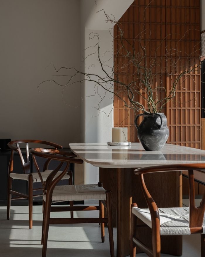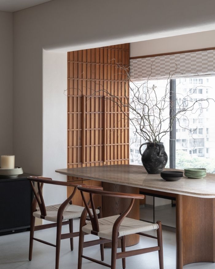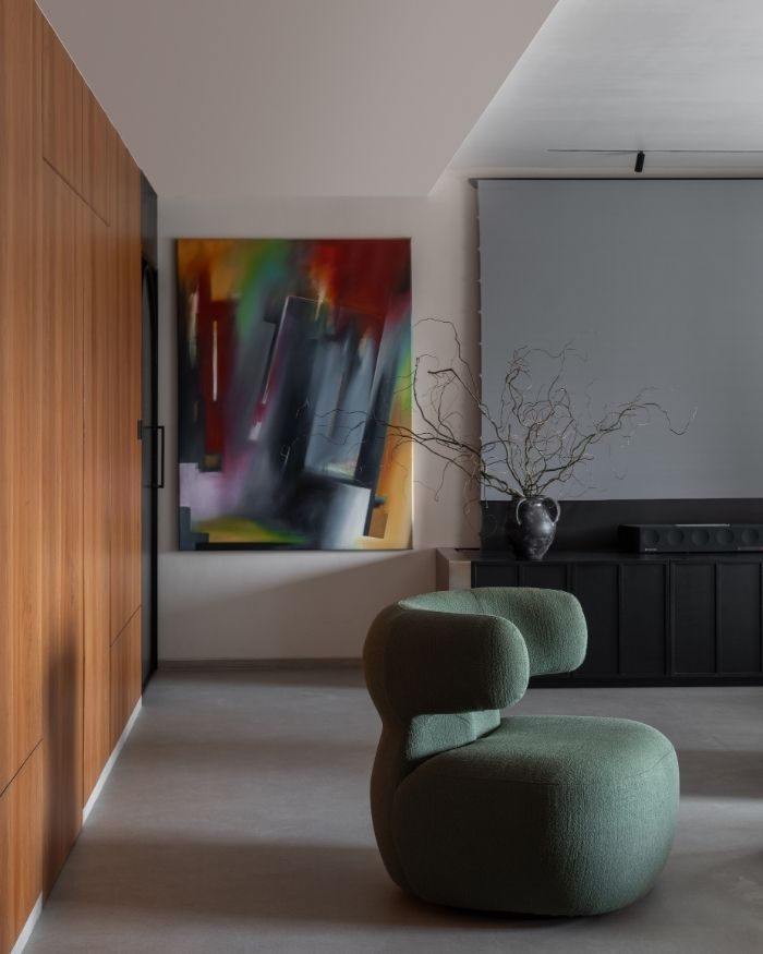

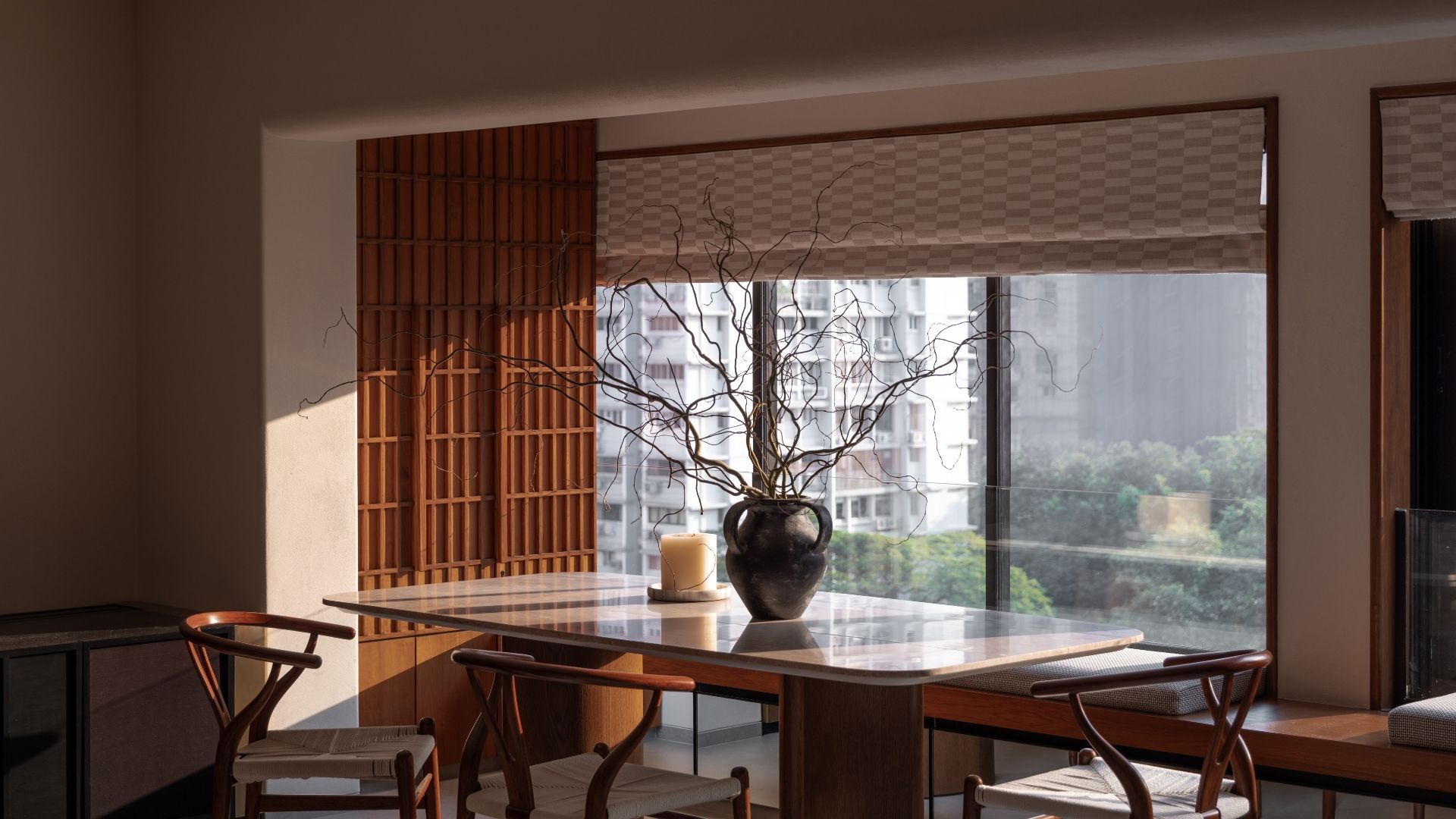
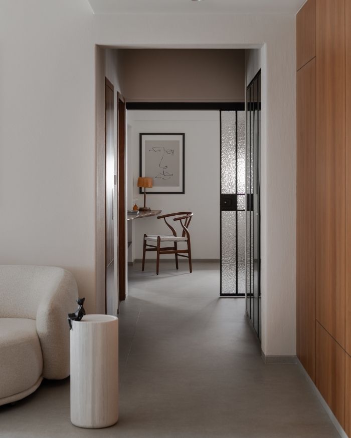
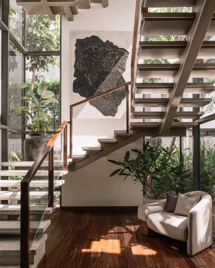
Are grey areas really a bad thing? While this is a question that’s worthy of contention, a similar reflection runs through the zen-inspired interiors of a Mumbai home where subtlety and layering become consequential to the everyday experience. A slow-revealing spectrum of colours through art and furniture melds with a constant cascade of daylight, falling softly at every turn and corner. Designed by Shonali Mahajan of Empire — The Living Company, the home dubbed Iris is inherently contemporary yet grounds itself in a state of ease, where every nook ushers curiosity with a sense of comfort and belonging.
“We looked closely at movement through the space; what reveals itself as you enter a room and how to maintain a sense of calm without visual clutter,” reveals Shonali.
“Another layer of complexity was maintaining continuity across the home while still allowing each room to have its own identity”
Shonali Mahajan
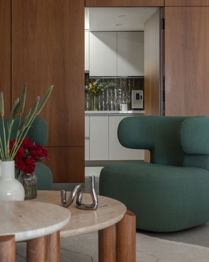
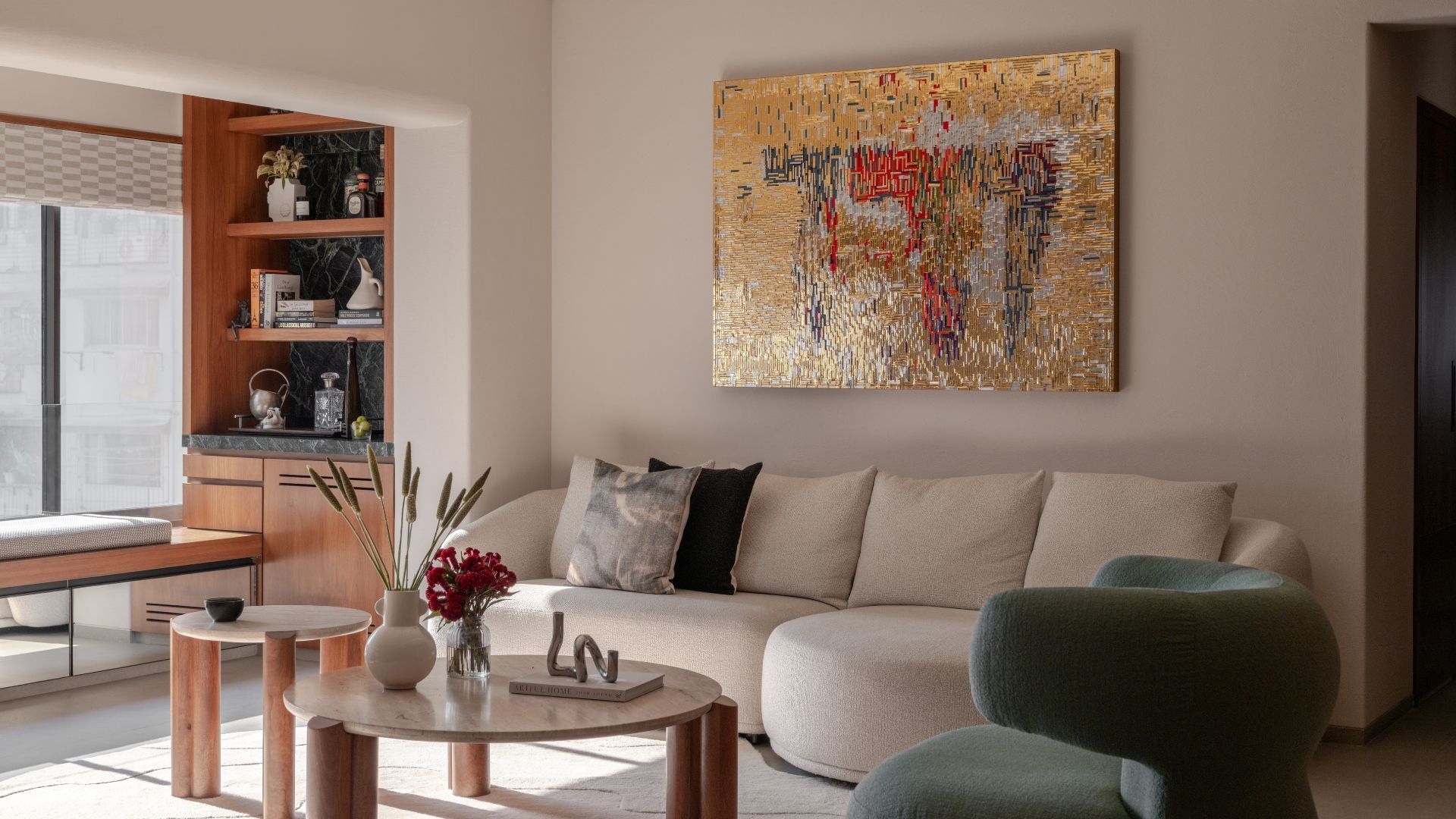
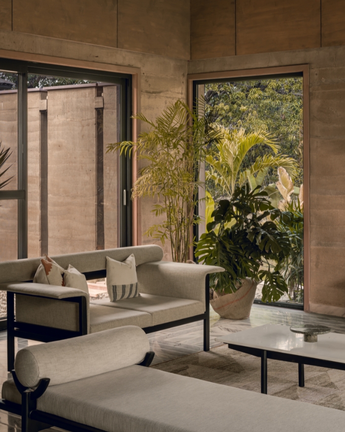
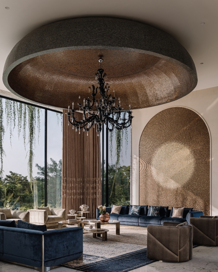
Enveloped in a restrained material palette and spatial order, the living area is one of the first spaces that instantly draws one’s eyes.
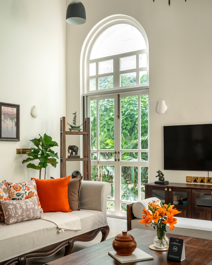
A sense of calm permeates the interiors, echoing a design sensibility that’s free from visual clutter. Even core decisions like concealing the kitchen door or avoiding a wall-mounted television stem from an intent to exercise restraint. Thoughtful placements of artwork in gold and orange accents and a cerulean green sofa reflect a dialogue between tactile richness and quiet luxury. Clearly, the design memo is loud: a myriad design elements are woven together to strike a sense of balance, where the overall vibe is structured but not rigid, warm but not heavy.
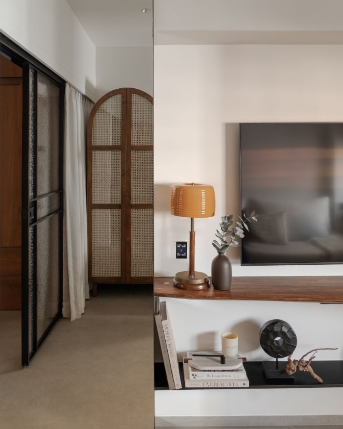
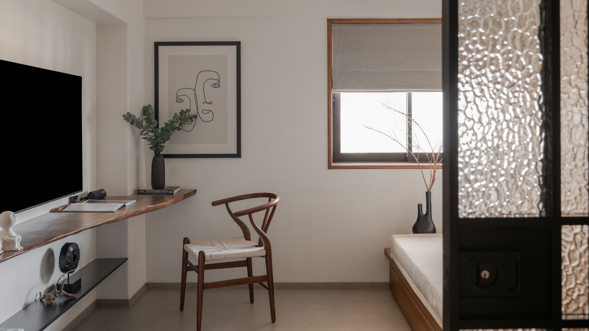
While it’s widely known that different corners of a home come with diverse energetic temperaments, a similar philosophy seeps into the colour palette. “We didn’t approach colours and materials as something to experiment with in a dramatic way. It was more about arriving at a combination that felt right and staying consistent with it,” she explains.
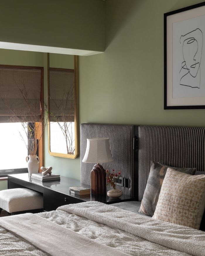
Here, the hues catch on subtly yet impactfully. Case in point: the bedrooms, where the palette shifts gently in varying degrees.
The master bedroom eases into softer, muted tones like sage green, while pearl white and warm wood dominate the palette of the guest room. The nursery takes on a more playful tone, within a controlled colour palette, not digressing from the overall theme that stays clear of a singular, imposed palette.
Wait, but did this come together as seamlessly as the end result that stands before us? Well, the designer responds with a resounding no. “Things like where to place the TV, how to integrate storage, or how much to reveal versus conceal required a lot of thought. It became an exercise in editing and restraint, making sure the space stayed clean and uncluttered,” she avers.
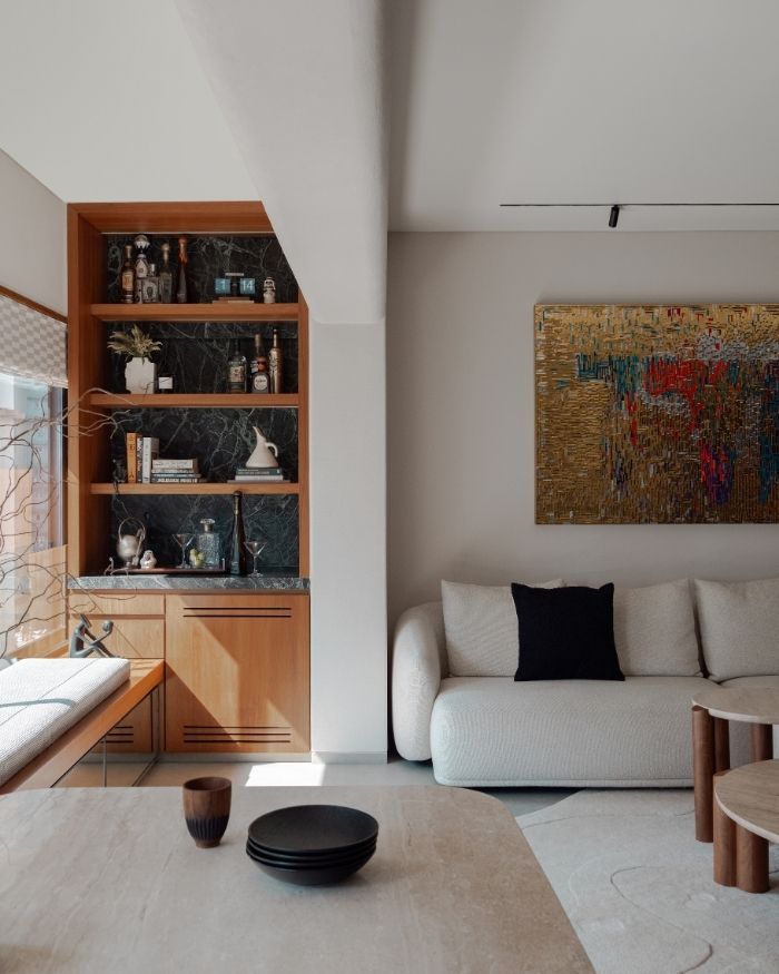
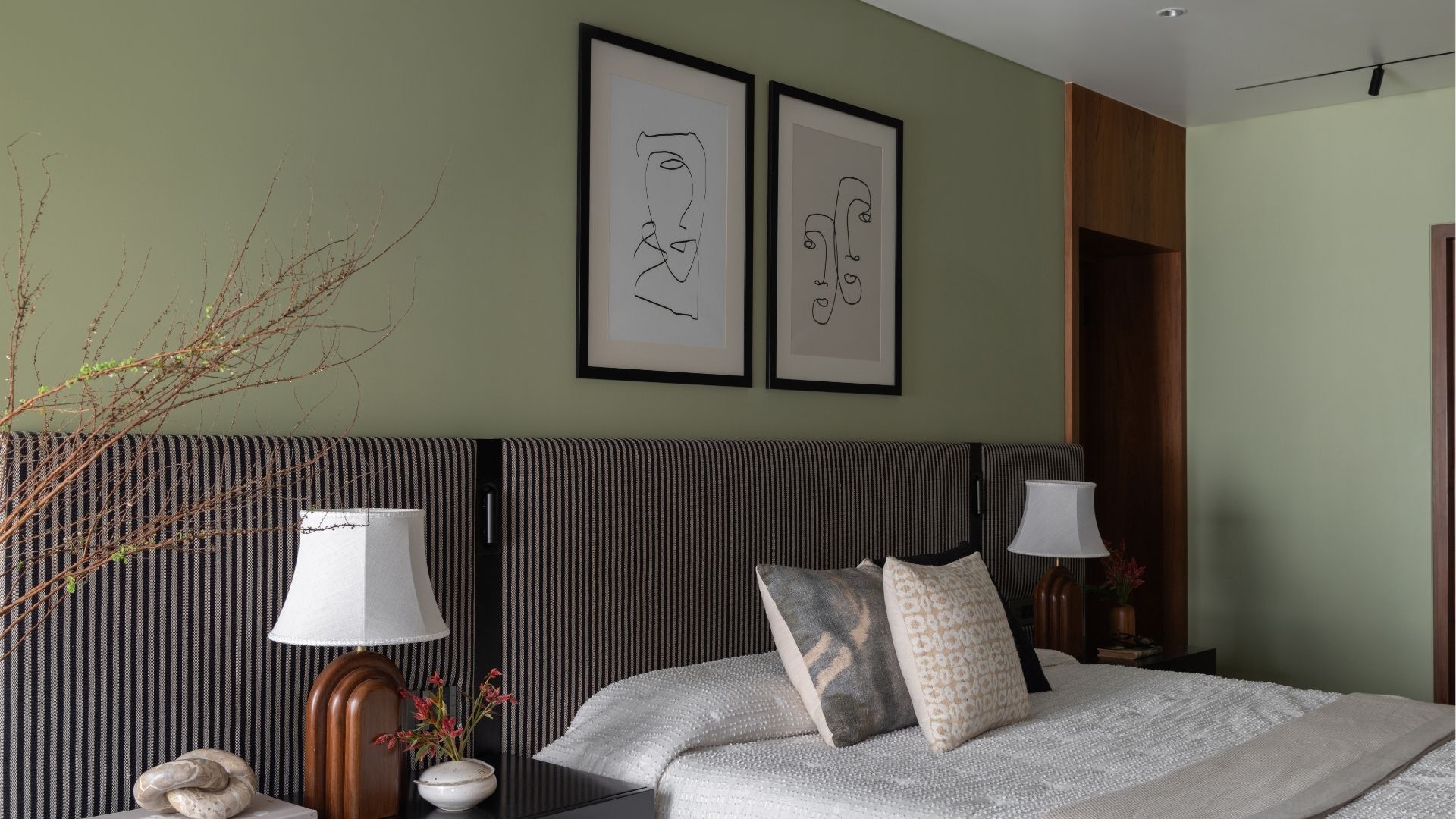
Much like in the case of life, even well-kept homes come with constant challenges and setbacks that are usually overcome with timely changes. While a sense of interconnectedness can be a wonderful thing, it’s also, “Another layer of complexity was maintaining continuity across the home while still allowing each room to have its own identity. Particularly in the bedrooms, it was about keeping the overall language consistent while subtly shifting the mood to suit each space,” Shonali outlines.
The Iris serves as a reminder of how a sense of softness and cohesiveness adds character, allowing the space to age gracefully.

No results found.