Photograph courtesy of Herman Miller
Featured

The psychology of colour at work

Herman Miller brings colour into the evolving landscape of workplace design

BY

Offices today must accommodate entirely different modes of work, from concentrated individual tasks to collaborative problem-solving and restoration. While creating different types of spaces has become standard practice, conversations around workplace design still tend to focus heavily on layouts, furniture models and amenities. The psychological role of colour is often overlooked, even though it can influence mood, behaviour and how a space is perceived. 

Photograph courtesy of Herman Miller

The psychology of colour

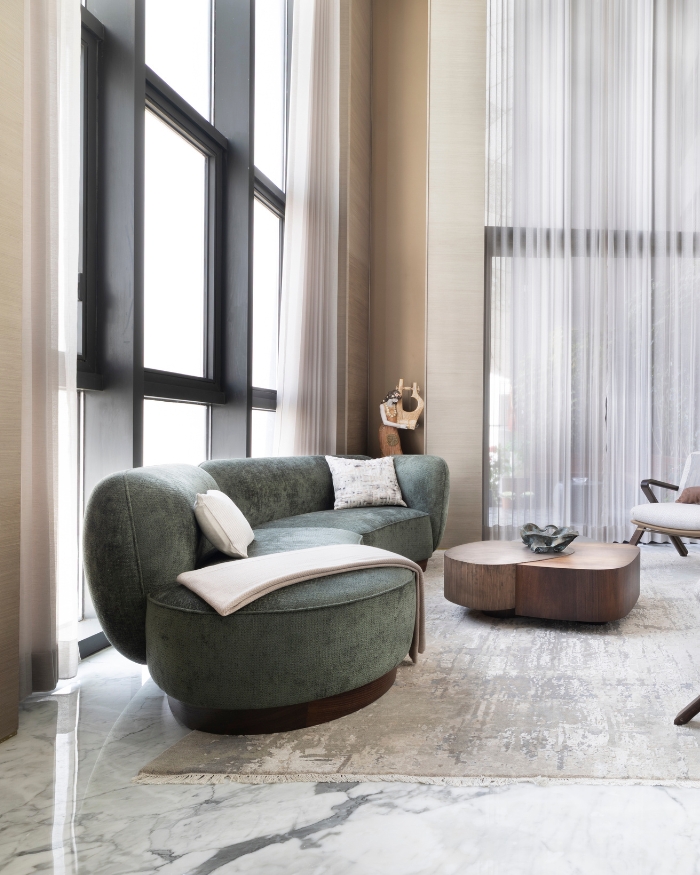
Individual responses to colour are always personal, but certain hues carry shared psychological associations. Cool blues can support collaborative environments by fostering energy and interaction. Soft greens, sage and olive tend to encourage reflection and focus. 

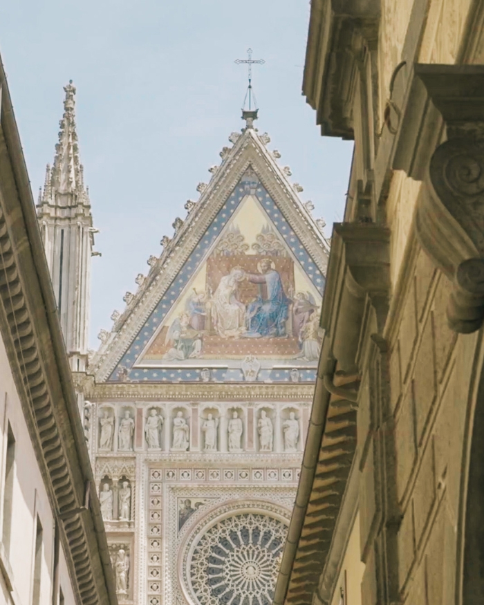
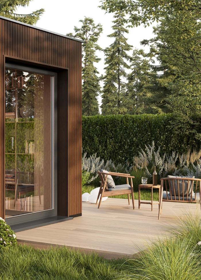
People often gravitate towards colours associated with positive experiences in nature. This can translate differently depending on landscape and cultural context: forest greens and deep lake blues; desert clay, burnt sienna and sandy neutrals; or Mediterranean blues, sun-bleached whites and terracotta. In modern workplace design,  it means choosing palettes that reconnect people with nature, without defaulting to an obvious “green office.”

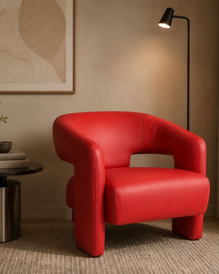
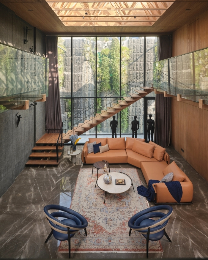
Colour also has to work in relation to everything around it. A workplace can quickly become visually chaotic when every wall, furniture piece and accessory speaks in isolation. Designers can work with related tones and complementary hues, giving different work settings their own identities while keeping the overall space connected. Furniture occupies the same visual field as walls, flooring, lighting and materials, so its colour can either reinforce or disrupt the larger palette.

Photograph courtesy of Herman Miller

Evolution of Aeron 

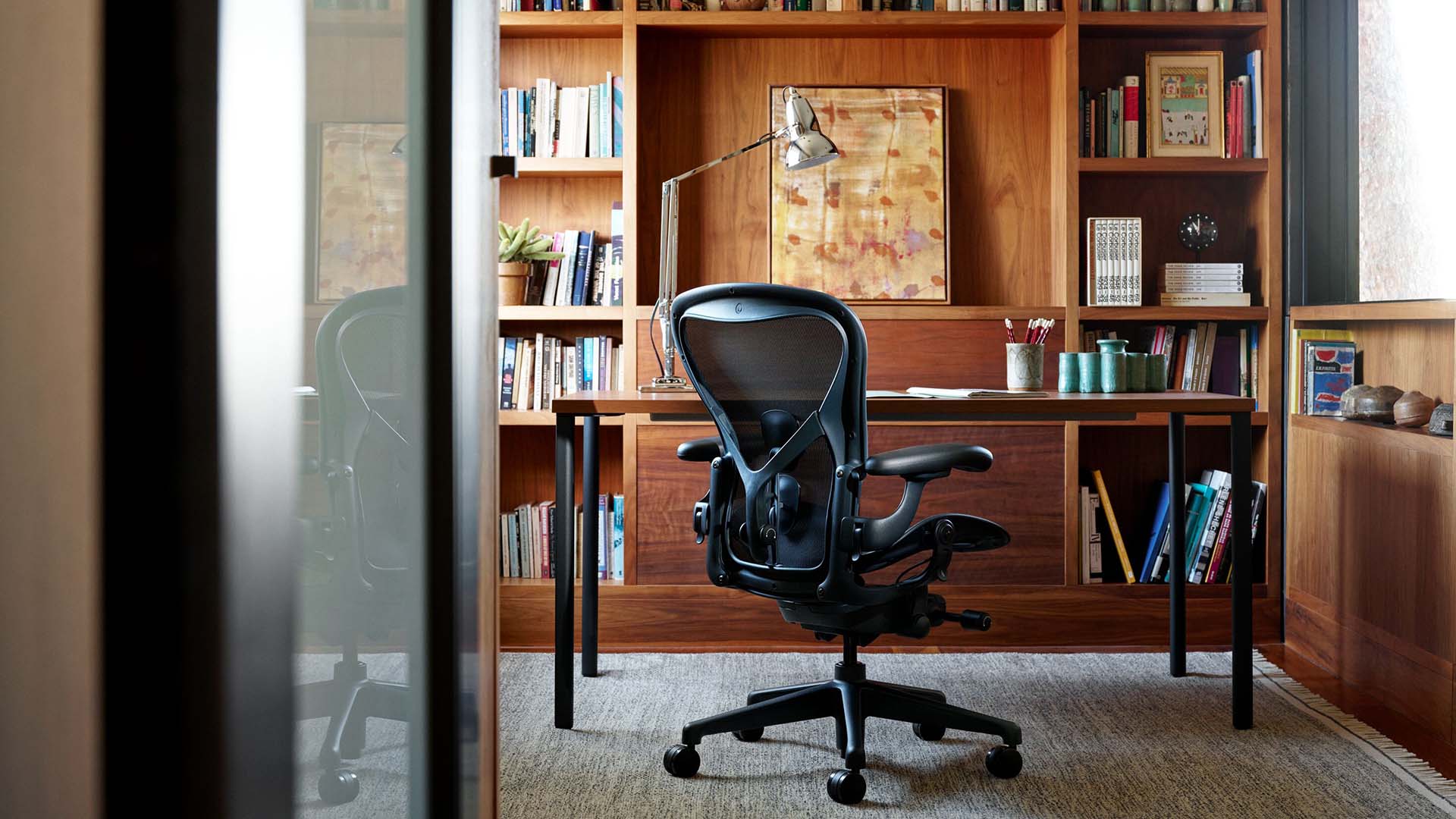
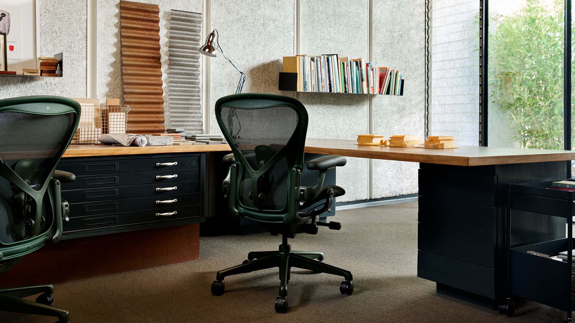
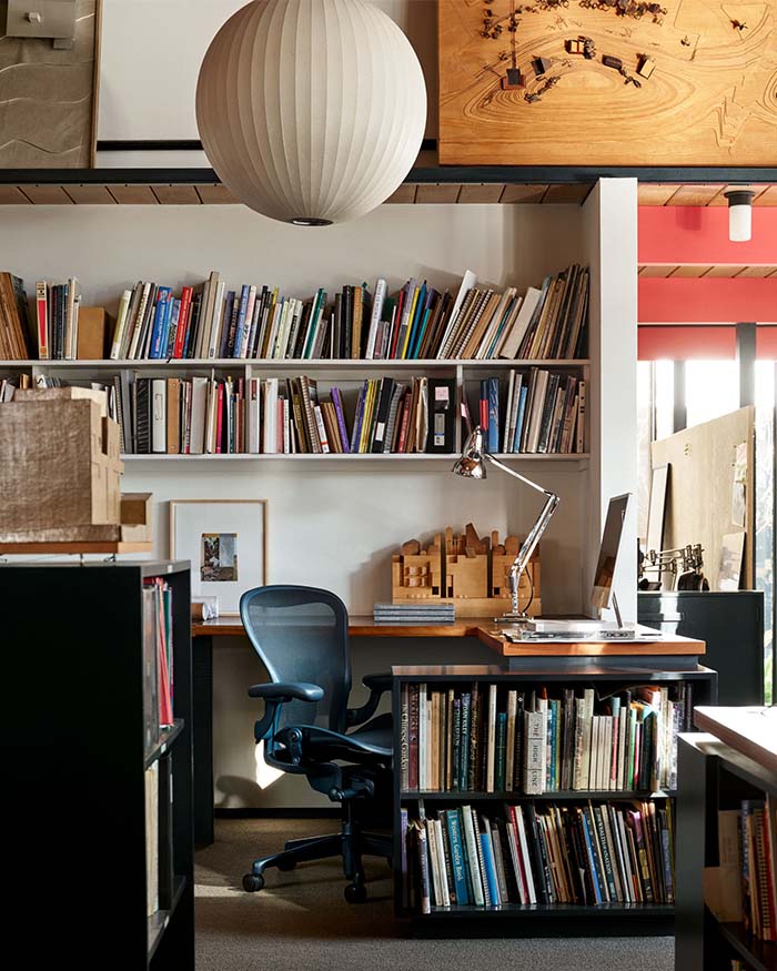
For nearly four decades, the Herman Miller Aeron has been a fixture in offices, almost always in shades of black or grey. The introduction of Jasper and Nightfall expands that identity through colour for the first time, prompted by how workplaces now need to accommodate several modes of work in a single day while feeling more personal to the people using them.

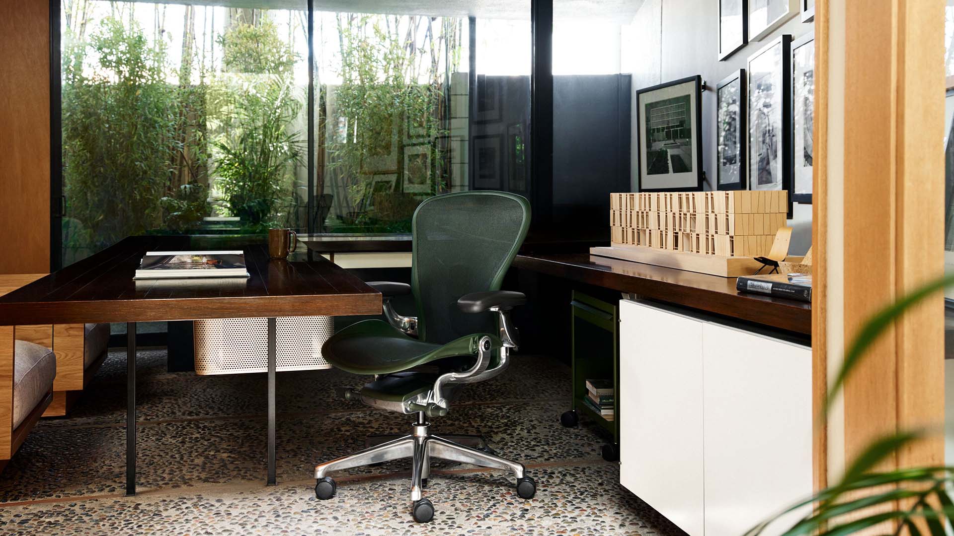
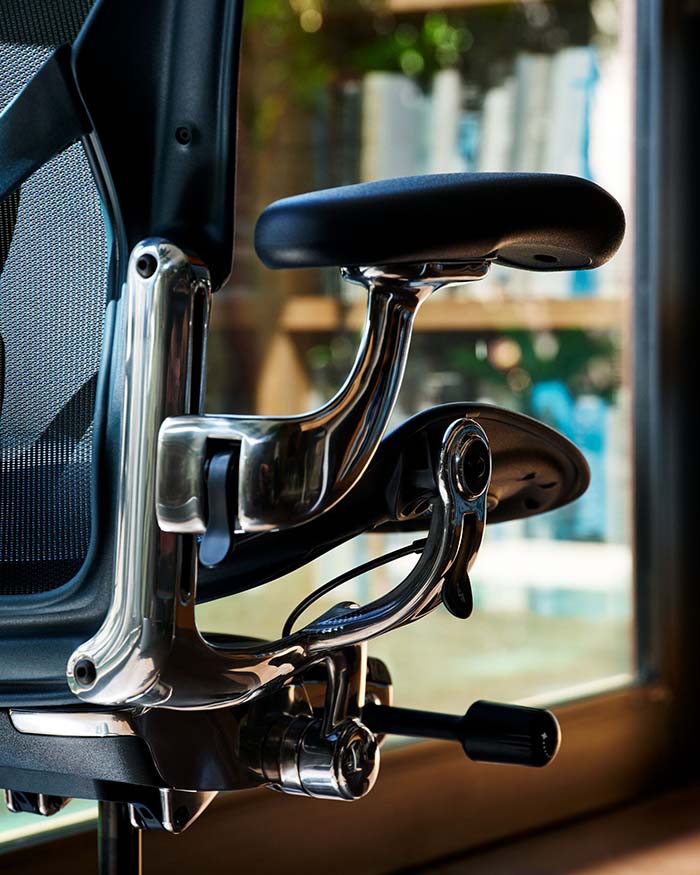
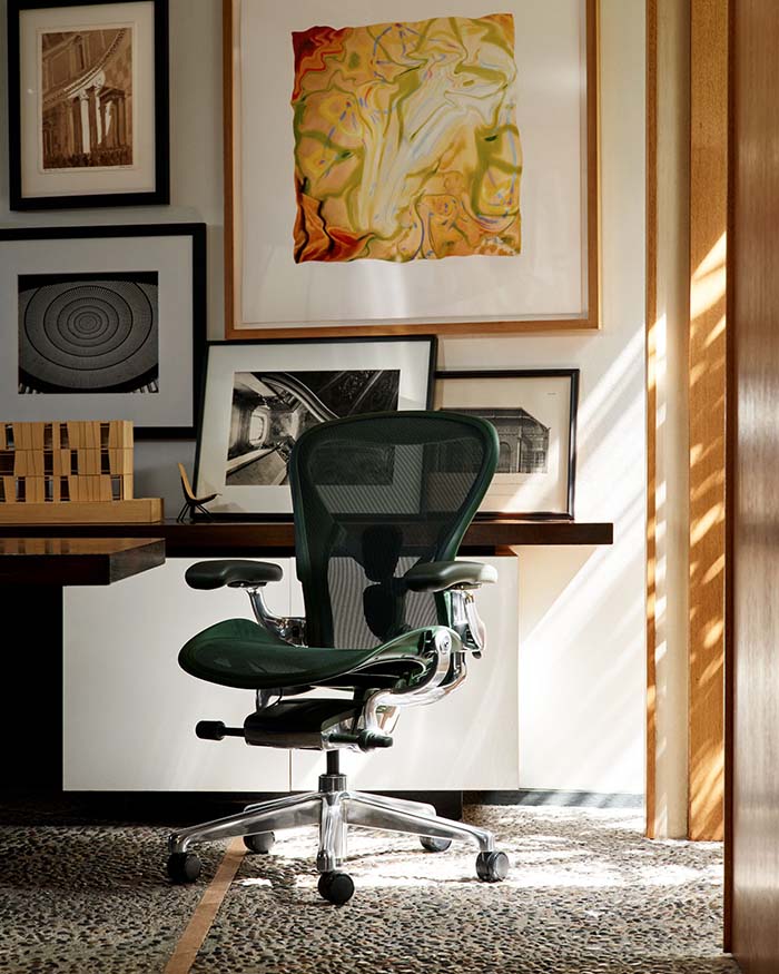
Jasper is a deep green that draws on forest green and olive tones commonly found in nature, bringing a sense of the outdoors into a workplace.  It was developed through paint experimentation and sample testing under varying light conditions, including natural outdoor light. Its darker hue gives the colour depth, allowing it to work within a range of workplace palettes. Nightfall takes a darker approach, with a deep blue-black that gives Aeron a more tonal appearance. The colour is applied across the chair’s different materials and components, so the frame, seat and other parts sit within the same palette. That tonal quality is part of why it moves easily between a collaborative area and a more formal meeting room, without reading as out of place in either.

Colour is no longer confined to the architecture around the furniture. As workplaces make room for focus, collaboration, creativity and restoration, colour helps shape how these different settings look and feel. With Jasper and Nightfall, that thinking extends to the individual product, making the chair part of the colour story of the workplace.

Visit Herman Miller to learn more!
Photograph courtesy of Herman Miller
SHARE THIS ARTICLE

You May Also Like

Watch

No results found.