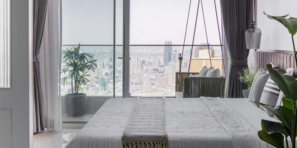
Just as an artist identifies its muse and frames it within their piece of art; a designer anchors the context and outlines a conceptual planning around it. When a panorama of the scintillating Mumbai skyline along with a spectacle of Bandra-Worli Sea Link uncovers as a vantage point, needless to say it adjures to be captured and framed, as seen in this Mumbai apartment by Studio Osmosis.
Located in a residential district, this 1900 sq ft residence on the 42nd floor is designed by Sameer Balvally and Shilpa Jain Balvally, Principal Architects of Studio Osmosis and styled by Shraddha Nayak.
The designers express, “As a curator of creative, technical and aesthetic aspects, it’s important to bring together each collaboration by overlooking the whole picture along with each part individually at every stage of the canvas and painting.”
You may also like: Studio Osmosis translates symphonies into space in a duplex in Mumbai
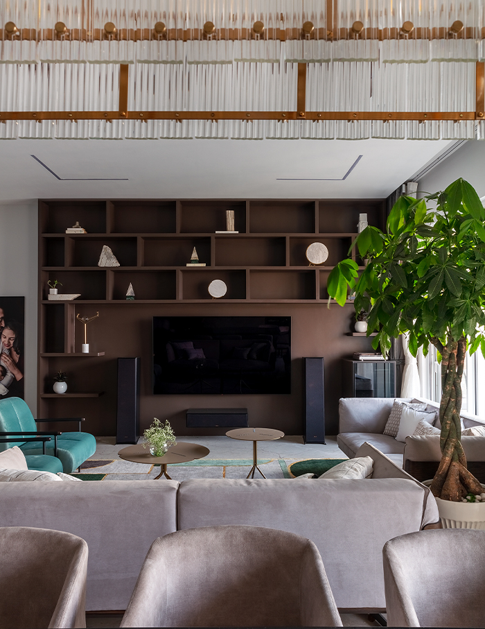
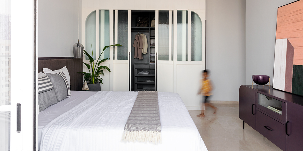
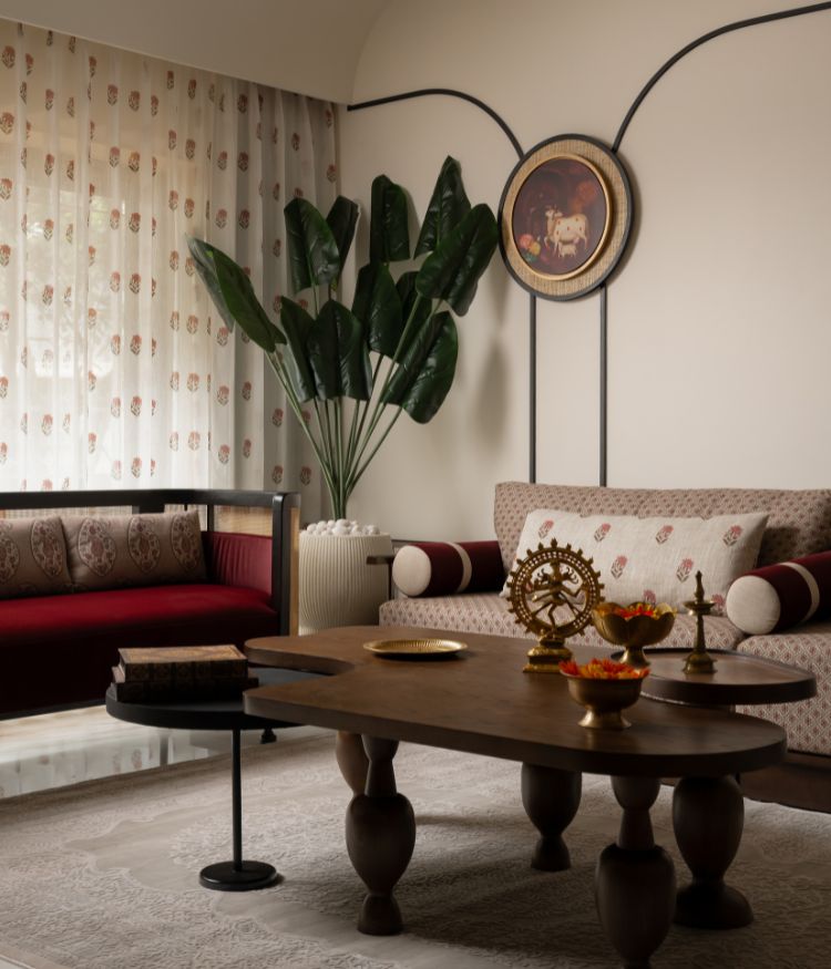
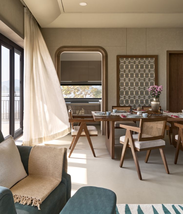
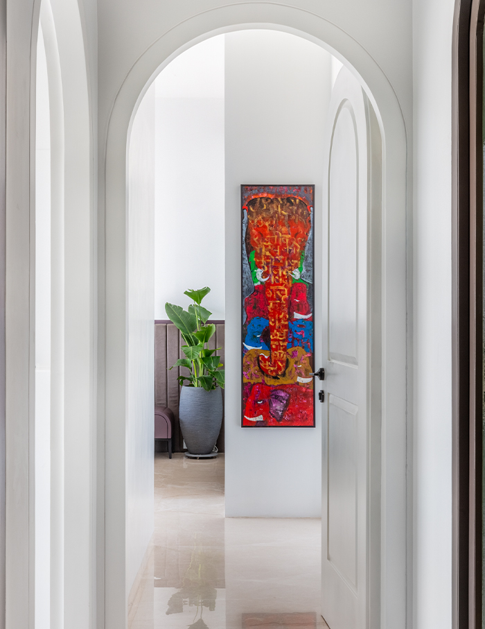
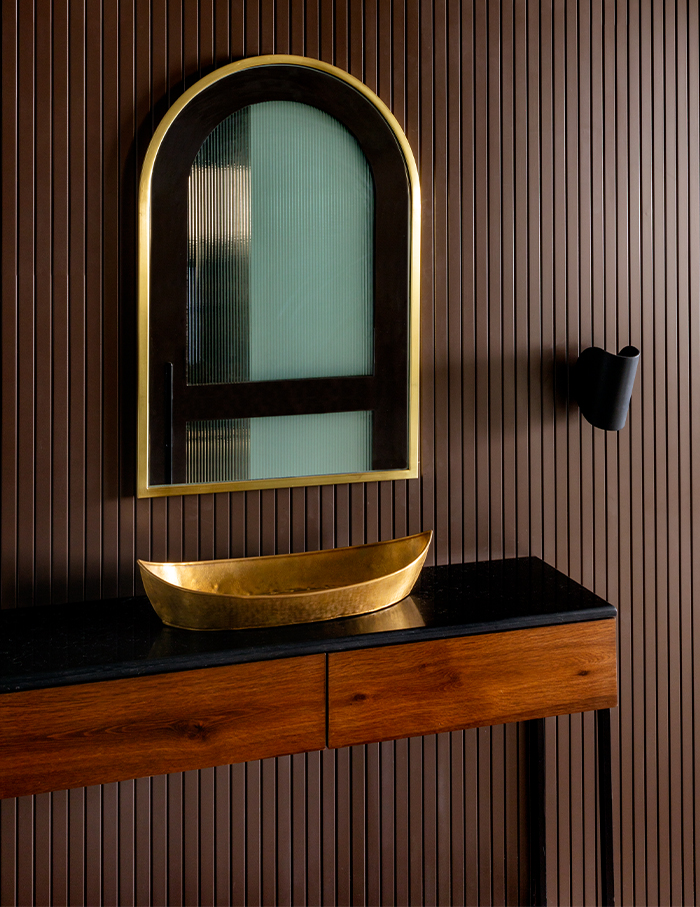
With a vision to reflect the homeowners personalities and lifestyle, a muted warm palette with a strong yet subtle arched language is carried throughout the house. Connecting spaces within the house, the arched forms function as thresholds and pause points.
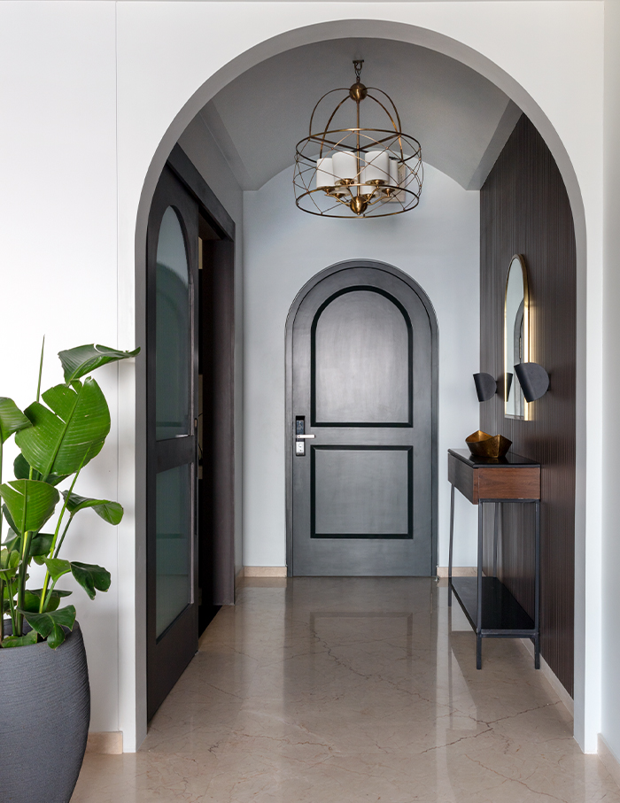
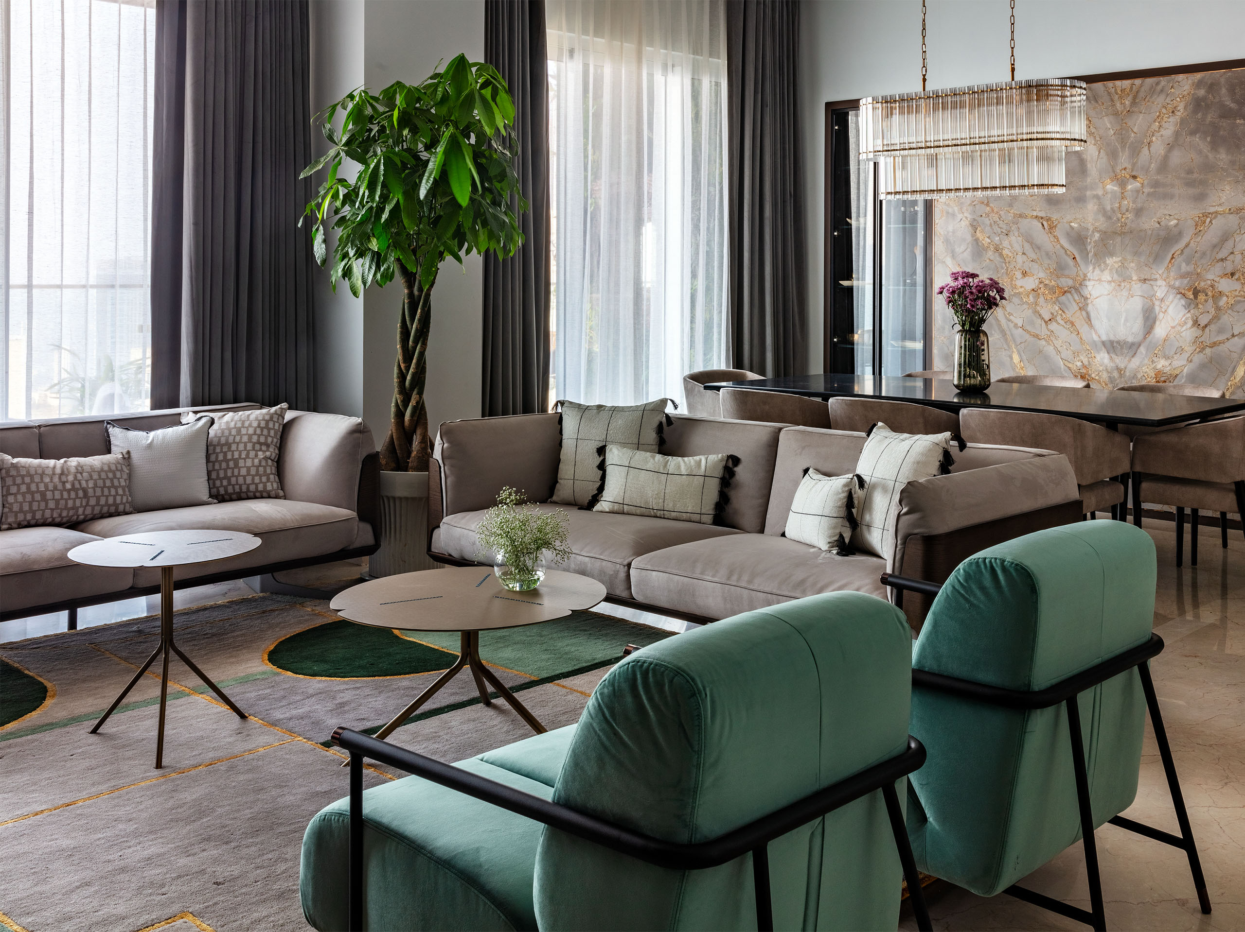
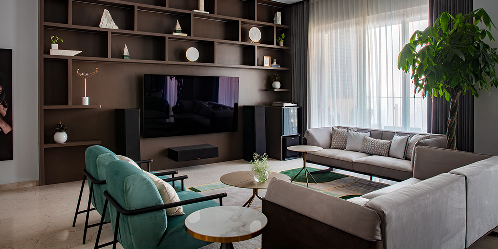
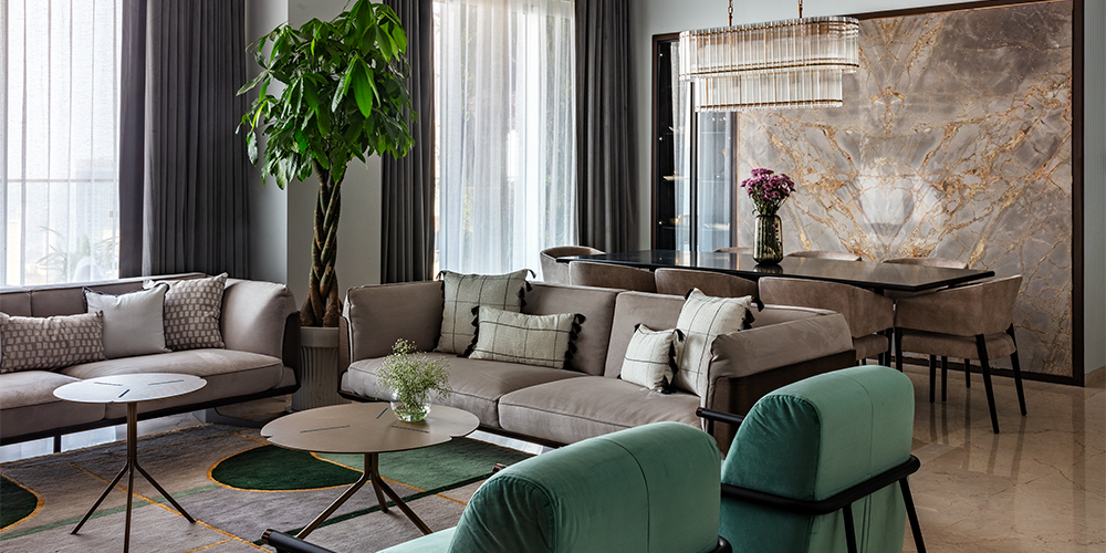
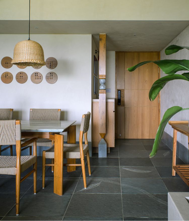
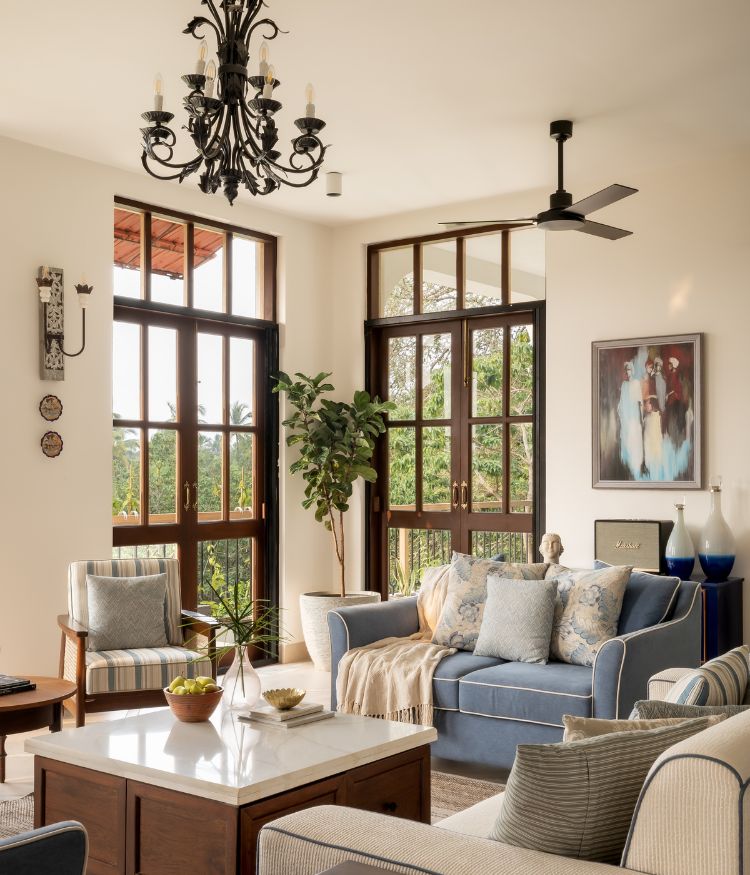
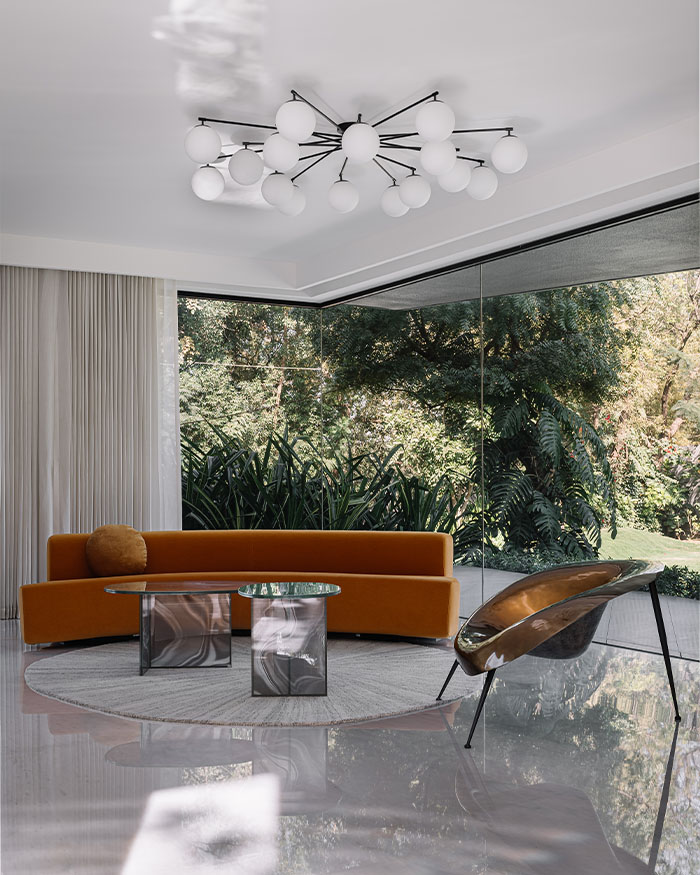
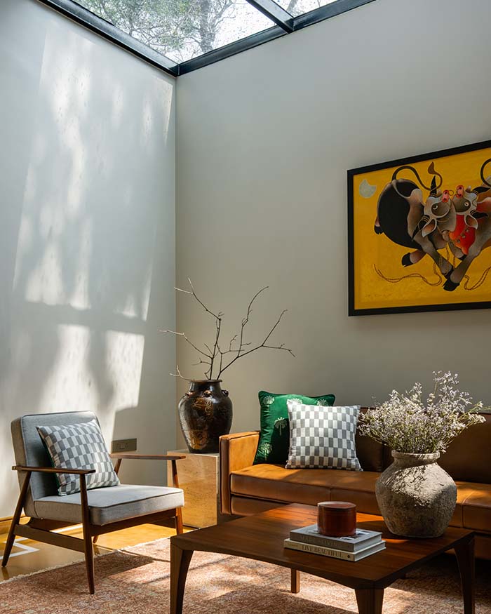
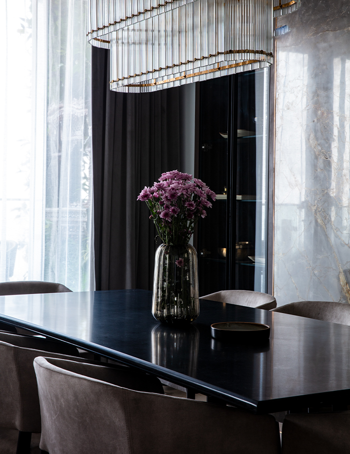
Taking a step into the apartment, an arched doorway leads you into the living and dining area cumulated together with neutral tones and green accents. Designed to look outward, the living areas open up to a vast balcony with a mesmerising view of the Bandra Worli sea link. It acts as a space to recharge and relinquish the serene sunsets and leisure into the evenings.
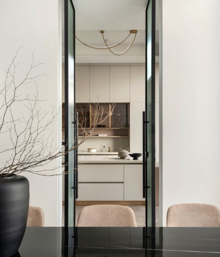
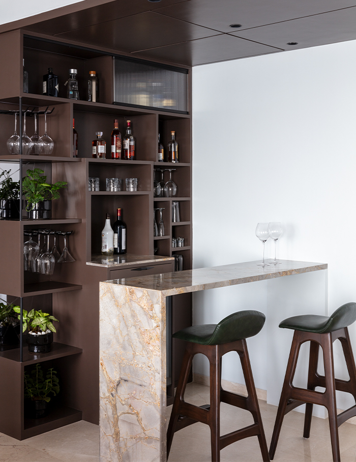
A 3BHK remodelled into a 2BHK apartment presents an extensive space for socialising. With an open plan, a bar designed in continuation to the dining room boasts the owner’s collection of wine and spirits and becomes a casual zone for conversations.
Parallel platform layout with mid-century patterned flooring in the central open space offers maximum circulation and complements the modern kitchen.
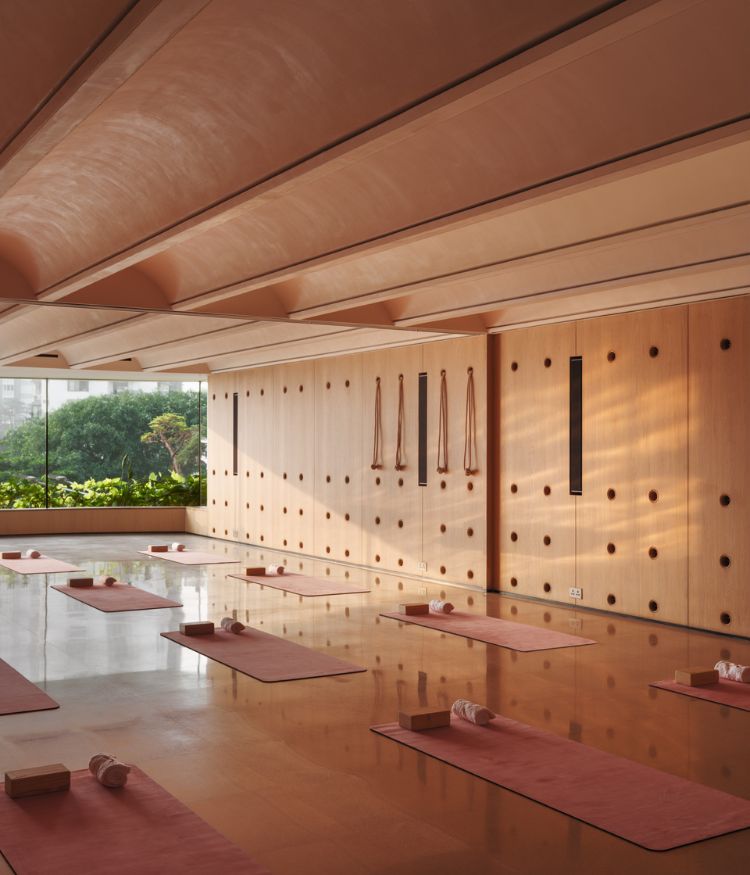
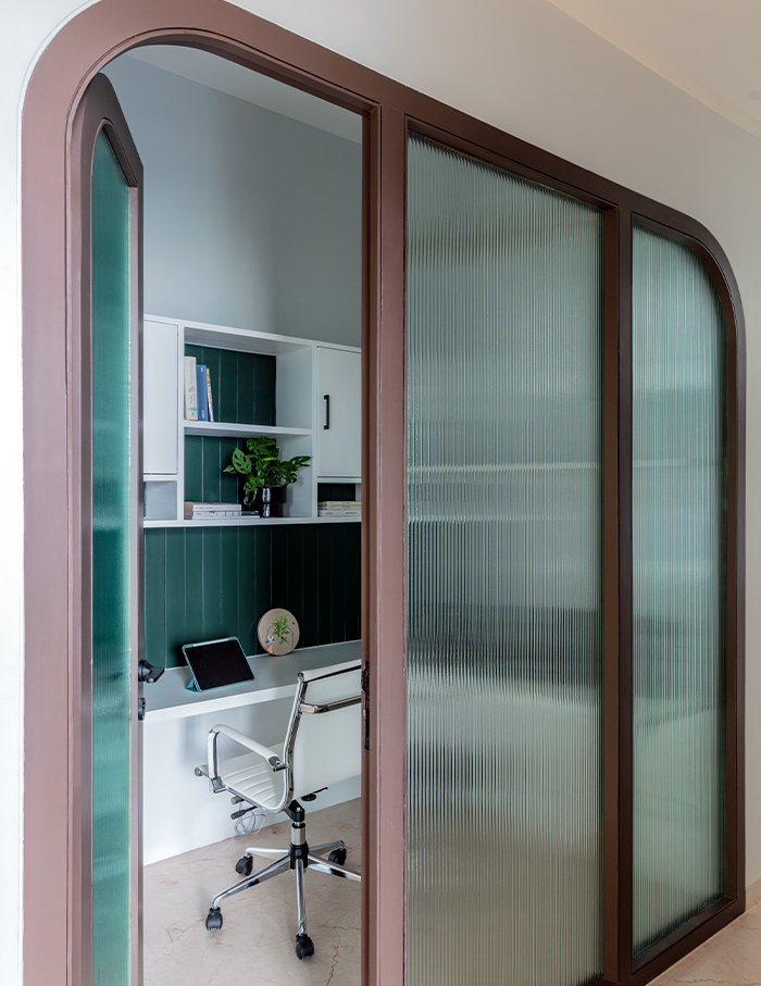
A vaulted passage leads to the bedrooms, mandir and study. With the work from home culture, a study area secluded by a glass partition becomes a part of the apartment.
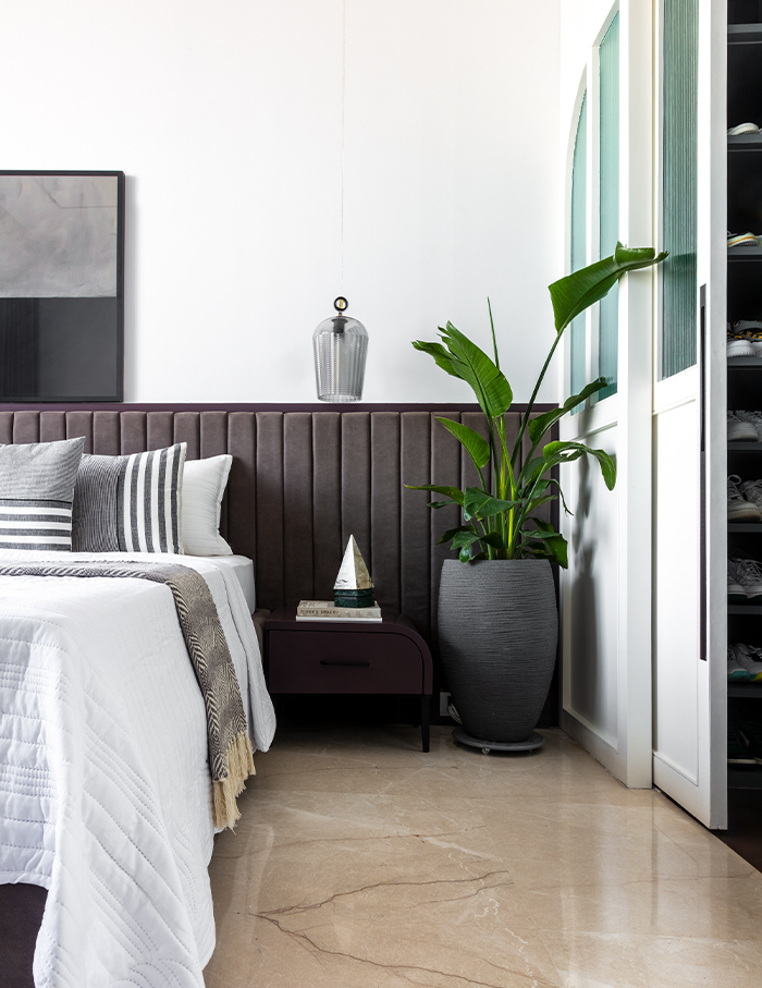
Keeping in mind the maturity yet the playfulness of the young toddler, the kid’s bedroom houses cosy nooks and fun components with shades of green furnishing a warm ambience. The mainbedroom is the owner’s personal oasis, disconnecting them from the humdrum of the city with a spacious sun deck, walk-in-wardrobe and a lavish master bath.
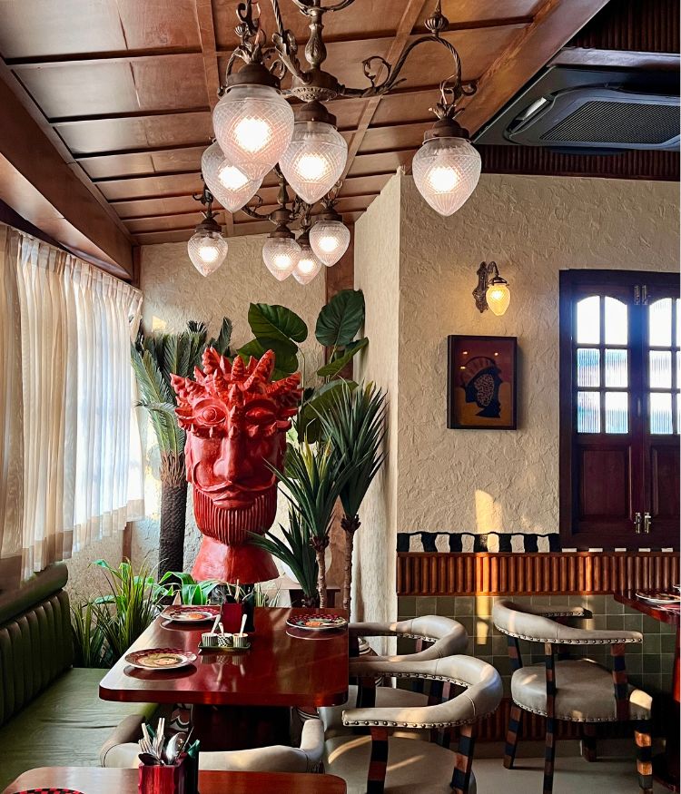
Subtle yet strong forms, simple and minimal material application and adaptation defines this project. Visually tying the spaces together, the materials and textures revolve around a neutral palette of white, various tones of taupe and greiges within the fabrics, wooden textures with marble and antique metallic finishes.
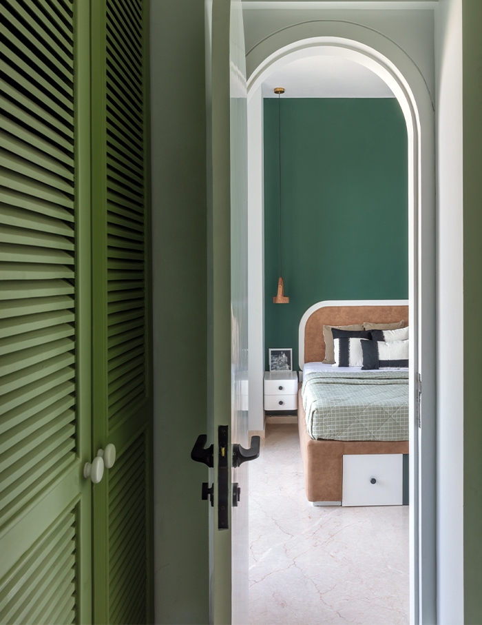
Variations of subtle yet deep greens have been used throughout the house in various forms to complement the beautiful views and natural daylight filtering throughout the house to evince a sense of calm.
Attention to detail, functionality and materiality responding to the homeowner’s way of life without overcomplicating design has always been a way for us rather than a trend. This makes the space appear functional as well as makes it vibrant or quirky.
If you enjoyed the strong yet subtle arched language of this project, check out: Curves and arches shape the nonchalant landscape of this Mumbai home crafted by Design Decor Drama

