This midcentury modern Los Angeles abode by Mass Studio is a true reflection of Californian ranch style of architecture.
Designers Safura Salek, founder of Mass Studio, collaborated with Leonardo Umansky of Arxis Design Studio to remodel this home—originally built by Robert Byrd in 1951—with a fluid, open-plan layout. Together, they have added a 1,500 sq ft master bedroom wing and turned it into a 5,500 sq ft house.
“The homeowners were attracted to the panoramic night vista that this majestic property offers. It is away from the city’s buzz in southern LA, and was chosen to be a sanctuary-like, forever home. Considering the structure’s age, we had to abide by the laws and maintain the exterior architecture style but we freely played around with the interiors,” shares Salek, principal designer of Mass Studio.
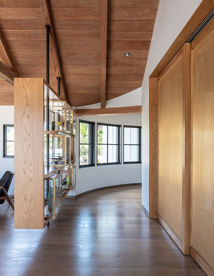
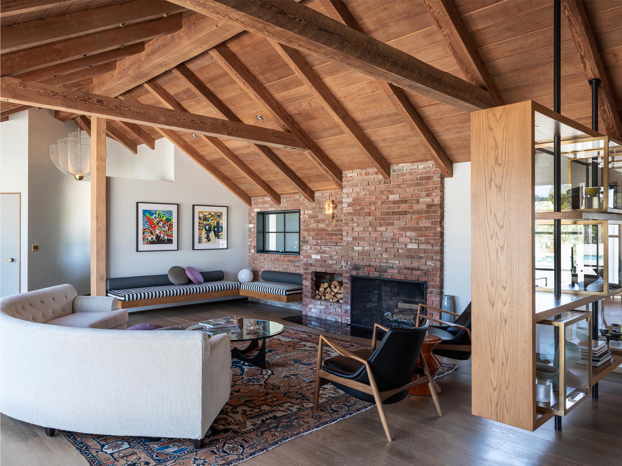
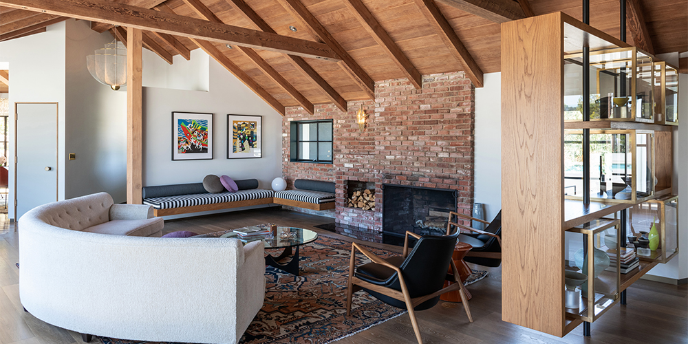
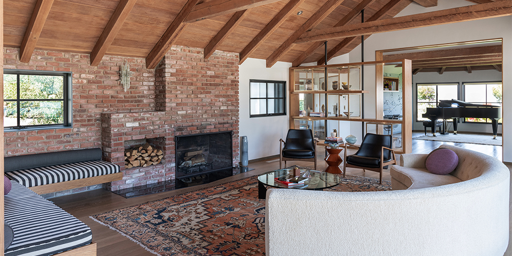
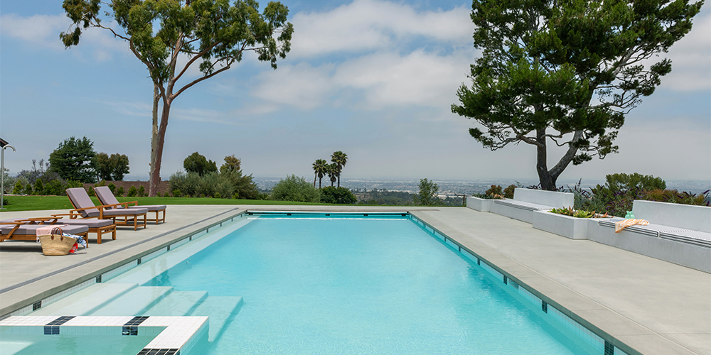
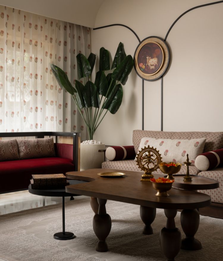
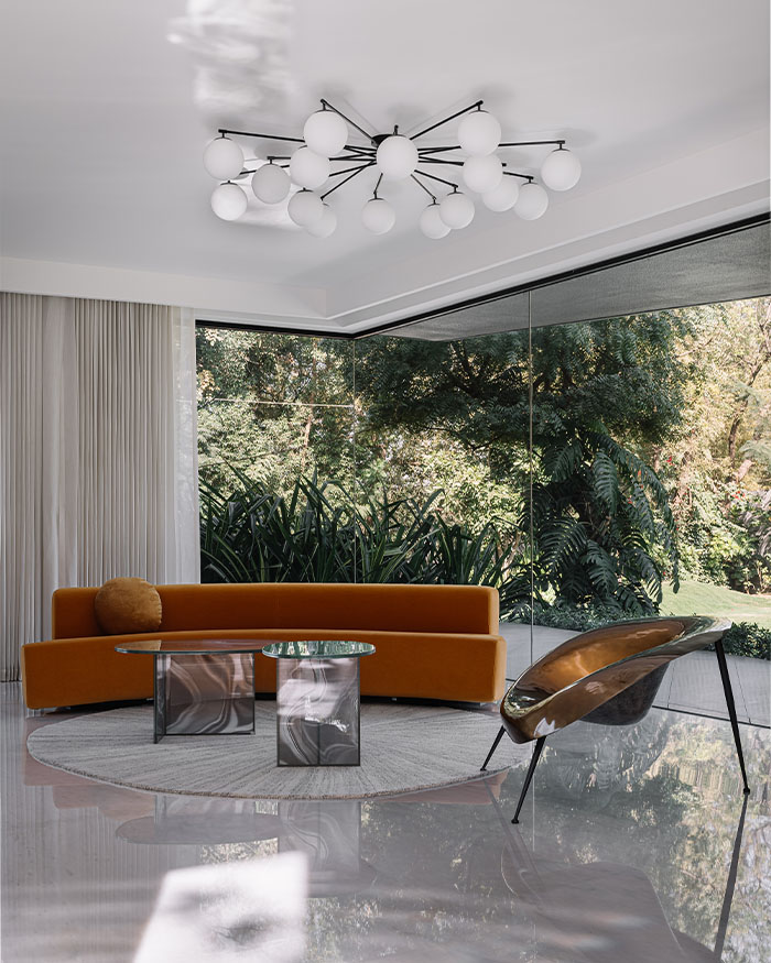
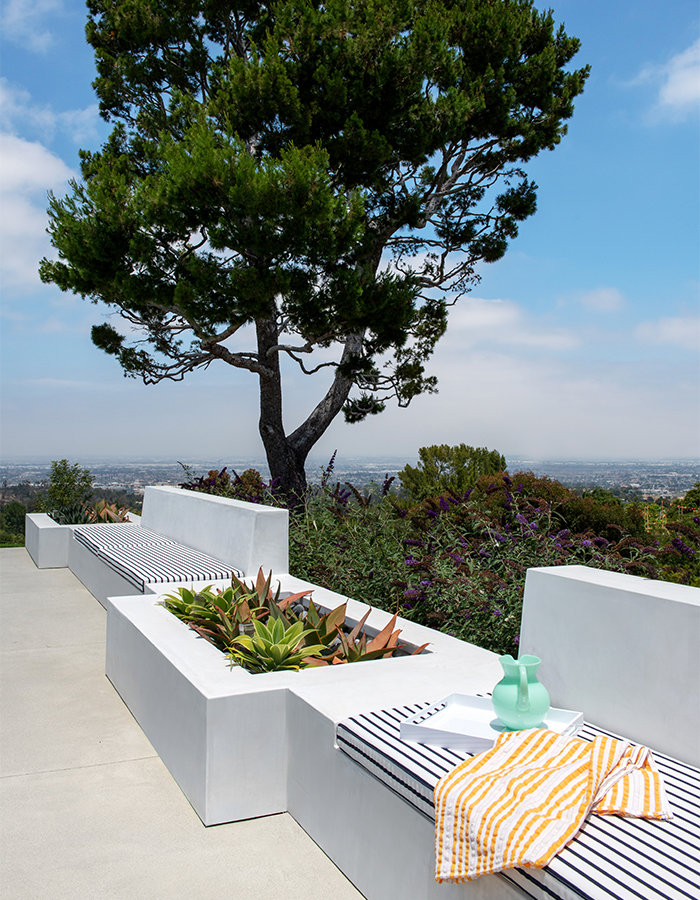
From the very entrance, each space reveals a glimpse of other interconnected areas. And each of those either look out to a lush landscape on one side or the city from the newly fitted pool. However, the living room remains the focal point. It houses an original brick fireplace, wooden beam ceiling, a 1950s curved sofa (belonging to the former owner) and a 100-year-old vintage Persian rug.
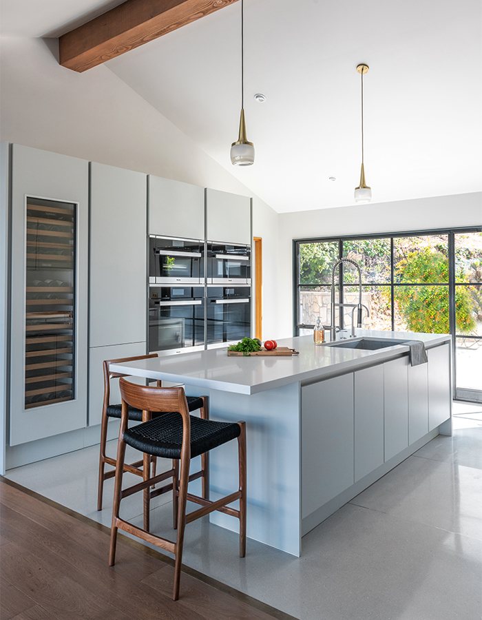
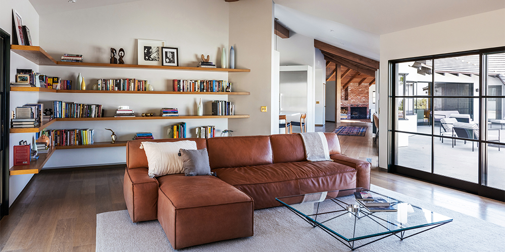
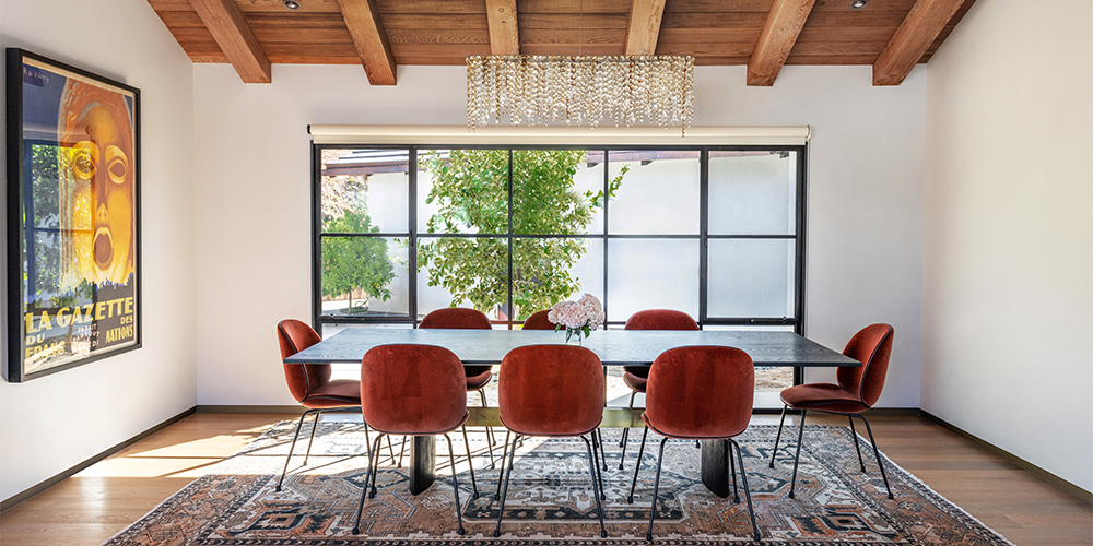
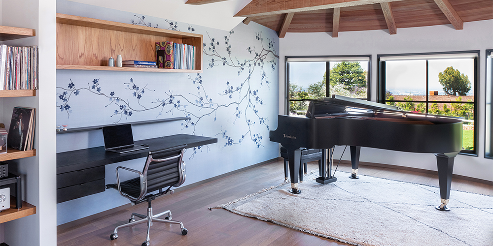
The living room also comprises a conversation pit with inbuilt benches, allowing people to engage in conversation. A partition here cordons off the music room-slash-home office. Meanwhile, the kitchen, dining and family room are set along the pathway that leads to the newly added master bedroom wing.
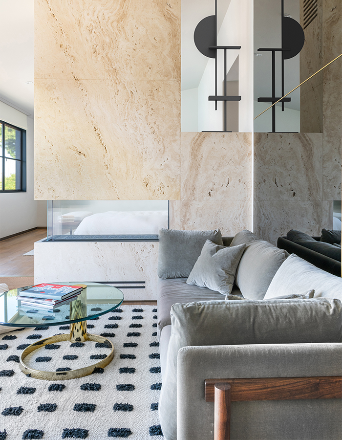
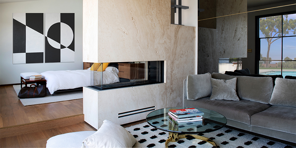
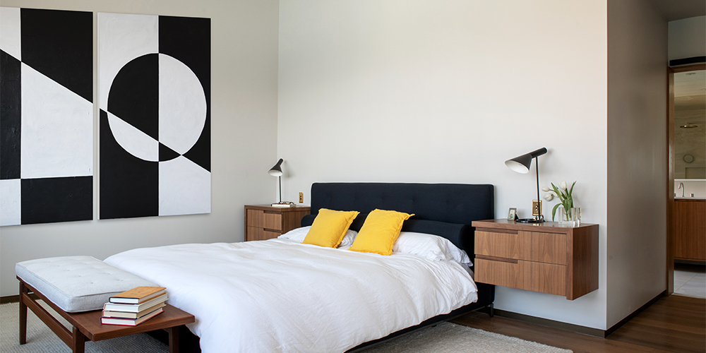
We love the master suite for its play on horizontal levels. It is divided by a two-way fireplace, clad in natural unfilled travertine slabs. A grey mirror backdrop doubles the space, where an Andersen quilt bed by Rodolfo Dordoni for Minotti is paired with a sofa ensemble. It is done up using the same material palette as the rest of the home—white oak with natural finish, unlacquered brass, exposed brick and natural stone—and in monochromatic hues with pops of colour for a cosy, rustic charm.
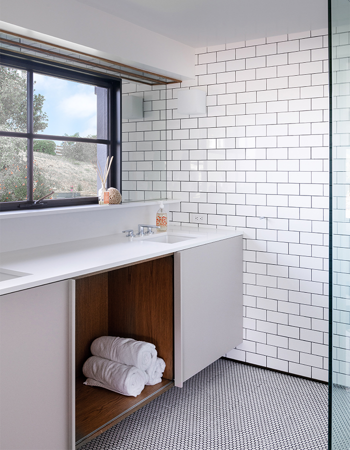
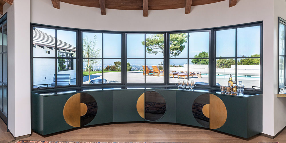
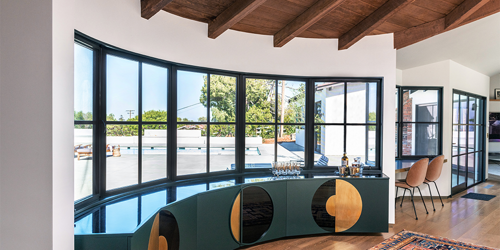
Another element we love is the midcentury-influenced, curved walk-up-bar across from the formal dining area. “It follows the existing curve of the window and wall, and is humbly inspired by Serge Manzon’s Eclair lamp for Pierre Cardin,” reveals the designer.
Salek adds, “When designing anew, it’s always important to contextualise the creation. Similarly, when redesigning something that already exists, we try to inject a sensibility that both retains the purity of what it was and also understand what it can become.”

