A designer’s mind seems to be under the same spell as Bellatrix Lestrange’s Gringotts vault (yes, that’s a reference to the world of Harry Potter!). Tap one thought and several others pop up. Admittedly, how does one escape long enough to find the ultimate focus?
The intriguing question of bringing focus amidst the constant city bustle somehow forms the precis of this office. Surat-based duo Jhanvi Mehta Shah and Rakshit Shah, Founders of D’WELL reimagine their architectural office as a minimalistic vessel and a creative cave positioned amid an urbane setting.
Aptly dubbed The White Cave, the 750 sq ft studio nested in a commercial locale of Surat commands the attention of its occupants by cutting the clutter inside. A sense of mystery guided by the overarching theme of no-clutter and many corners that turn into abyss of creative design make you admire how well-being and work meld seamlessly in this office.
You may also like: Inside the newest Mumbai office of Sarah Sham of Essajees Atelier
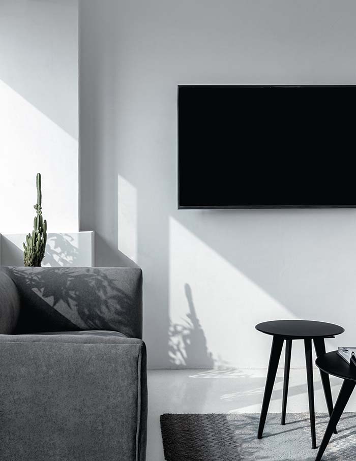
Segregating the indispensable from the dispensable, the office is stripped of all its distractions to render a binary setup. Dressed in white, the space is devised as a catalyst to zone out from the outside world and concentrate on the task in hand.
“The ideology of minimalism is not constrained to the look and feel of the space but goes beyond, taming the emotions of the users and visitors,” divulges Rakshit.
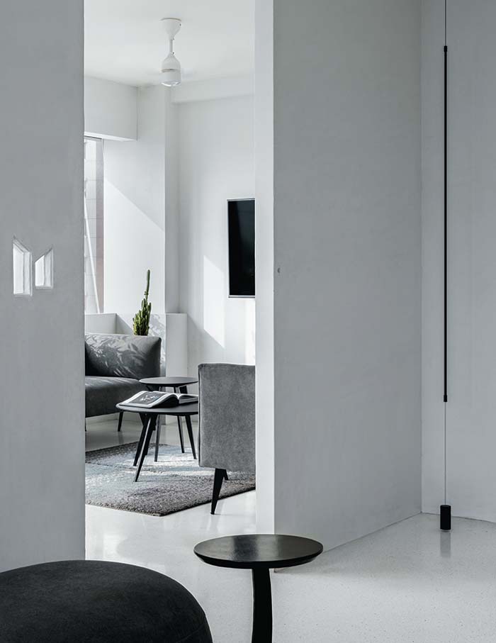
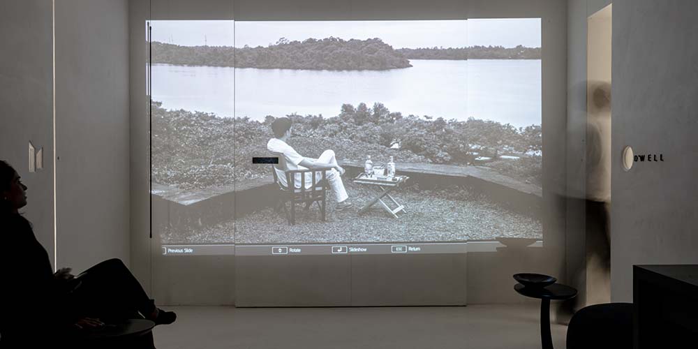
As one steps into the cave, there is an intentional transition from colour to monochrome, alerting the senses. By the time one reaches the reception area, the mind is already picking up on the subtleties of the cave.
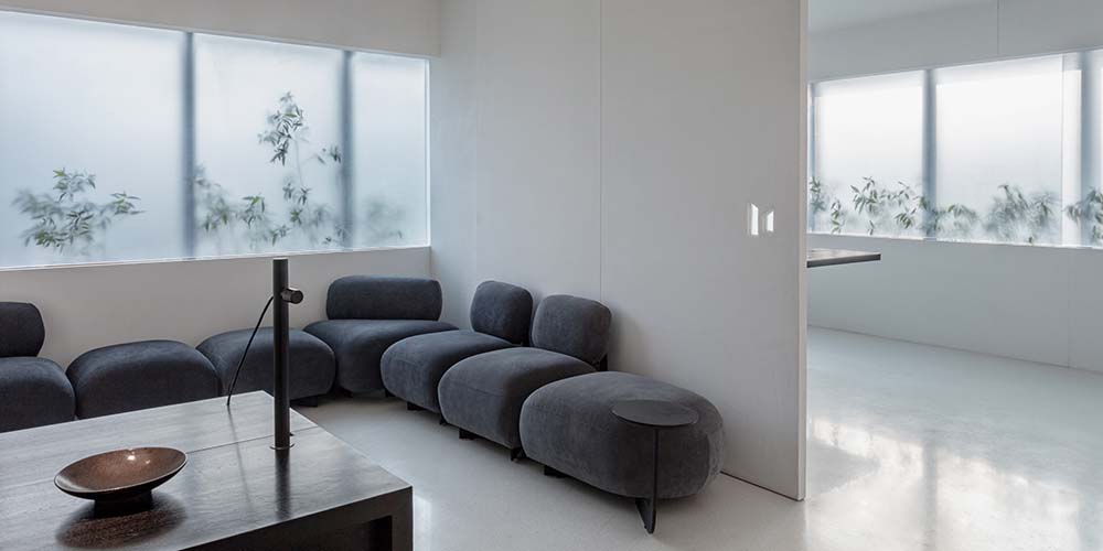
The reception is a multi-purpose area serving as both a waiting zone and a dining setup by the day and doubling up as the entertainment hub post office hours.
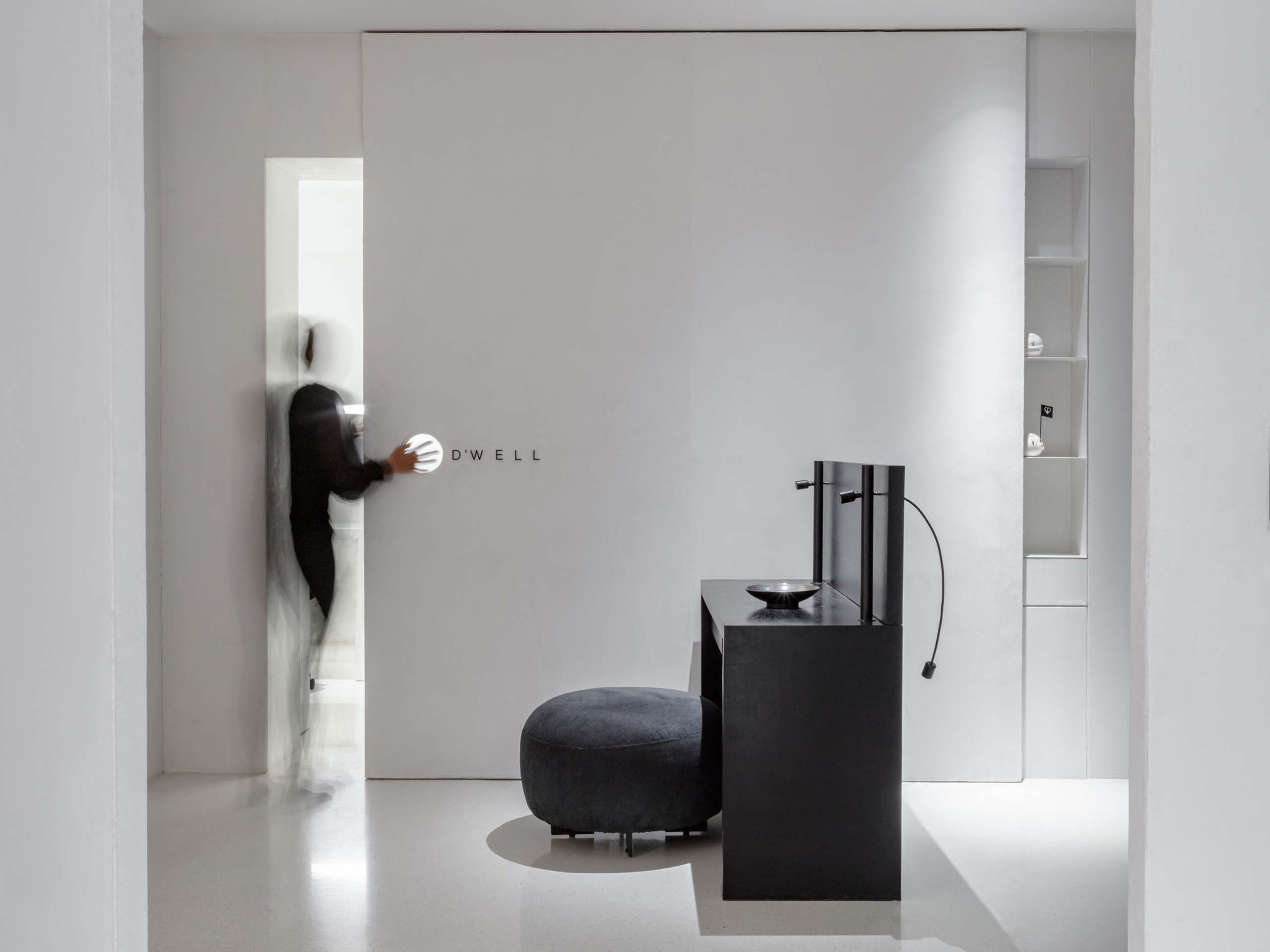
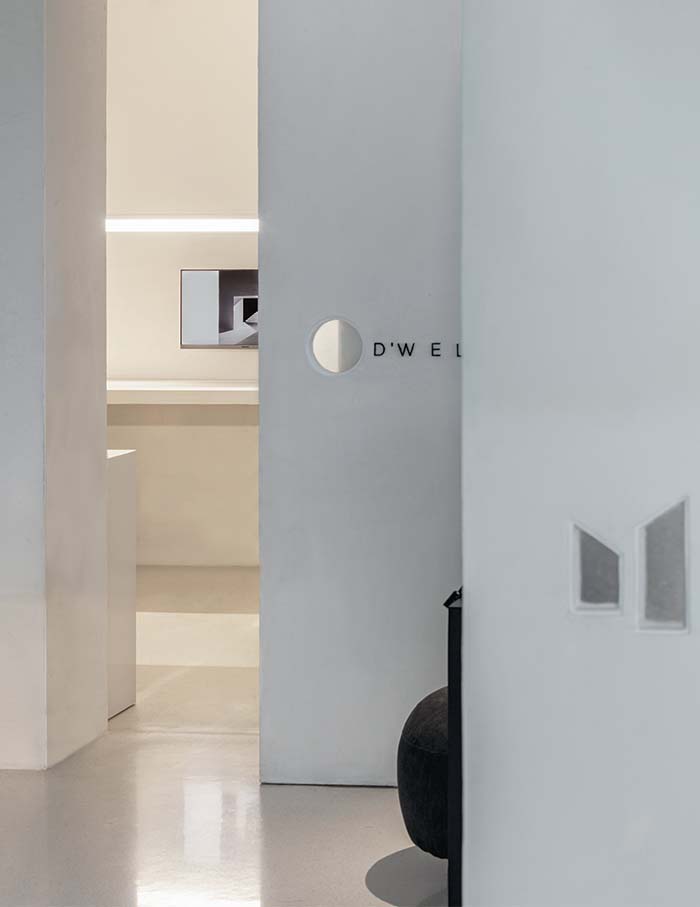
Taking the focussed fortress theme a notch higher, the studio eliminates the static door design to opt for sliding doors that camouflage into the surroundings. The concept of no doors creates a ‘lost room’ of sorts. “So when a visitor enters the reception area, they are a little lost and require a moment to figure out the entry to the cabins,” reveals Jhanvi.
The instant disorientation engages the user, making them more aware of the structure, the space and the present.
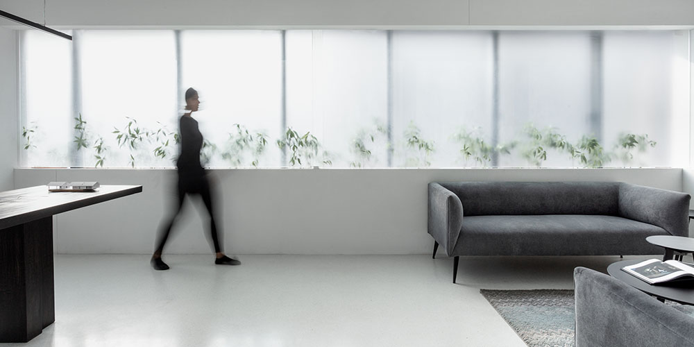
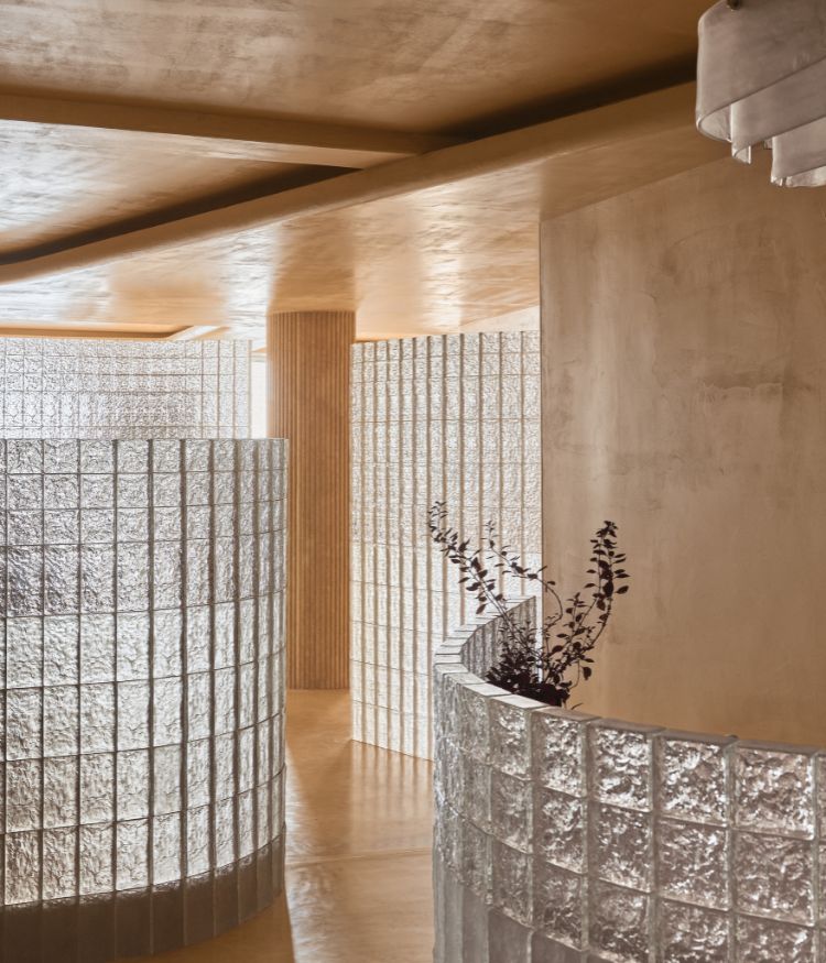
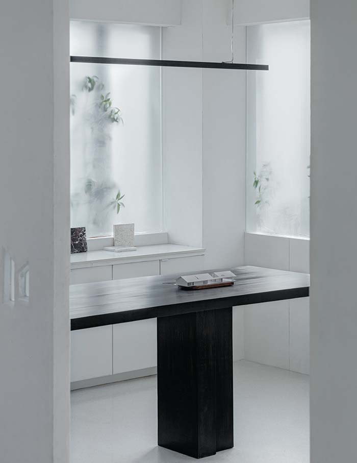
The reception further reveals the two focal areas of the studio otherwise known as the main office cabin and the staff cabin followed by the pantry. The main cabin, on the left, harbours all client meetings and group discussions. To diffuse the harsh West side sun, the cabin introduces a translucent glass wall curtain enabling optimum lighting conditions for comfortable working.
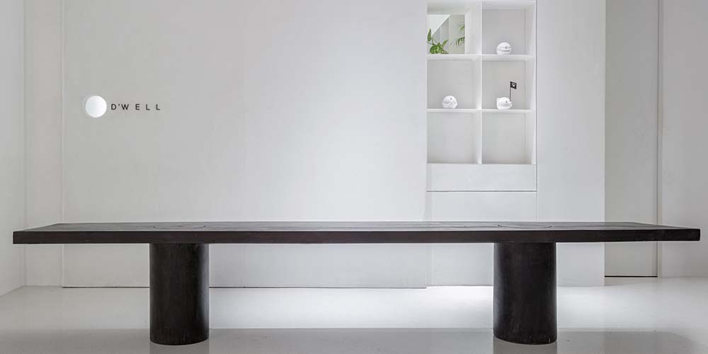
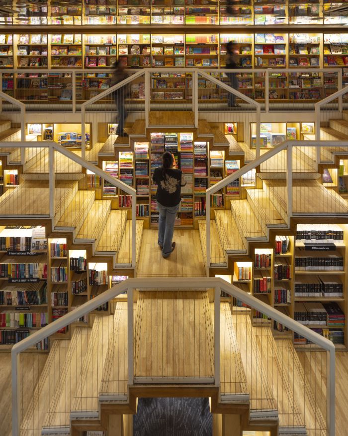
On the other hand, the staff cabin borrows natural light from the entrance foyer via the book rack. The space takes the office’s no-clutter policy to heart by tucking away all excess storage to produce a clean room that replicates a blank drawing sheet eager for the next project. The space houses two movable stone tables meant to be clubbed together for occasional model-making sessions.
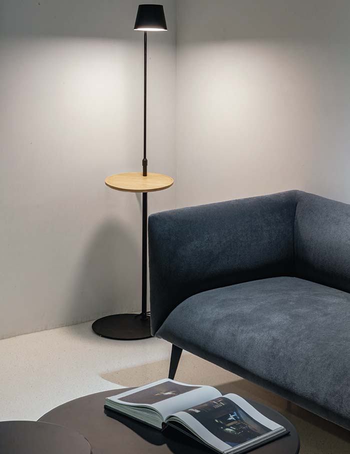
Echoing a monochromatic mood, the studio employs impeccable white walls enhanced by black-stained wood furniture and greys hued furnishings. The lime based wall plaster and the cast in situ micro terrazzo flooring are conscious preferences.
The overall spatial arrangement of the office promptly conveys D’WELLs clear and meticulous hold on contextual planning and organising of any space, instilling work-friendliness, feeling of community as well as a sense of disconnect that lingers for a moment more than you’d imagine.
You may also like: Expressing vibrant energy is this Mumbai office by Saniya Kantawala Designs that reimagines work from office
