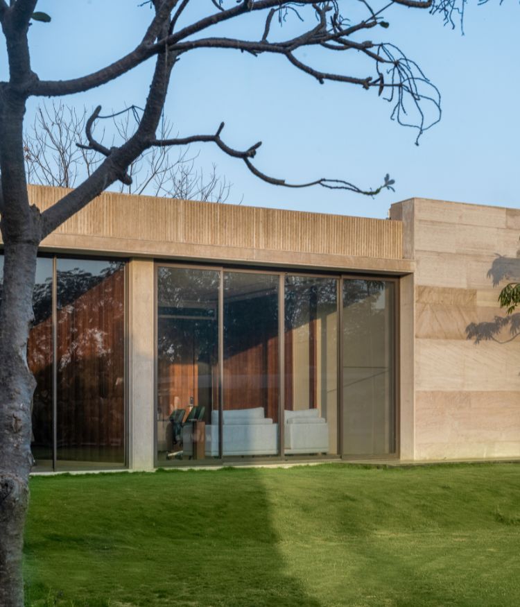
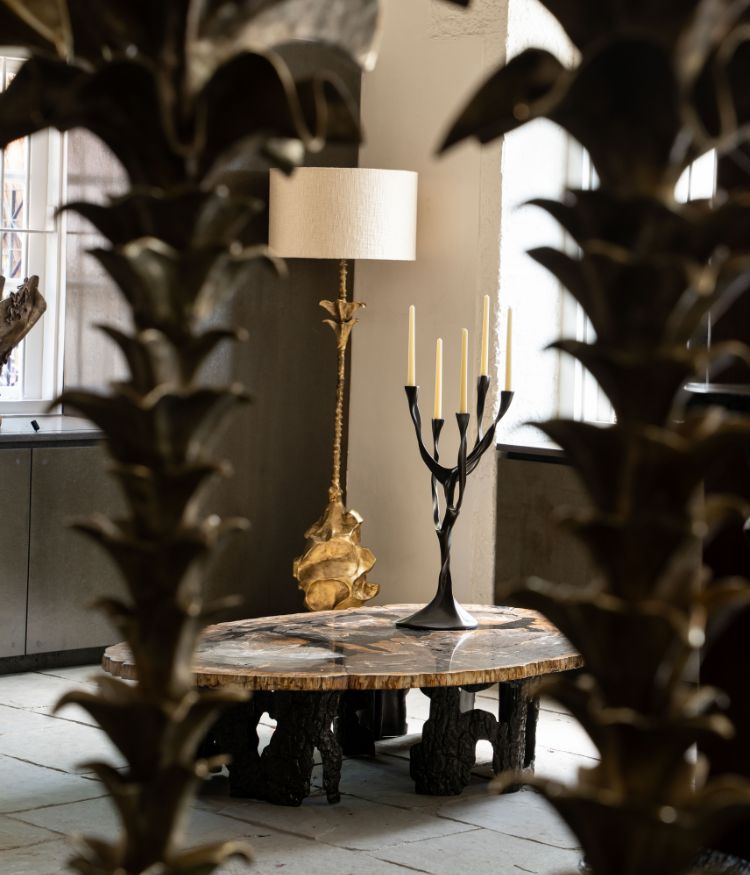
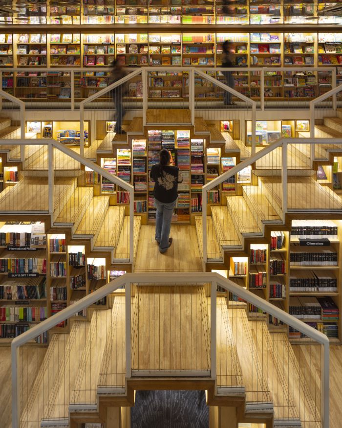
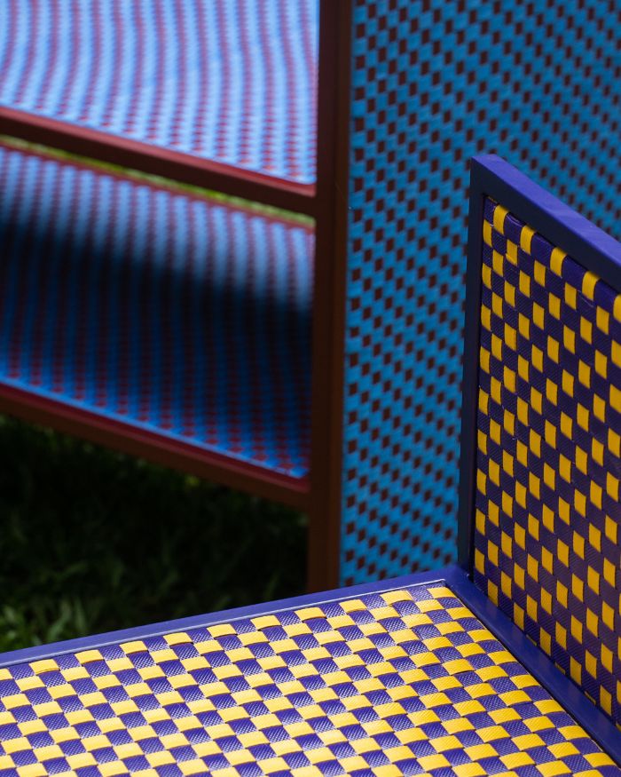
Honestly, we’ve loved #WFH and why wouldn’t we? Our “office” has been mere steps away from our bedrooms and having lunch that’s freshly prepared is one of our favourite things to do. But now that we’ve come across these workspaces, we’re really wishing these WFH days would end and we could work out of these smart offices!
Office by P&D Associates
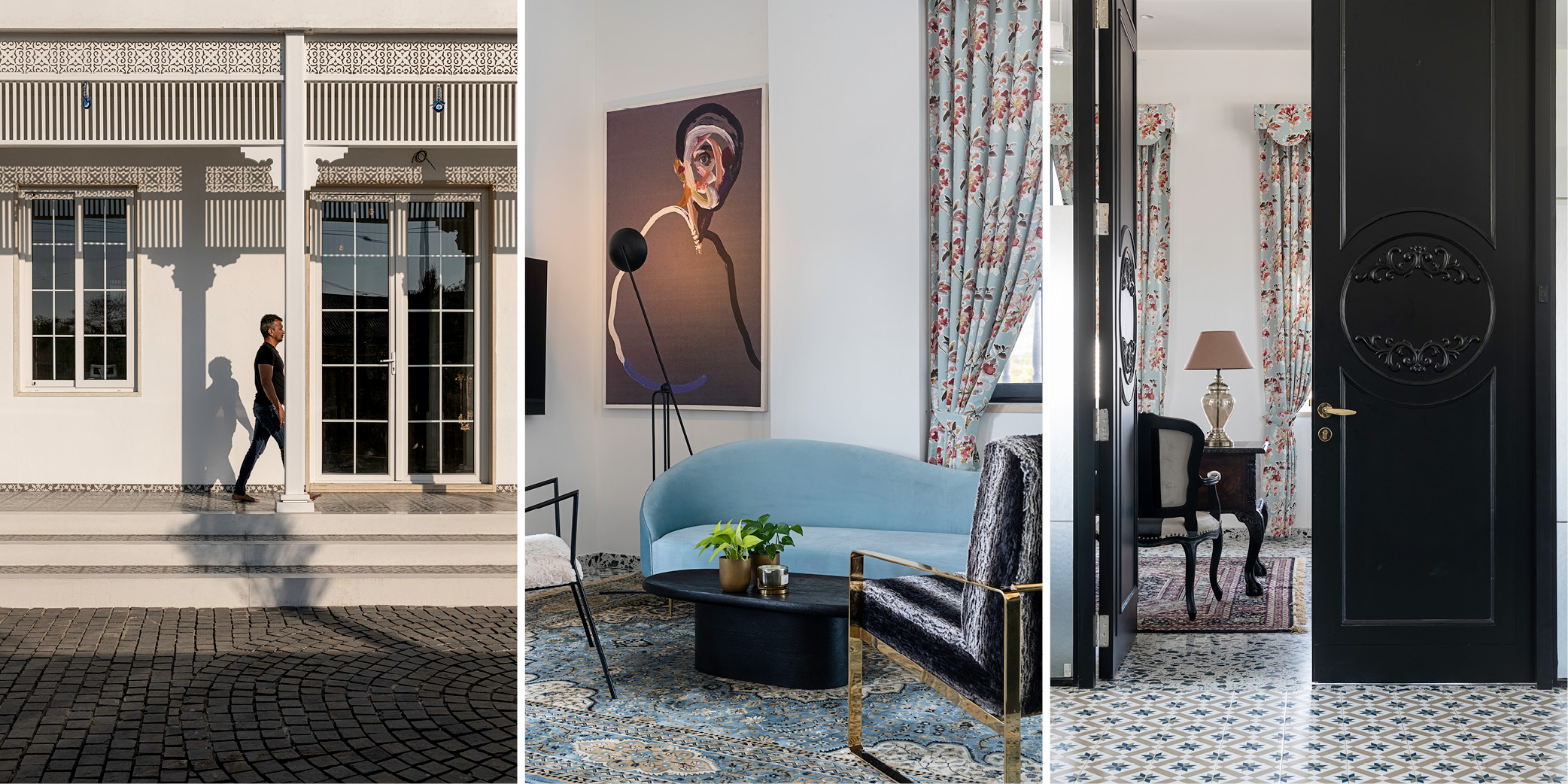
Devang Patel and Pratik Siddhpura combine trendy interiors, flooring and open spaces for this office (see scroll above). The minimalist space is dramatically enhanced with the innovative use of patterns, artworks and (surprisingly) the colour black. Our favourites include the the reception desk, where a large Henri Matisse cutout painting is placed as well as the central passage for its use of Bharat Flooring tiles.
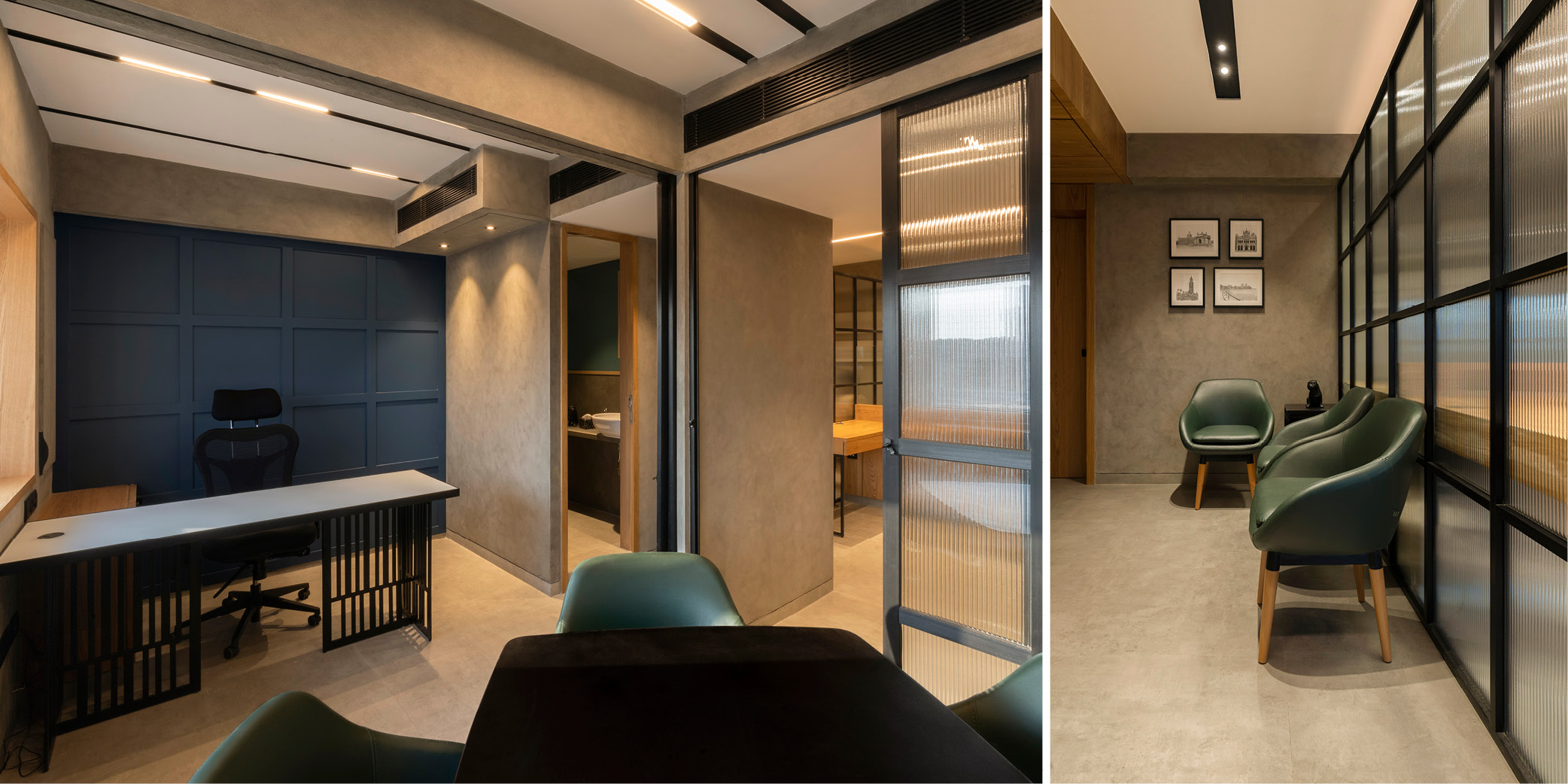
Dalamal Tower by Kumpal & Associates
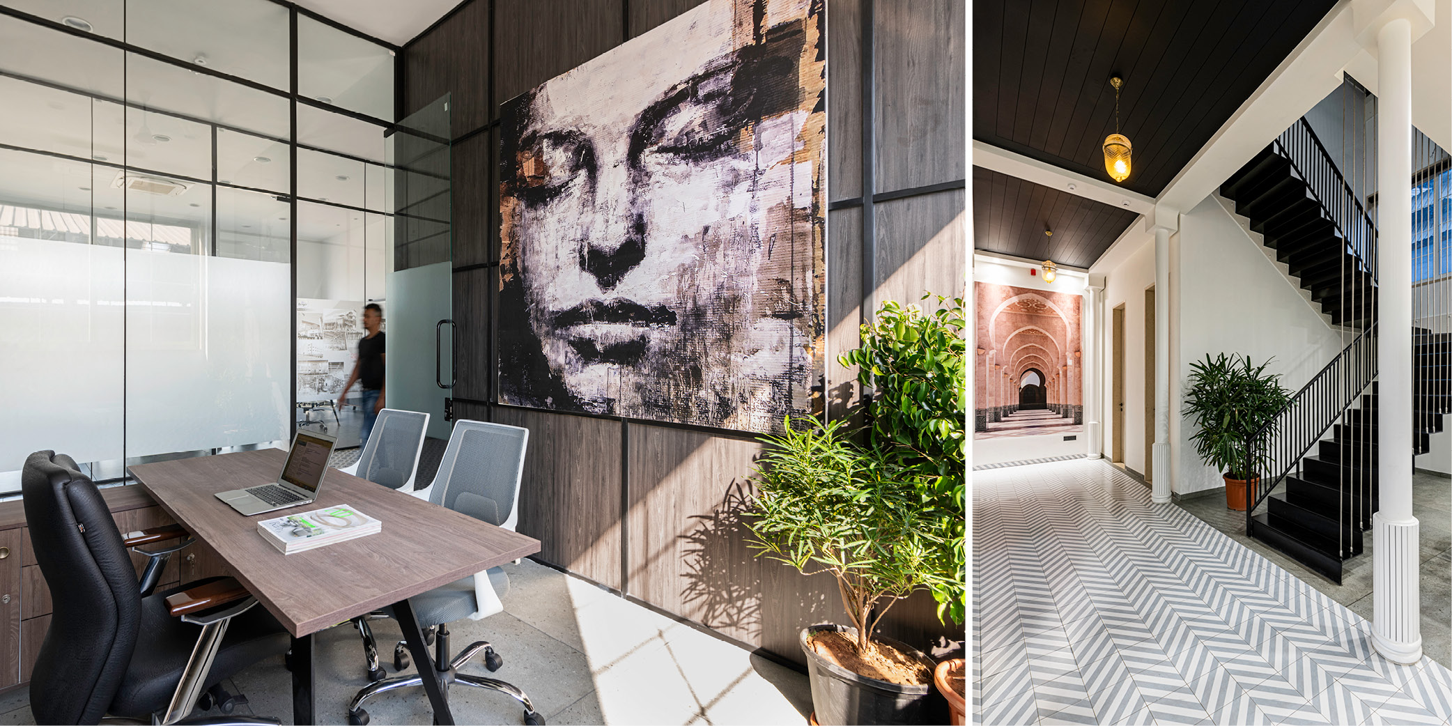
This whole office (see scroll above) seems to have a concrete appearance, thanks to the use of a softer shade of veneer and splashes of colour. Kumpal Mittal has emphasised straight lines and grids that are carried over chamfered glass, which are offset by a black metal accent.
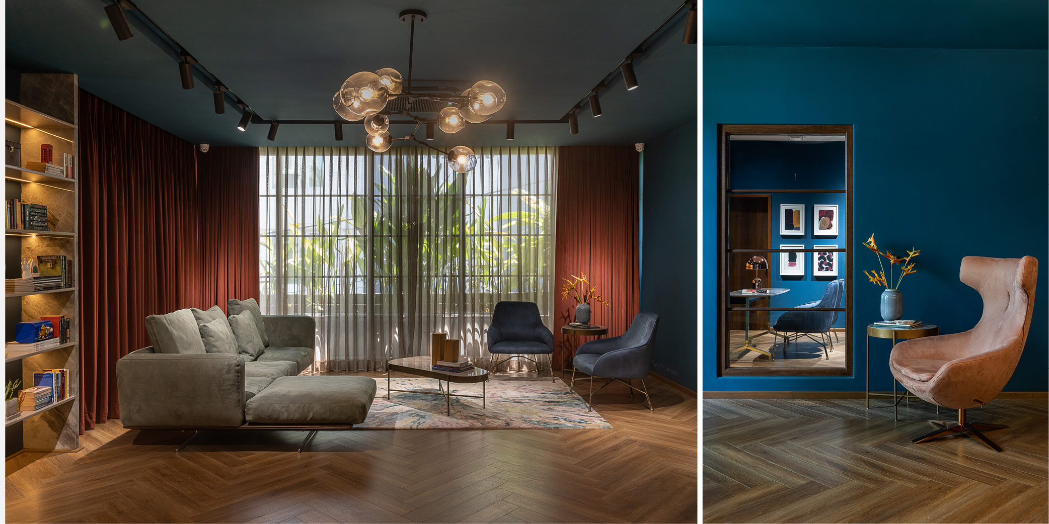
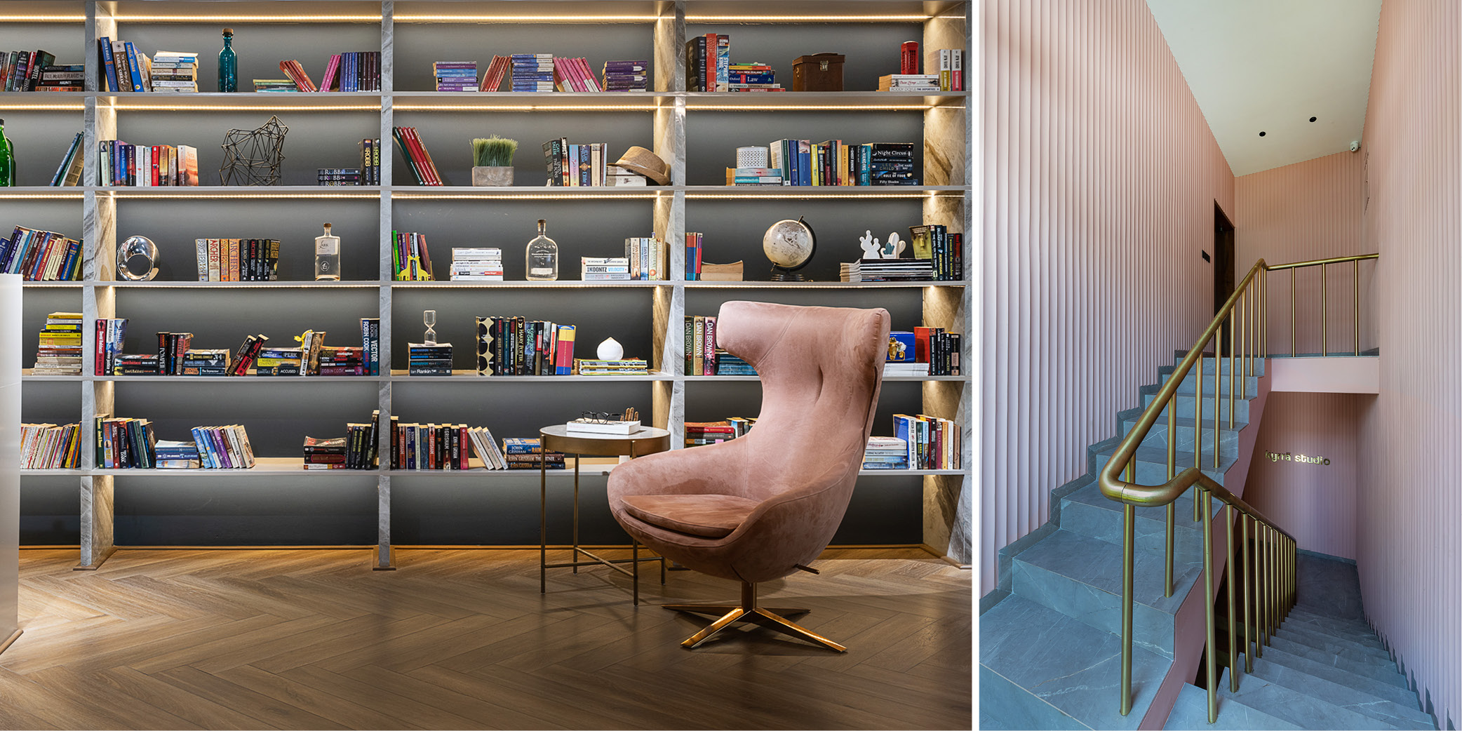
The office belonging to and designed by Kyrra Studio
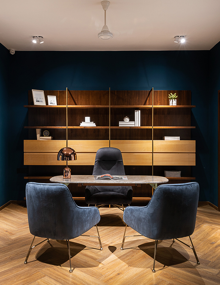
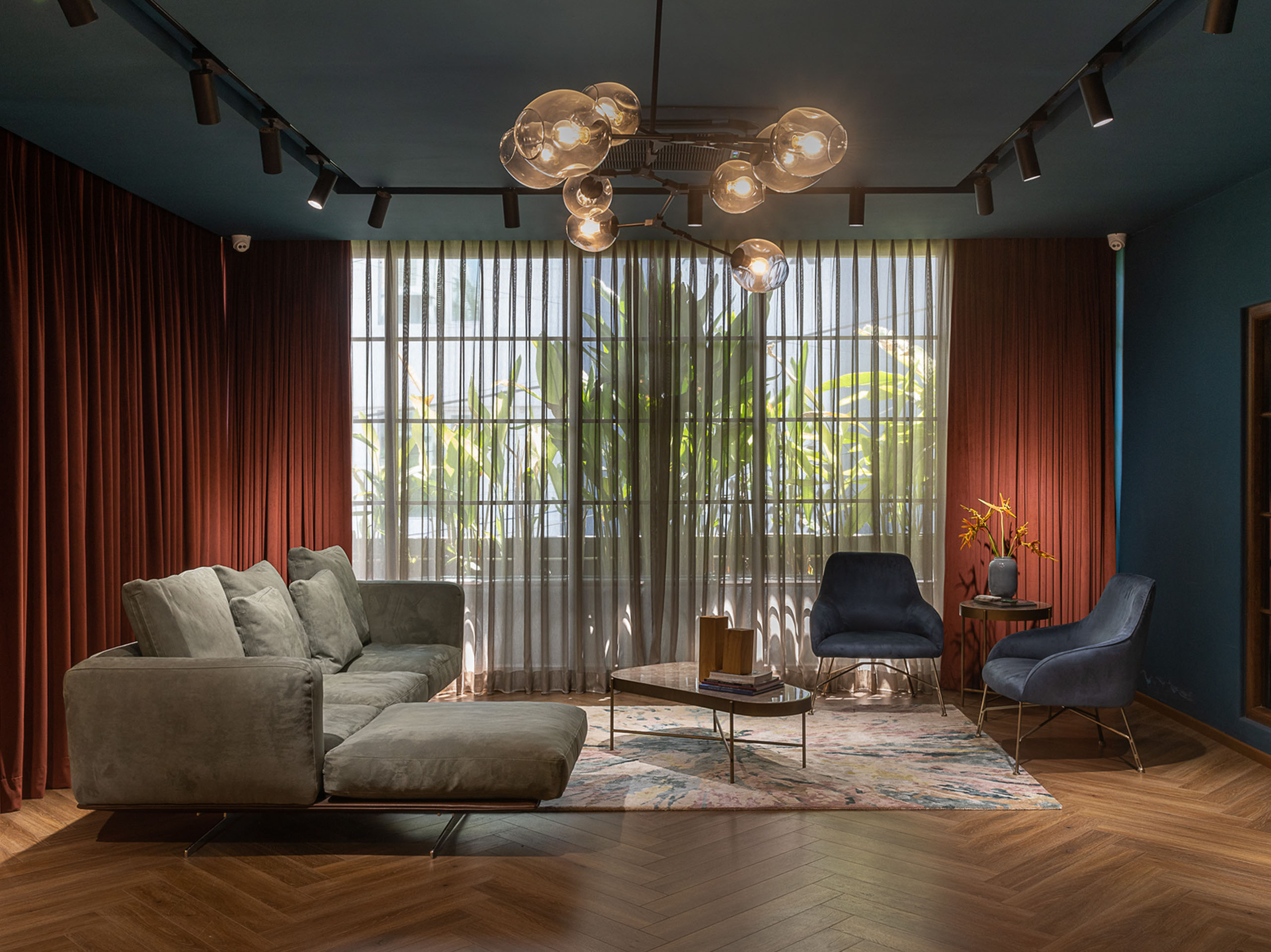
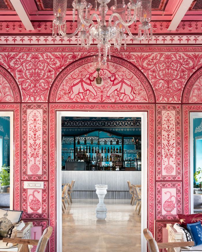
Coral fluted walls and brass railings set the stage for this extravagant gallery-style office by and for Shivani Sanghani’s practice. A sense of drama with a bold colour palette unfolds in this workplace, which is split into three sections—a wide lobby, staff workroom and Sanghani’s work zone. We love the use of midnight blue on the walls that contrasts with white ceilings and wood-meets-brass accents.
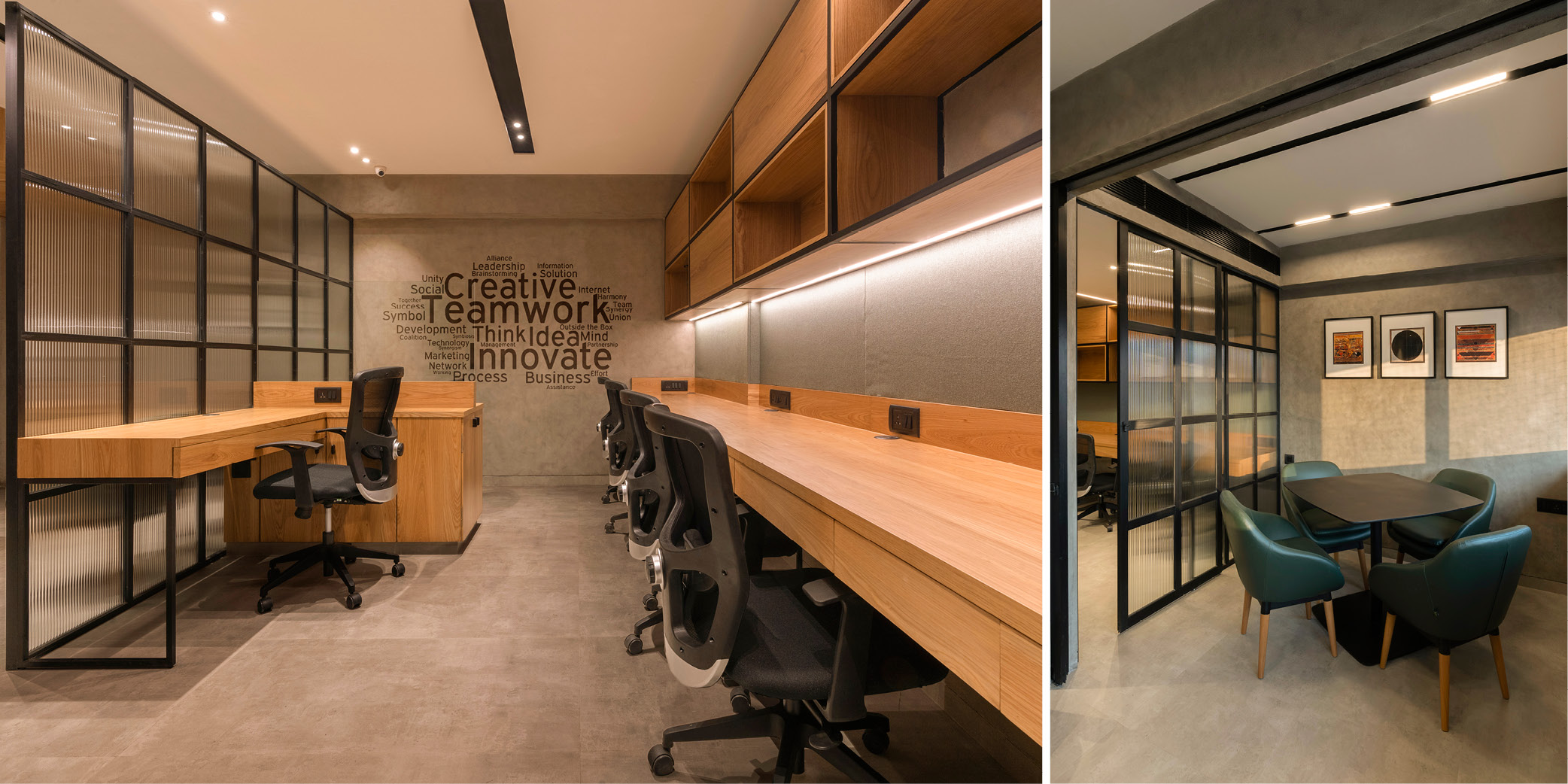
RLK office by Projects 3.14
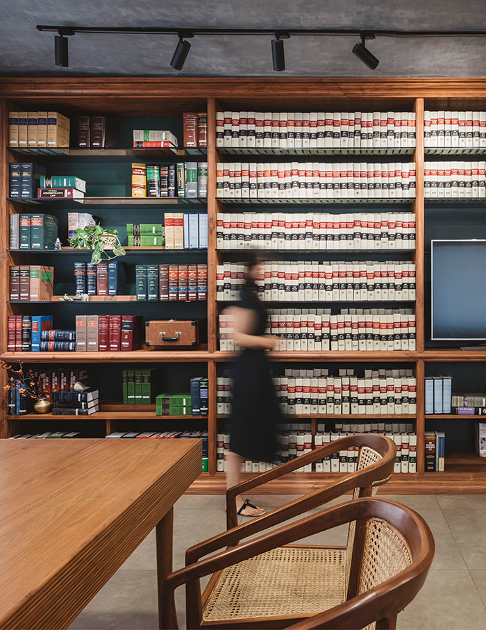
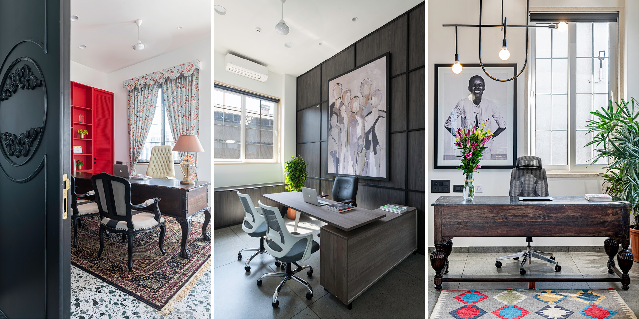
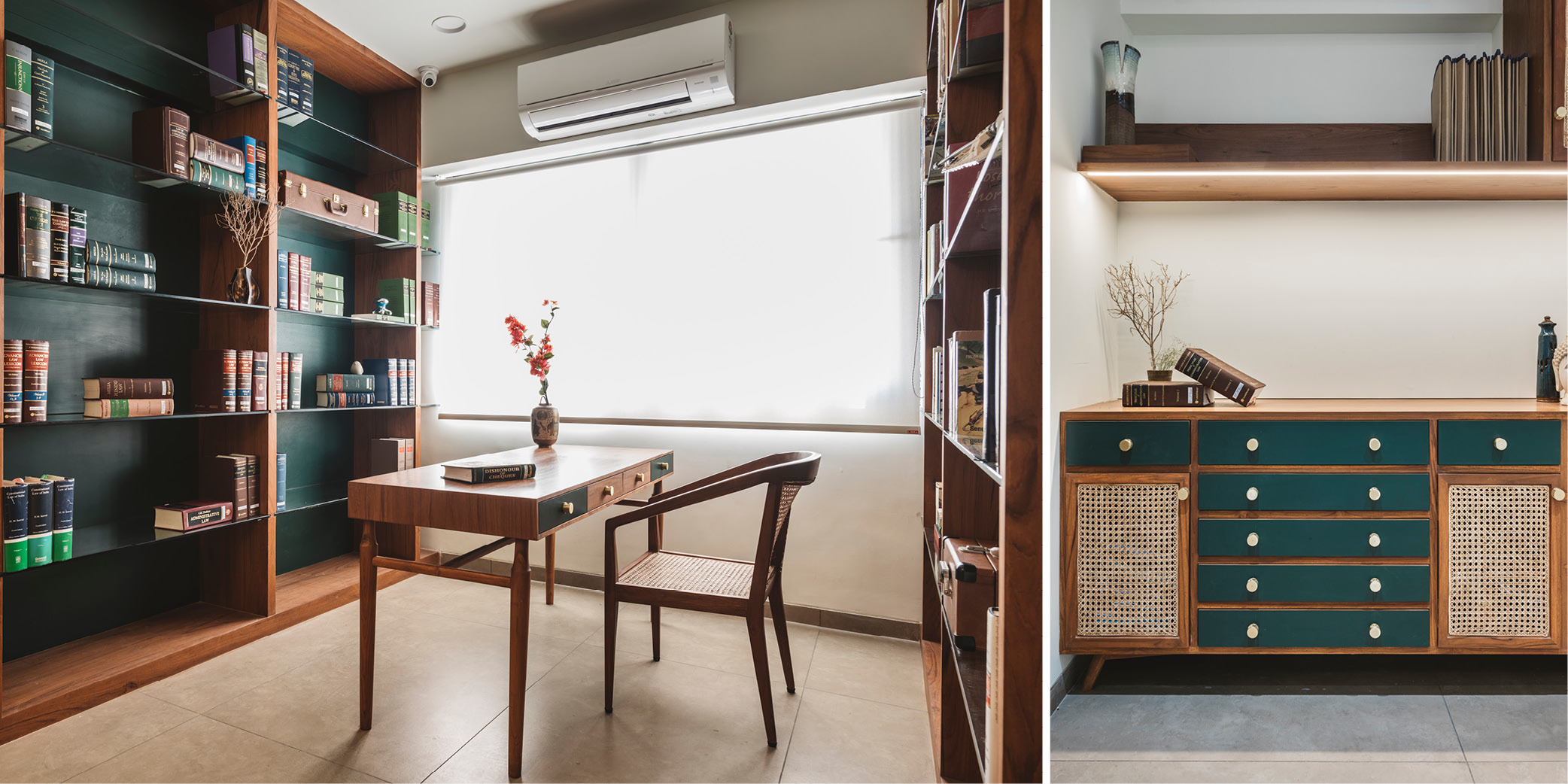
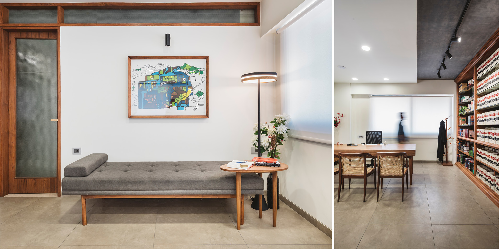
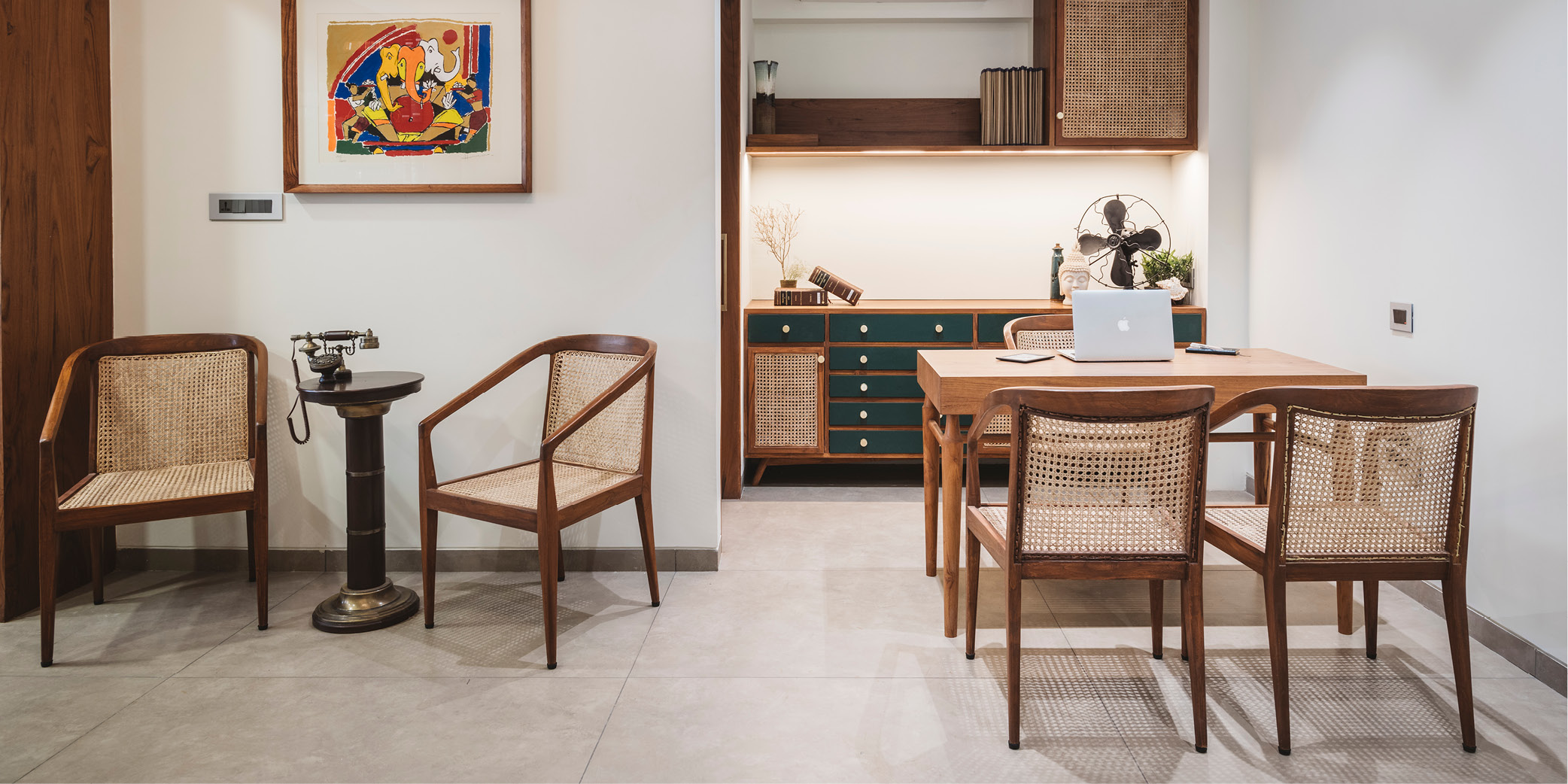
This 900 sq ft, Ahmedabad office by Noopur Shah and Chinmay Patel features a main chamber and common room that’s segregated by a vast library unit (it can hold over 800 books and journals!). The designers have played with wood and veneer to create a “House of Commons” using green in the staff storage and a “House of Lords” in crimson. The best part is that the duo have custom-made furniture pieces by merging periods and styles of architecture.
Placid Hues by UA Lab
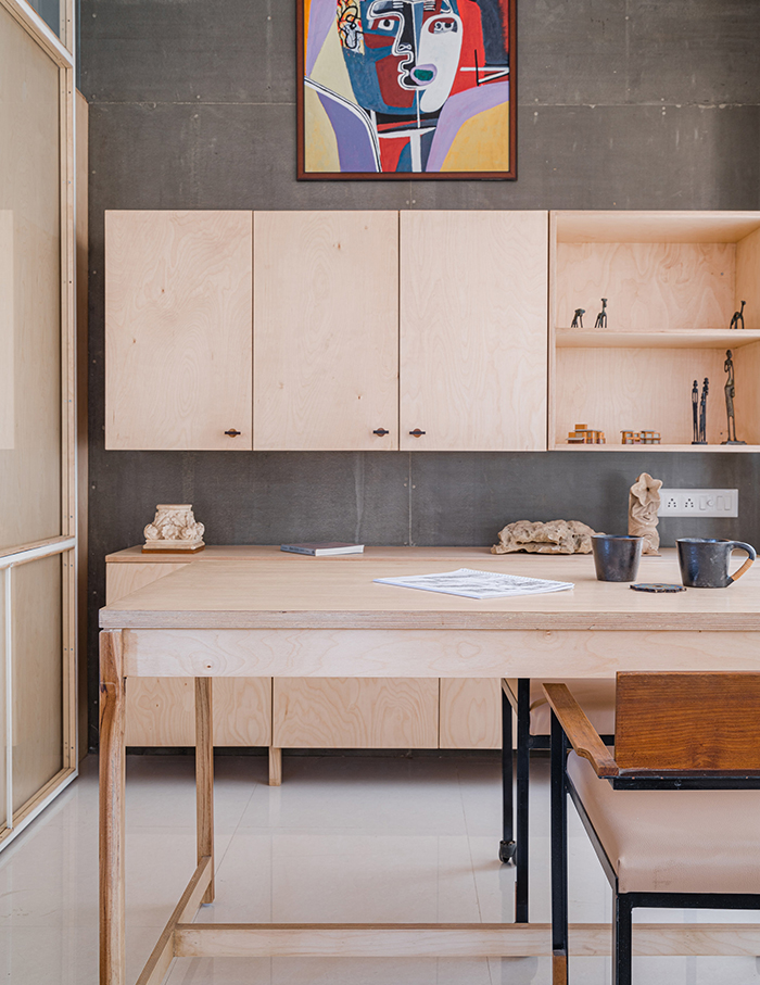
Calm, fresh and invigorating best describe this Ahmedabad workspace for Placid Hues. Designed by Vipuja Parmar and Krushnakant Parmar, this singular space takes on a monolithic appearance, which receives ample natural light. The use of geometry and symmetry across this light-hued office adds another soothing element that’s a sight for sore eyes.
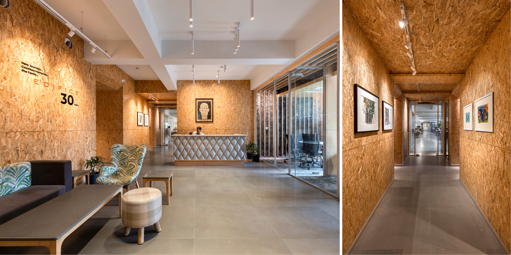
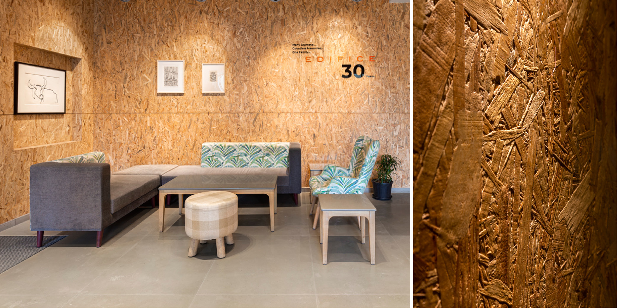
The office belonging to and designed by Edifice Consultants
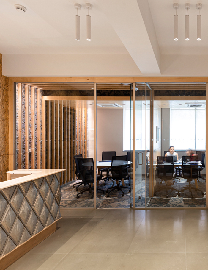
For their Mumbai office, Ravi Sarangan and Sanjay Srinivasan wished for a space that would serve as a creative studio. So, the duo, along with their team, divided this open-plan into three functional zones—public, cafeteria and IT facilities. The resulting design is almost entirely void of colour, which is neutral but vivid owing to the use of unconventional materials. The element we like most is that the creative practice has employed a zero-waste flooring with grey Kandla stone contrasting with terrazzo panels.

