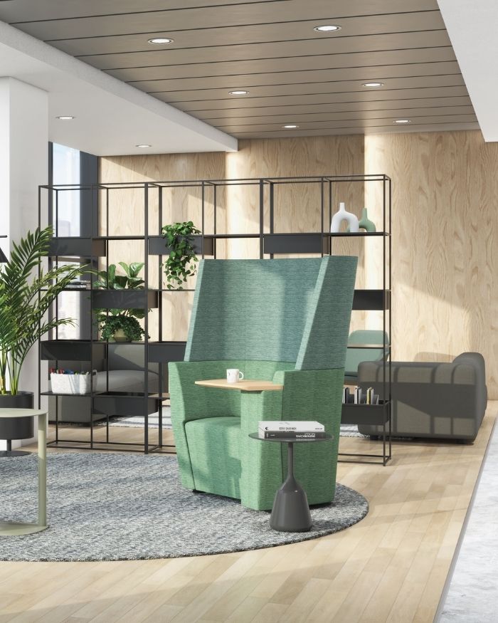
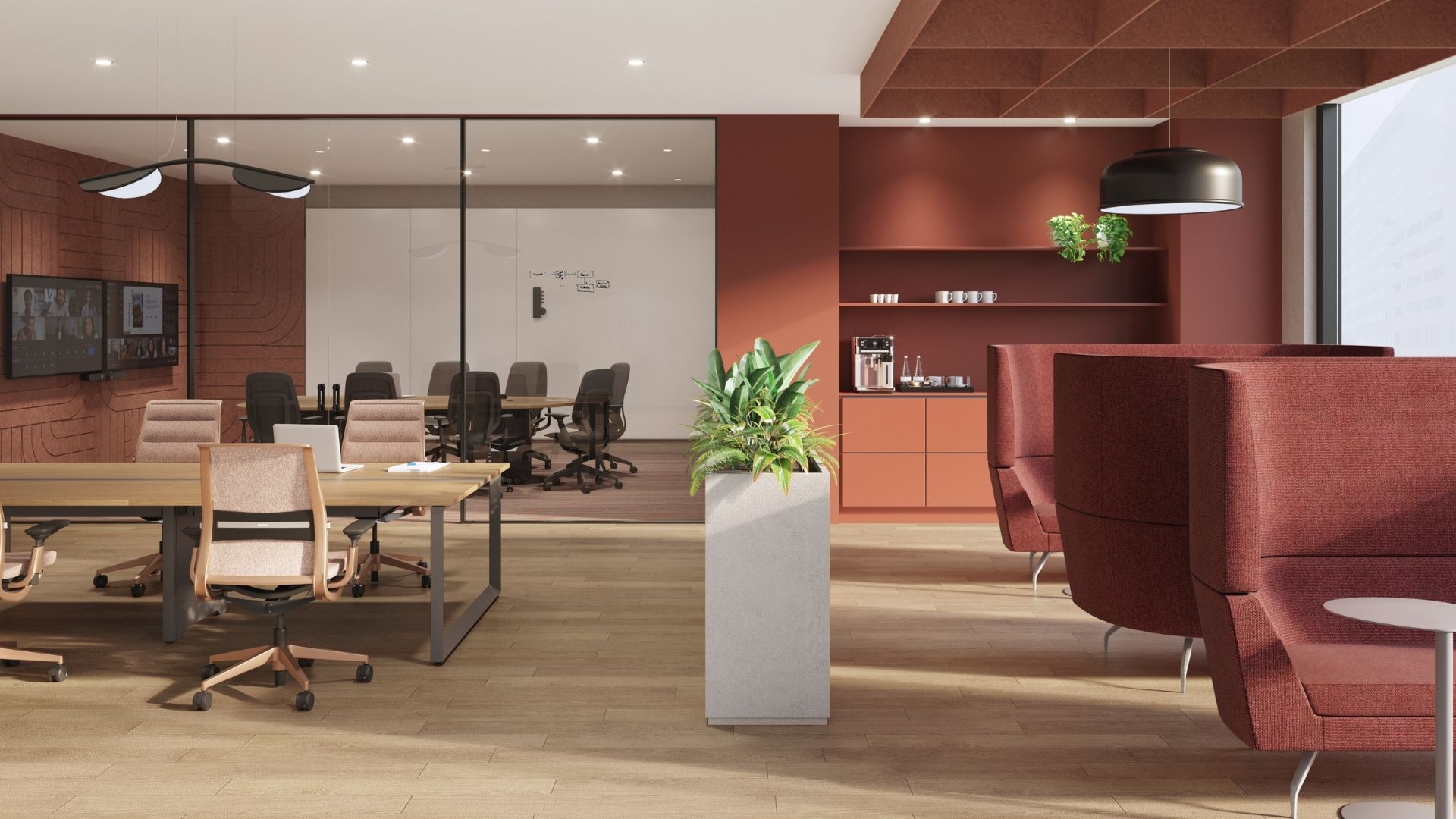
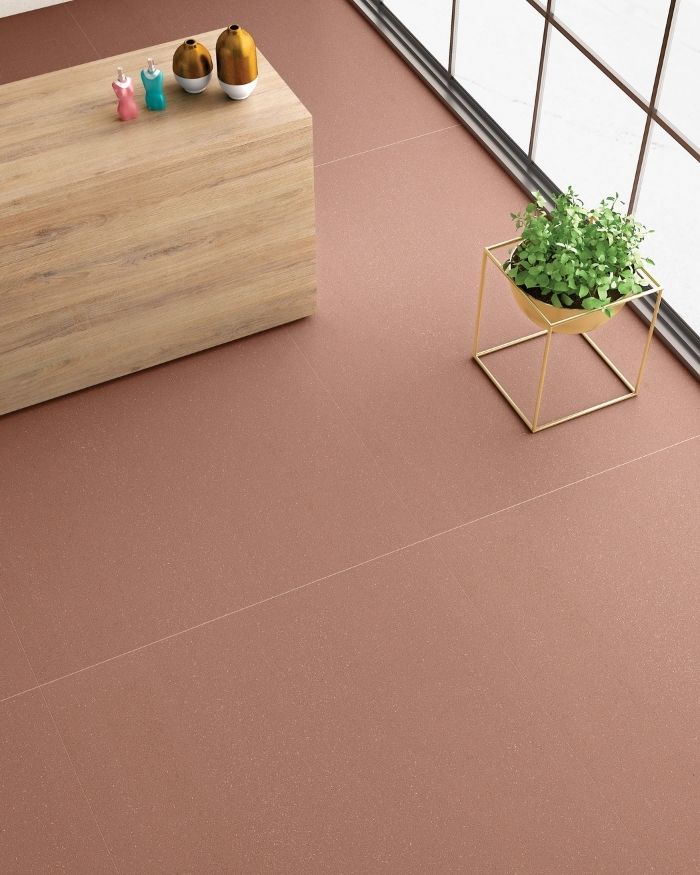
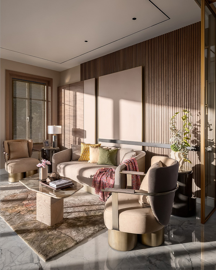
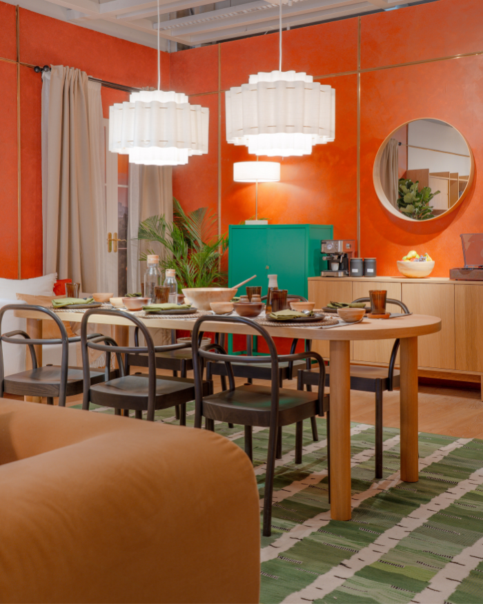
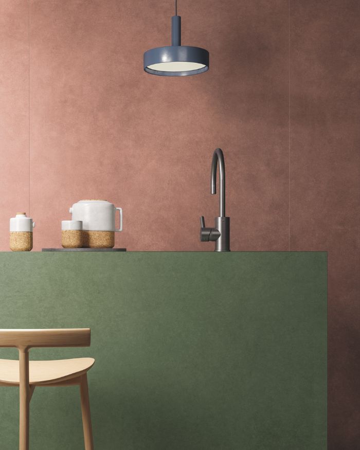
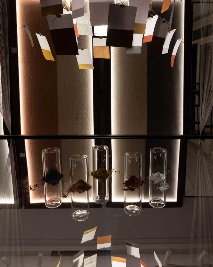
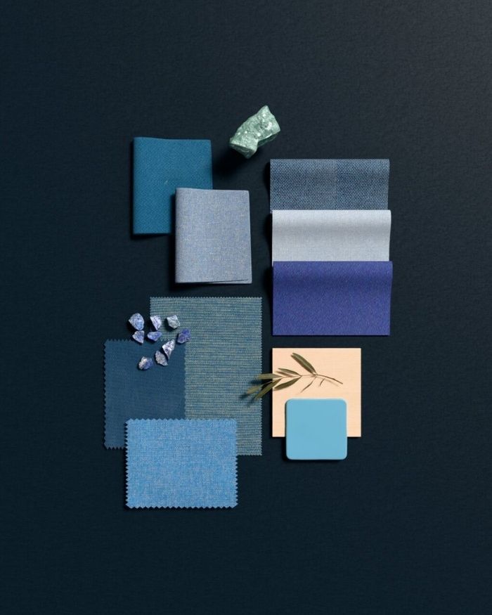
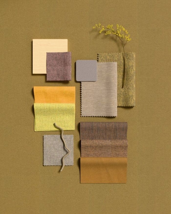
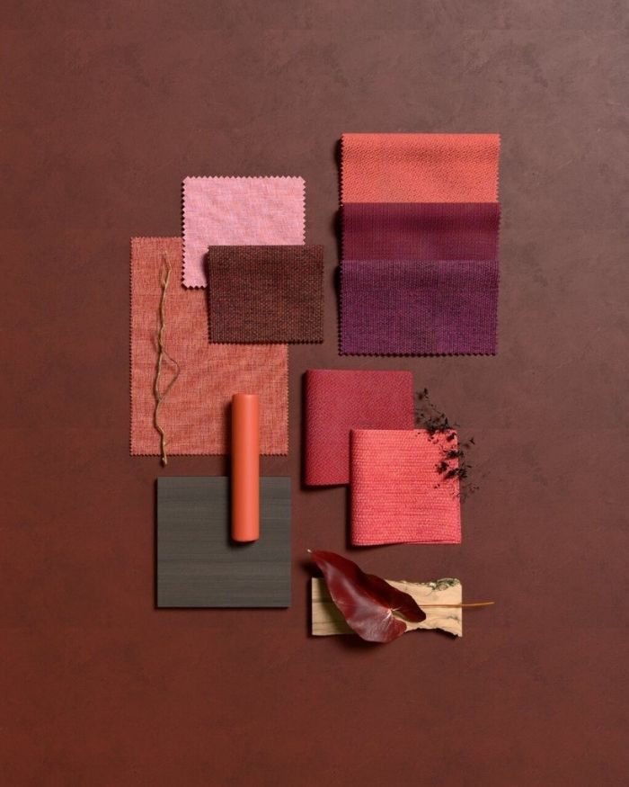
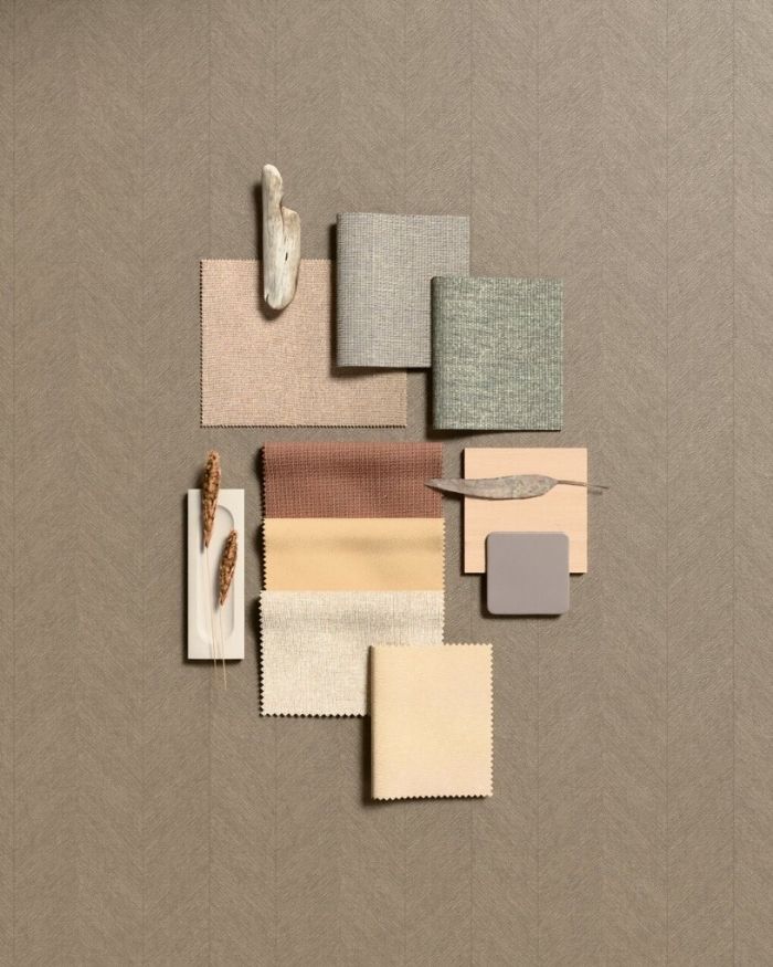
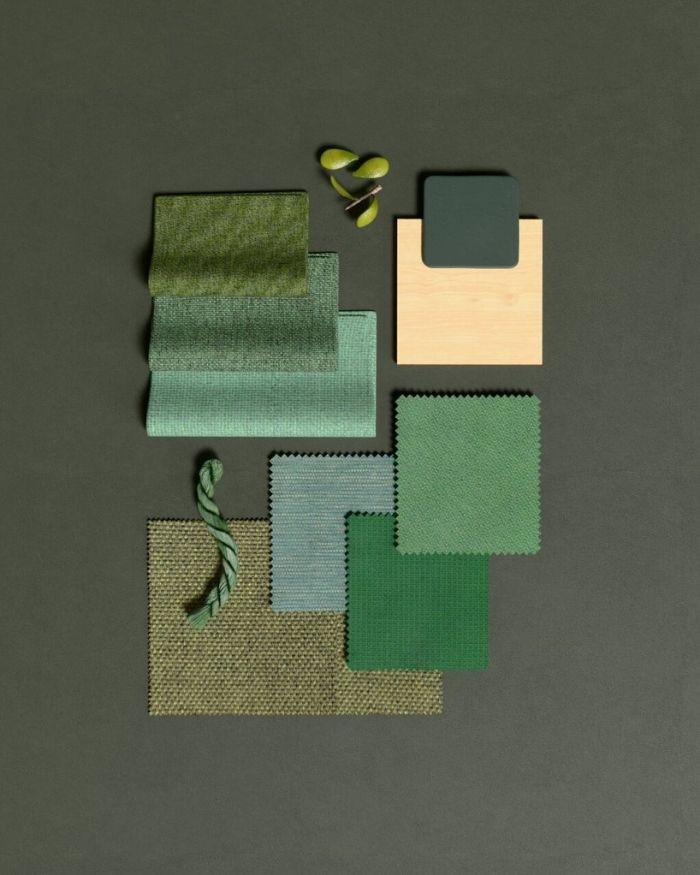
The Sandstone palette draws inspiration from India’s sun-washed architecture and natural stone landscapes. Composed of mineral whites, clay tones, and warm taupes, it creates calm, grounded spaces ideal for shared environments and everyday interaction. In contrast, Spice Market channels the sensory richness of traditional Indian bazaars through expressive hues designed to energise collaboration and spark creativity. For more focused settings, Royal Heritage explores profound blues and stabilising indigos inspired by India’s history of natural dyes, bringing a sense of confidence and visual calm to leadership spaces and meeting rooms. Meanwhile, Sacred Groove introduces earthy greens and botanical tones that ease mental fatigue and encourage moments of pause within fast-paced workdays. Festive Light, perhaps the most spirited palette of the collection, captures the optimism and illumination of Indian festivals through vivid accents balanced with grounded neutrals. Delivering a varied fabric selection across its diverse product range, Color Works, Palette to Product reflects a growing shift towards workplaces that value emotions as much as performance — where colour moves beyond decoration to become a deeply experiential element of design.
Visit www.steelcase.com to explore more