Japandi whispers and Wabi Sabi echoes in this 450 sq ft apartment cocooned in the bustling city of Bengaluru.
“Here, minimalism is not a void but a concoction of nuanced details. It’s a delicate dance, a harmonious interplay between subtlety and substance where each detail is a brushstroke painting value onto the canvas of space without overwhelming its essence,” explains Principal Architect Aishwarya Govind of House of Ruya.
The art of minimalism
In the genesis of the collaboration, the homeowners vision was a beacon—a home, not just a space, but an ode to the eloquent fusion of Japandi and Wabi Sabi. The hushed tones of minimalism resounded in their hearts and minds, not as an aesthetic preference but as a guiding principle for their oasis.
A canvas of monotones was born into visual poetry where every shade and every hue spoke in unison, crafting a serene melody that resonated through the hallowed halls of their inaugural haven.
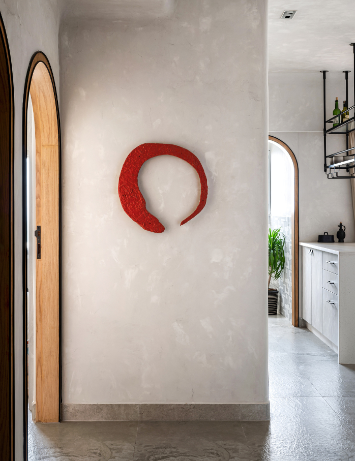
Explore every corner
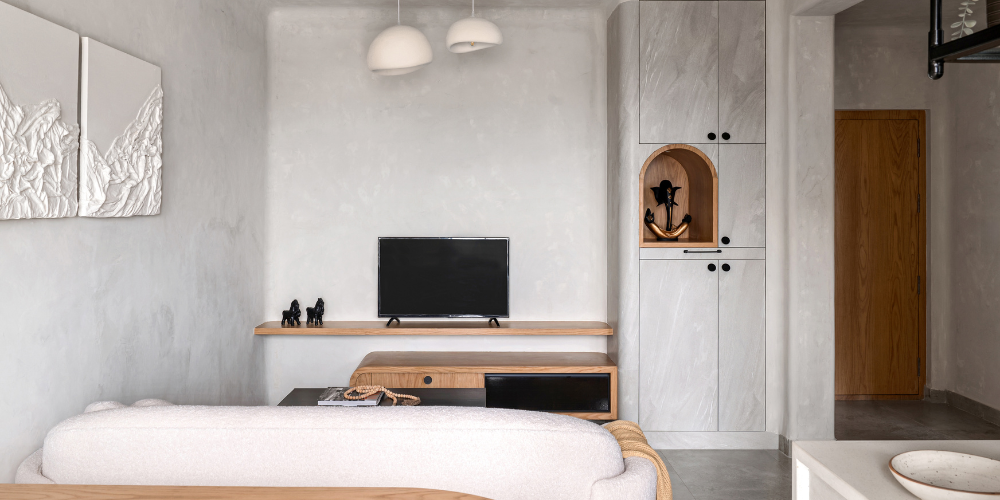
Step through the portal of the main door, and you find yourself in a petite foyer, graced by a bespoke masterpiece—a Japanese symbol embracing destiny with artistic embrace.
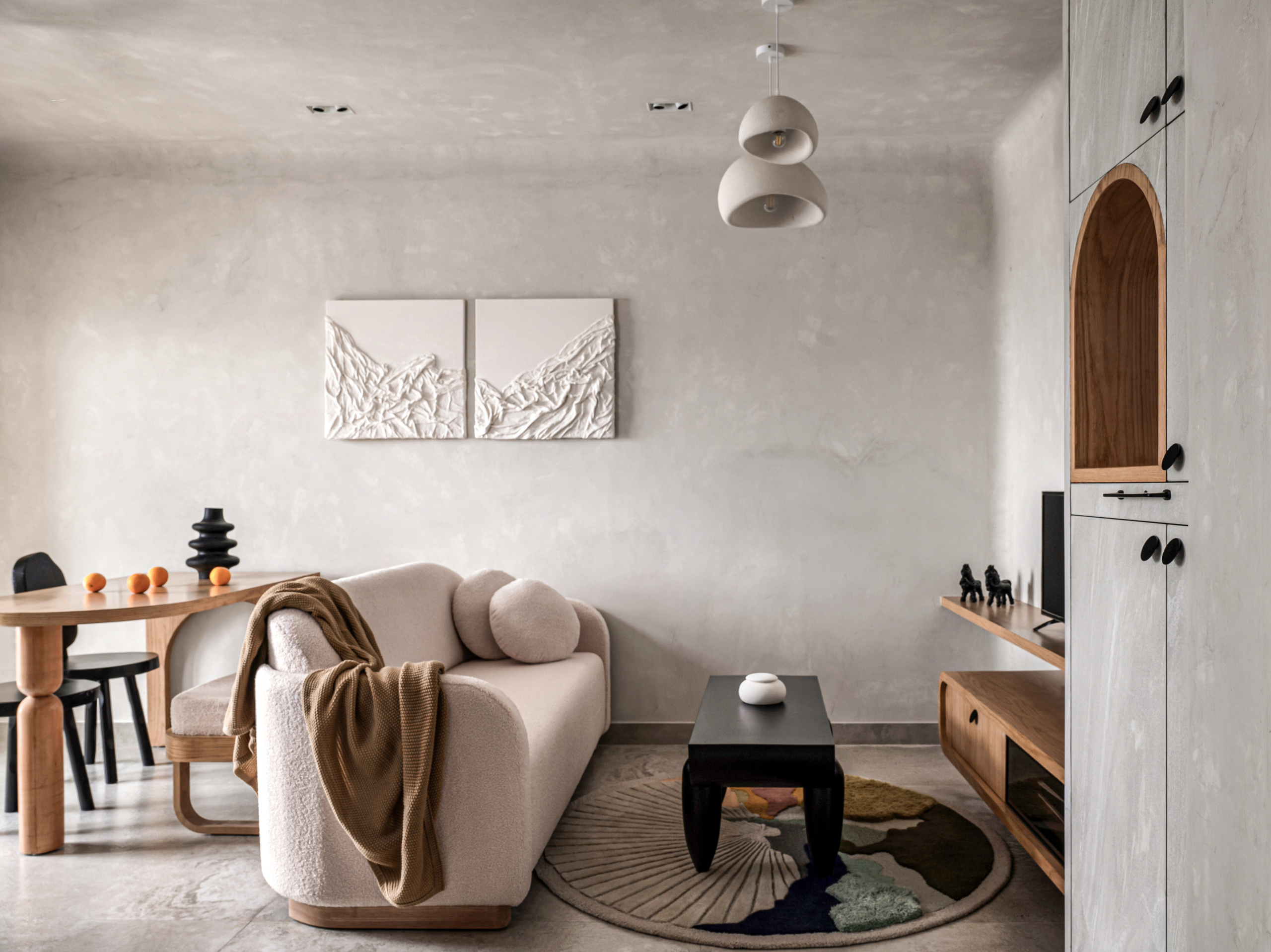
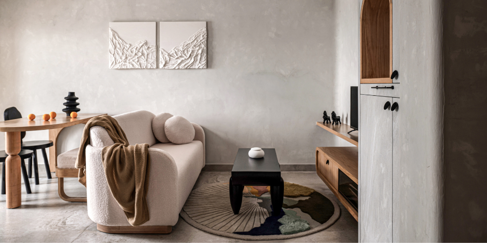
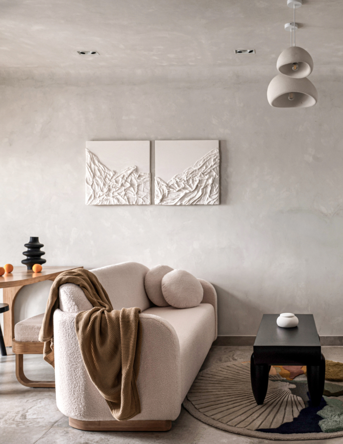
As you pivot rightward, the threshold opens into the heartbeat of the home—the living area. Here, a custom-crafted boucle-clad sofa arcs with organic grace, a silent poet in the symphony of seamless design. Beneath, a rug unfurls a kaleidoscope of hues, a vibrant punctuation in the monotone poetry. The Lakkadhaara black centre table and the cloud pendant light echo the organic motif, each telling a tale of form and flow.
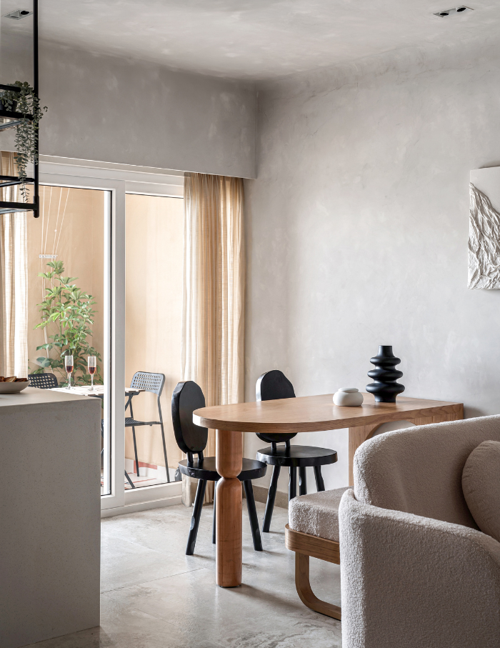
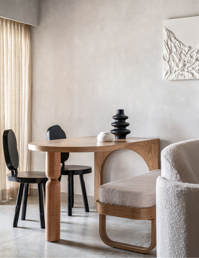
In the dance of spatial choreography, the living area gently yields to a compact dining expanse. The oak table and bench, born of bespoke craftsmanship converse fluently in the space’s language. The black chairs embrace wabi-sabi, finding beauty in imperfection while the bench, a versatile companion gracefully tucks itself beneath the table when intimacy reigns blossoming into additional seating when guests join the soirée.
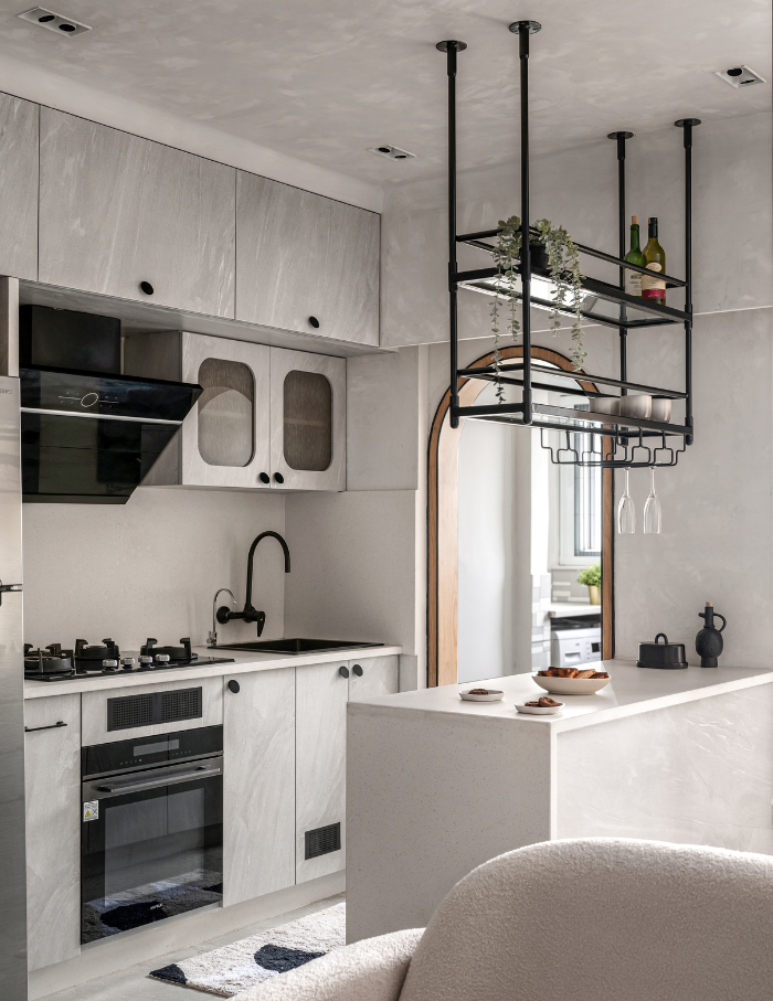
A culinary overture beckons with a breakfast counter—a minimalist marvel suspended in mid-air. The kitchen, a paragon of functionality mirrors the monotone hymn sung by the living space.
Venturing into the balcony, a burst of colour unfolds accompanied by sleek outdoor furniture offering repose amid nature’s embrace. Beyond the living enclave, two doors usher you into the sanctuary of slumber and ablution. Altered to an arching cadence, they soften the edges maintaining the fluid design lexicon.
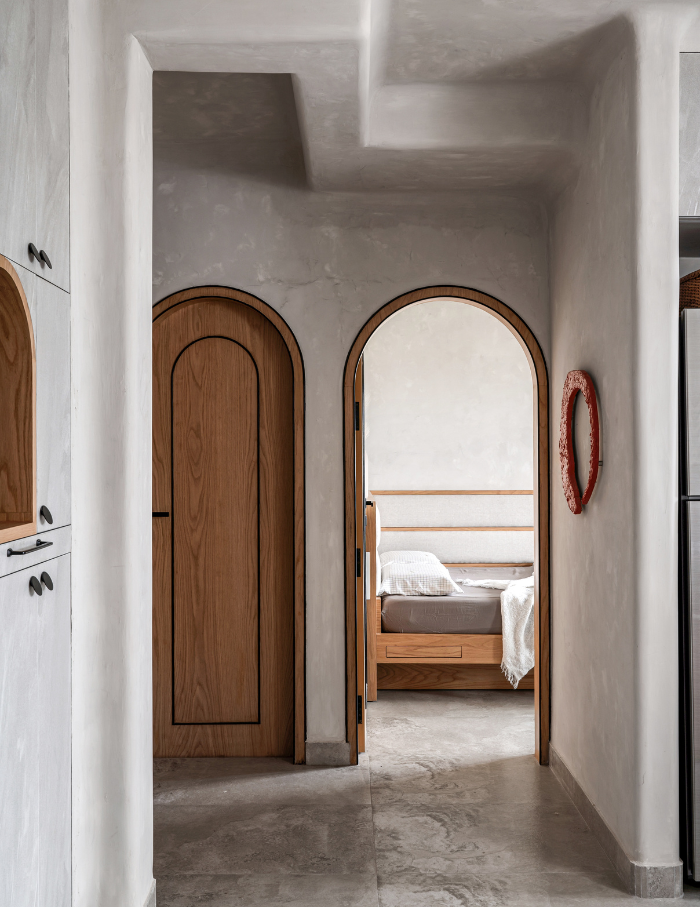
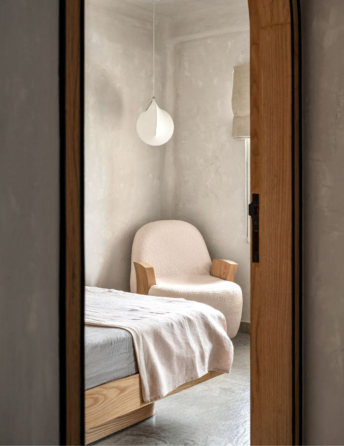
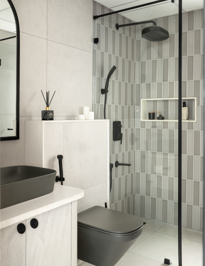
The singular bedroom is a space that exudes serenity; an organically shaped bespoke chair invites contemplation in a corner birthing a cosy reading nook. The lavatory, a pristine testament to functional elegance emerges with grey subway tiles—textures in glossy and matte, completing the home’s narrative with a clean design coda.
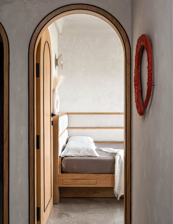
Every edge and corner, anointed with curvature contributes to the seamless visual symphony that defines this dwelling—a sanctuary where form and function pirouette in perfect harmony.
The delicate dance of minimalism
“Our palette was curated cohering coherence with the ethos of simplicity; we wielded a limited selection, orchestrating a visual sonnet that resonated throughout,” elaborates Aishwarya.
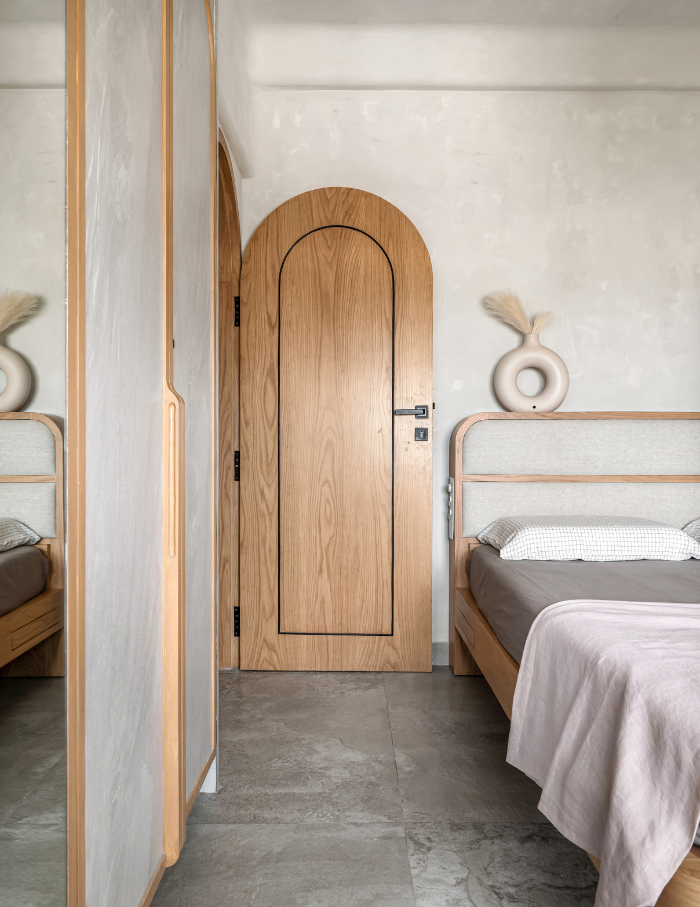
This home beckoned for a hue that was both light and tranquil. In the embrace of minimalism, dark shadows were forbidden for fear of cloistering the spatial breath. Thus, a warm grey kissed with a subtle whisper of beige unfurled its calming embrace.
Under the guiding hand of restraint, only three principal materials took centre stage, like virtuoso performers in a minimalist ballet. A concrete-textured laminate or tile, embodying the raw elegance of industrial charm, stood as a stalwart pillar.
What Aishwarya fell in love with
In the House of Ruya, where themes are transient, minimalism becomes a dynamic philosophy—a delicate equilibrium where every subtle detail breathes life without overwhelming its essence. Every element, from strategically suspended bar units to bed frames concealing hidden storage, played a role in this choreography of utility and grace.
In the intimate embrace of limited space, each corner becomes a treasure, making it arduous to crown a favourite. Yet, amidst this spatial ballet, “My heart finds solace in the mesmerising view of the suspended bar unit, a sculptural masterpiece commanding attention from the living quarters,” confides Aishwarya.
You may also like: Understated with undertones: A Kochi home draped in minimal-modern hints is designed by Greige Studio

