My learning curve in the last decade since establishing my studio boils down to one simple belief: Good clients make good projects.
I remember a few things distinctly from the first time I met the homeowners—their simplicity, warmth and willingness to explore a design approach that wasn’t dated. The expansive residence—at 3,800 sq ft across two storeys—designed about 12 years ago had different requirements now.
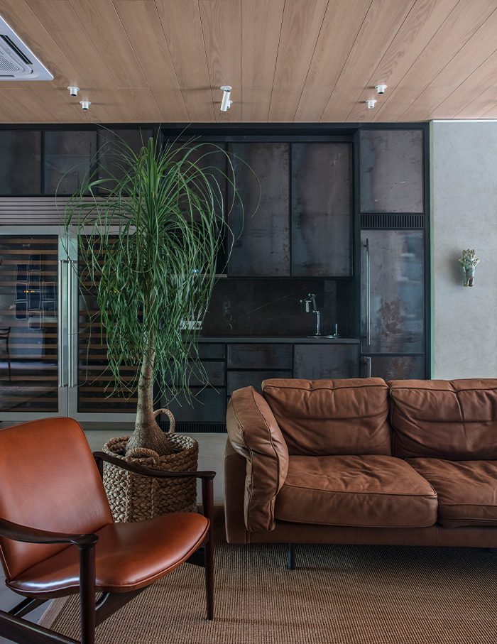
Since the daughters had moved out, I was briefed to redesign the upper level of the home. The greatest challenge was to tie the two levels into a single aesthetic, especially since I was only renovating the top floor, not the lower one housing the living area, kitchen, powder room and a guest bedroom.
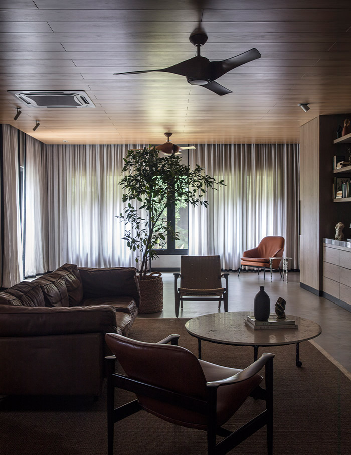
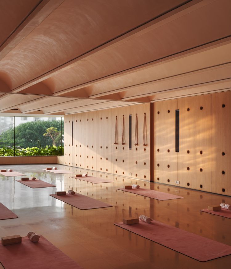
So, I realigned the upper storey to the homeowners’ current needs. This space housed three bedrooms—one for the couple and one for each daughter—and a den. In its earlier avatar, the den contained a gym, media room and a home office. I have repurposed it into a multipurpose zone, where the couple can carry out diverse activities such as entertain close family and friends, practise yoga and lounge about, in general.
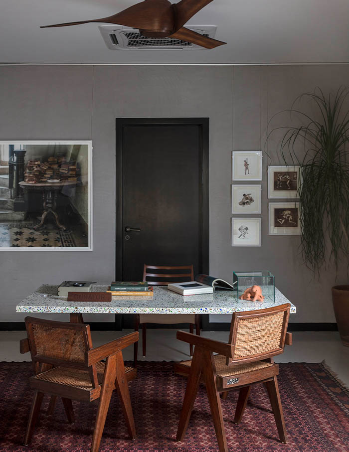
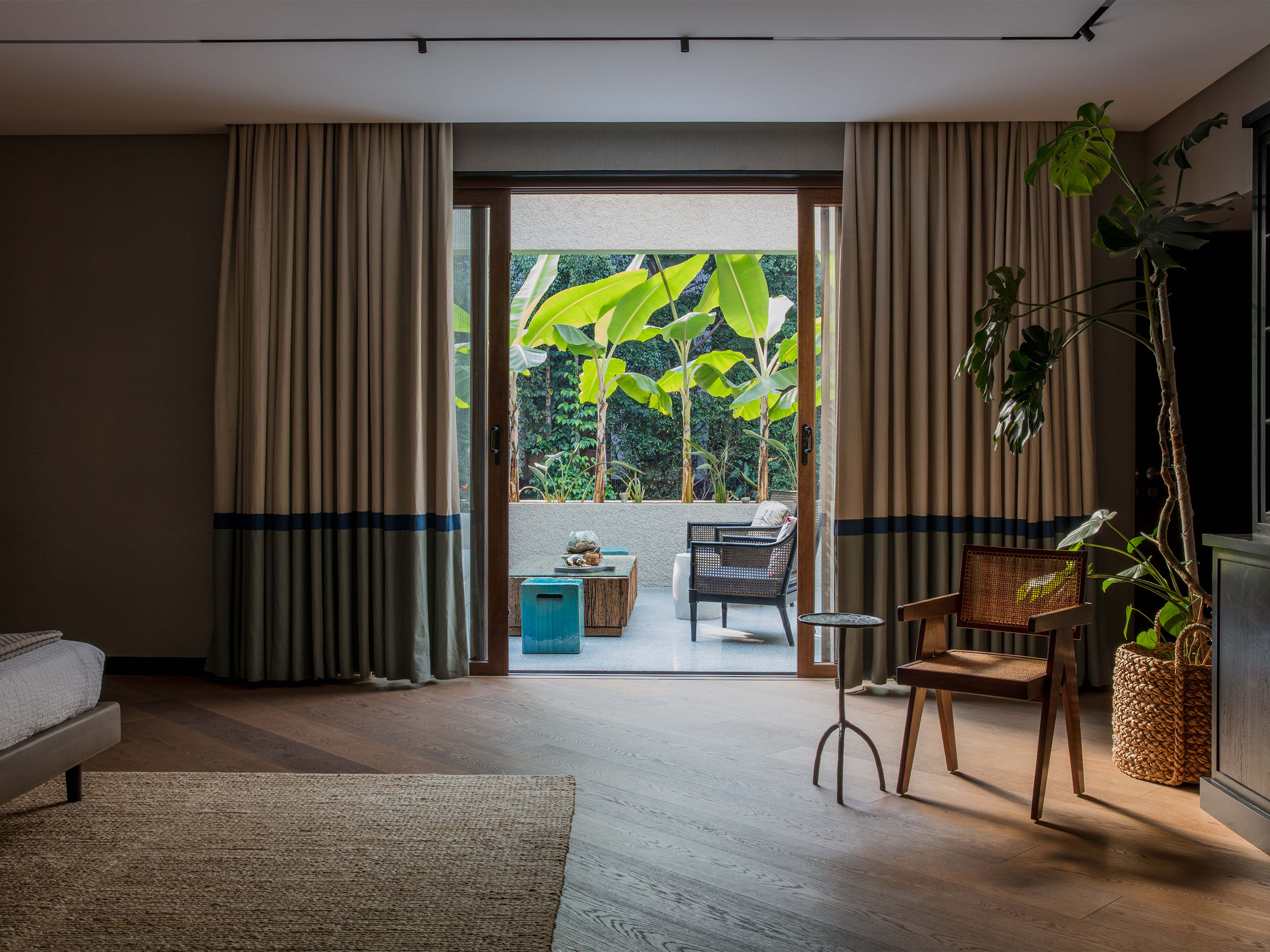
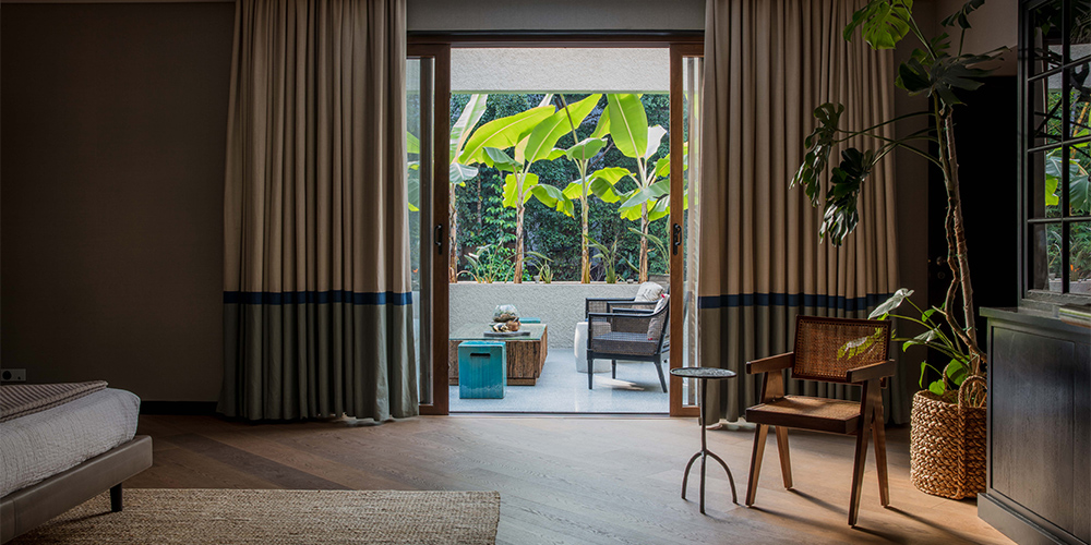
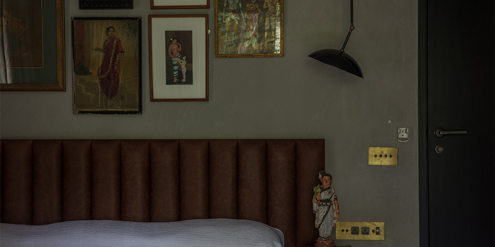
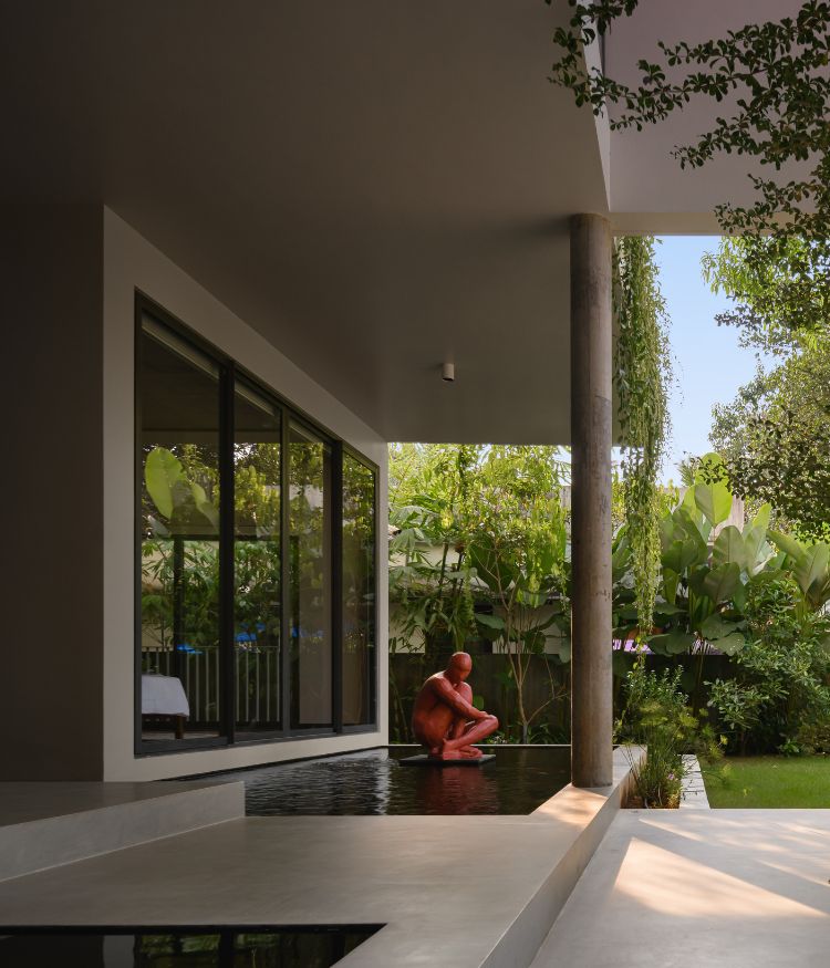
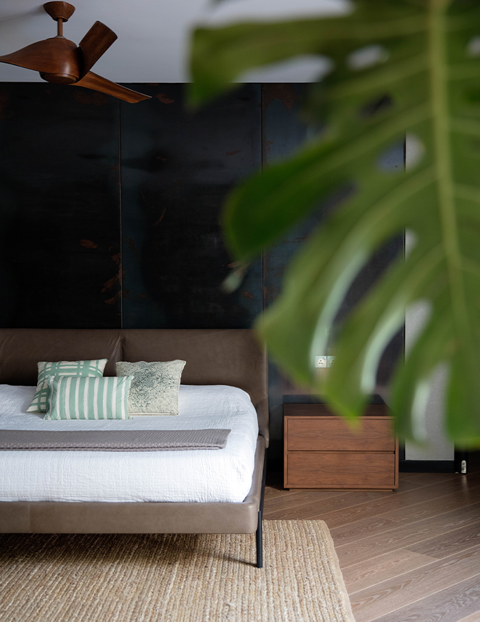
The master suite remains a sanctuary of tranquillity with just a bed and a cabinet holding photos and collectibles. Clad in linen wallpaper and adjoining the den, it opens into a private verandah that overlooks the verdant garden on the lower floor. One of the daughters’ boudoirs is converted into a study, while the other serves as a guest room.
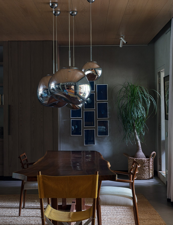
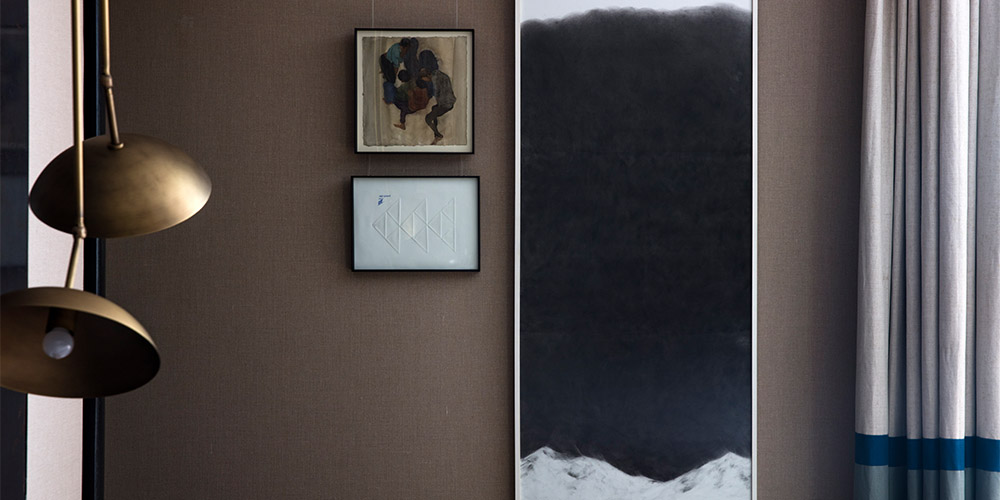
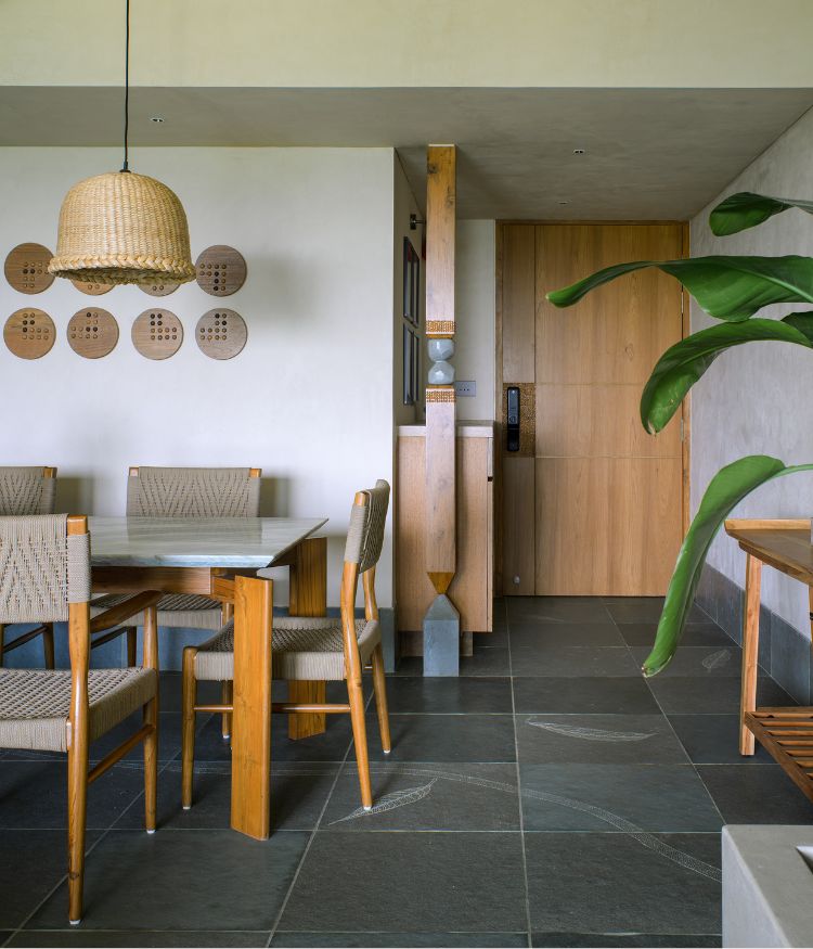
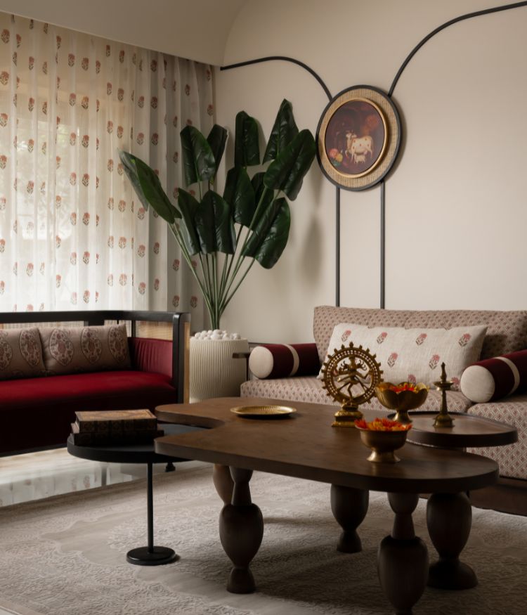
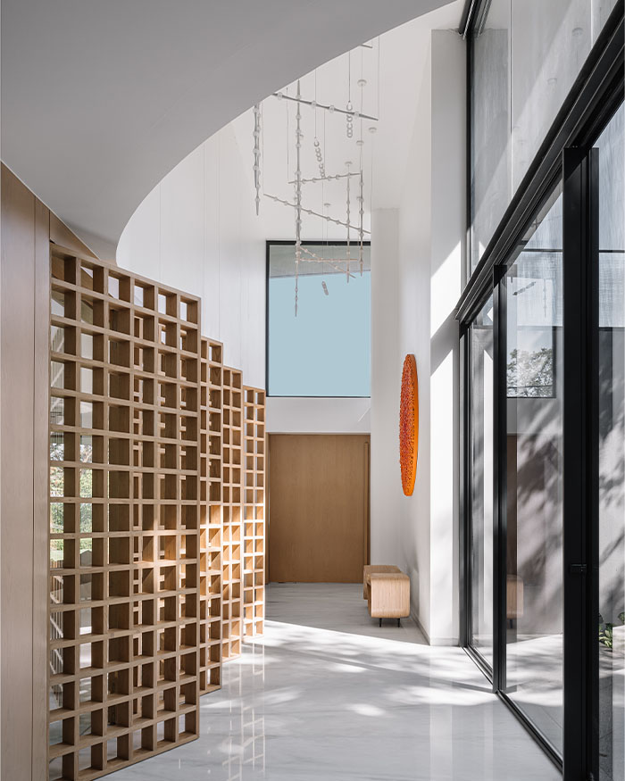
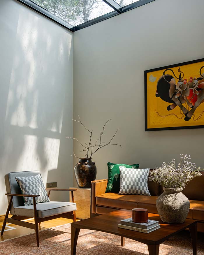
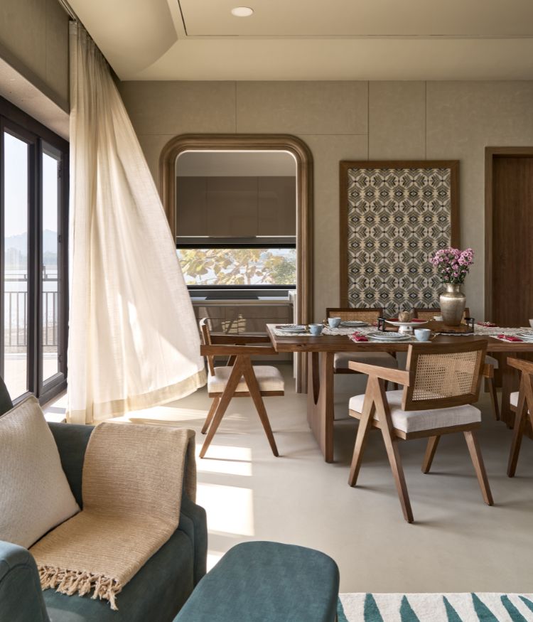
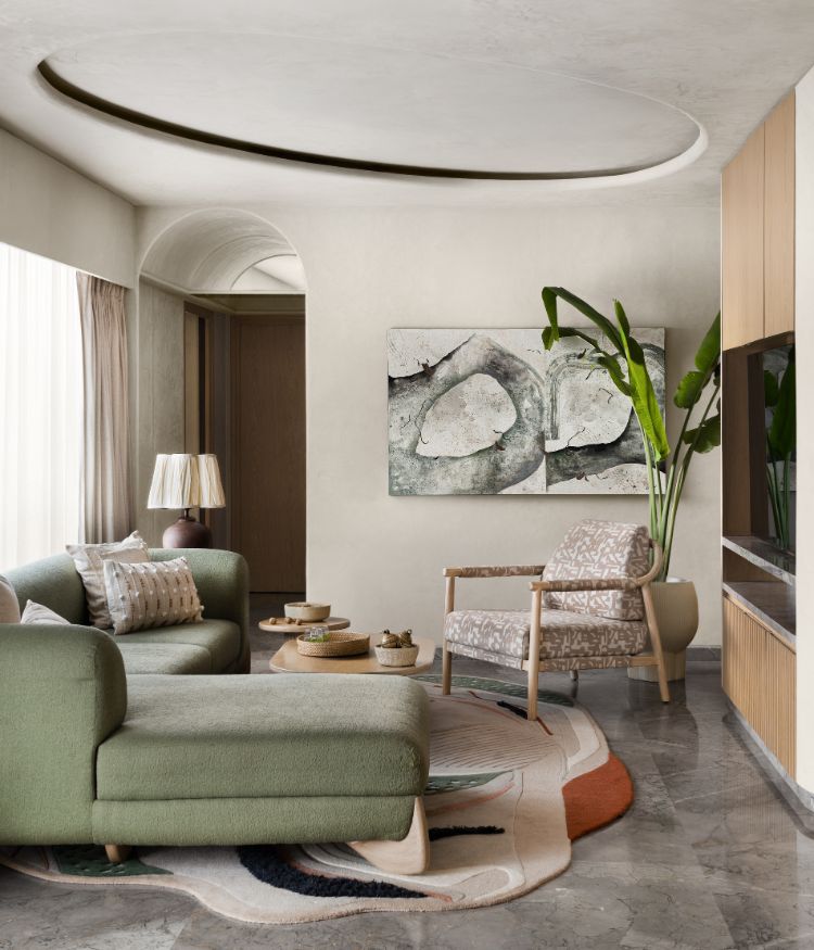
Restraint and simplicity were the watchwords for the design of this home. The clients, being well travelled and dedicated to conscious living, were inclined towards understated elegance. This resulted in the muted material palette—lime finished walls, wood, terrazzo and concrete flooring, linen curtains and a conspicuous lack of patterns—as well as neutral colour tones. In line with the homeowners’ passion for art, works by Munem Wasif, Chirodeep Chaudhuri and the client herself, along with old Tanjore paintings are seen throughout. I recycled old materials and upcycled wherever possible, ensuring minimal waste.
The furniture was carefully selected such that they’d serve as collectibles to be passed down to future generations. These include pieces such as a George Nakashima bench, Eames loungers, Carl Hansen CH25 chair and Pierre Jeanneret Chandigarh chairs, among others.
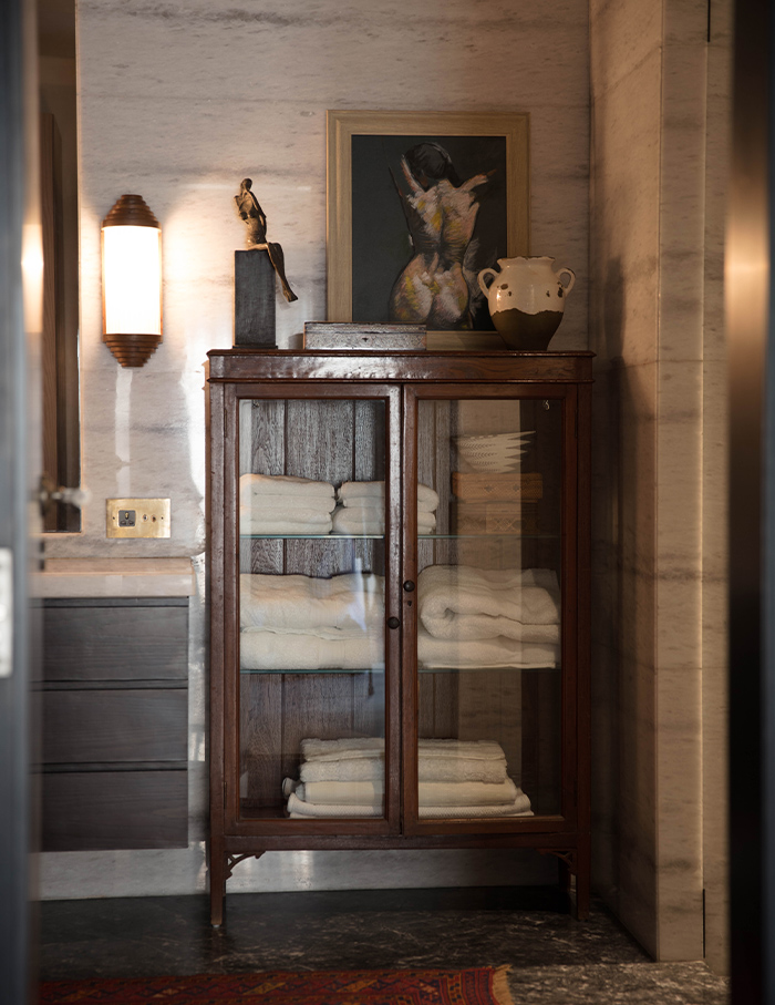
It’s the bathrooms that I enjoyed working on the most. They use a natural material palette of marble and lime walls, while the master bathroom is enveloped in Italian marble.
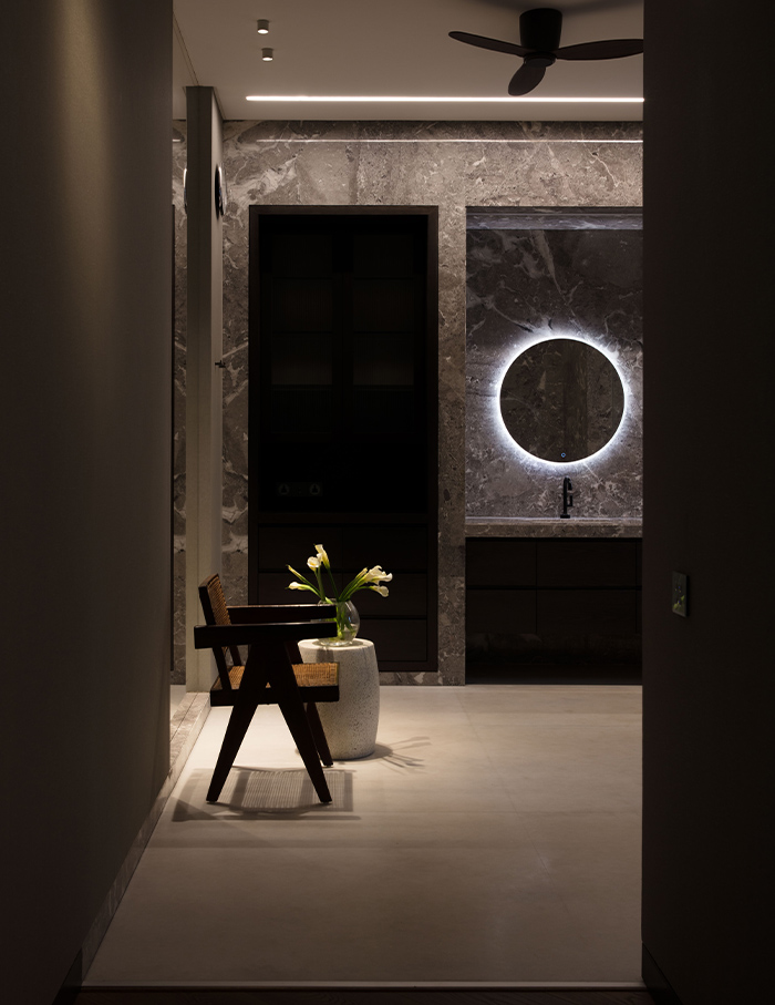
The theme of luxury subtly comes through in the objects that the home dwellers interact with on a daily basis—the furniture, hardware cast in brass on doors and automated lighting, to name a few. This house truly reflects my aesthetic sensibilities, since I detest being over-stimulated. In a sense, this is an abode I would live in.
You may also like: Rohan Parikh’s minimal office in Mumbai

