When the homeowners are open minded, even the spaces of a home start conversing freely. This home by Simran Bhargave, Principal Designer of The Design Cube is a thoughtful combination of varied elements that allowed her to experiment whilst following a uniform industrial style of interior design wherein one uses a monochromatic palette of greys, blacks, whites and accessorise with pop of red and orange.
Chandigarh, described as ‘mecca for architecture lovers’ because of its urban planning, forms a befitting location for this 8000 sq ft 3 storeyed contemporary and minimal home. The ground floor of this home has the living area, bar and other utilities whereas the first floor houses the bedrooms.
The curious brief
A designer gives structure to feelings of love, warmth and understanding and creates a bare shell into a home which the owners can call their own. “Our prime motive was to add a personal touch to the space and to showcase our client’s personality,” elaborates the designer.
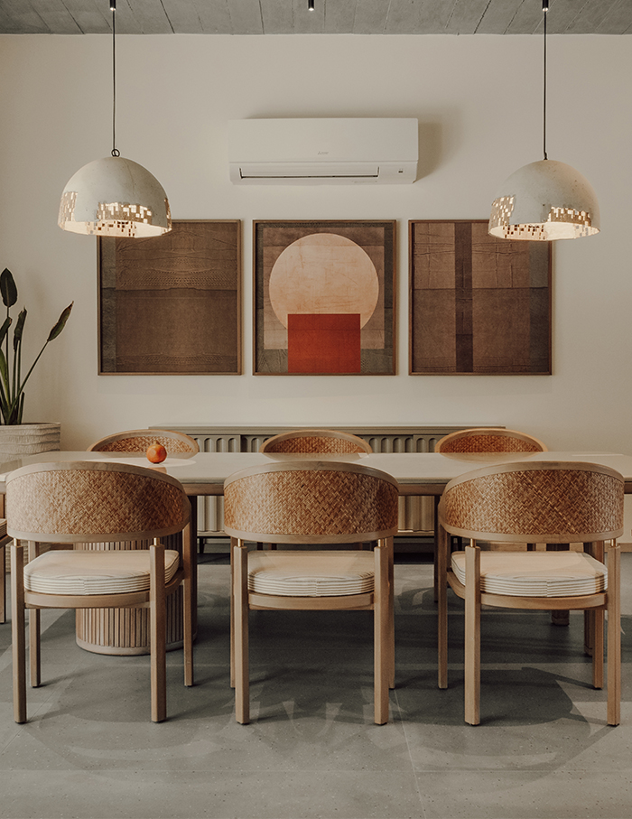
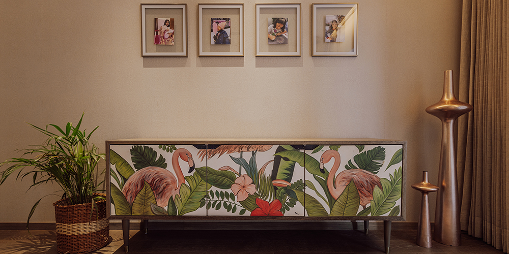
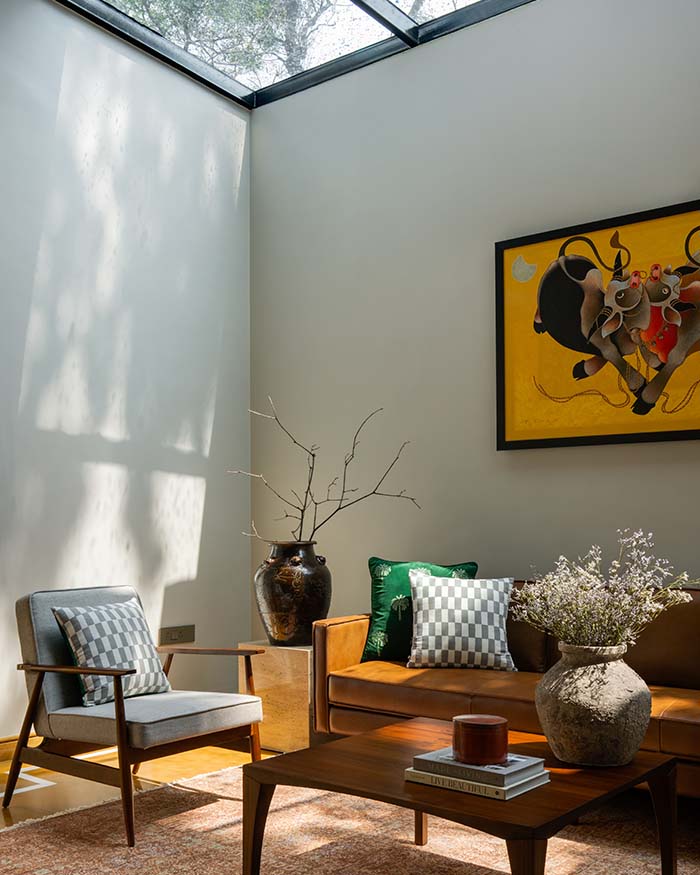
The homeowners gave the designer complete freedom to experiment with their home, but the only request was to incorporate wall art inspired by their love for travel. A lot of art pieces have been commissioned to suit their style.
Tour every turn of this home
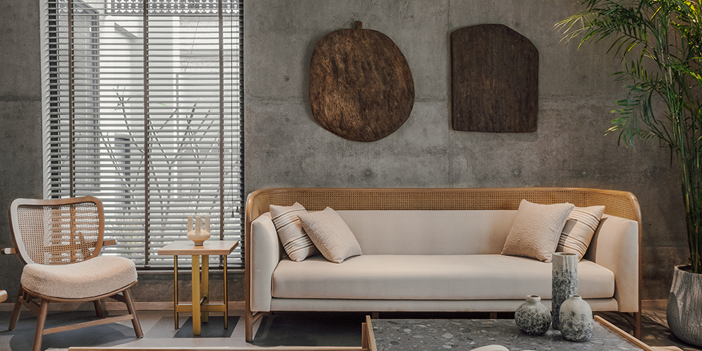
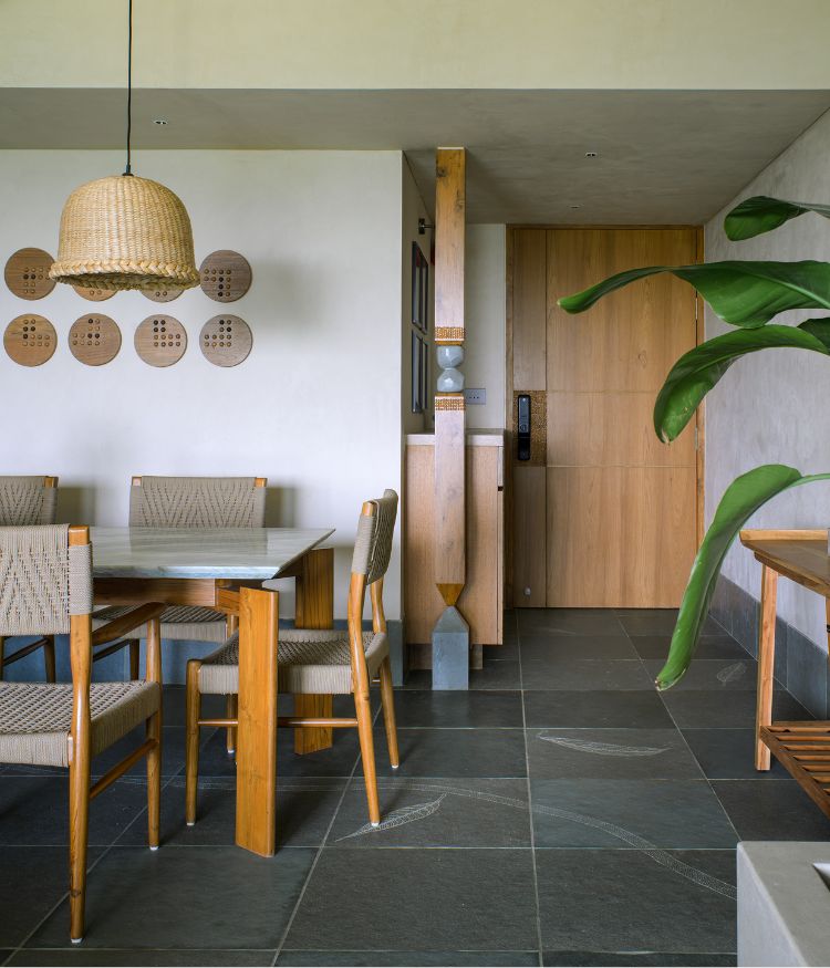
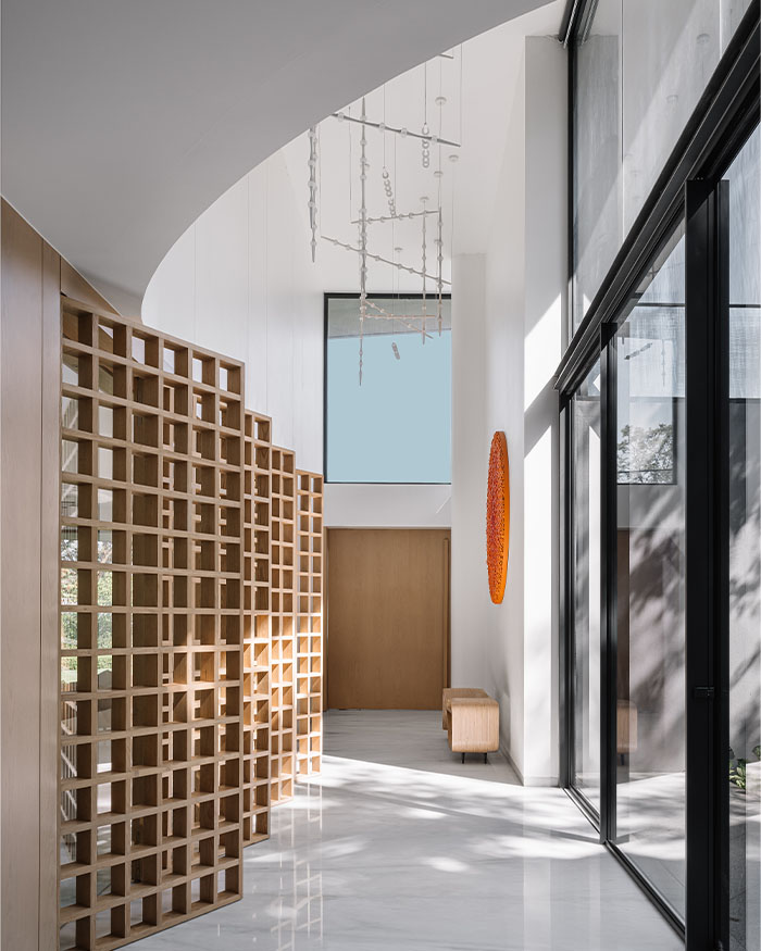
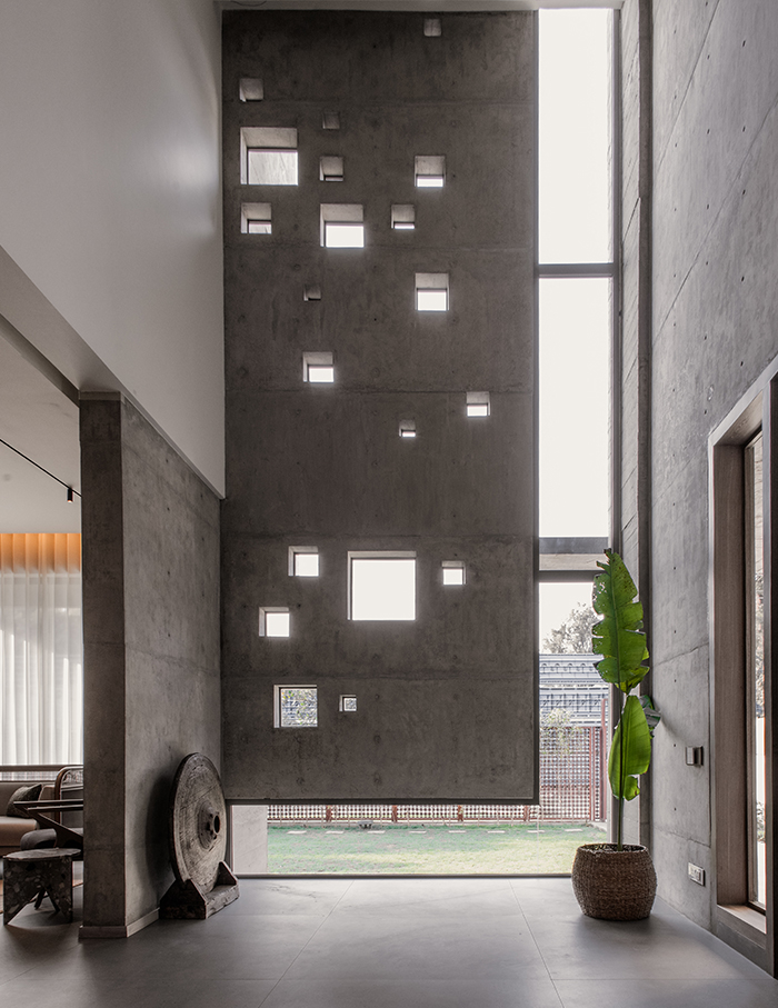
The foyer that welcomes one into this house is designed beneath a double height ceiling unlike the rest of the house which is enveloped under a flat ceiling. The designer has added a sense of raw and unfinished beauty to the entire home using exposed concrete as a primary finish. The perforated wall forms a focal point of the foyer.
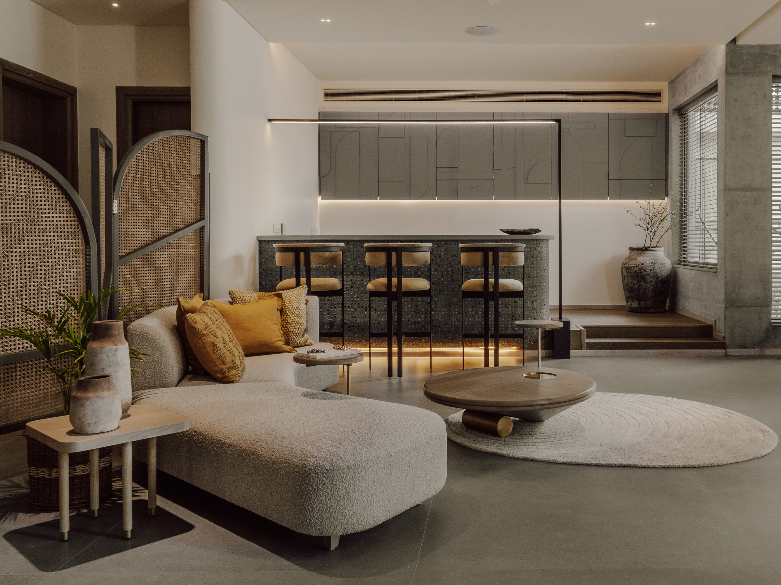
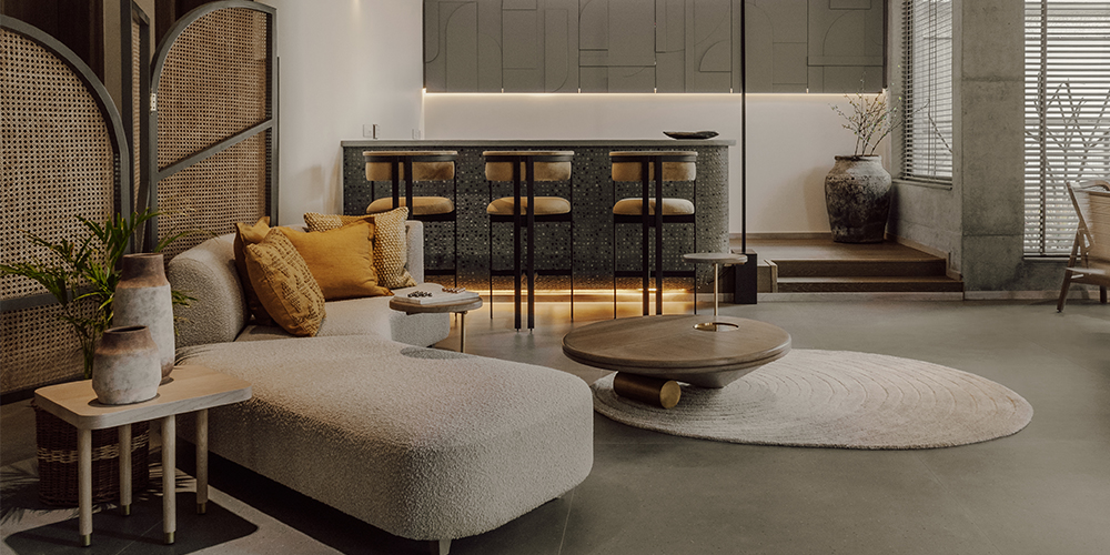
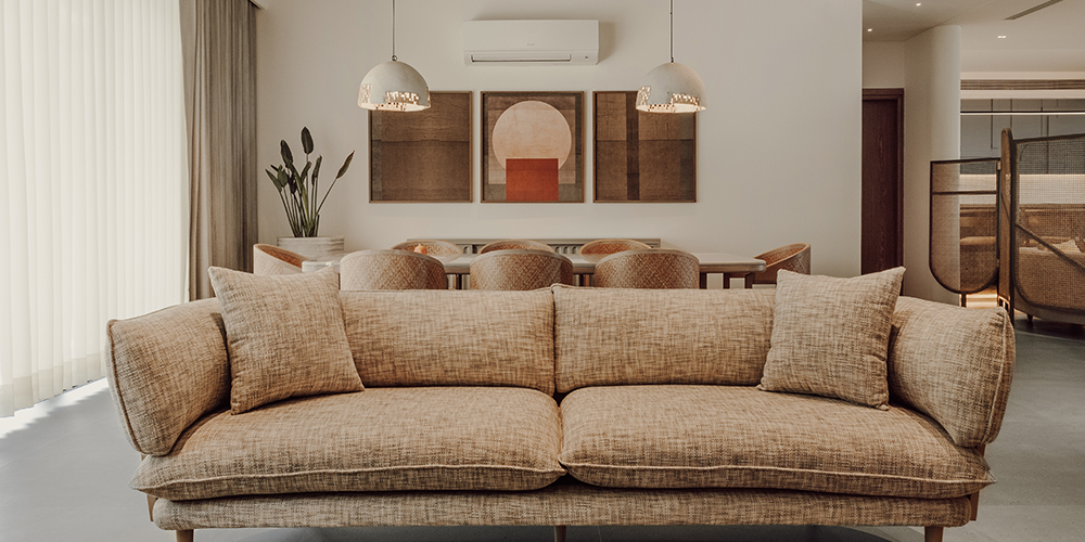
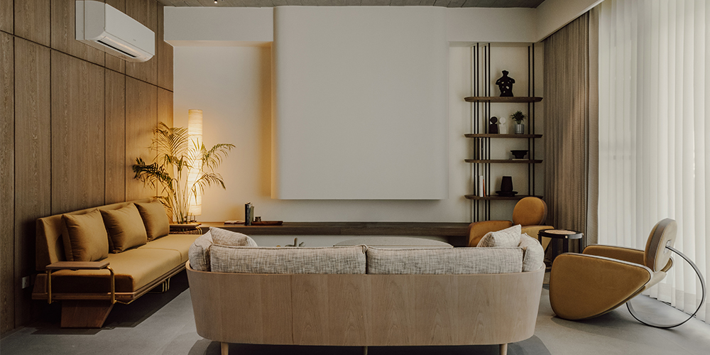
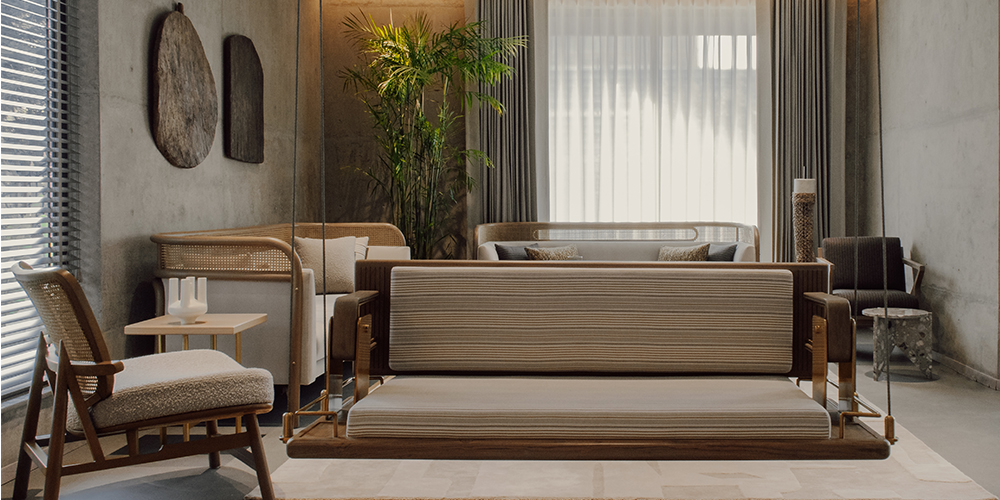
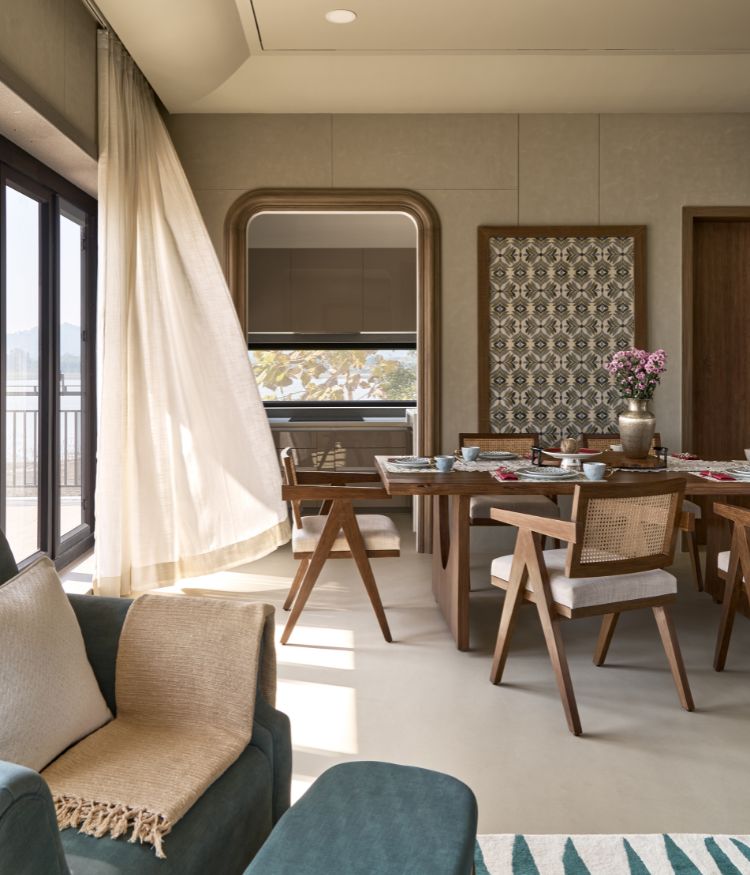
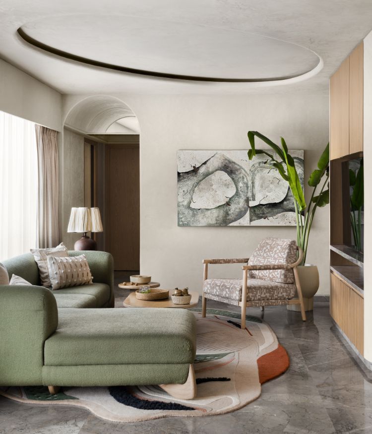
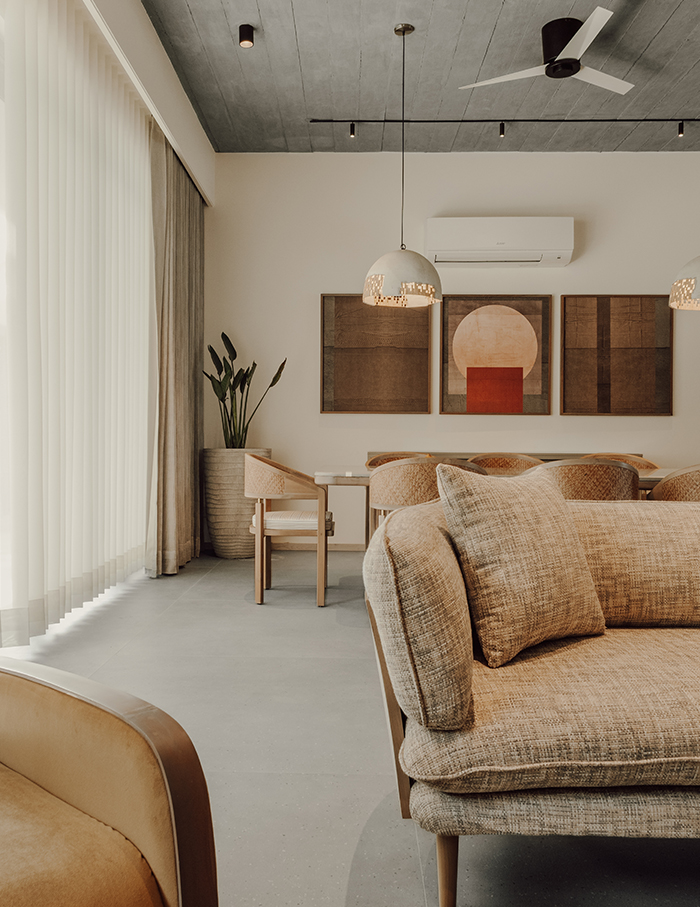
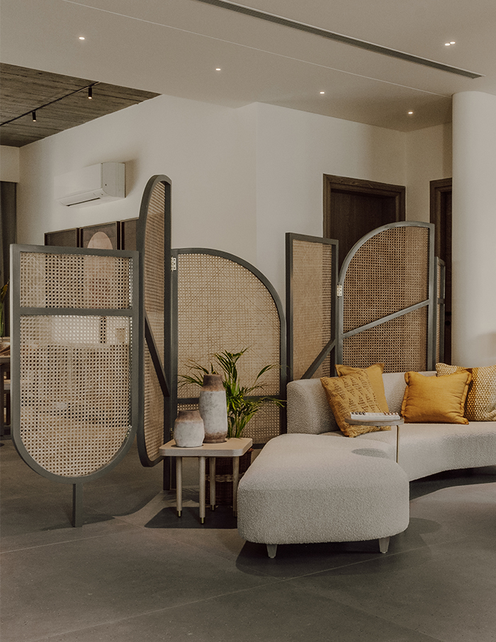
The designer follows an open house plan where areas freely flow into one another. Elements like wicker partitions and swings are used between two spaces to separate them but a common colour tone is used to bind them. The living room lies adjacent to the dining room and follows a nude palette with whites and beige. Beyond the wicker partition is the bar and drawing room which has blacks and greys following the industrial aesthetic with a playful swing acting as a separator. The curved bar is the designer’s signature style of using mosaic and tiles on furniture.
The designer designates the staircase as the ‘showstopper’ and mentions how they spent days selecting the unusual material which would be in sync with the theme and colour palette of the home— Greys and whites accentuated with lime and red for the concrete walls.
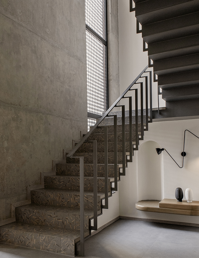
A twenty-first century designer’s language for creating contemporary homes is to create corners which are meant for individuals as well as for the family. The sitting space at the landing of the stairs makes for the perfect isolated spot to curl up and have some alone time.
Ideas to bookmark
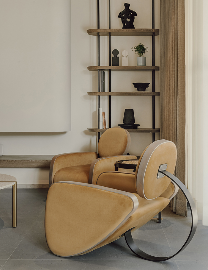
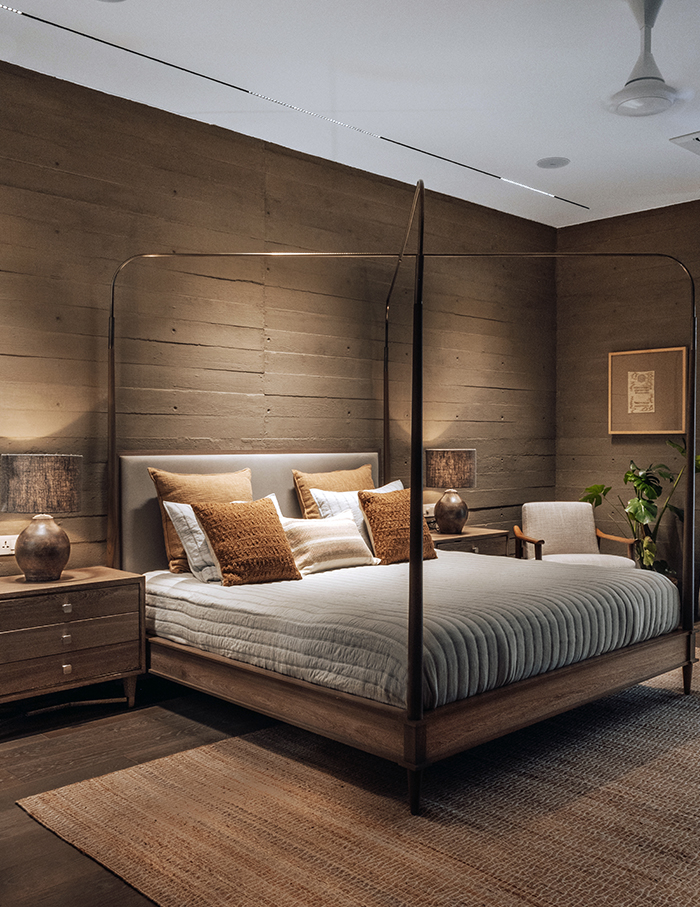
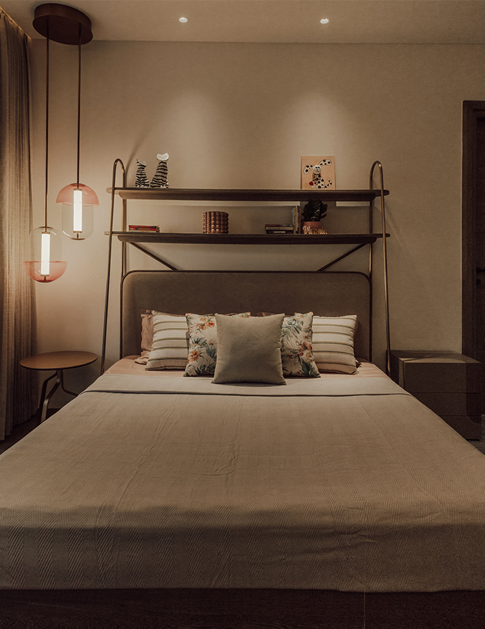
“We always love mixing products, wicker, oak and fully upholstered furniture, we have used all styles in this project and yet confining ourselves to the theme of the house,” says the designer.
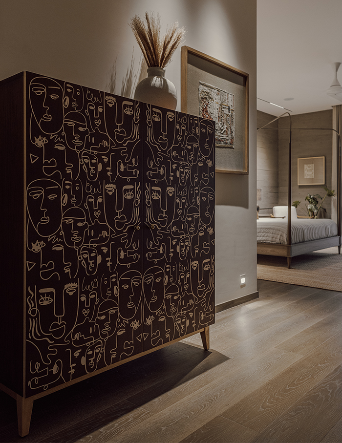
Every furniture piece you see in this home is simple but has been picked because it is unique and unconventional. The uniform palette, nude walls, minimal floors, and usage of matte finished elements helped in creating a subdued appeal but enough to have its own standout character.
You may also like: A functional haven with earthy roots— Ketaki Poonawala incorporates the opposite personalities of the dwellers in this Pune home

