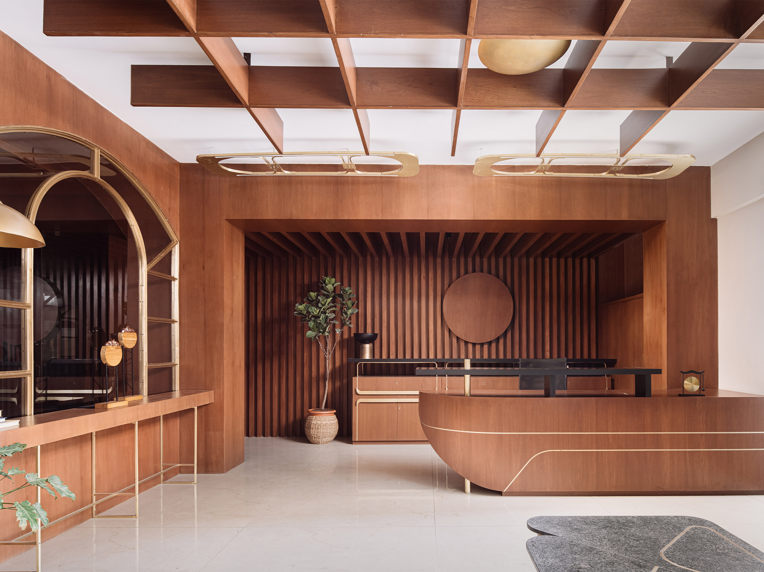
A 3,200 sq ft office space in Ahmedabad, realised in shades of russet and brass to reflect the client’s social stature, is a project aptly named ‘The Philanthropist’s Office’.
From banality to innovation, CraftsPOD Design Studio’s Janki Contractor and Atreya Bhattacharyya pave their way to creating an office that celebrates functionality and aesthetics in shades never seen before in workspaces.
Hitting the brief
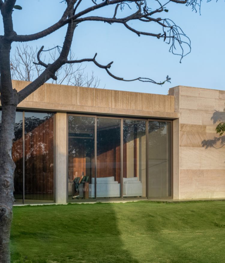
Situated in a low rise commercial business park in the western part of Ahmedabad, the office space already had a perfect existing structure. However, few non load bearing internal walls were broken to arrive at a more open and transparent layout.
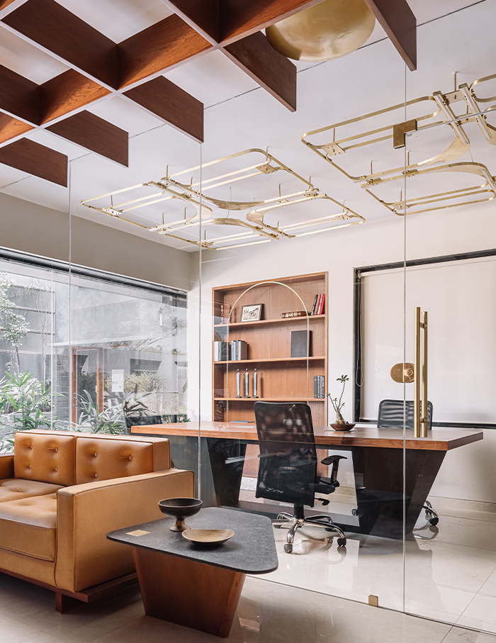
The client is a businessman turned philanthropist, who after the acquisition of his company plans on spending the later phase of his life funding young investors and managing a foundation which works closely with government schools to provide value-based education. He wanted the office to represent itself beyond workstations and cabins; spaces where conversations of innovation and growth are instigated.
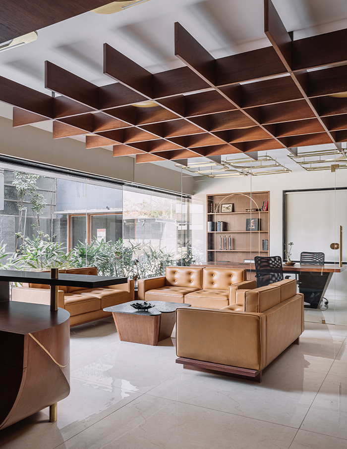
After understanding the concept from the client, the general notions of formalised setups were challenged. Spaces that try to break away from the conventions, blurring boundaries of demarcation and hierarchy were encouraged. And hence, it was decided that the office will have minimum private cabins, more common meeting rooms and an open seating plan.
Take a tour
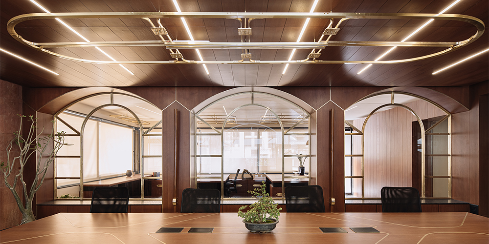
The office is designed on two levels, the ground floor for semi-public spaces and the first floor for more secluded functions. After passing through the reception cum waiting area, you find a meeting room near the entry, a larger conference room in the middle and workstations at the rear end of it, opening into the semi-covered spaces. These spaces are demarcated by arched partitions.
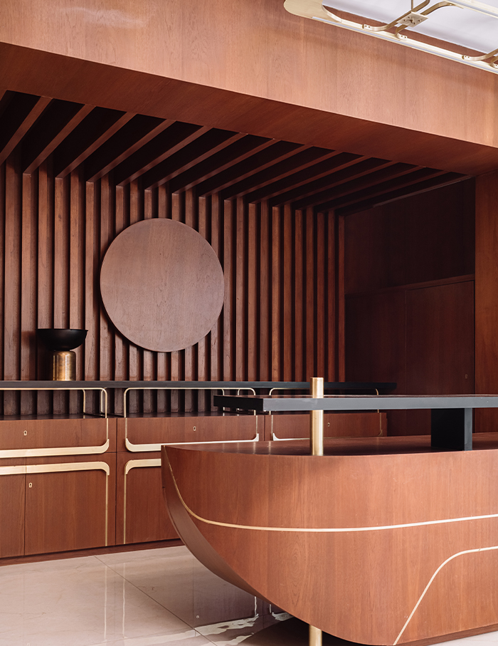
On the upper floor are the workstations, a waiting zone with a reading area at one end, and a central gathering space. More important spaces like meeting rooms and CEO cabins are tucked in to overlook the outdoor terrace.
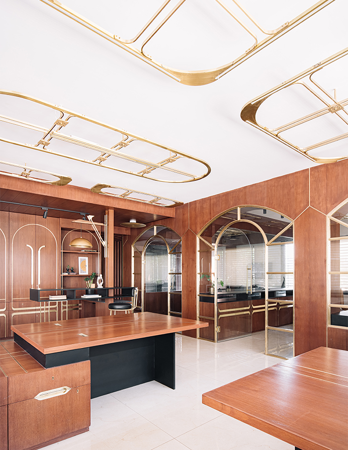
The main cabin, by virtue of function, inherits the character based on the arrangement of elements, without compromising their productivity and efficiency.
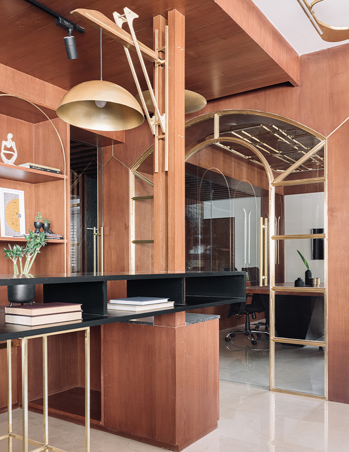
A game of sunlight
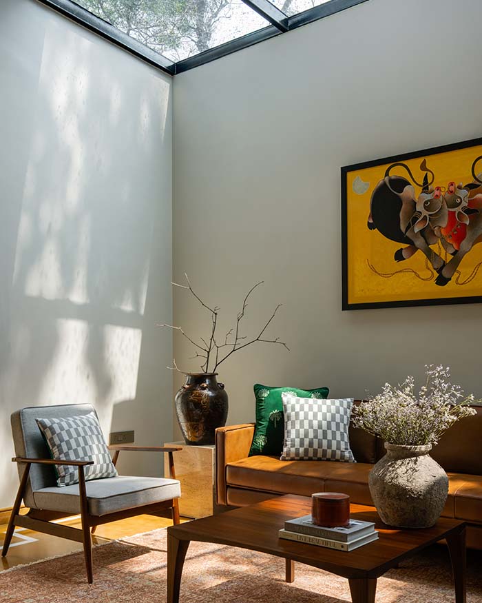
There is no better muse than seeing the incoming sunlight make beautiful patterns on the floor and adjacent walls. But apart from that, the team of CraftsPOD Design Studio decided on using sunlight as a means to control temperature in the office by crafting this natural light source.
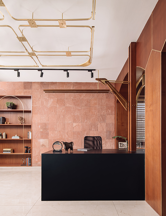
The floor plan works out on how the workspaces can be organised and oriented in a way that they orient themselves with the openings, but at a perpendicular angle. Each of the two sides are further planned as semi-open usable spaces, landscaped with outdoor seating that helps cut the direct glare as well as creates a buffer from the surroundings.
These semi-open spaces are partially covered and contribute in controlling the temperatures of adjacent spaces to an extent, but majorly on the ground floor, thus enabling natural cooling in significant degrees.
Theme it up
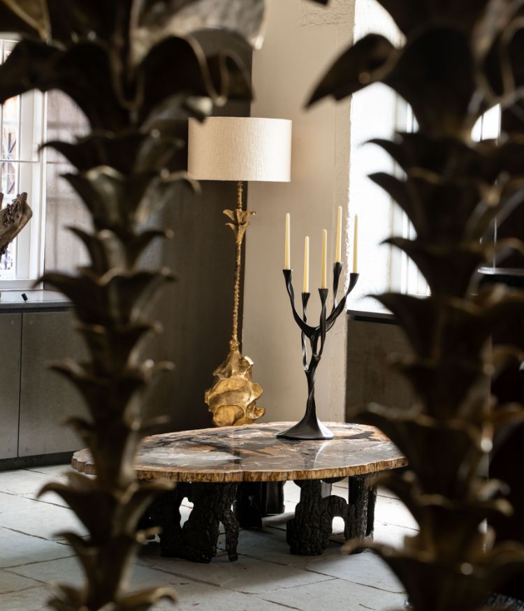
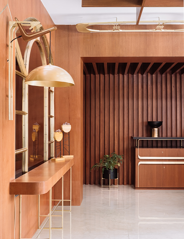
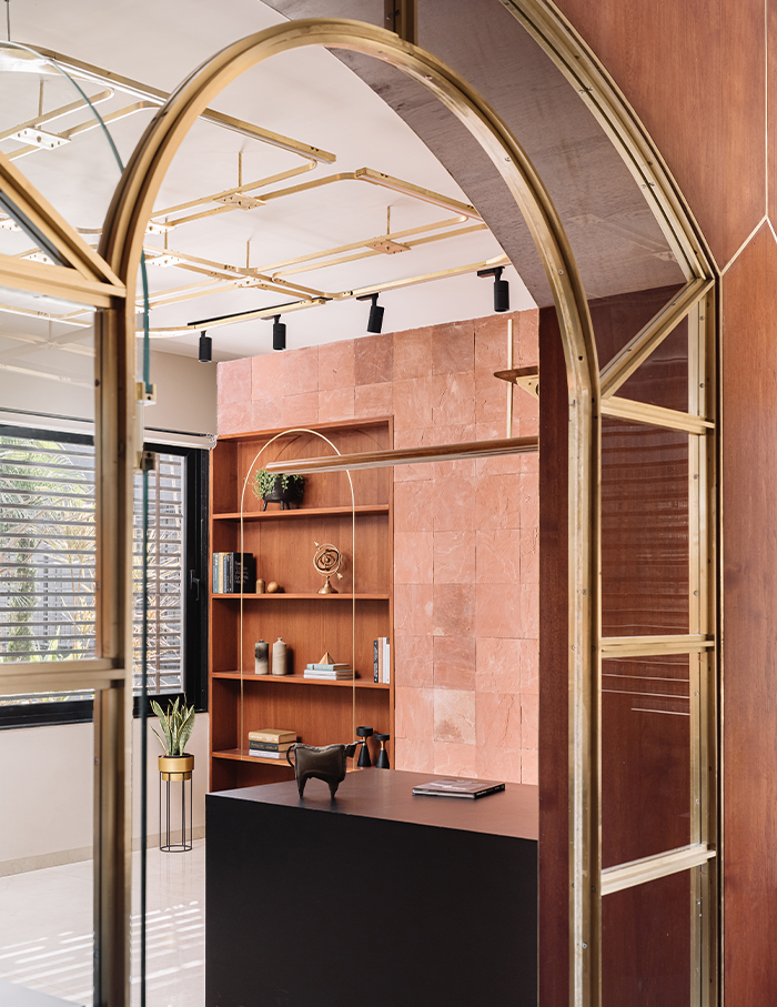
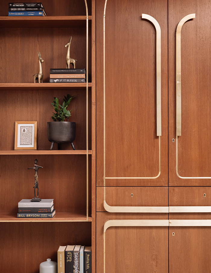
A warm palette of materials was decided – Agra red sandstone, reddish wooden polish, brass and black stone to compliment the brief set by the client.
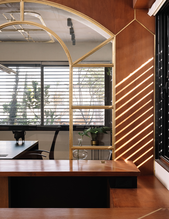
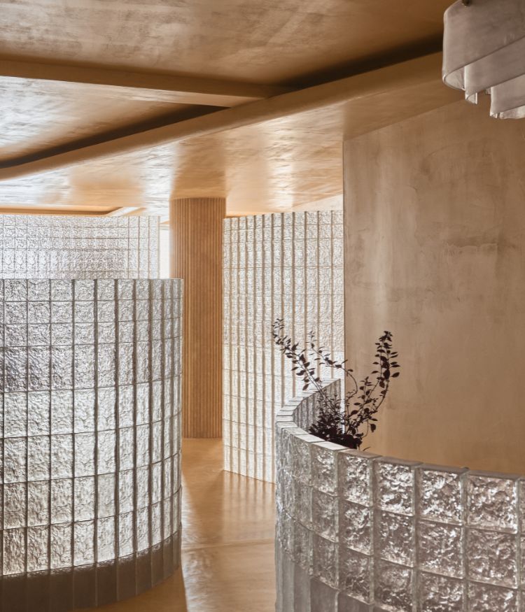
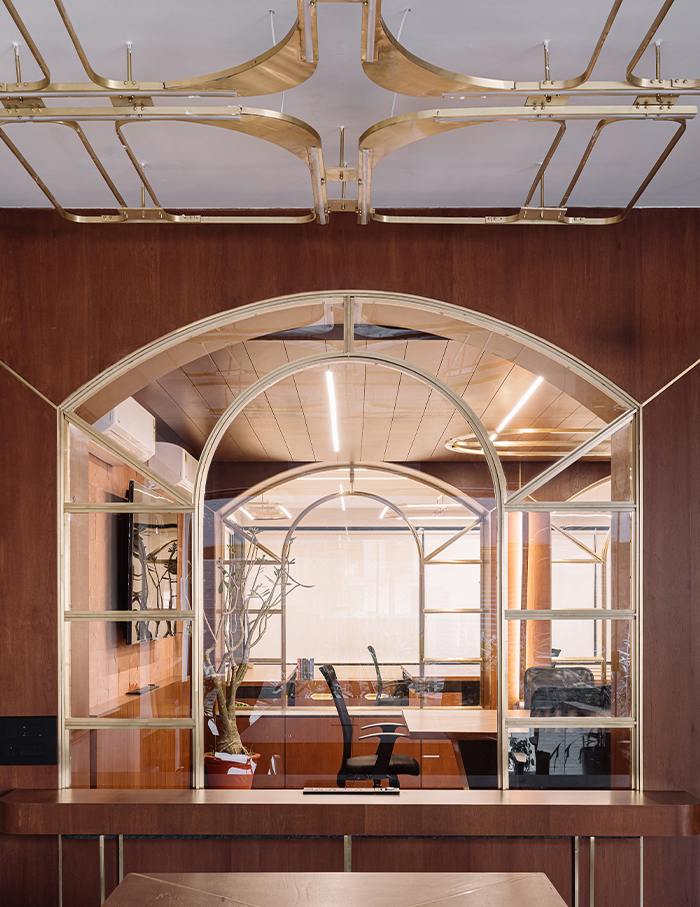
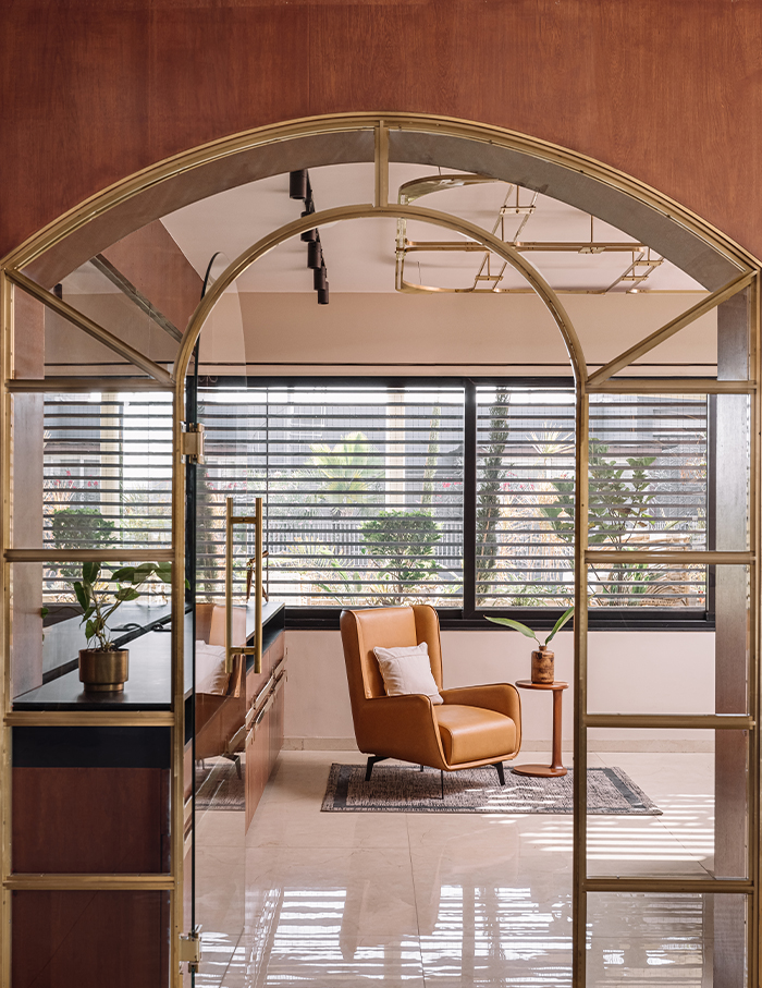
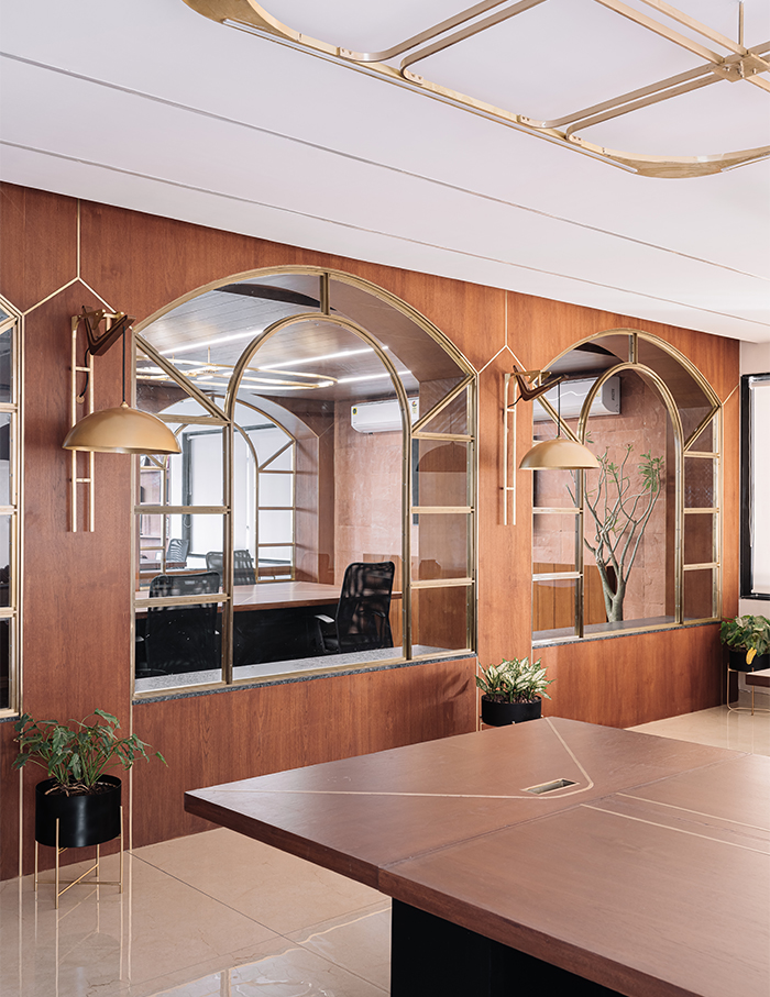
This project was supposed to look like anything but a conventional office, because it was necessary to break the monotony of the work culture. The first ponder was regarding the traditional way a partition is designed and treated in the workspace. After deliberations, the design of partitions used in this office has come up– partitions with glass designed in arched frames.
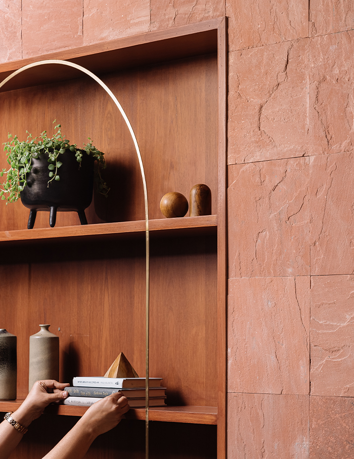
The team analysed the ways in which people will use this office space, and came up with smarter designs of partitions in order to mould the occupants’ ways of moving across the office. Since glass was used to divide spaces, it has lent its many ironies to the office- ironies of transparency, barrier, light and style.
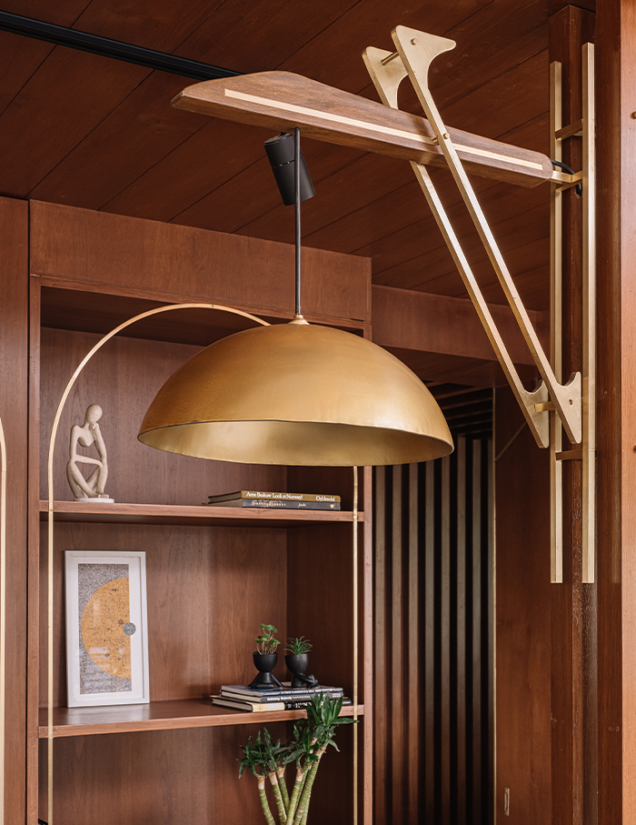
A mix of brown and red was the base colour for this office, on which rest of the materials were chosen. Although the materials, texture and patterns on the browns and reds were different, the team struck the perfect balance to keep them on each other’s sides. Brass as a material for accents was crafted in the space to make the space look like one coherent unit.
Everyone loves a healthy challenge
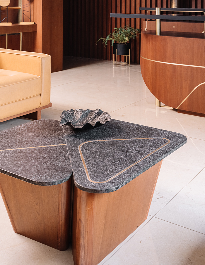
“The most enjoyable part of the project was designing the brass inlay elements in furniture and choosing from a variety of wall and ceiling light fixtures. Ironically, their execution turned out to be the most challenging for us due to their size”, the principal designers tell the ELLE DECOR India team.

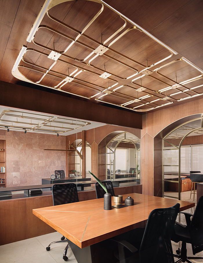
Since the colour palette of the office was already decided upon, it was now time to design or choose lights which would accentuate the interiors, and the functionality was not to be compromised. Therefore, lighting fixtures had to be meticulously worked out, integrating elements from the wall, ceiling and furniture.
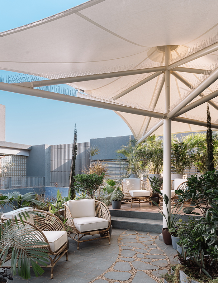
Furniture in brass and wood was to be complemented with ceiling lights and wall fixtures to give the space a texture as well as create a volumetric expression. Lighting was a challenge in a way that it also had to display contrasts in the space– contrasts between the solid and the dark and those between the light and the dark.
You may also like https://elledecor.in/article/this-bengaluru-home-by-treelight-design-is-a-story-waiting-to-unfold/!

