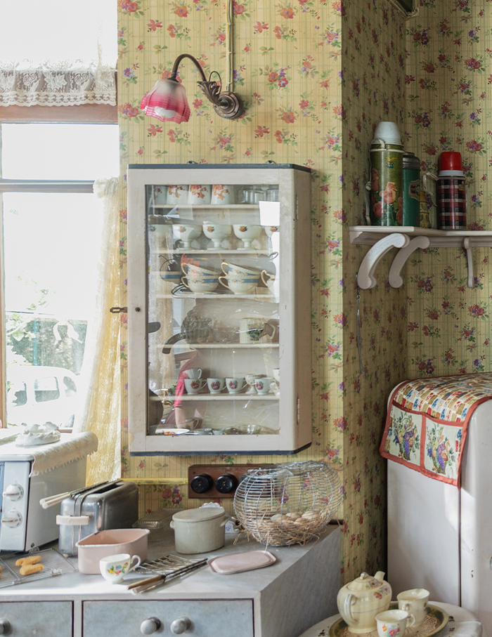
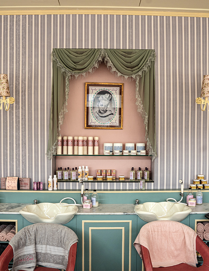
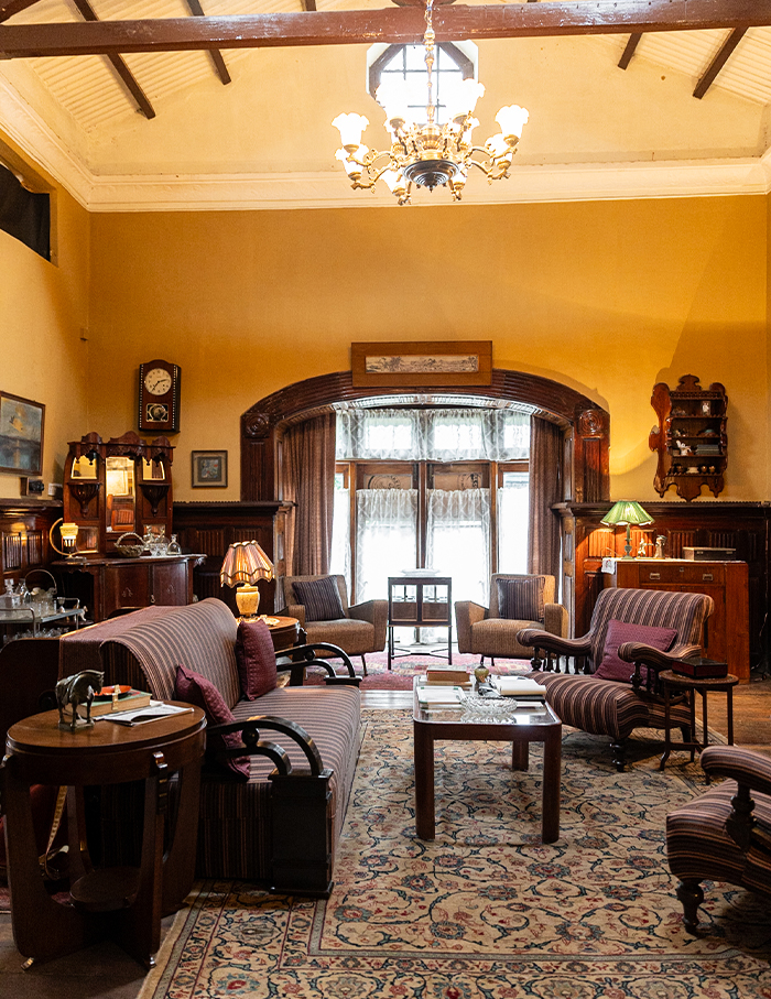
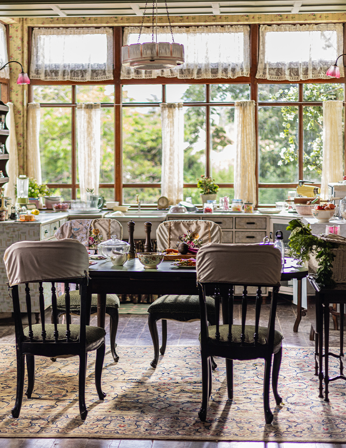
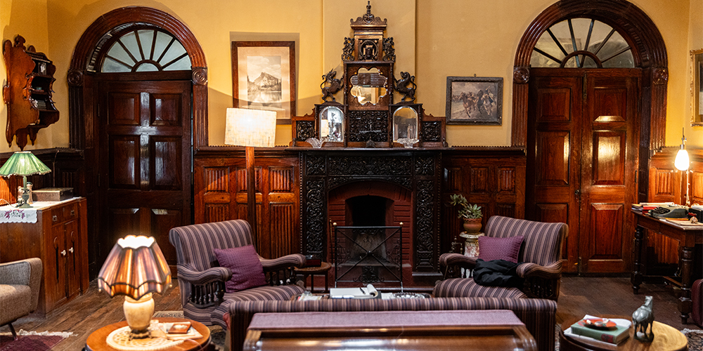
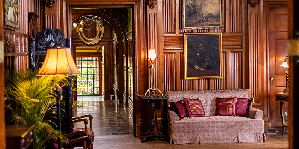
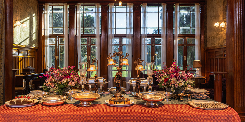
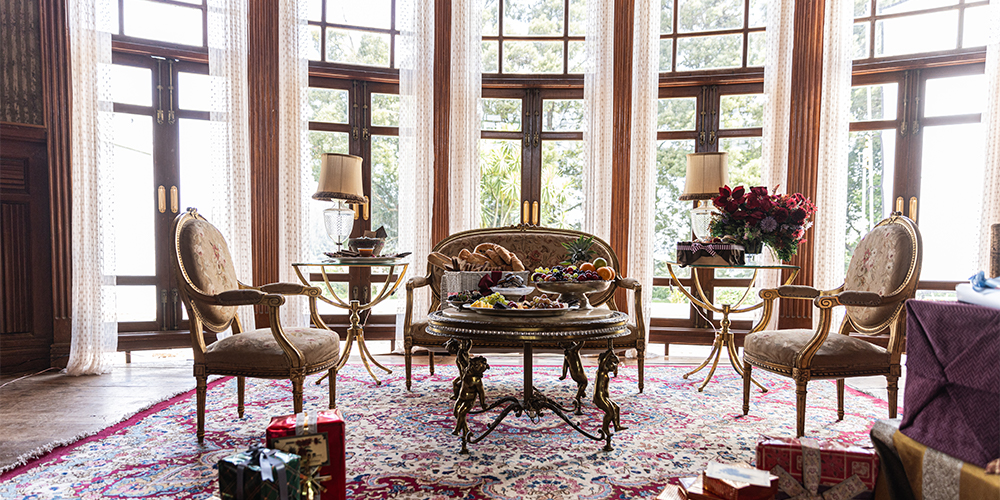
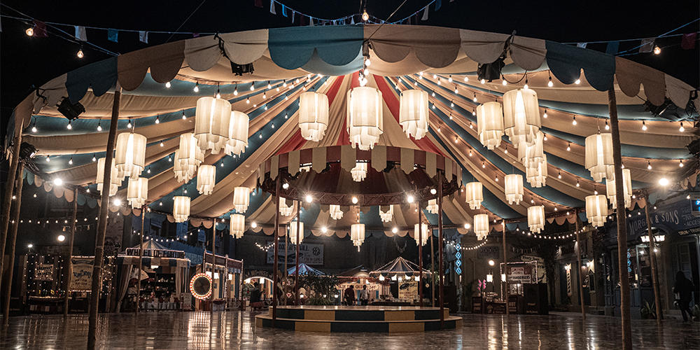
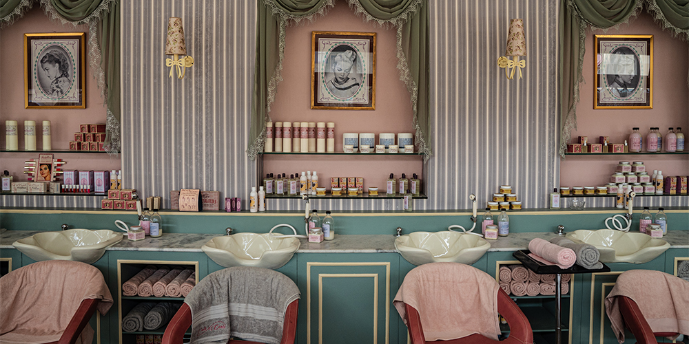
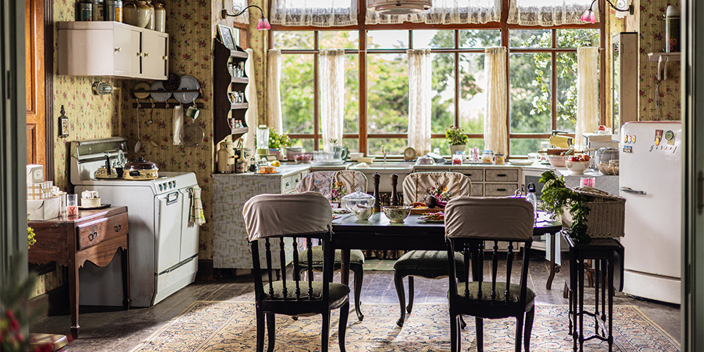
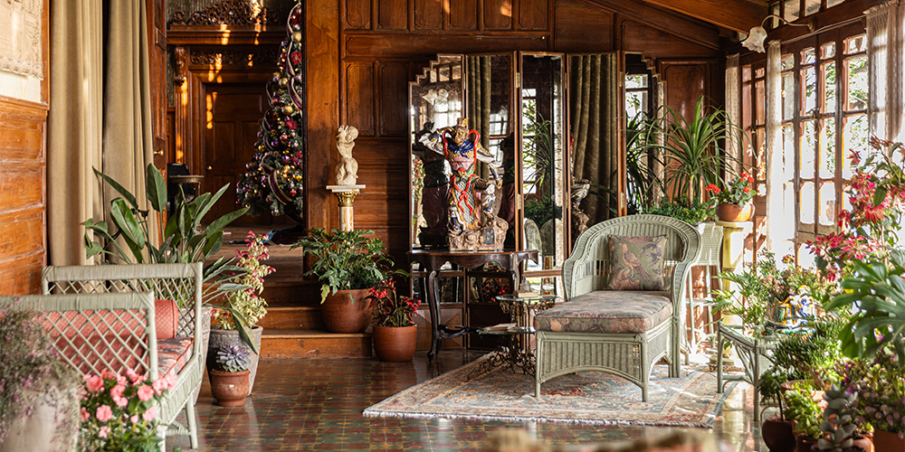
A generational heirloom or a pop culture zeitgeist? Or perhaps both. Plenty has been discussed and dissected about the frenzied, eventful universe of Archie. From the glossy, crisp papers of the genre-shaping comic being the playground of the characters to the script assuming a life of its own — the Indianised debut of Archie in India is tailored through a too-real-to-be-real movie set, majorly sited in Ooty.
Far away from the American landmarks, Archie in India allows itself to redress in visuals of a socio-cultural time period of the post-colonial India of the 60s. Where an almost tactile nostalgia summons through warm, old-school cinematography awash with a sepia-tinted dreaminess, which doesn’t shy away from rejigging yet another graphic moodboard of Archie for the new generation.
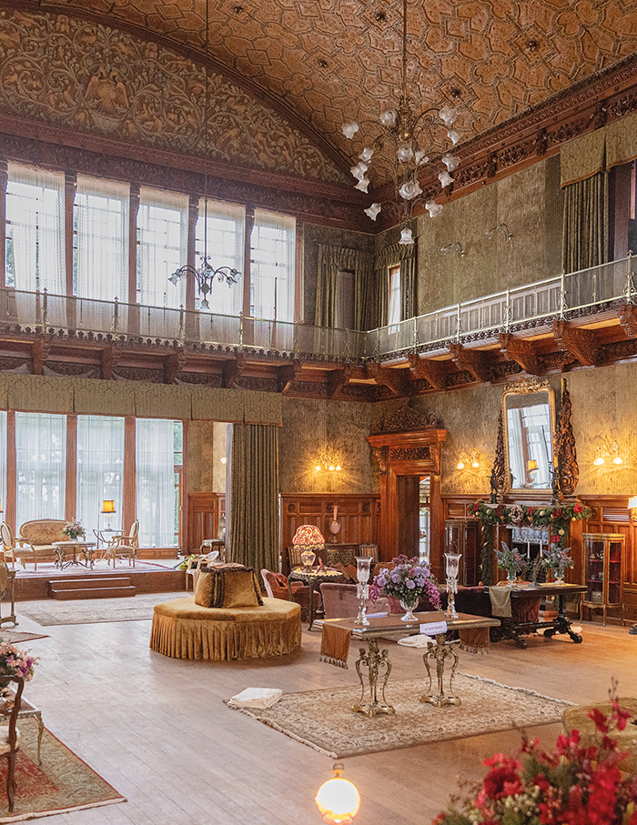
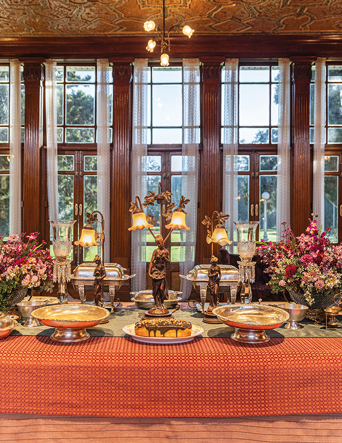
ELLE DECOR India’s exclusive breakfast-hour chat with director Zoya Akhtar and set designer Suzanne Caplan Merwanji unbundles some exciting design notes and decodes behind-the-scenes moments that eventually led them, the crew and the seven debuting actors to recreate the fictional town of Riverdale beyond its comic-styled repute.
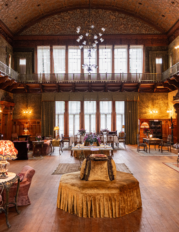
Suzanne muses…
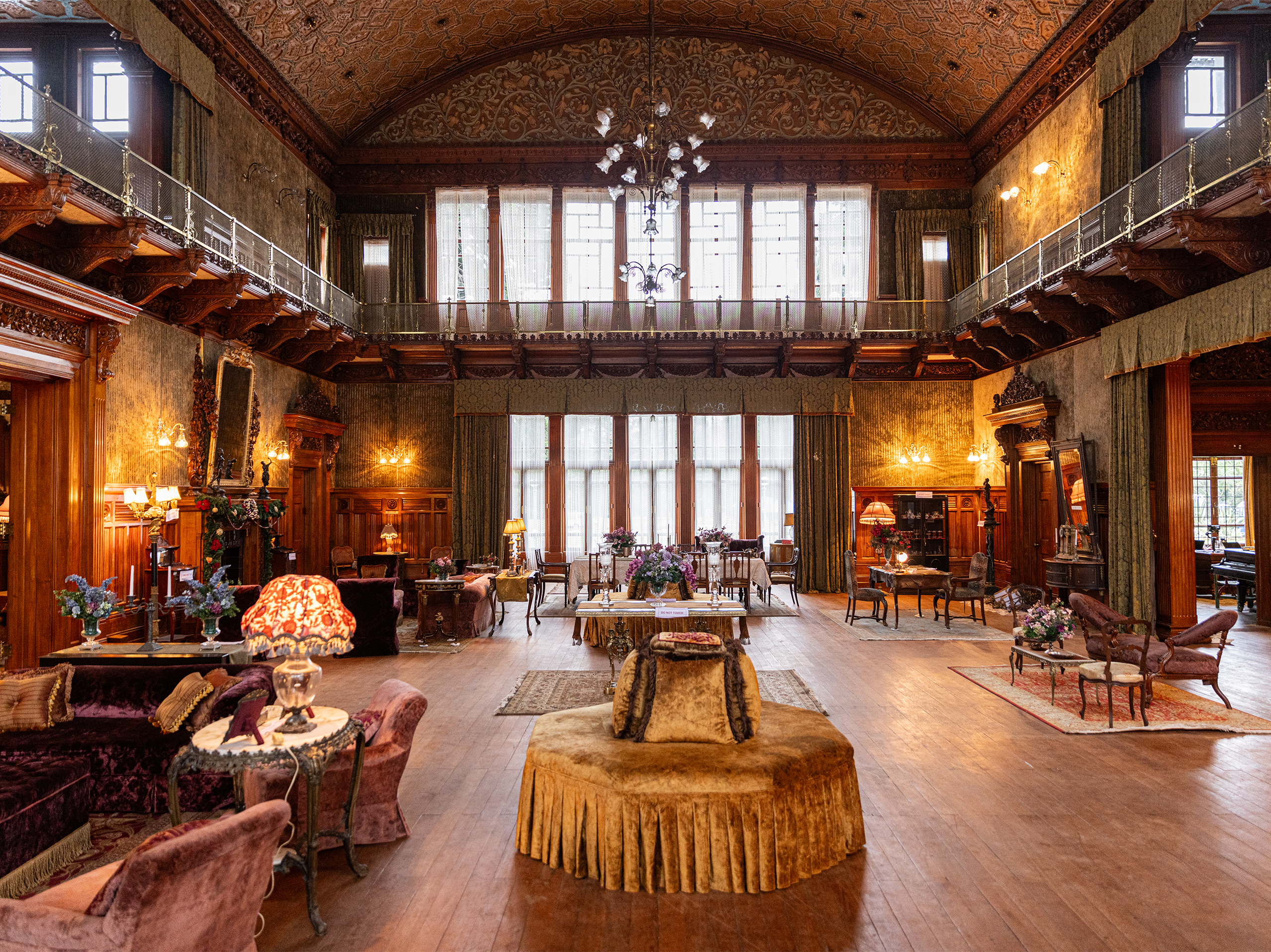
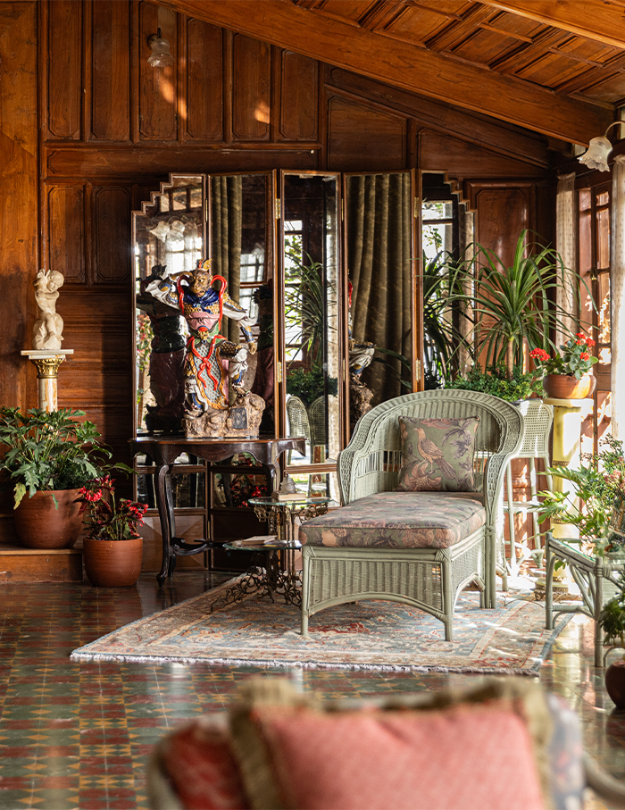
I have to admit that I never knew about Archie. I don’t know if that’s because I was brought up in England… After reading the script, we decided to follow a storybook feel instead of a comic book approach. We researched into the 60s, hill stations and the Anglo-Indian community. The goal was to create an ideal world, somewhere one wouldn’t expect the Archie universe to exist. Veronica’s house, sort of, was the only real rich ambience in the whole film, being the home of wealthy people. It was a big contrast to the homes of Archie and Betty. I also tried to not make the colours too self-conscious. According to the time of day, colours would change right through the set; it’d become too bright or look very dull. So, we did a lot of work on the colours. In fact, we even painted some buildings two or three times.
Zoya muses…
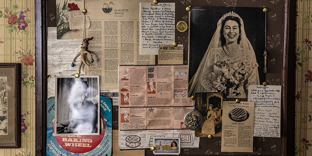
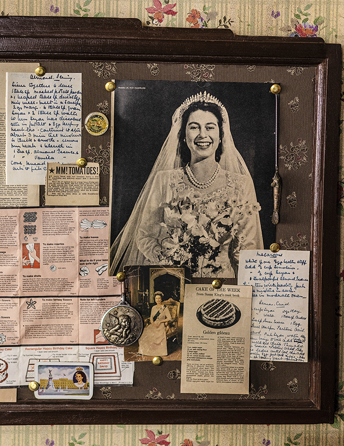
For films, one is designing for characters as opposed to interior design in general or for somebody’s comfort. It’s about what will add to each character, how their houses and spaces will tell the story of who they are. Scripts inform the design, which is almost like the subtitles. For instance, a picture of the queen on the wall deduces that the person who lives in that house, such as Betty’s mother, is indeed fascinated with the queen. There are always things to play with and to discover. It was also the surprise on Archie’s face (played by Agastya Nanda) when he opened the drawer at the set and found that everything had stuff in it.
The company Archie sent me comics from that era (60s) because today the comic itself has evolved. It’s way more inclusive and way more diverse. But we wanted the tonality to be a bit period-like. The brief was to move away from the modernness of it all. So we went back to the wholesomeness of what the comic originally was. I mean, it is the adaptation of a fictional place Riverdale that doesn’t exist in America. And to then adapt a fictional place and then fictionalise the fiction was fun to do!
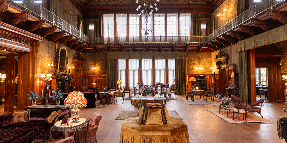
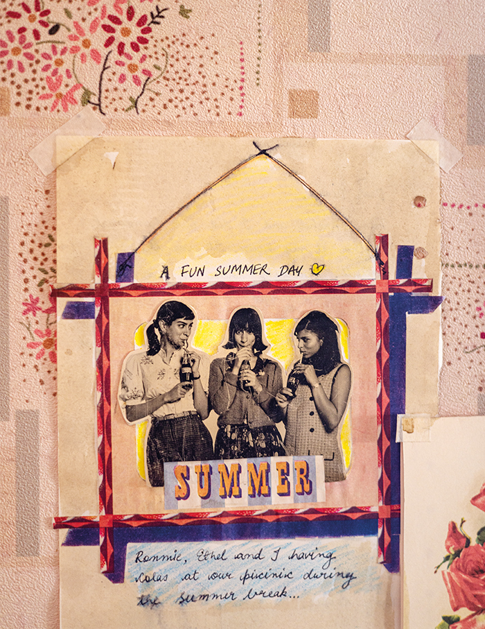
The original comic actually has a lot more primary colours, which we did not follow for the movie. We’ve visually pushed back to gentler colours. Though there is interdependence of colours and characters in each frame, but each personality is different. Take for instance, Veronica’s (played by Suhana Khan) space is a huge mansion. It is modern, fancier than what Betty’s (played by Khushi Kapoor) would be. Veronica’s room will have that one thing that she has accessed from just about anywhere across the world!
Suzanne muses…
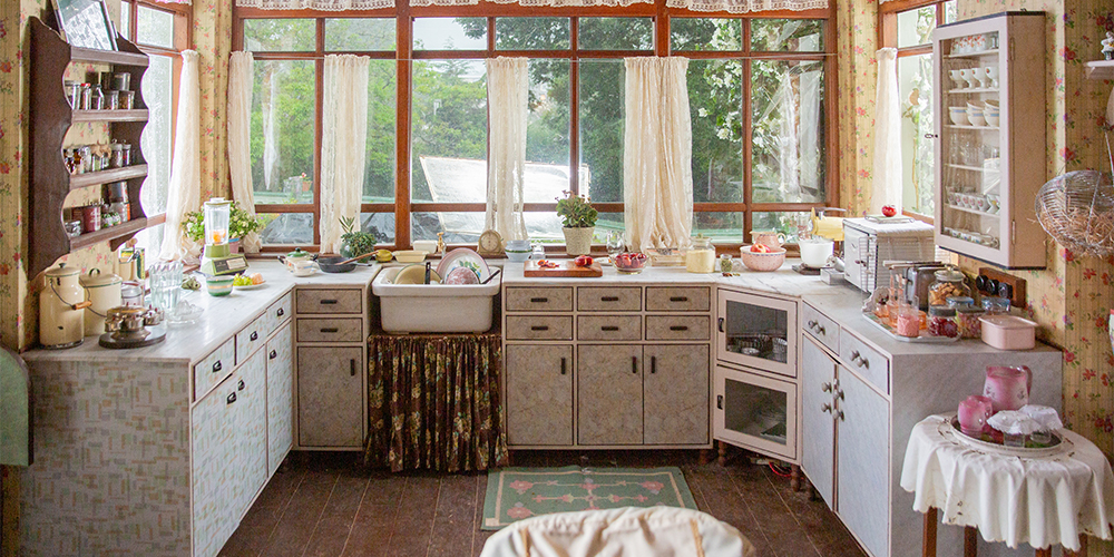
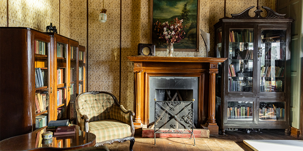
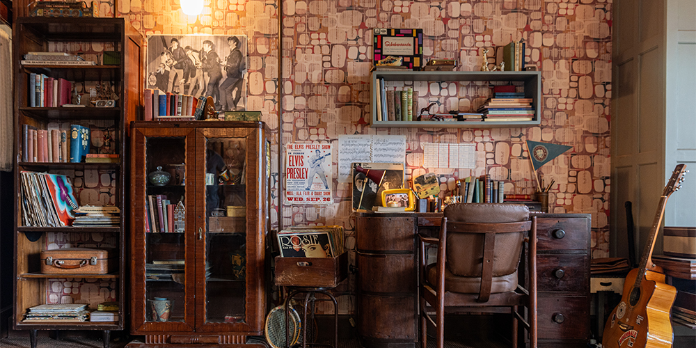
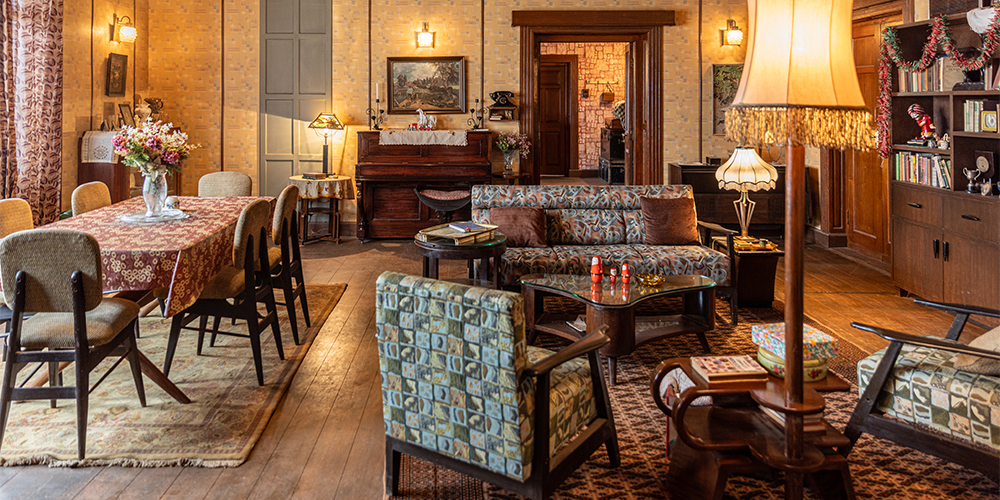
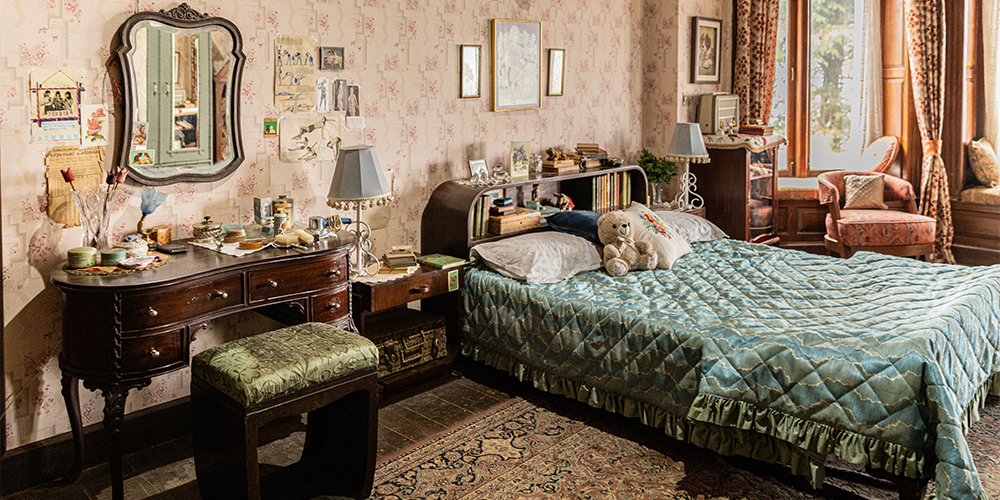
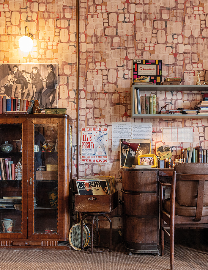
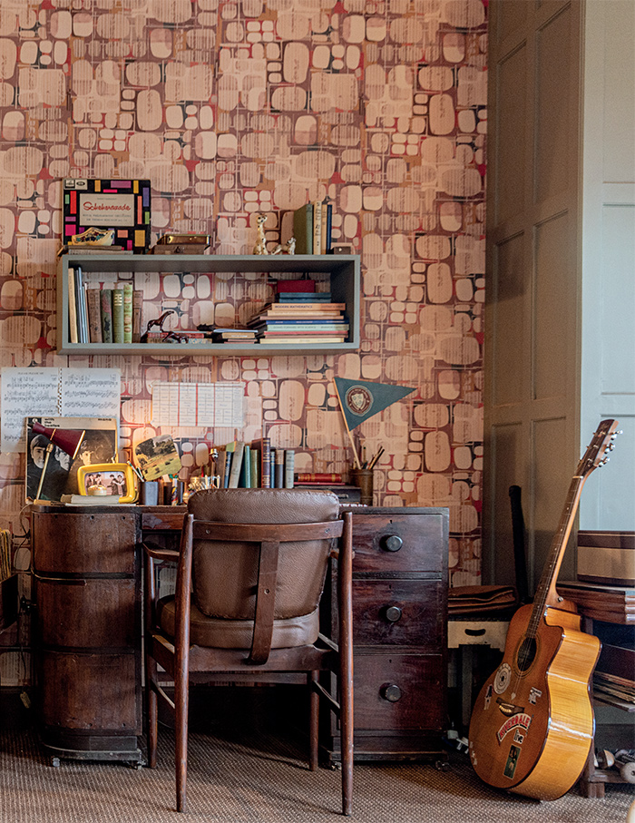
The design shouldn’t fight the story. I didn’t want the overall palette of this film to be too bright. Emotionally, primary colours don’t really take you back to a period. We went through almost every wallpaper in India and researched the late 50s and 60s. Barely anything worked for a ‘period’ narrative. About ninety per cent of wallpapers in the movie are tailored by our art team. Betty’s house is warm, decorated and quite old-fashioned. While Archie’s living room is more late 50s-early 60s and much simpler in its decoration. And of course, it being the Anglo-Indian community, they were very aligned with the British. So imagining visuals closer to the colonial world is equally essential as well.
Scroll to enter the world of Archies…
