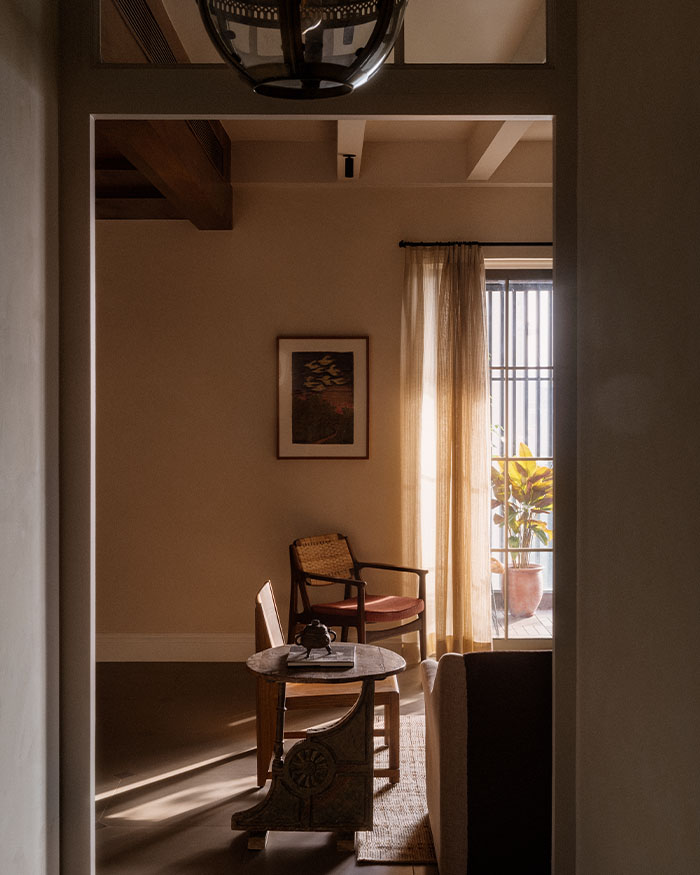
Who knew minimalism could feel so pronounced? Insitu Design Studio purposely kept this 1,700 sq ft home in Mumbai, free of clutter. But what Ami Mody, Project Lead and Sahiba Madan, Principal Architect chose to include in this home is refined, polished and high end. The result is a minimalistic home which still manages to create a space where the eye just glides from zone to zone.
“The design of the space is a combination of effective space planning in a city apartment and using simple but effective design gestures and clean forms, to create a sense of timelessness in every space,” Sahiba shares.
An organic canvas
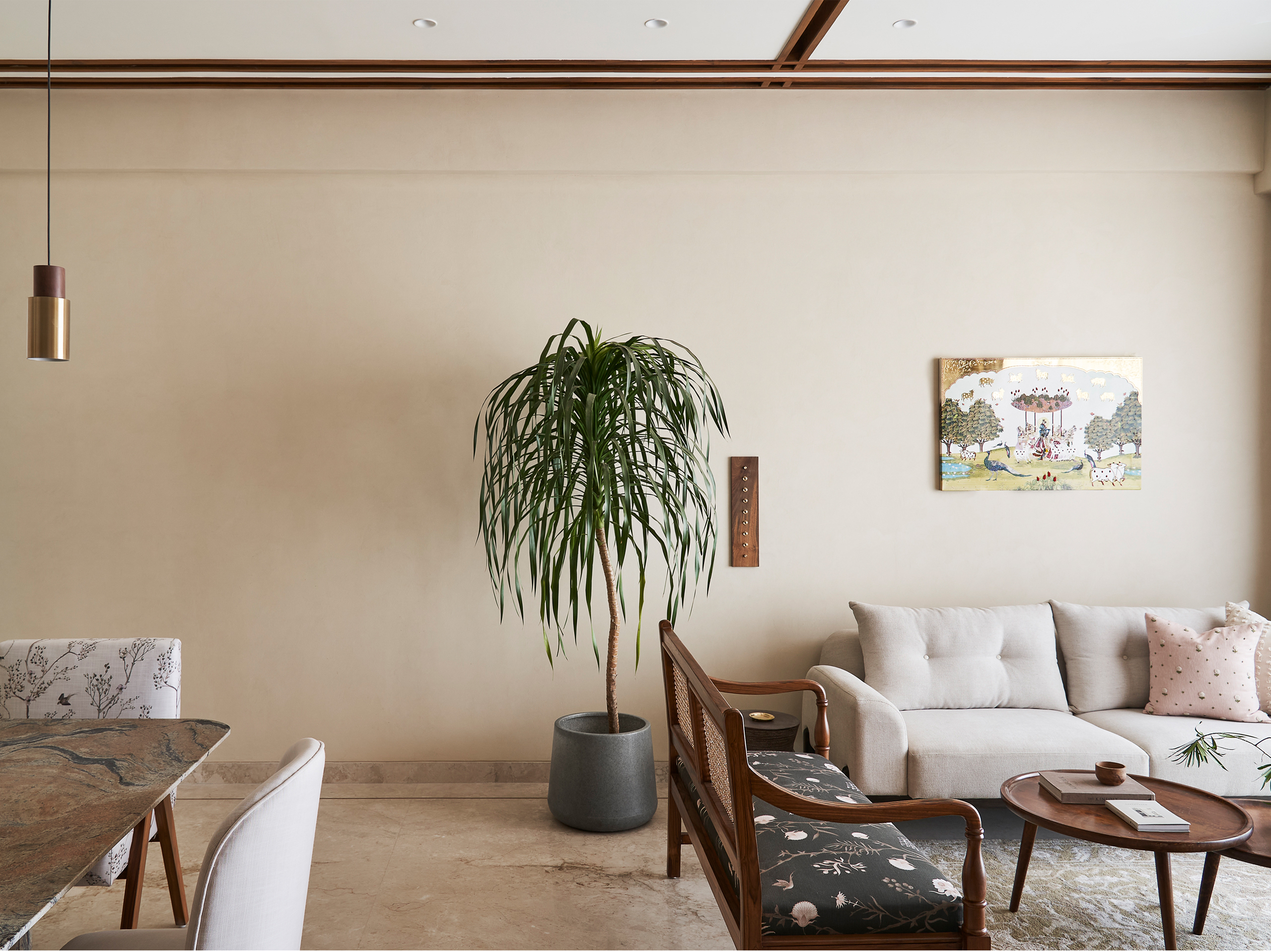
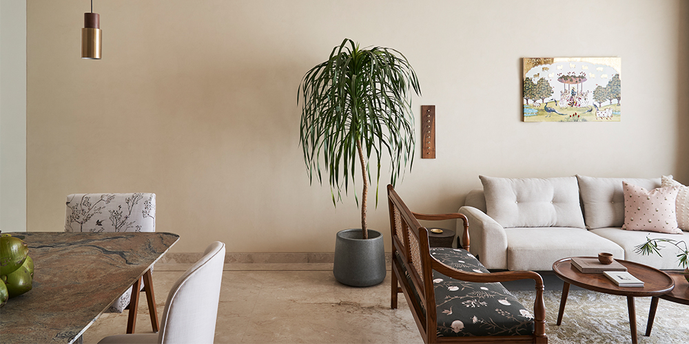
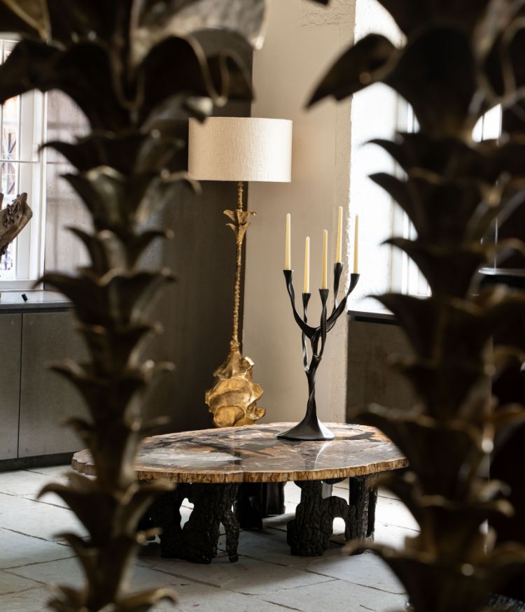
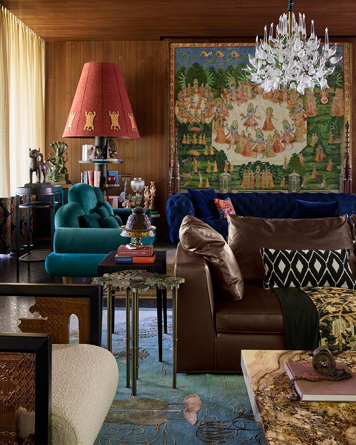
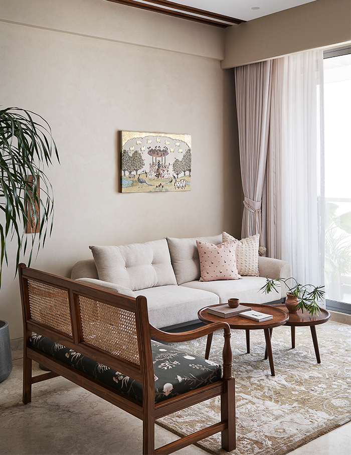
Clean minimalism and sleek lines meet nature-inspired shapes, organic textures, brass, marble and rustic elements in a Vastu-centric home where the homeowners were open to experimenting to make their house distinctive. This modern organic style also praises the airiness of the entire space.
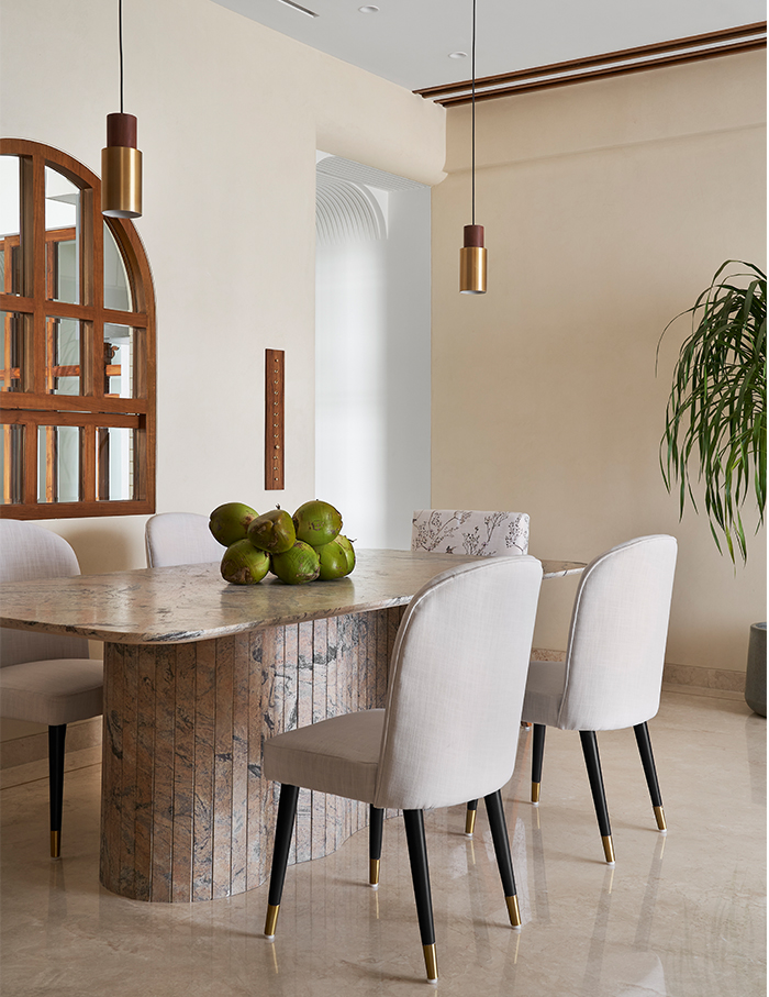
As you enter through the walkway, you’re enveloped in a visual experience in the form of a ribbed ceiling and a whimsical screen with features inspired by nature. Next, through an arched service window, the living and dining rooms create a visual dance with the kitchen.
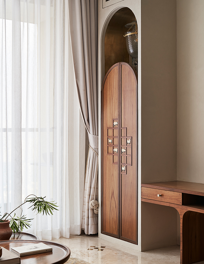
A huge monolithic dining table, built by the design studio firmly asserts its position in the centre of this exceptional room. The wall opposite the kitchen is built with solid wood, glass and wall-painted MDF accentuating a surprise here and there in brass. The living room incorporates the mandir as well. Intricate carvings on a wooden traditional door help the entrance stand out from the rest of the house and adds to the area’s eye-catching traditional appeal by making it resemble a village temple.
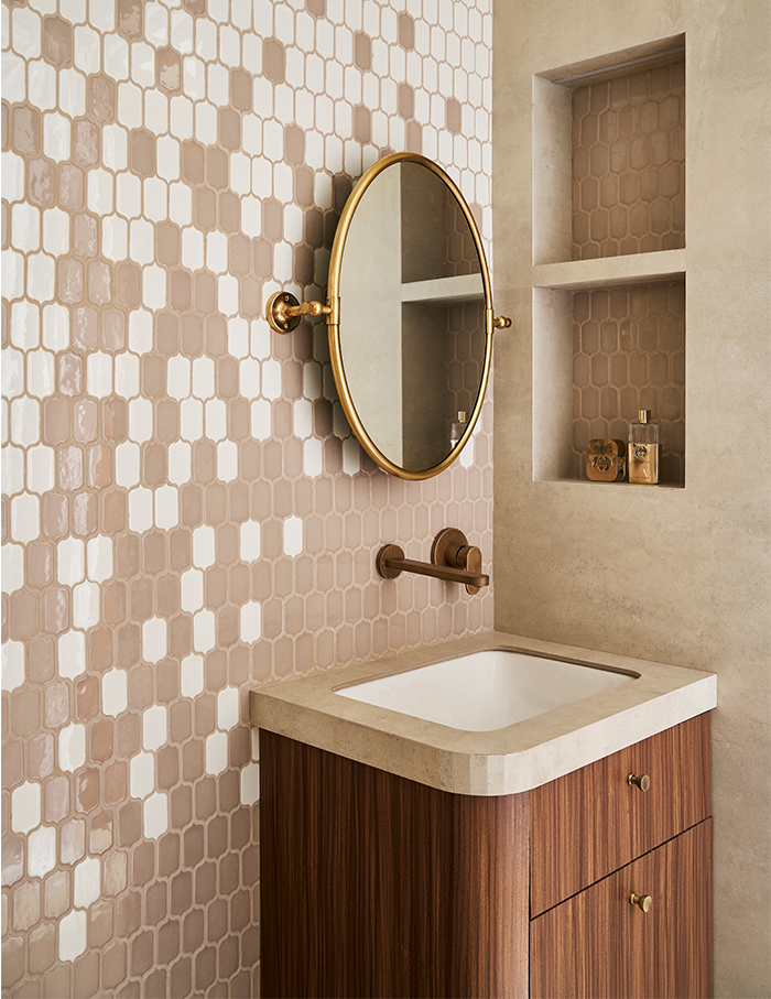
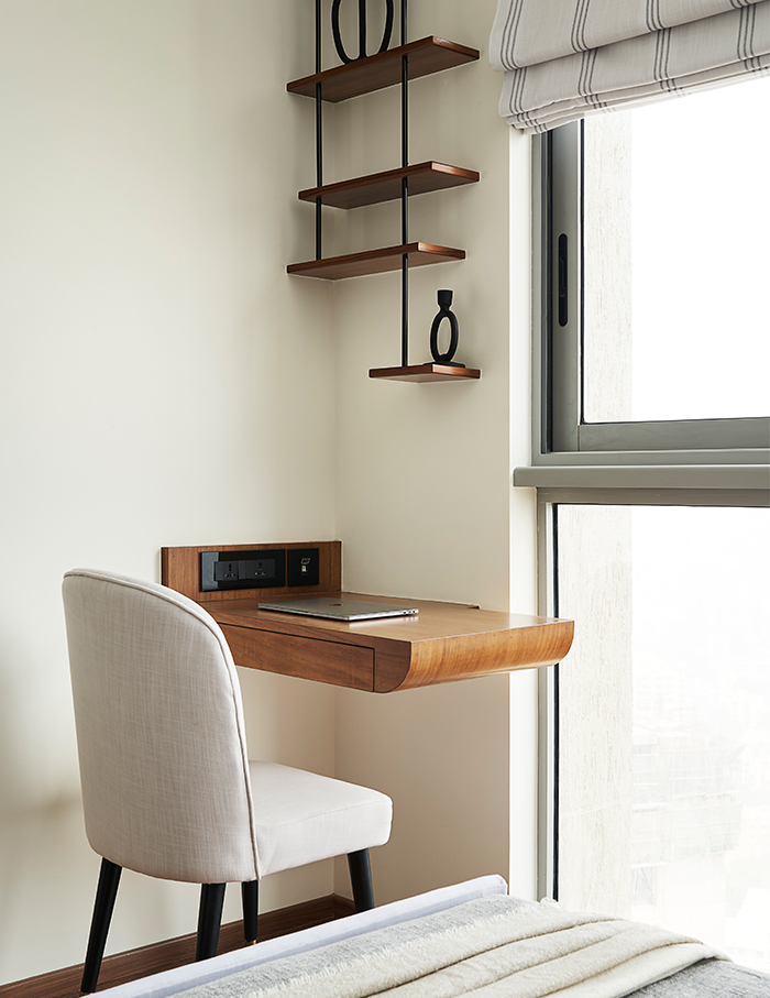
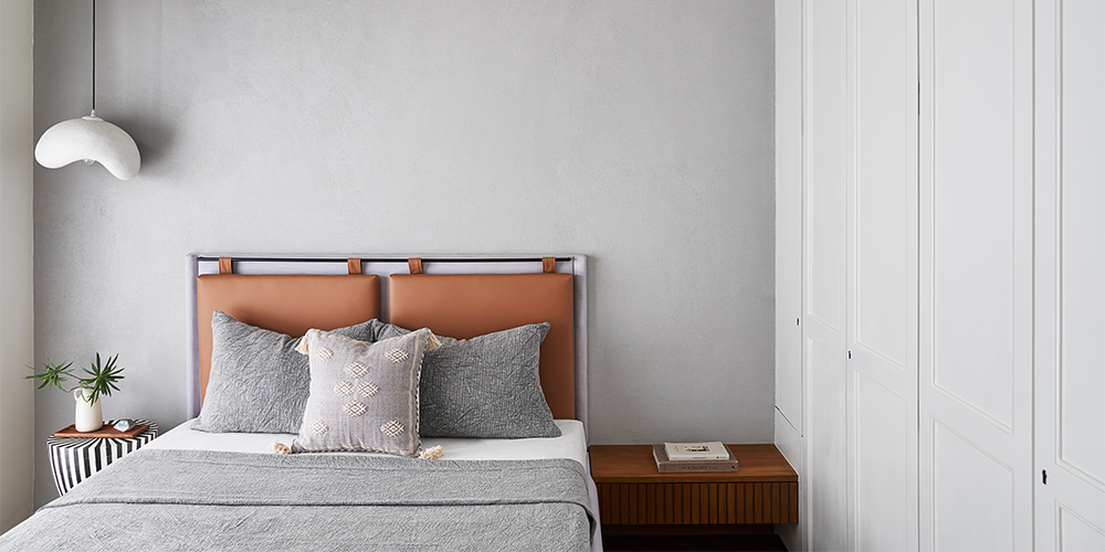
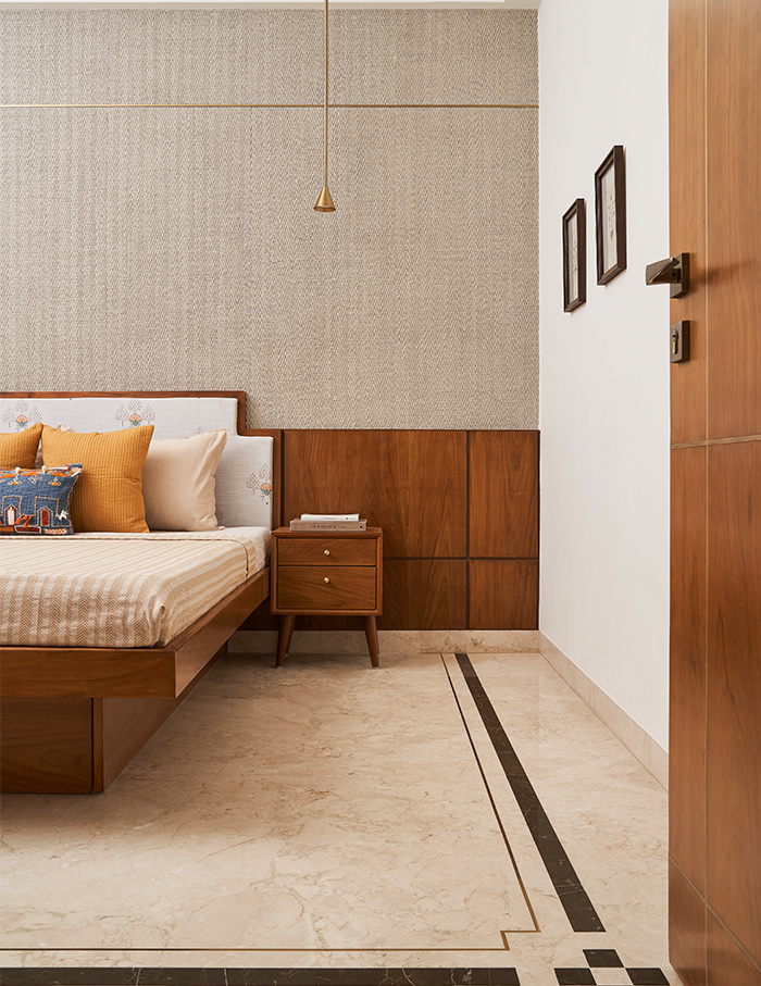
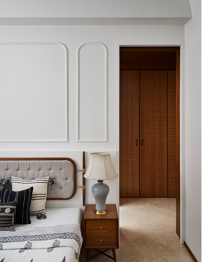
A sense of calm washes over one as they walk into the bedrooms. The materials and design elements come together to become the backdrop to everyday life, one that is defined by the aspirations of the very people who live here. The interior partitions between the primary bedroom and the daughters’ bedrooms have been reconfigured. Instead of one walk-in wardrobe that was originally intended, two have been eventually carved out.
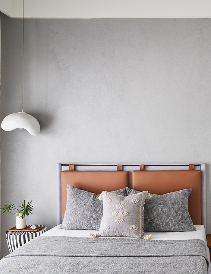
This home is yet another example of putting just enough inside a house where you can live comfortably but calmly. Every corner has been designed to create a family of features that reverberate throughout the apartment.
You may also read: Coastal lullaby — Flip through layers of light, monochromes and luxury in a Mumbai home crafted by Urban Studio

