Homes
How DIG Architects reimagines the classic vaulted ceiling in this Mumbai apartment
SEP 20, 2024 | By Ria Gupta
How do you take something simple, something that has recurred through generations past, and make it as unique as something never seen before? That is the question that pops in your head when you enter this Mumbai home, which stands like a sterile vision from the future built on anachronistic elements from the past.
The answer lies in the details, in the play of space, design, and elements of the 4,300 sq ft home called Vaulted Haus, designed by DIG Architects. When the owners – a family of four – expressed their desire for a home that was niche, minimalistic and social with fuss-free aesthetics, principal architects Amit Khanolkar and Advait Potnis with architects Fenil Gala, Esha Indulkar and Manasi Pawar decided to build its personality from scratch, turning to the bare shell structure for inspiration. “The theme of the house was thus based on its architectural interpretation. We decided to use vaults as the primary element, explored consistently throughout the space and uniquely complemented with other architectural elements,” says Amit.
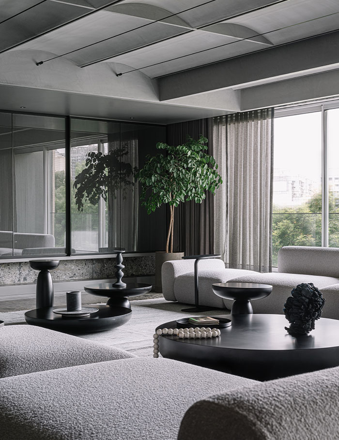
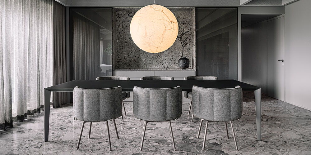
Vaults have been a common element in building architecture through generations, visible in the Gothic ribs of Parisian churches and iconic ceilings of the Pantheon. But its use in a limited metropolitan apartment immediately lends a breakaway aesthetic to the space. But that’s not where it ends. Opposing the vaulted ceiling is the Ceppo di Gré flooring. “This stone is used widely in building facades across Europe, but rarely seen in India. Its rugged personality adds a unique touch to the house,” says Advait, revealing how minimalistic design speaks volumes, all thanks to thoughtful curation.
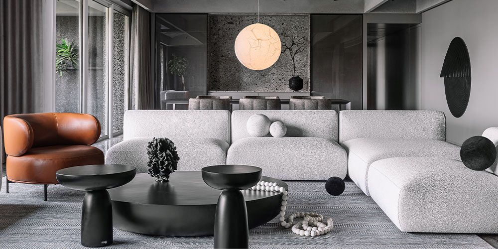
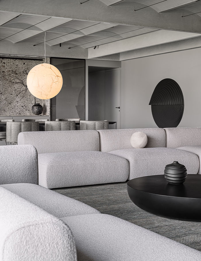
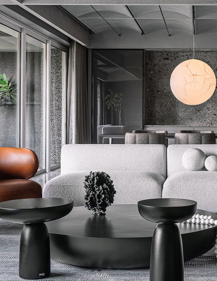
Just as the vaulted ceiling, the colour palette used was also tried and tested – a comforting monochrome scheme with minimal play of materials. But all these elements, combined with the structural rework of the house, resulted in a home that looks straight out of an AI-generated moodboard – unbelievable yet inviting.
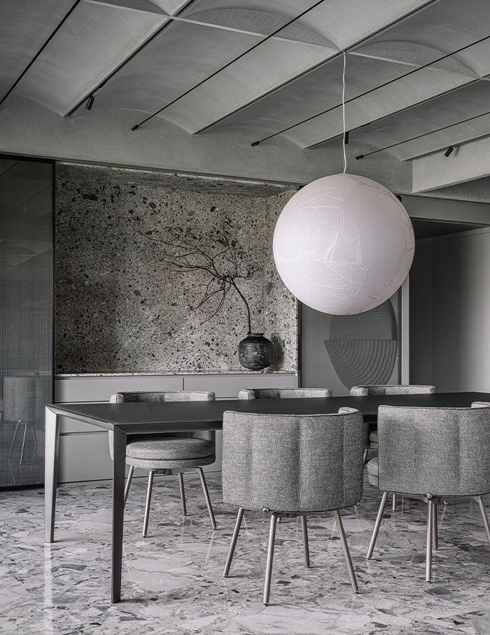
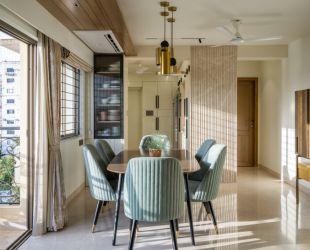
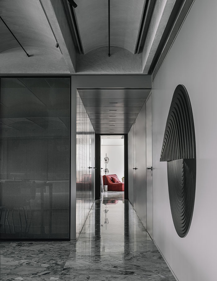
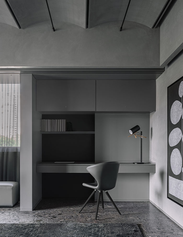
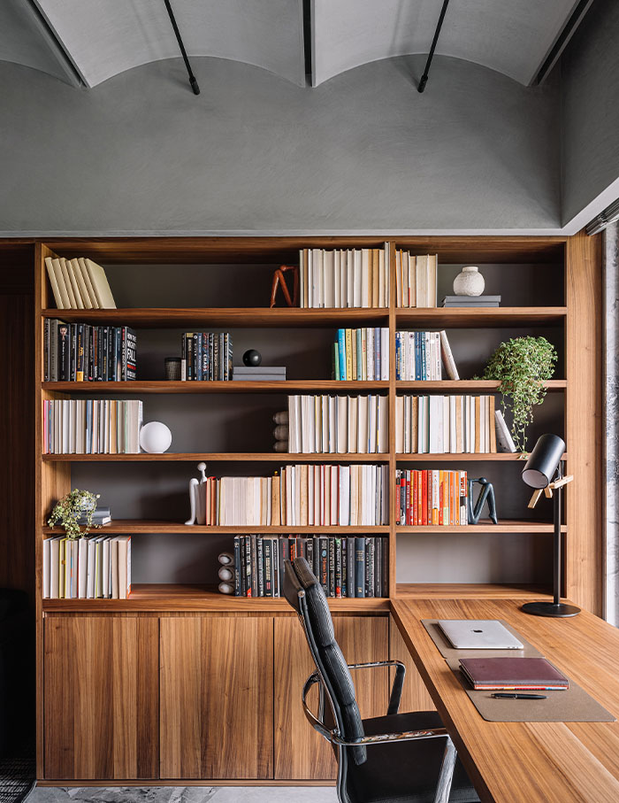
At the outset, you can’t tell that this used to be a five bedroom house. To accommodate the needs of the family, the space was repurposed to have four bedrooms, a study, a kitchen, a bar, and a walk-in wardrobe. The nucleus of the space is the open plan living and dining room – visible to the left upon entering the house and connected to the rooms through a corridor. With seating facing the dining table, this area opens room for mingling and communal dining.
“We think of a space in terms of volume, not fragments. Working with a larger idea and chopping it down to work at a micro level for consistent design satisfies our design philosophy,” says Advait when explaining the guiding philosophy behind designing the space.
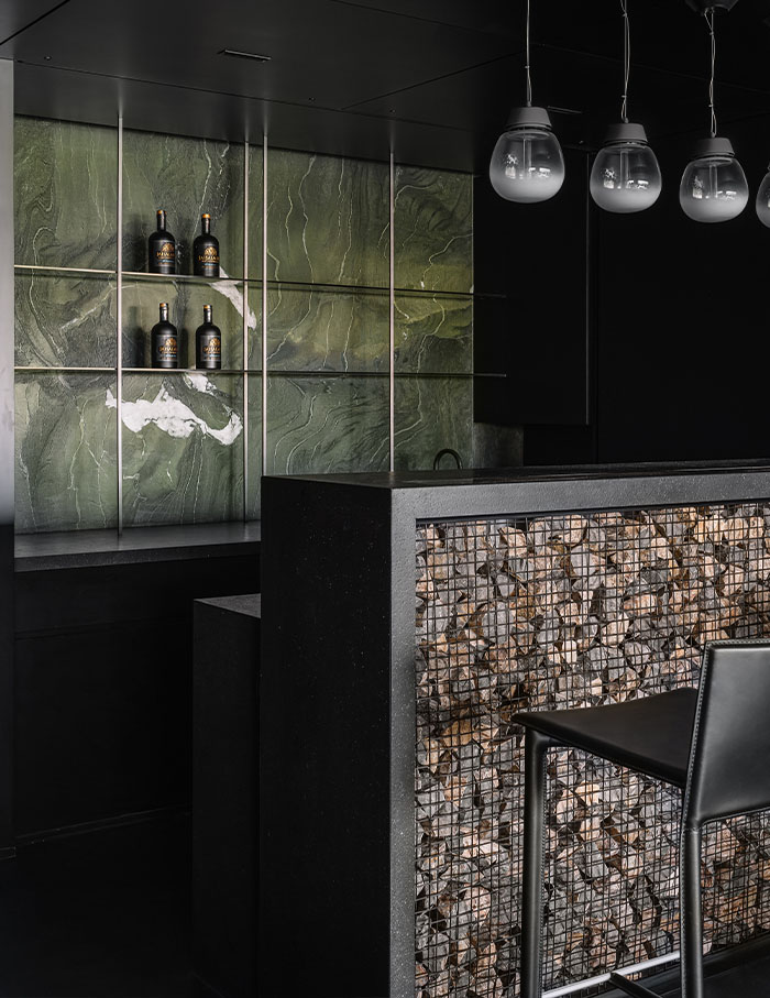
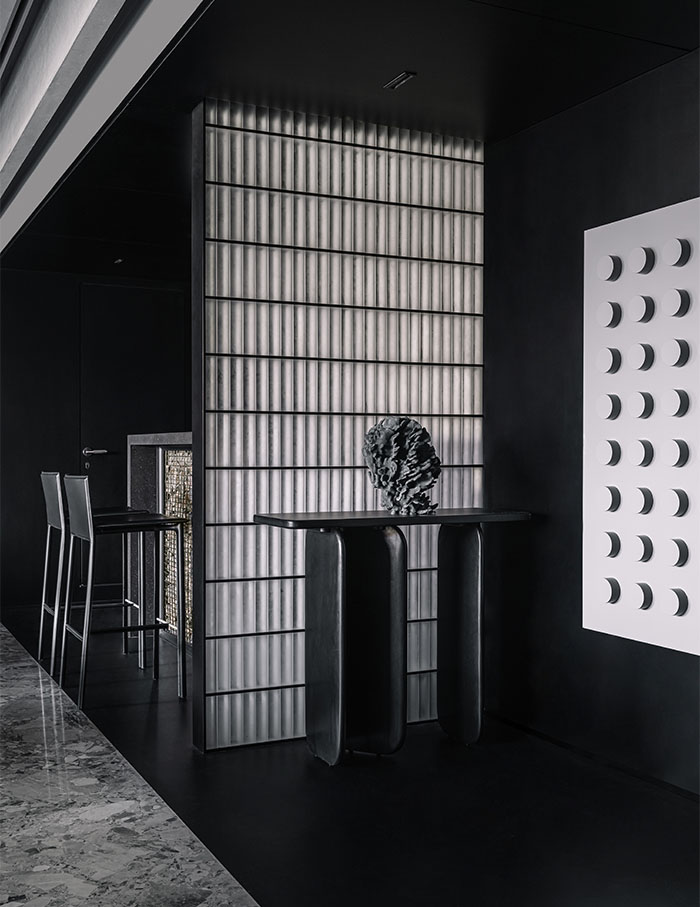
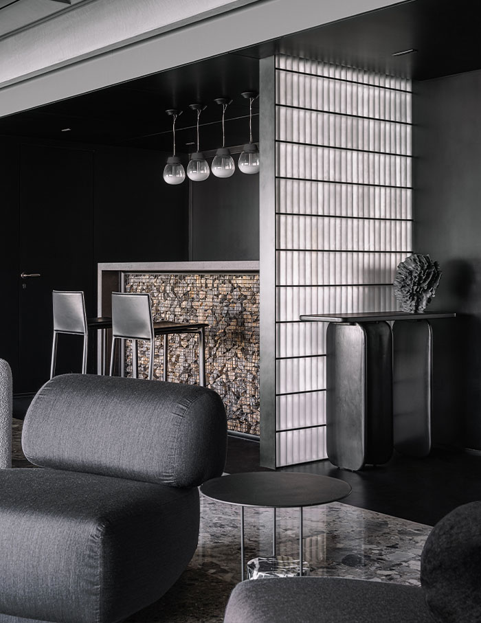
On the other side of the entrance, the bar is possibly the boldest manifestation of this concept. It takes shape as a massive black alcove stretching till the kitchen. Standing on black a ceramic floor, the bar itself is conceptualised as a gabion wall, made by trapping stones in a metal wire mesh. A frosted glass brick partition divides this black scoop from the main entrance. What seems like an intense space instantly lightens up from the refractive quality of this glass, creating a bold orchestra out of what could easily have been a mundane corner of dark colours.
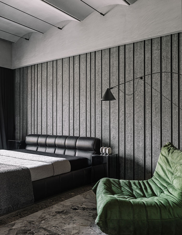
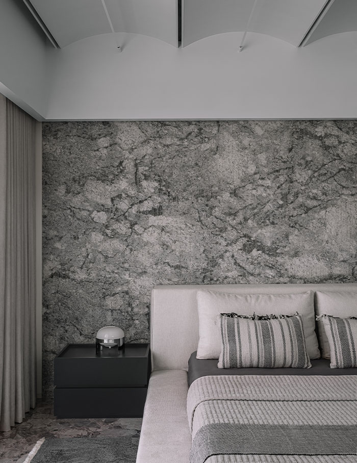
Among the rooms, the master bedroom and two rooms for the children take on unique characters. The grayscale in the son’s room, for instance, is broken by the splash of green in the form of a study table and tapestry. The headboard wall in the master bedroom is a combination of frosted glass bricks and grey veneer. But the glass bricks are illuminated with ambient lighting for a spin on the cool hues.
This layering, visible in various shapes and forms through the house, makes you believe one thing: that sometimes, divergent design is born out of the most conforming principles.
Scroll to see more glimpses of this home in Mumbai…
Read More