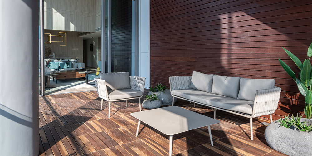
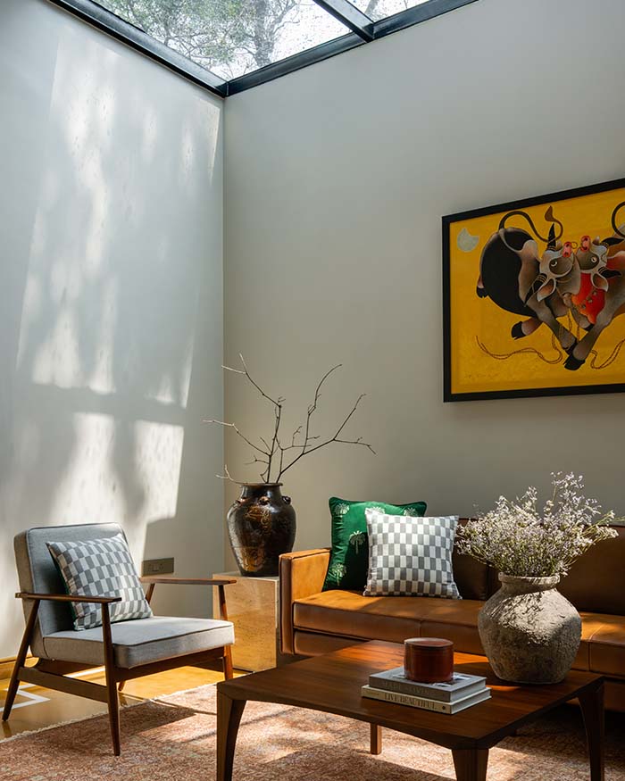
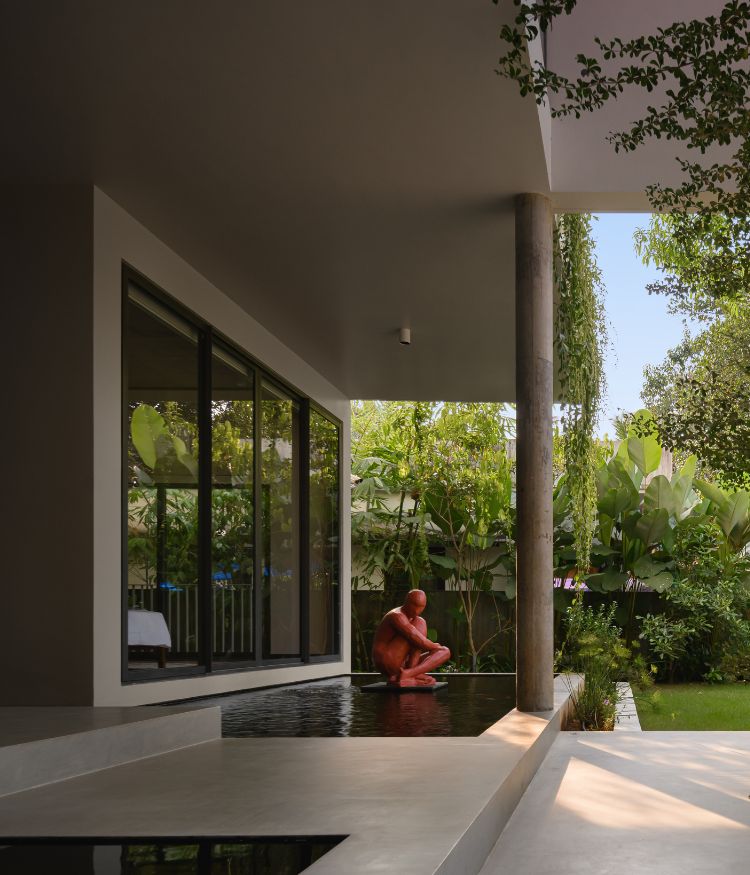
Abundant daylight streams in and illuminates this eighth floor residence in Ahmedabad, by Ego Designs, which overlooks the bustling cityscape.
This 3,200 sq ft apartment is realised as a simplistic space, where every element plays its part without dominating the other. It is planned in a linear manner with common spaces (living, dining and kitchen) closer together, while two long corridors on either side lead to the four bedrooms.
“Our clients, who are primarily based in Singapore, expressed a clear brief. They desired a minimalist, neat and clutter-free abode. So, we adopted a Scandinavian approach to ensure that the home radiates a pristine vibe with a hint of luxury,” shares the practice’s designer duo Sneha and Chirag Doshi.
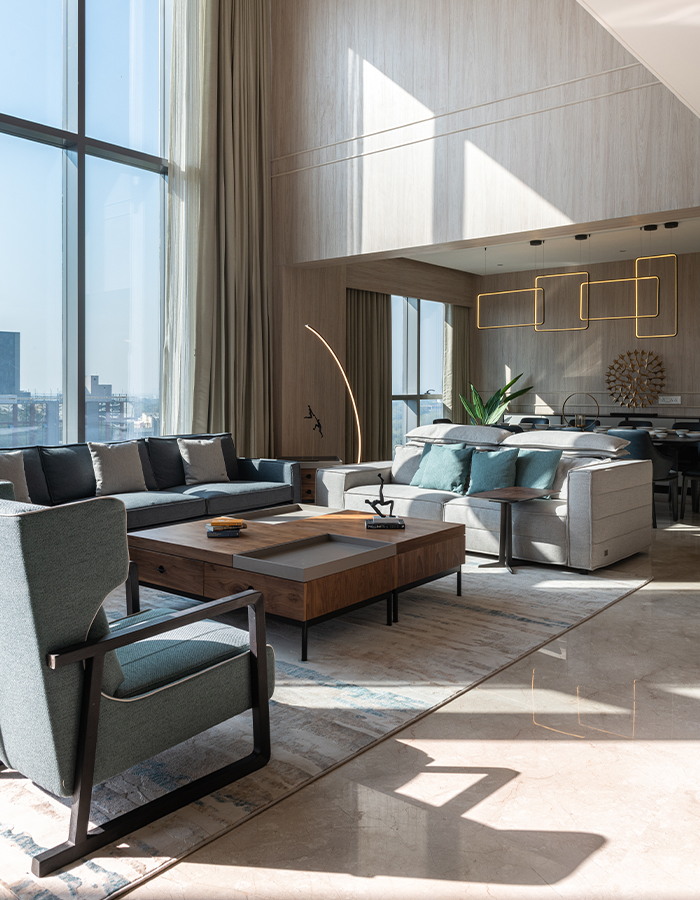
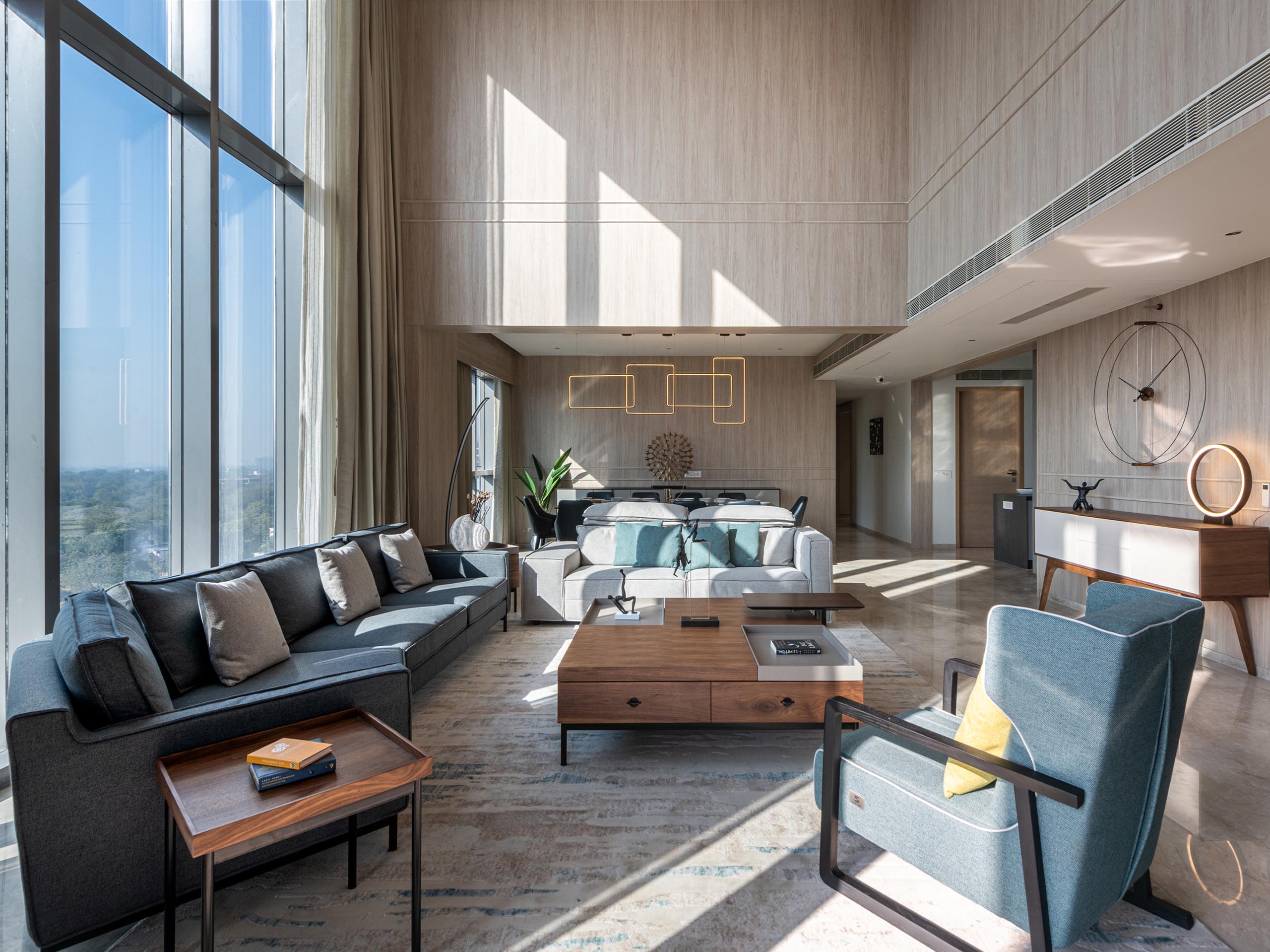
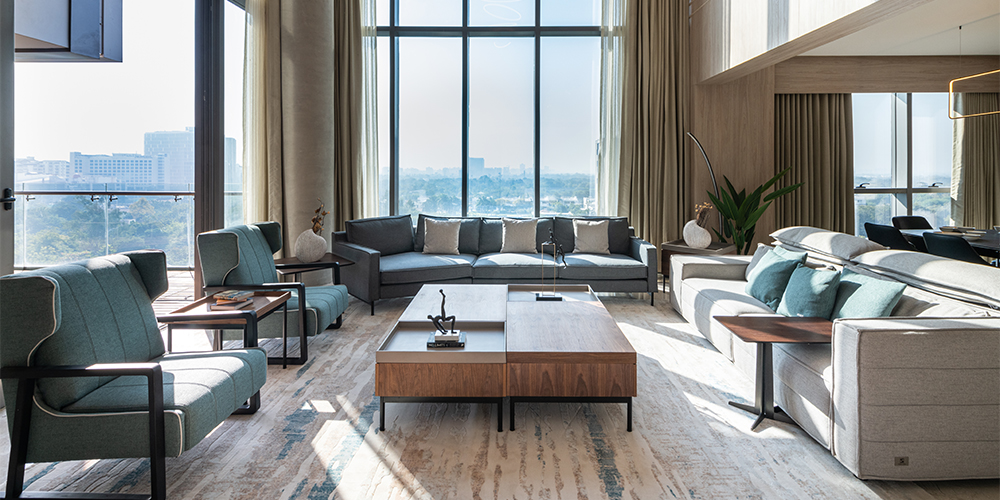
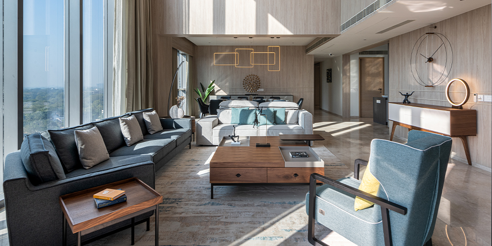
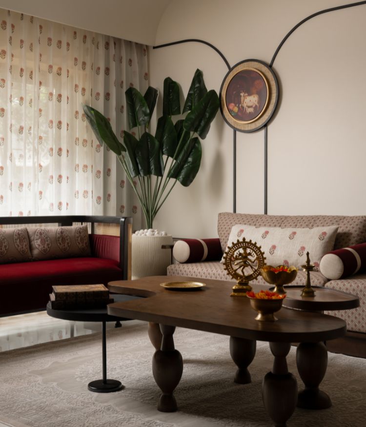
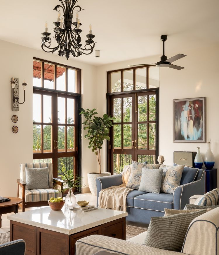
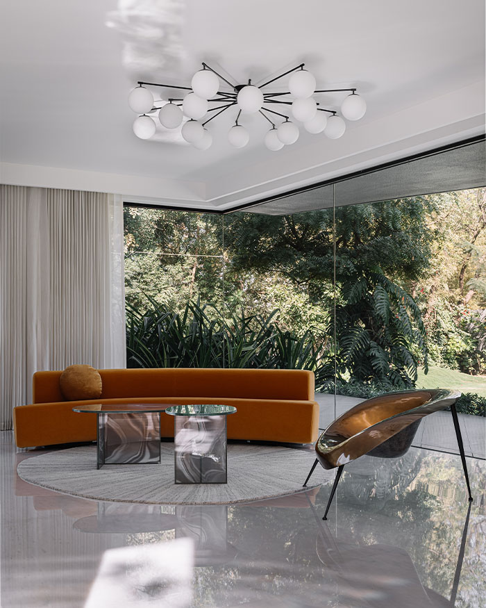
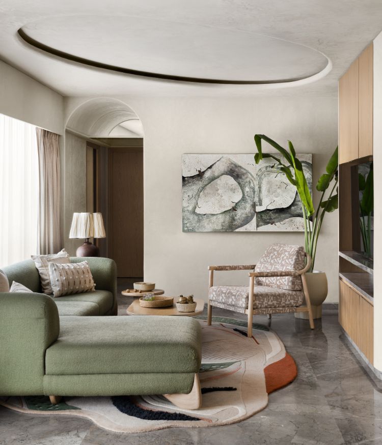
The home opens up to the voluminous living area that awes with its double-height grandeur and expansive, south-facing glass facade. This zone indulges in a neutral palette, highlighted with accents of soft pastel hues and sculptures.
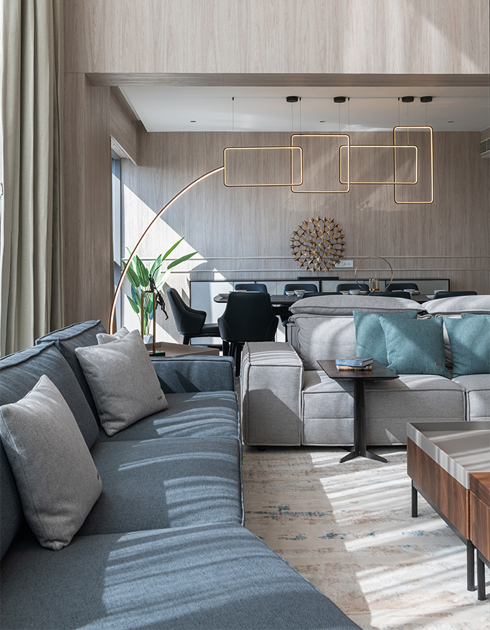
Undoubtedly a show-stealer, the living room witnesses white oak panelling, linen sheer curtains, an ensemble of sofas with textured fabrics and wooden furniture—all of which stand out against a beige Italian marble floor.

“This living area was the most challenging and exciting space to design. It’s south-facing, so we wanted the interiors to consume natural light instead of conflicting with it. We clad the double-height walls in light white oak panel with grooves and chose a neutral theme to enhance the space,” adds Chirag.

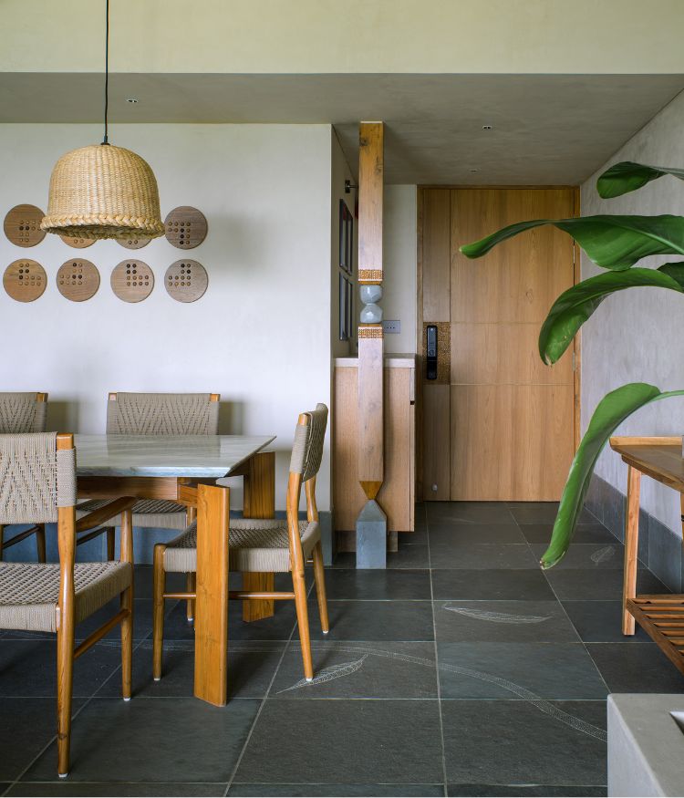
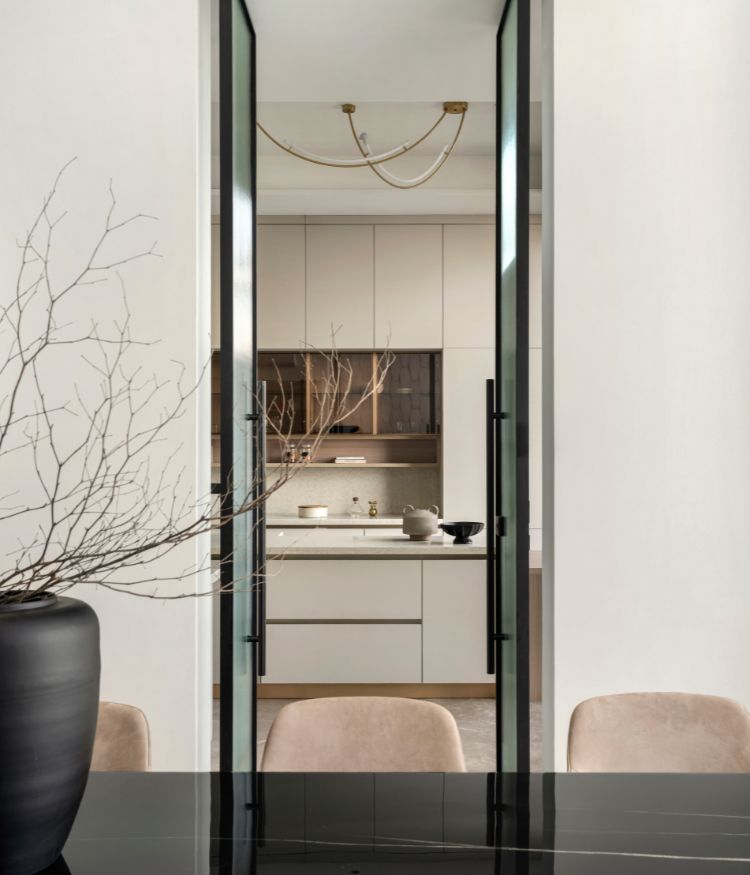
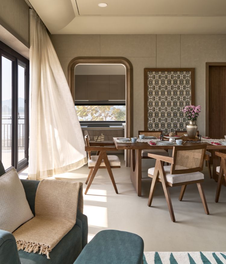
The dining and living zones are visually segregated with the help of a contrasting palette. A darker-hued ceramic dining tabletop is paired with blue leather-finished Nordic chairs and a sculptural artefact. Placed above is a geometric, four-piece pendant light. A similar theme of deeper greys continues in the kitchen with a Dekton countertop.

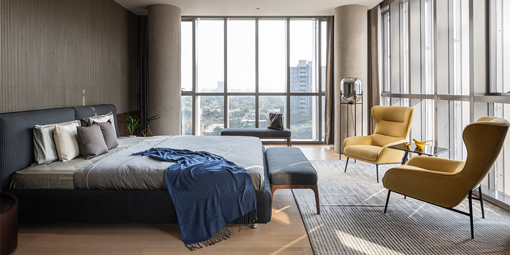
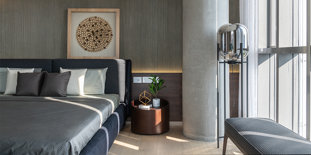
The master bedroom also boasts a south-facing glass facade. So, the darker grey tone is also used to wrap the space and counterbalance the light beige wooden floor. A fabric headboard offsets the elegant bed backdrop in fluted bison board, coated in varnish.

The second master bedroom uses hues that are on the other end of the spectrum. It observes a combination of vertically striped, birch ply-panelling backdrop with subtle furniture and furnishings. The thematic, geometric lines are seen in the accessories as well, including the carpet and pendant light. These create a dynamic essence in the otherwise subdued palette and pattern of the room.

The other two rooms are planned for guests. These are rendered in a cosy and cushy vibe, owing to their wood-panelled walls and decor. Accompanying the timber is the presence of concrete finish and super-matte laminate—both of which are embellished with artworks, draped in vibrant bed covers and given planters for freshness.

Matching the overall material palette of the home are hues such as light ivories, beige, greys and muted tones in turquoise, green and blue. A mix of geometry, surface treatments and quality finishes add a hint of luxury to this minimally curated home.

“We don’t usually indulge in too many ideas within one space and that is how we bring integrity to designs. Here, the central idea revolved around minimalism and sophistication, and we are glad that our clients got what they desired,” concludes Sneha.

