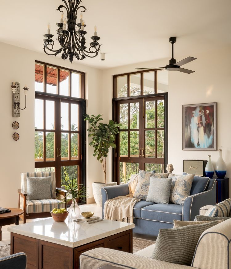
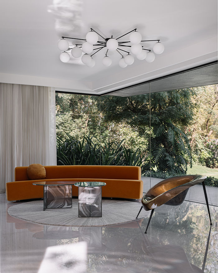
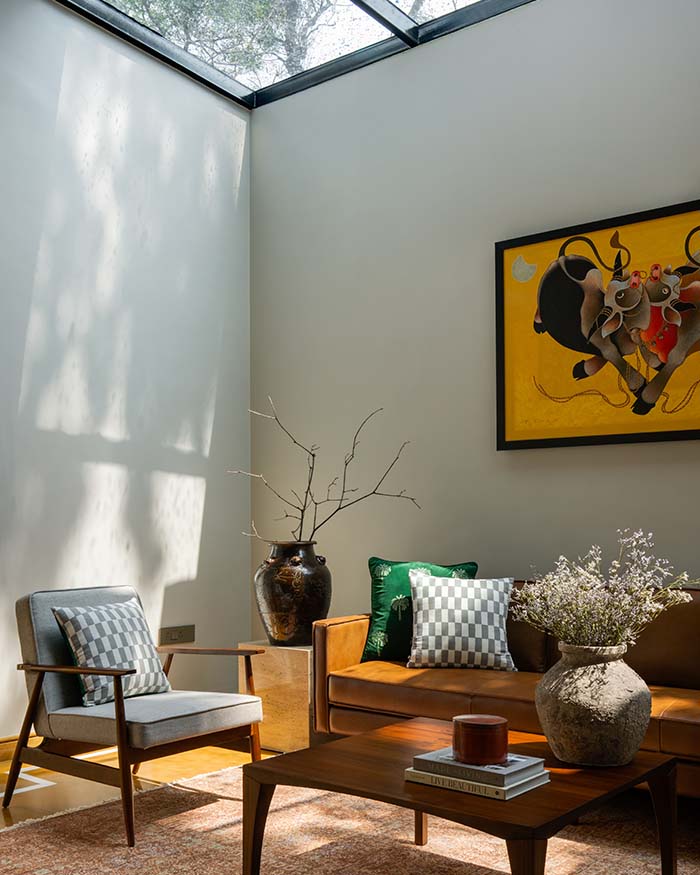
Clever layering and a mixture of opposing textures form the key aesthetic of this 1,800 sq ft Mumbai home designed by MuseLAB for a family of three, with warm minimal tones that bring a respite from the din of the city.
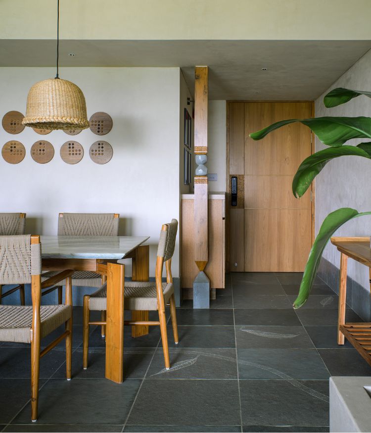
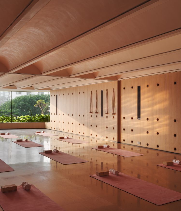
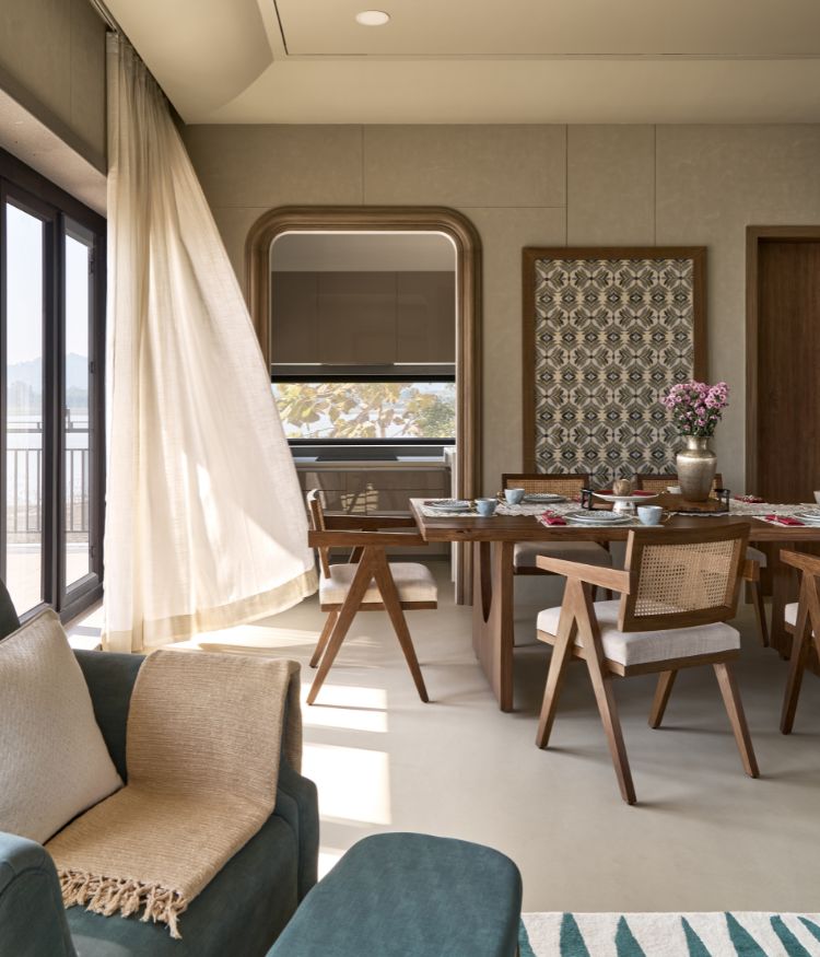
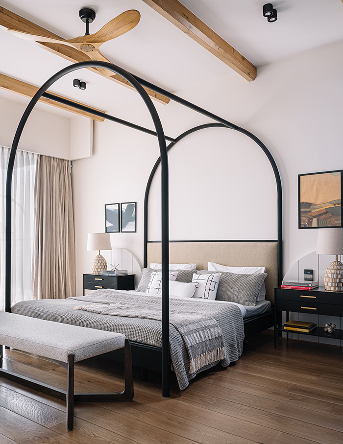
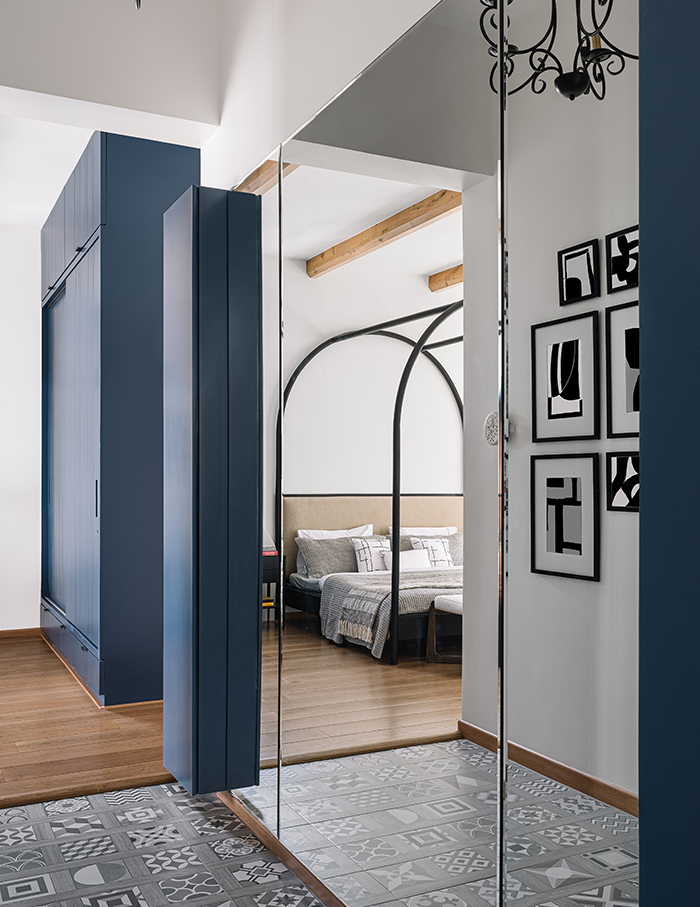
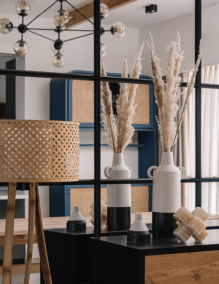
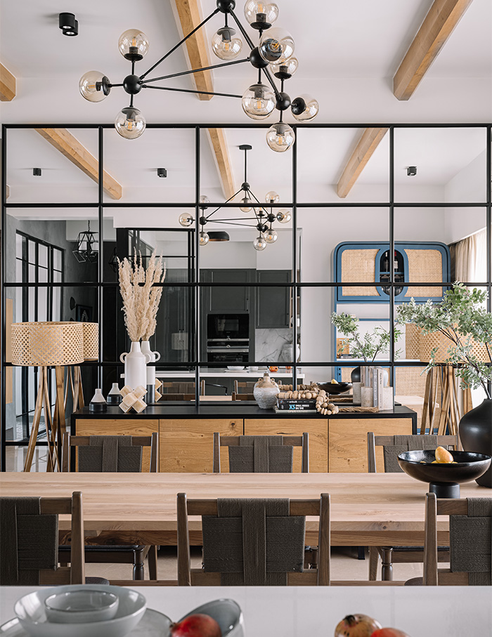
The dark oak rafters line the ceiling of the living and bedroom spaces neatly and cleverly . Knotty oak doors with wooden furniture and leather upholstery play a delicate balance with choice hints of colour, horizontal stone countertops, sliding glass shutters in matte black aluminium frames, and a dining space bookended with mirror panelling for added light and depth. A measured use of patterned tiles, whitewashed walls and concrete finishes mixed with a contemporary industrial feel and a classical traditional woodsy touch. All of this forms a cool combination of textures and layers.
A romantic “rustic-modern” brief
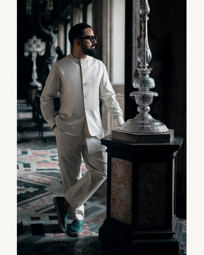
Designed by décor firm MuseLAB, this project, code-named Tango Dreams, is a labour of love between co-founders Huzefa Rangwala and Jasem Pirani along with project lead Aishwarya Lakhani and designer Batul Paryani. Located in a quiet decade-old standalone building in a leafy and very residential eastern suburb of Mumbai, this apartment is home to a small family of three, Aditya Raju and Kumudini Sagi and their five-year-old daughter. “When this project came to us, Aditya (who went to boarding school with me) and Kumudini were living in the US and looking to move to Mumbai,” explains Pirani. This was bang in the middle of the first and second wave of the pandemic, and all the ideation happened over Zoom calls. “The brief given to us was modern rustic – modern for the clean, straight lines, and rustic for the textures and warm tones,” adds Pirani.
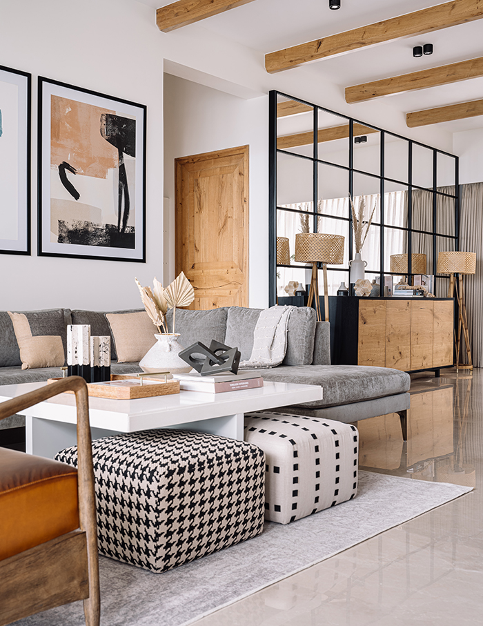
Sagi, a classically trained ayurvedic physician and a public health graduate from University of South Florida, wanted a simple, light, airy, earthy home that was also functional and modern with a muted colour palette and light tones. With some intervention from MuseLAB, Sagi’s shades were eventually supplemented by additional accents of warm wood, darker finishes and concrete textures mixed with metal and glass that add depth and dimension to the space.
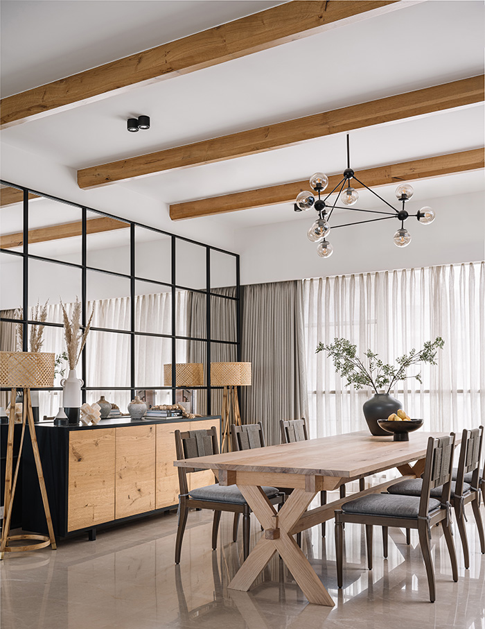
Fluid spaces, functionality & visual connections
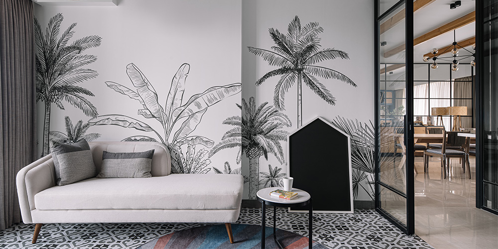
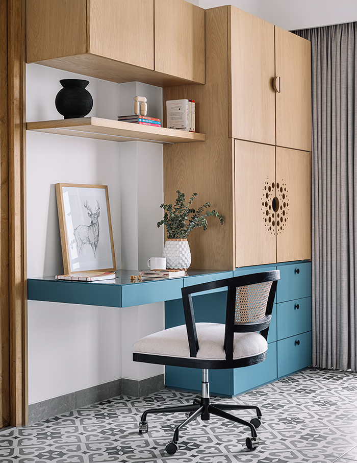
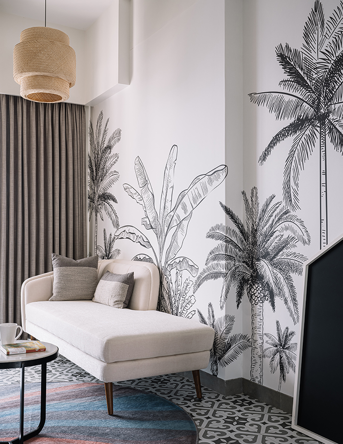
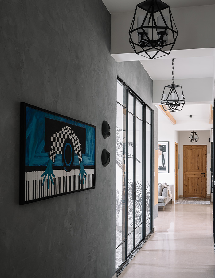
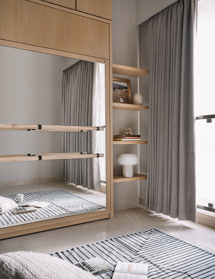
The entry to the home is through a foyer-like corridor that has been flanked with a kitchen on one side and the study across from it, which allows for better visual connection throughout the space. At the very heart of this house is the playroom-cum-study with its monochromatic wallpaper, located across the partially open kitchen that is anchored to one side of the dining and living space. While the two other bedrooms belong to the couple and their daughter, the fourth is a guest bedroom with a pull-out Murphy bed that also doubles up as a space for yoga, meditation and ballet lessons.
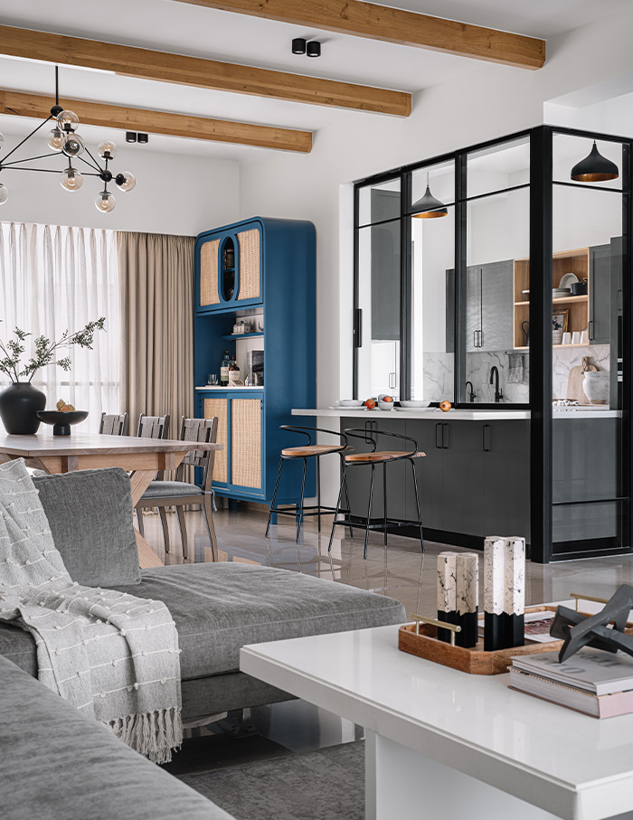
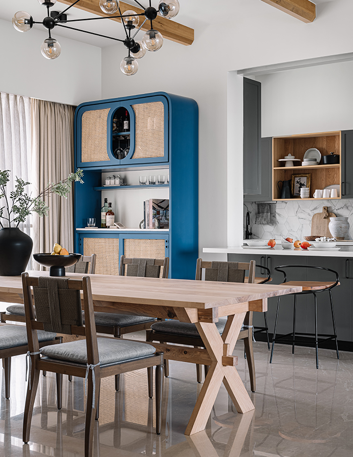
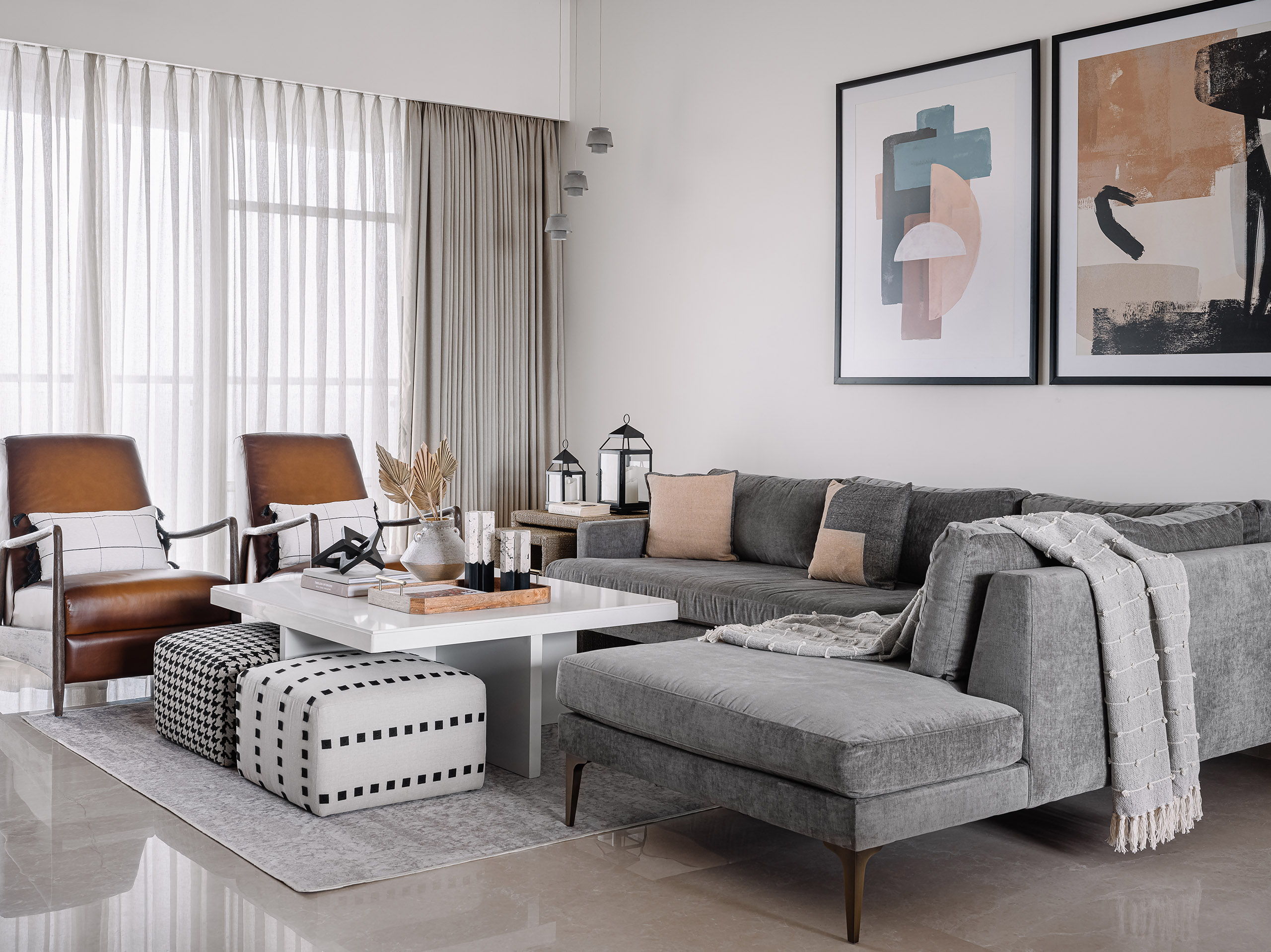
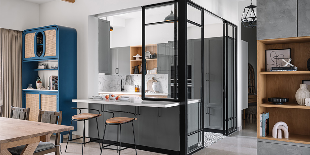
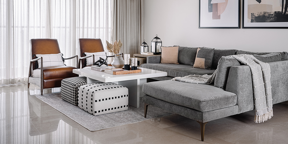
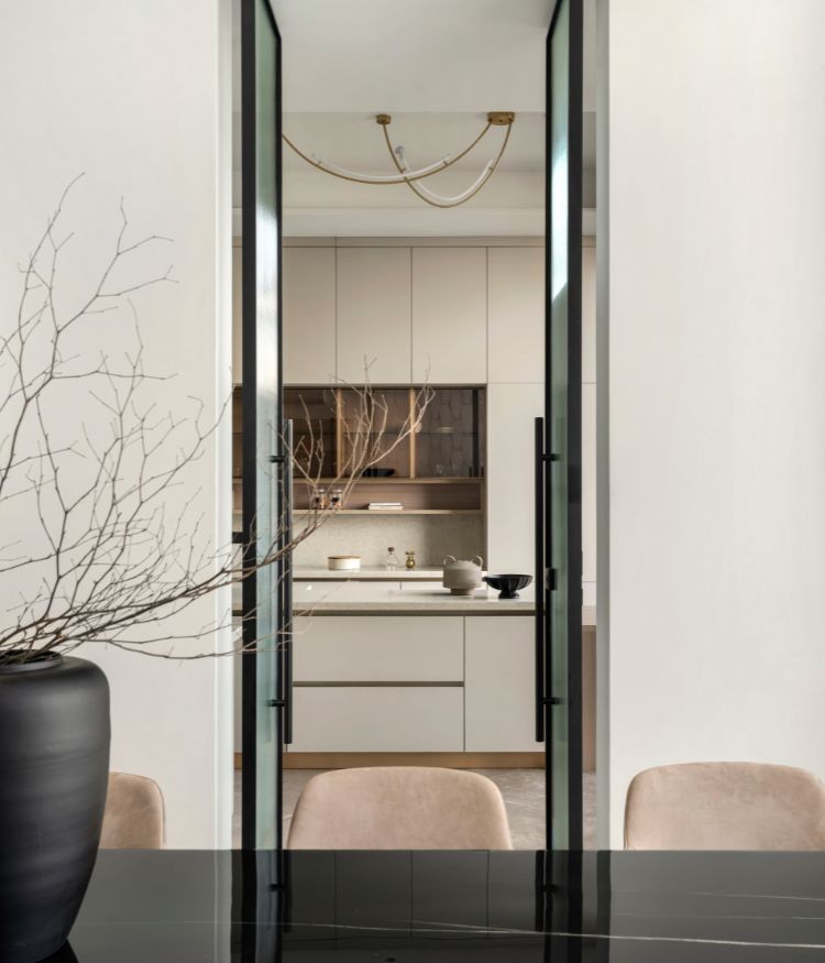
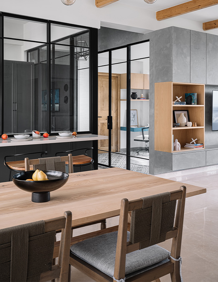
Functionality and versatility lie at the core of this space. For one, an automation consultant helped with the automation of lights, curtains and air-conditioning. Additionally, optimal storage space that reduced clutter on the eye was a priority for everyone involved in this project, which is why the living room cabinetry was finished with a concrete textured paint to make it look like part of the wall. Most importantly, the homeowners wished for a fluid social space between the family room, kitchen and dining area that felt connected but also discreet. “It allows us to do different things within our home and stay connected at the same time,” smiles Sagi. “MuseLAB cleverly designed our space with sliding glass partitions that were functional and elegant.” MuseLAB’s goal in turn was to create a connection between the public spaces and expand visual and sensorial contact within the whole home.
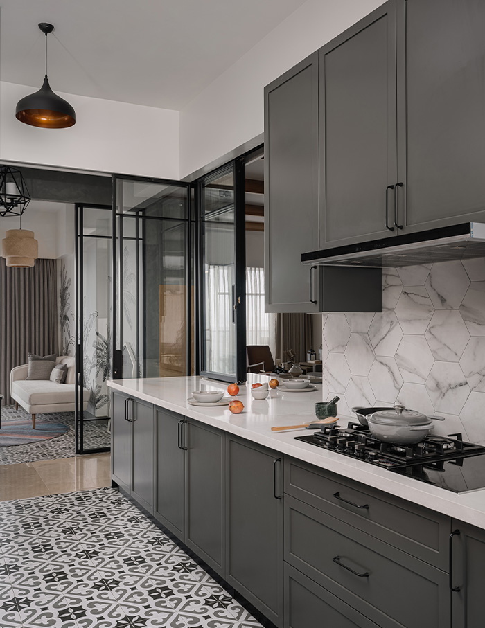
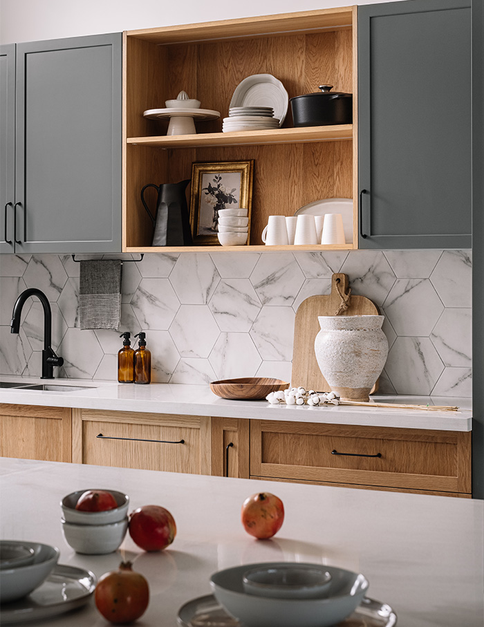
As the mother-daughter duo love to bake together, the warm vanilla scents of beaten butter and sugar wafting from the kitchen across the home on most days. Not surprisingly, the kitchen and dining areas were at the forefront of most conversations between Sagi and MuseLAB and ultimately became the favourite spaces for both parties. “You will most often find me in my beautiful kitchen experimenting with new recipes with my five-year- old,” says Sagi. It is deliberately designed for shared experiences – where the kitchen counter extends into a breakfast bar and the spicy smells of everyday Indian cooking can be concealed with sliding glass shutters when needed.
Reuse, refurbish, recycle
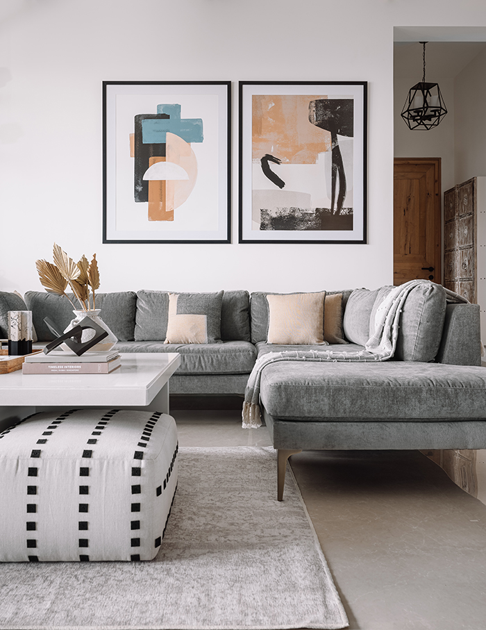
Sustainability was another key factor for the design team at MuseLAB and homeowners alike. “To start with, the design team did a great job in selecting affordable, yet high-end furniture, curtains, rugs, artwork and lighting to beautify our home,” says Sagi. Apart from that, the home came to the couple with marble flooring, complete bathrooms and built-in wardrobes, all in good condition. “There was no point in demolishing those, so we gave them a new lease of life by changing the finish on the shutters from a laminate to an MDF with a duco finish and updating some hardware for smooth functioning,” explains Rangwala. “We also retained the flooring in most places besides the kitchen and the study/playroom. Here we went in for patterned tiles to add some visual texture.” What’s more, while a large part of the apartment was furnished afresh, a few choice pieces of furniture – like the living room sofa, armchairs and bedroom armchairs – were shipped across from the owners’ home in the US along with their other belongings and put to good use right here.
When pink won
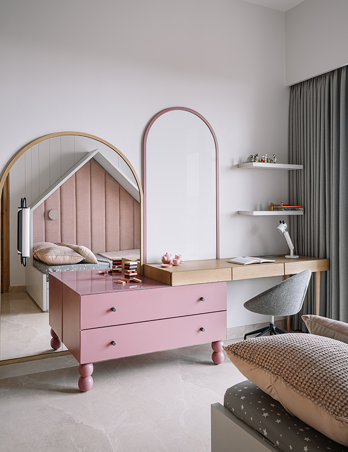
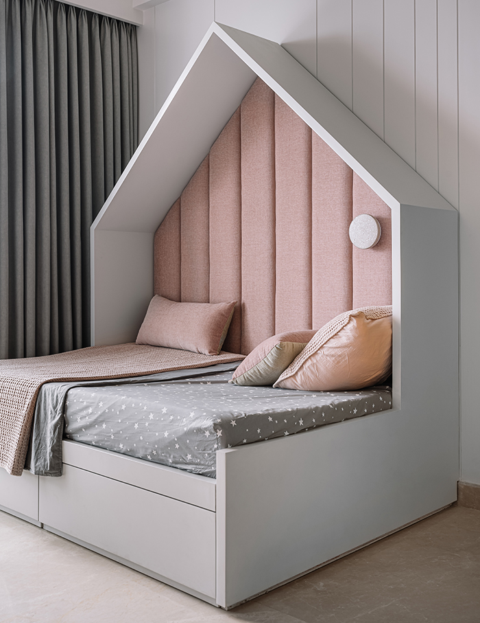
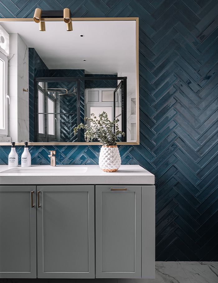
With clients who were wary of using colours, MuseLAB kept the palette natural, painted the walls linen white and let the veneers be the hero. Since the built-in wardrobes within the bedrooms were visually heavy, the MuseLAB team used this opportunity to sneak in a dash of blues and greens to tone it down. The colour palette overall is earthy, highlighting the wooden veneer tones of the doors and the rafters in the living spaces, dining spaces and the master bedroom. There are shades of grey, black, blue and green used in most spaces. Tones of pink pastels feature within the daughter’s bedroom, for which MuseLAB collaborated with the five-year-old, so much so that she happily transitioned from co- sleeping in the family bed to sleeping on her own bed in her own new bedroom.
Scroll down to see more glimpses of this home.
You may also like: This Ahmedabad home designed by Adhwa Architects is one with nature

