We spend a large amount of our lives with our jobs making it ever so necessary that our offices are thoughtfully designed to cater us. They should spark inspiration and at the same time welcome you to an occasional pause. They should be a catalyst for productivity and at the end of the day make you feel like your own boss. Breaking free from standard conventions, these unique office interiors show how work can be done just right.
Aromasphere by The Works Interiors
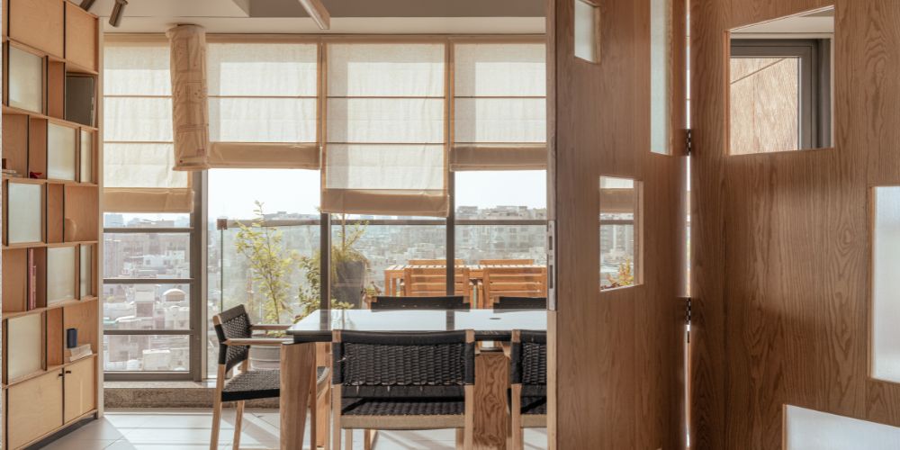
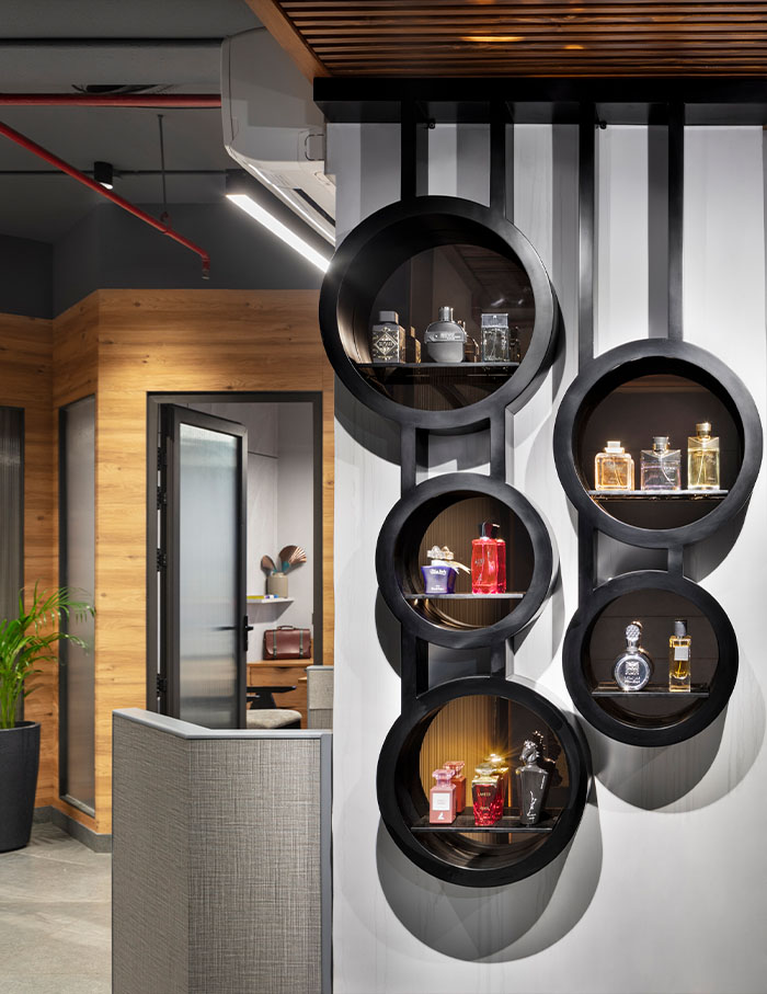
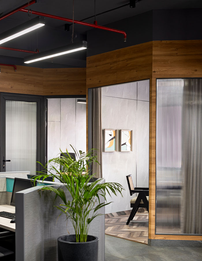
This perfume company’s office embodies straightforward design, simple shapes and subtle elegance. A testament to the innovative spirit of ‘Aroma-Sphere,’ creative director Devika Khosla aimed to create a space that embodies the essence of their business—transparency, beauty, and a deep connection with nature. But what’s the point of a beautiful space if it is not functional? Angular partitions are designed to optimise functionality, providing privacy where needed without sacrificing connectivity: as one navigates through the office, the angular partitions guide the path, clearly delineating zones while maintaining an open and spacious feel.
A cultural boutique by Alara Studio
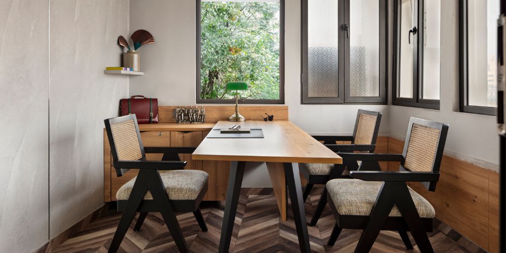
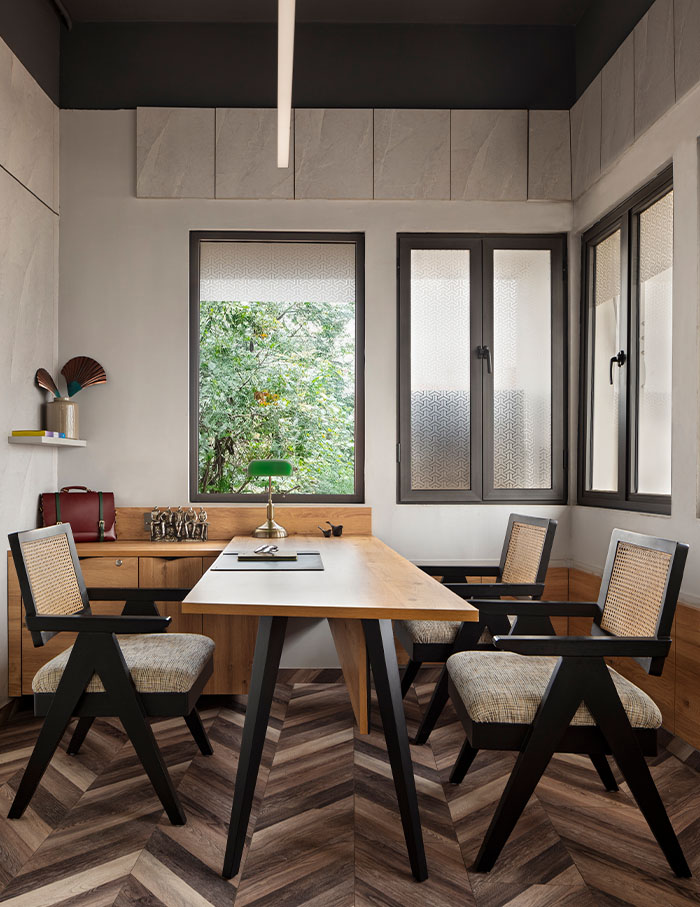
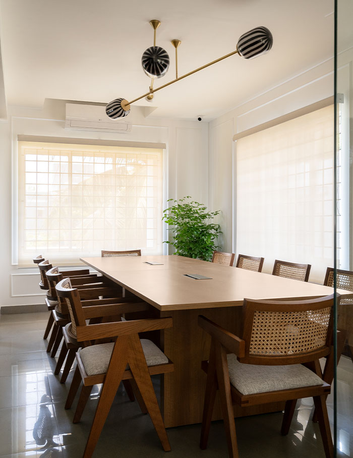
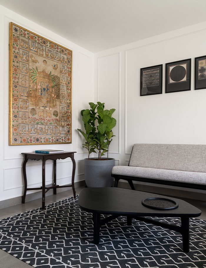
With a larger-than-life grandeur, Alara Studio is keeping up with the cosmopolitan air that it is surrounded by. Located in Chennai, this office is the epitome of less-is-more. Light pours through the vast space and creates an elegant dance on the white wainscoted walls. In the conference room artisanal Chandigarh chairs bring in an old-school charisma, making a delightful combination with the blown-glass lamp designed by Arjun Rathi that is the ultimate eye-candy. Amrita Thomas has created nothing short of magic here as she pays homage to true craftsmanship, through the vintage Pichwai Art to cotton kilms handmade with Jaipur Rugs to her new East-african inspired furniture collection.
Office Of Hues by Akshat Bindal Design
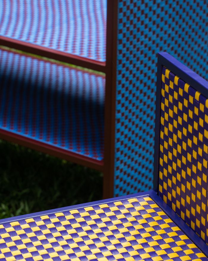
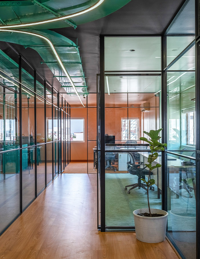
In a world celebrating neutral palettes, this space heroes vibrant hues, adamant to prove that colour should not be feared. The aim was to transform the client’s vision into a vibrant and distinctive office environment by introducing colour as a primary highlight with an identity of its own. Each cabin is distinguished by a unique colour scheme, fostering easy identification and contributing to the dynamic energy within the workspace. These hues are meticulously integrated into elements such as acoustic panels, carpets, and air conditioning units.
The great walls of Tetris by Studio AVP
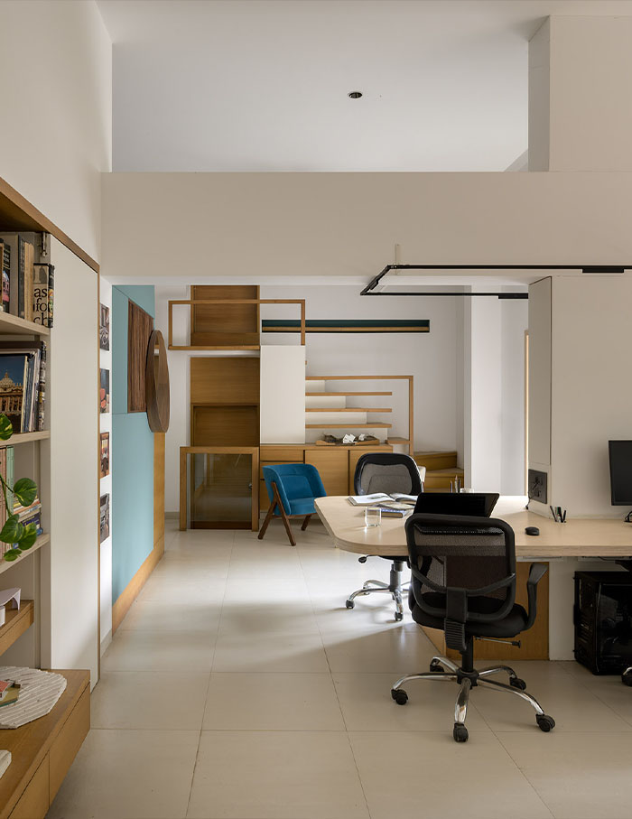
A clear exhibition of structure epitomises the design of Studio AVP located in Pune, as the interior architecture takes on a full-time role of cubism. The walls seem to be in motion as they’re built with varying depths and dimensions, whilst the birch plywood desk glides across the main working area, making it far too easy for chatterboxes like myself. There are art-nouveau subtleties as furniture with sinuous lines are incorporated alongside a turquoise wrought iron door that has intricate depictions of the natural world. From stone-concrete flooring to jesmonite-flexi plywood walls, Vikrant Panse’s unrestrained exploration of materials and forms feels radically innovative.
An ‘oasis’ of colours, by Concepture Studios
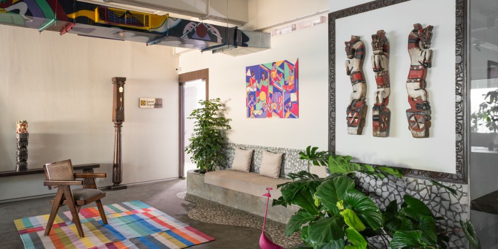
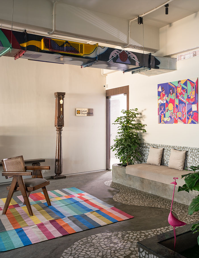
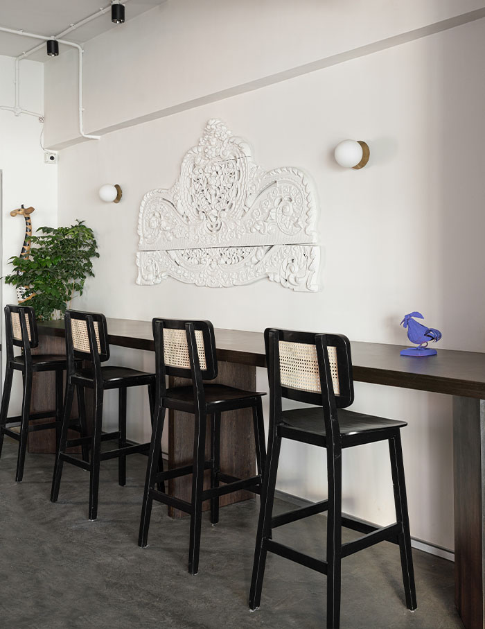
When your office looks like this, work feels less like work and more like play. Within the narrow lanes of Mumbai lies this bright and bashful studio designed by architects Kirthi Pillai, Amal Nair and Yash Shetty. Concepture Studios has infused its artistic identity into the interior architecture with graphically retro painted vents and walls that make the perfect backdrop for the dark-hued furniture that stretches all over. As pools of inlaid stone slip into the board-washed concrete floors, funky chairs and tall foliage engrain this open space with an exuberance. Abstract art meets the craft of antique here – and it is exhilarating.
Minimal and methodic by Studio Gasp
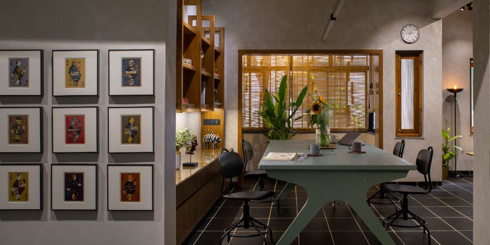
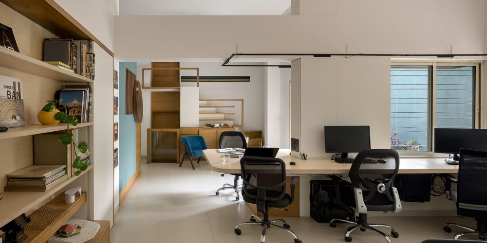
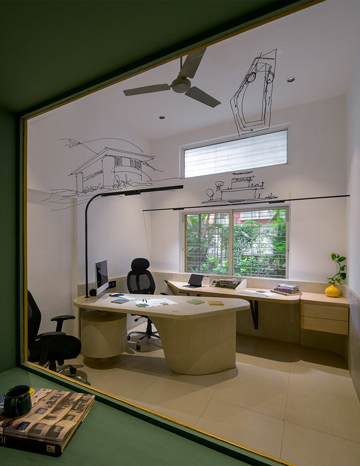
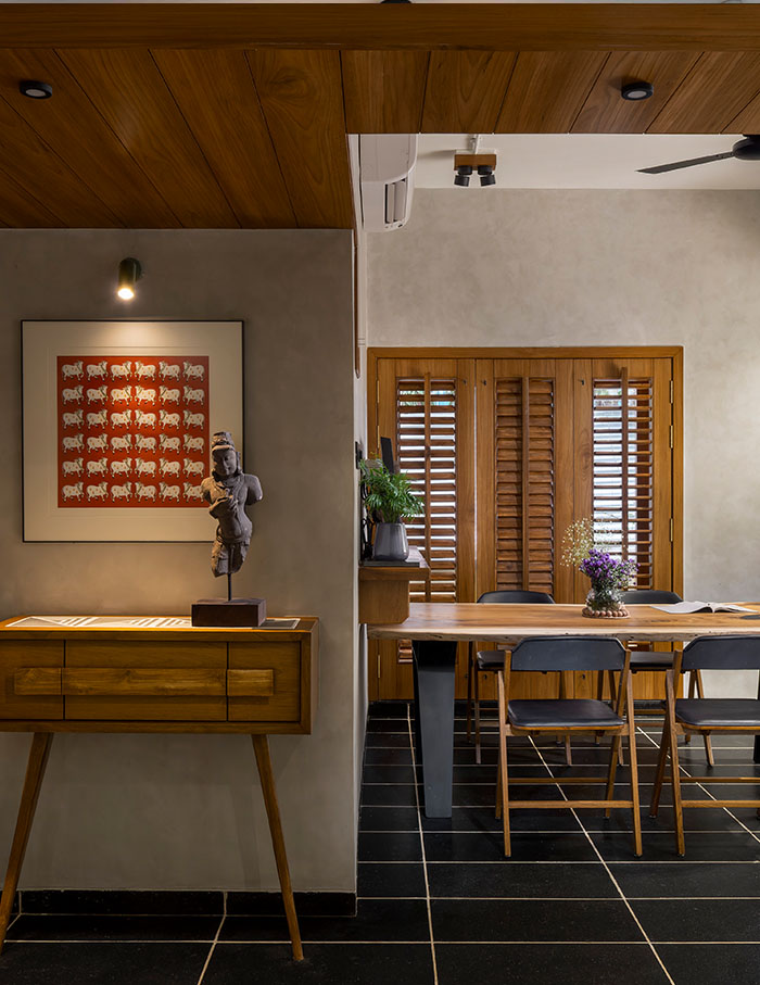
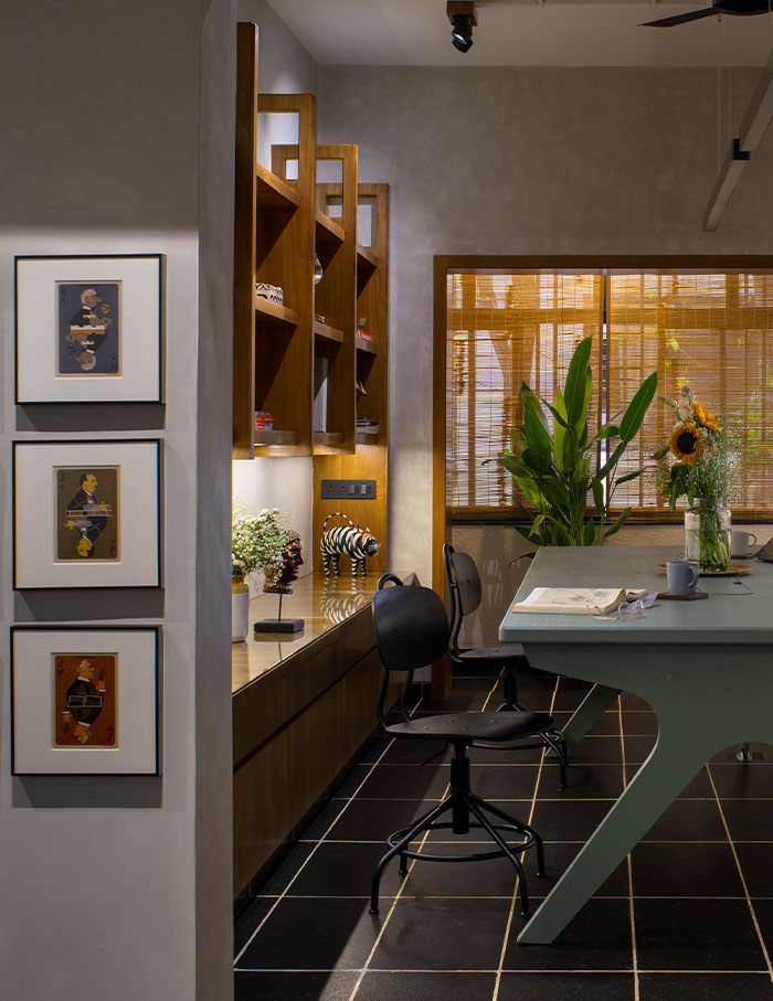
If you are the Marie Kondo type, then this office will certainly spark a wholesome joy within you. This former residential studio in Pune has been quietly transformed into a 980 sq ft brutalist haven by Gargi Kulkarni Pherwani and Sahil Pherwani for Studio Gasp. With eclectic art thoughtfully positioned and furniture with sleek-tapered legs, this studio is a bow to the mid-century modernist era. Or vice versa. There is a rhythm of organised simplicity with vertical ceilings and grid-tiled flooring. The comforting warmth of the wood sits within the earthy tones of the space, creating an environment that feels good for your soul.
A golden ratio between aesthetics by Mulled Spaces
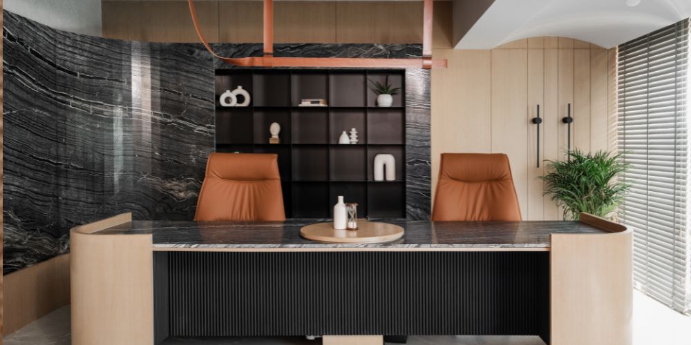
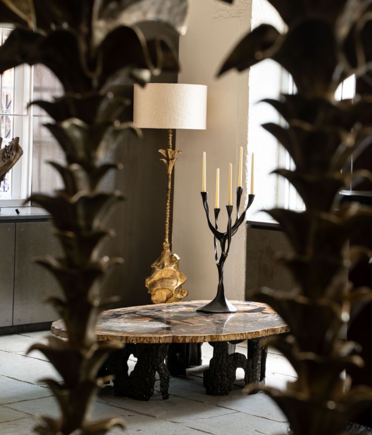
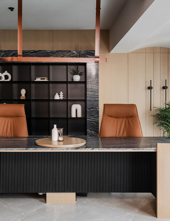
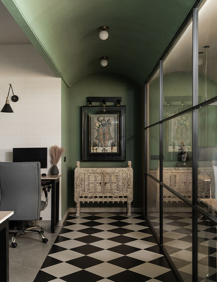
Treading the line between neoclassical antiquity and new-age glamour, Mulled Spaces has designed a palatial office in Ahmedabad. One can sense echoes of ancient architecture as marble-clad floors and screens meet with scooping arches and pristine gold accents. Whilst the Scandinavian-inspired decorative elements and sculptural furniture serve as the holy grail cues of a pared-back design. Udit Padhiar, Rajvi Dave, Anand Banerjee, and Dhruv Jasoliya have certainly hit the mark with proportions as they embrace crittal doors that are most generous to the sunlight, alongside ribbed wall panelling and concealed curtain tracks that amplify scale and light even more.
A tropical retreat in the city by Studio Camarada
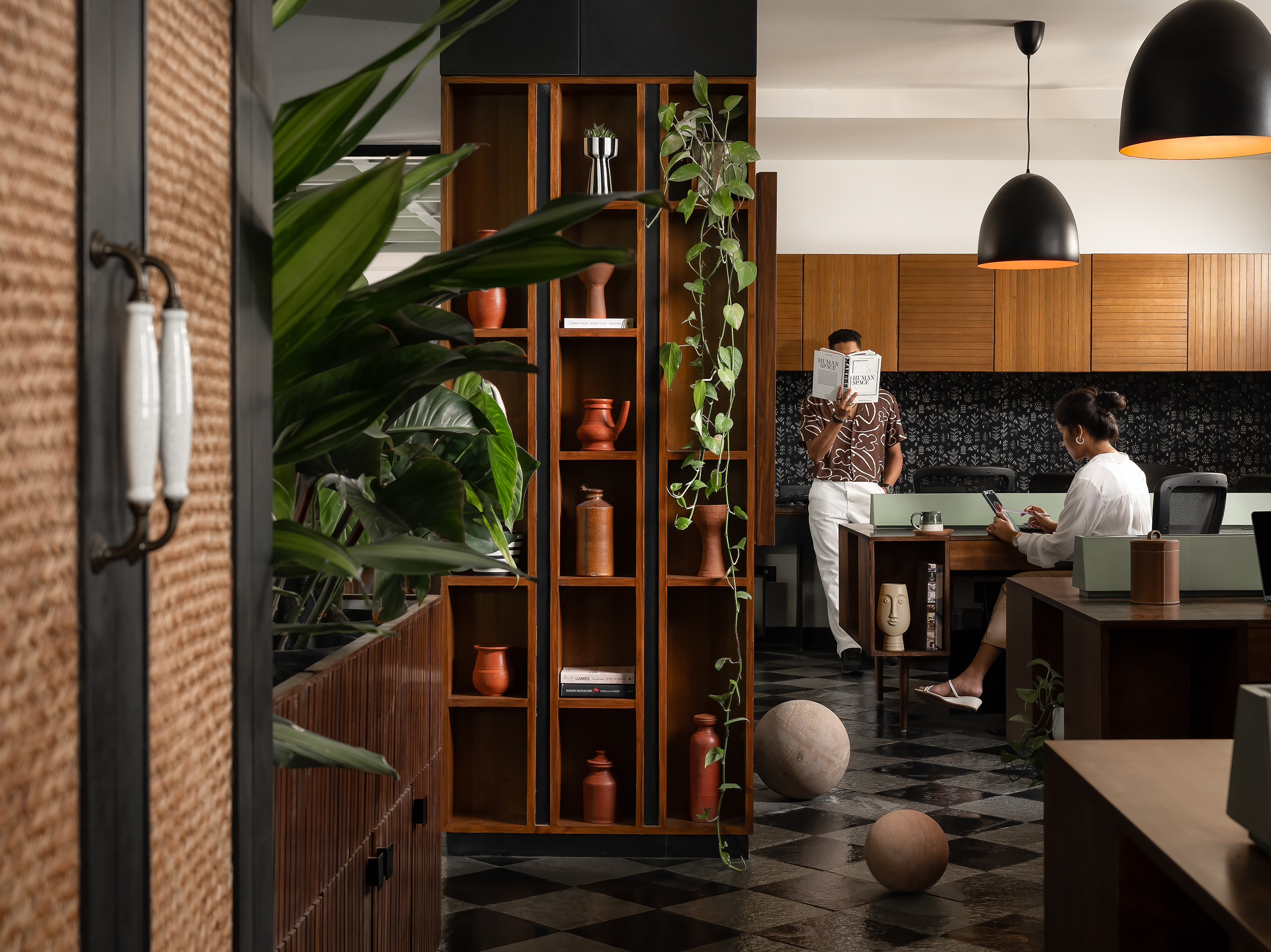
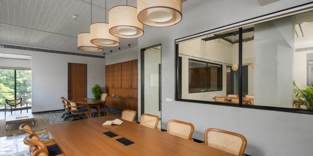
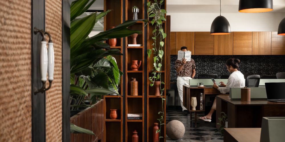
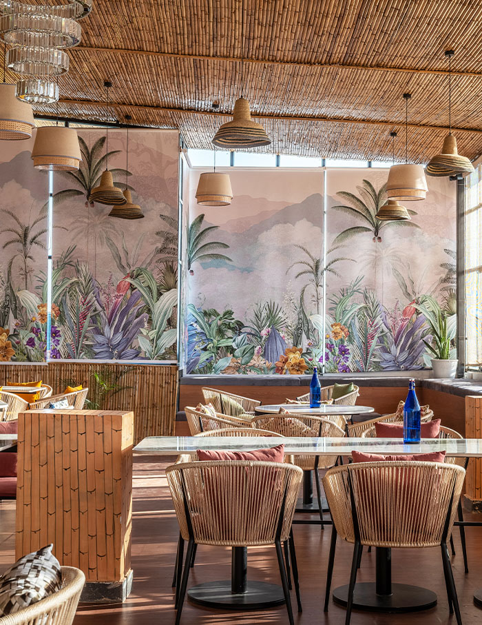
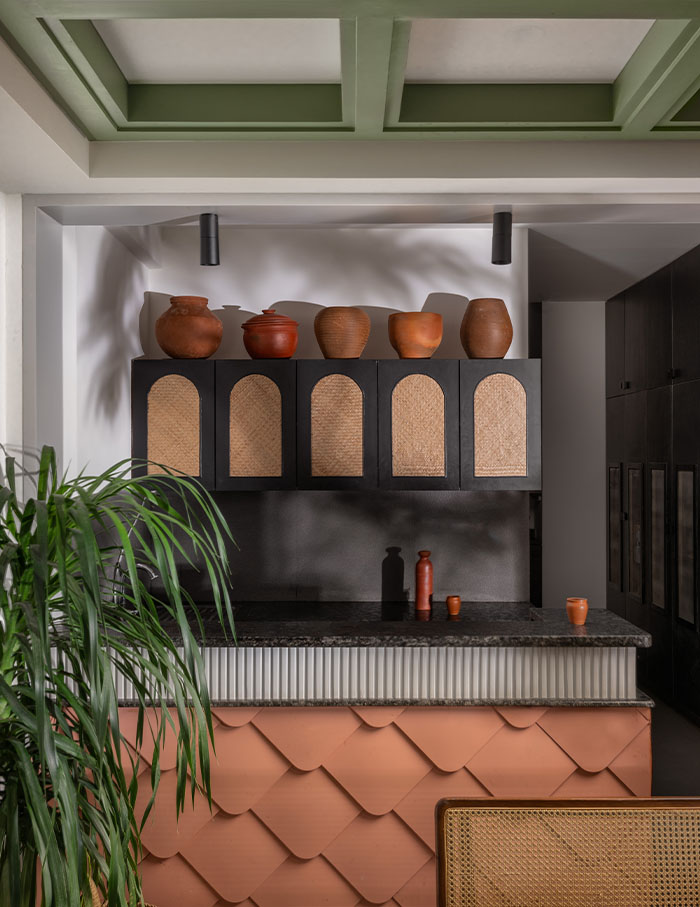
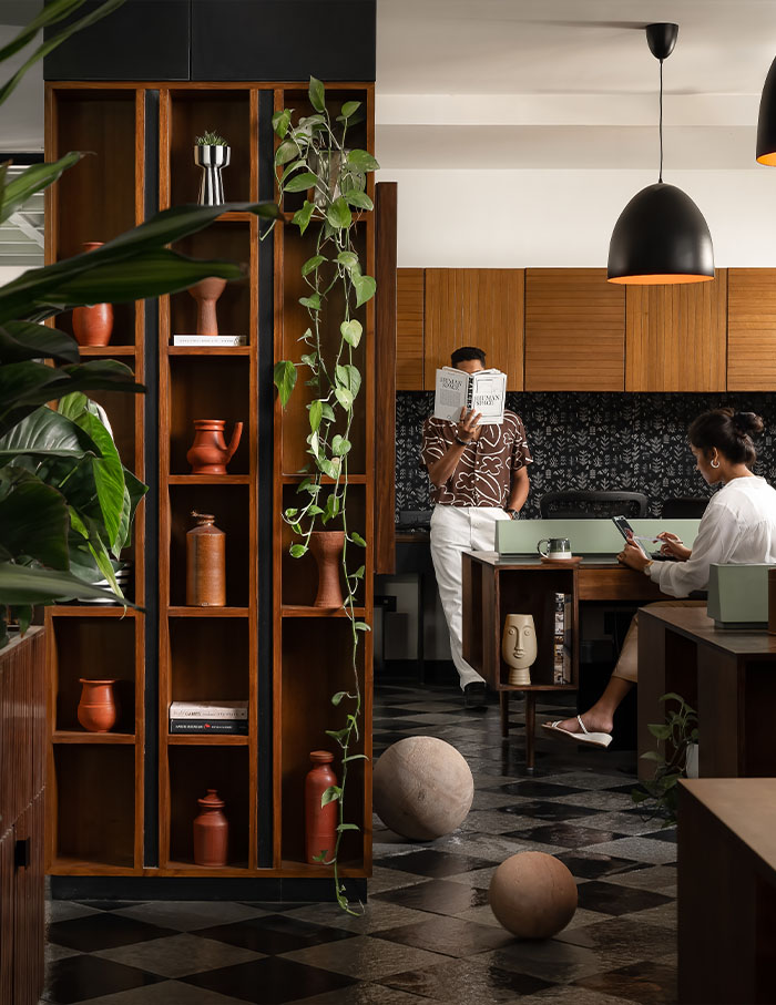
The interiors of SC Office is a celebration of Bangalore’s local vernacular of design and serves a shaking of hands between India and Sri Lanka. An intentional design that is ergonomic and revitalising, the space has been designed by Andre Camara and Shravya Shetty, founding partners of Studio Camarada. In this Bawa-inspired studio, a palette of earthy tones and textures embeds indigenous roots, conjuring charm and nostalgia. An abundance of rattan elements carried with varying complexions of wood brings forth a familiar tropical warmth. Lush tropics punctuate the space complimenting the green coffered ceiling that deserves a standing ovation. And the Flora and Fauna wallpapers provide a wonderful backdrop for the collection of terracotta vases and jars.
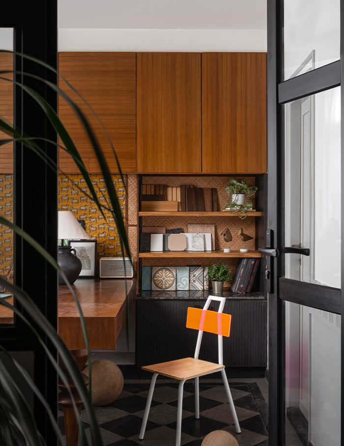
An edgy but cool renovation by The Crossboundaries
In the Vadodara lies an industrial shed that has taken a dramatic turn (for the best) as it has been refunctioned to inhabit the architectural studio: The Crossboundaries. The design, in touch with its roots and sympathetic to its architecture has retained its utilitarian details. Air ducts and steel beams are left exposed in the ceiling creating the perfect rustic scene. Principle architect Harsh Boghani has reconciled the raw detailings of this factory aesthetic with plenty of warm accents through wicker chairs and wooden cabinets. The lime-painted walls bring forth a textural depth and tranquillity that frames this sanctuary.
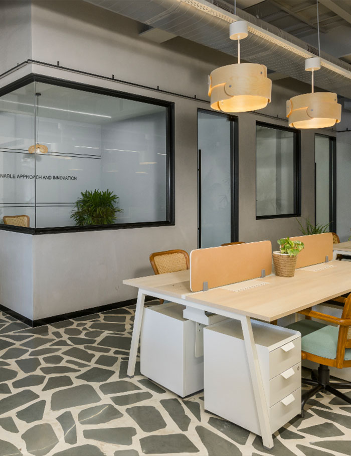
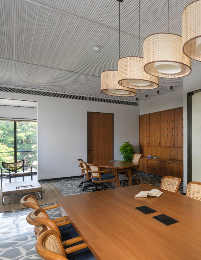
Warm and welcoming by Shodh Design Workshop
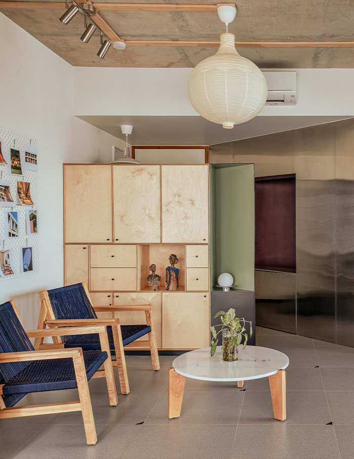
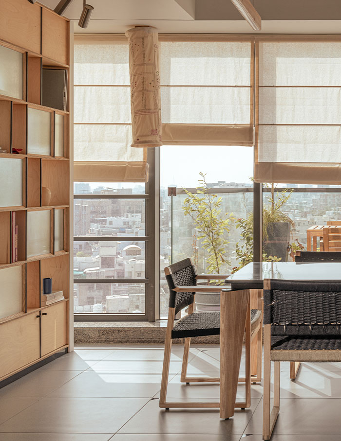
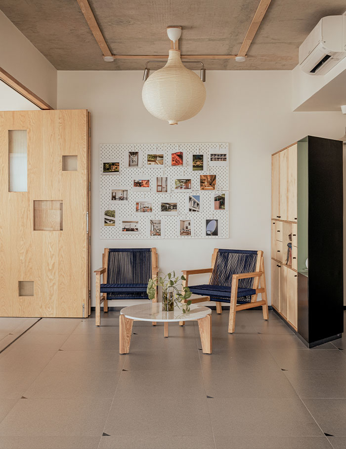
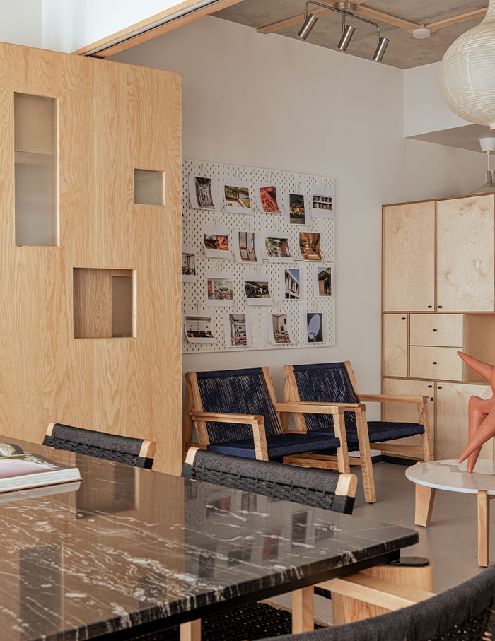
The Ahmedabad-based architecture studio comes alive as sunlight transforms the space throughout the day, keeping the workspace as dynamic and lively as its inhabitants. As morning sunlight pierces into the space from the east, the stainless-steel reception cove captures the drama of the light against reflections of cool greens, feisty maroons, indigo blues, and placid lavenders. The space is a symphony of ash wood, birch plywood and stainless-steel punctuated with local white marble and black granite: the perfect synergy of interesting texture and neutral colours.
Where Luxury Meets Productivity by Space Matrix
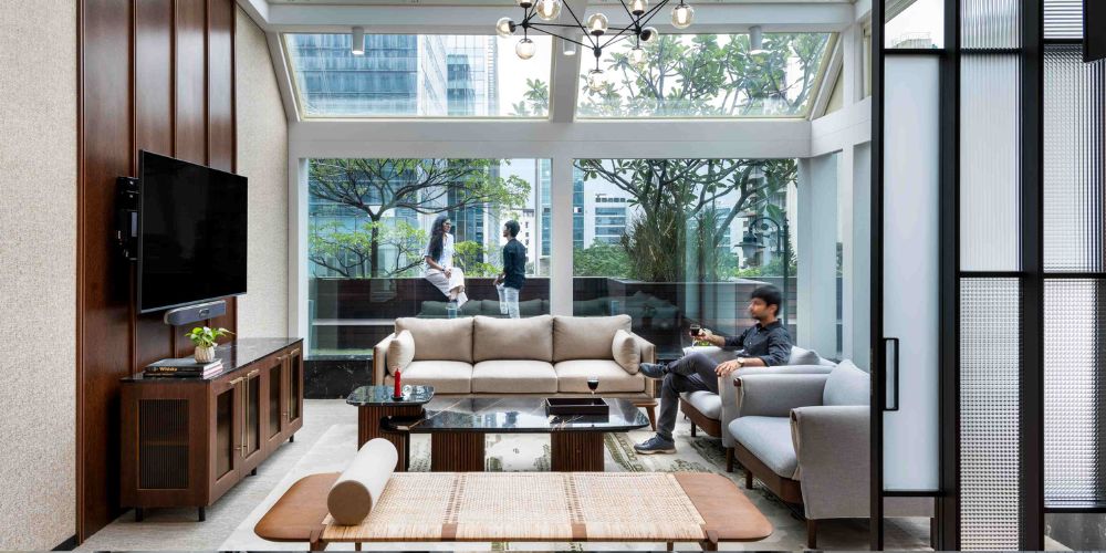
Imagine: brainstorming sessions in a meeting room where, with a touch, the ceiling retracts, revealing a canvas of open sky. Financial services firm Avendus’ sprawling Mumbai office screams inviting innovation. By implementing a consistent design language across the workspace, the individual business units visually connect, weaving a cohesive narrative for the Avendus identity. The refreshing infusion of biophilic elements provides a welcome respite from intense discussions, allowing for the much sought-after creative spark.
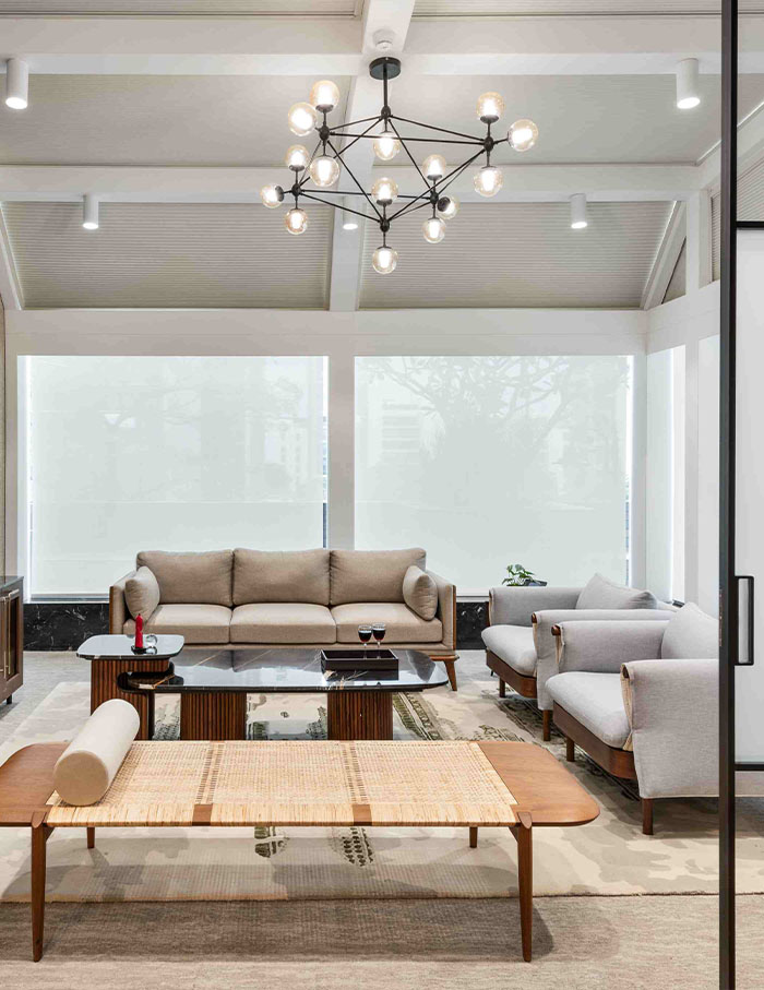
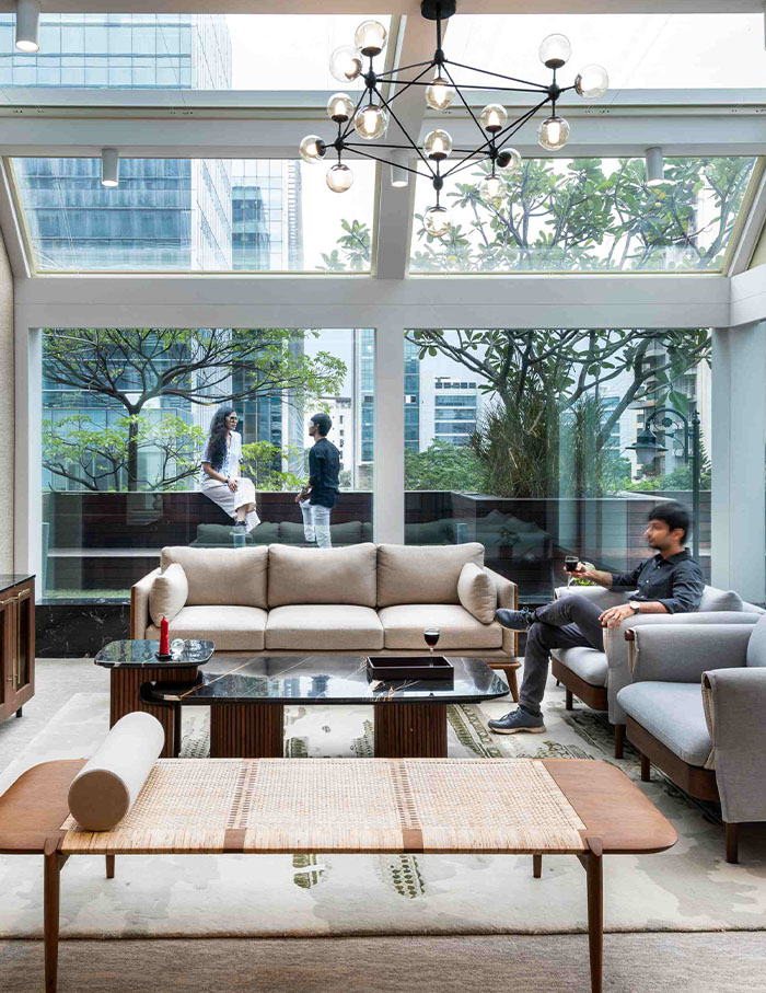
The Grain Loft: A Modern Industrial Makeover by Squelette Design
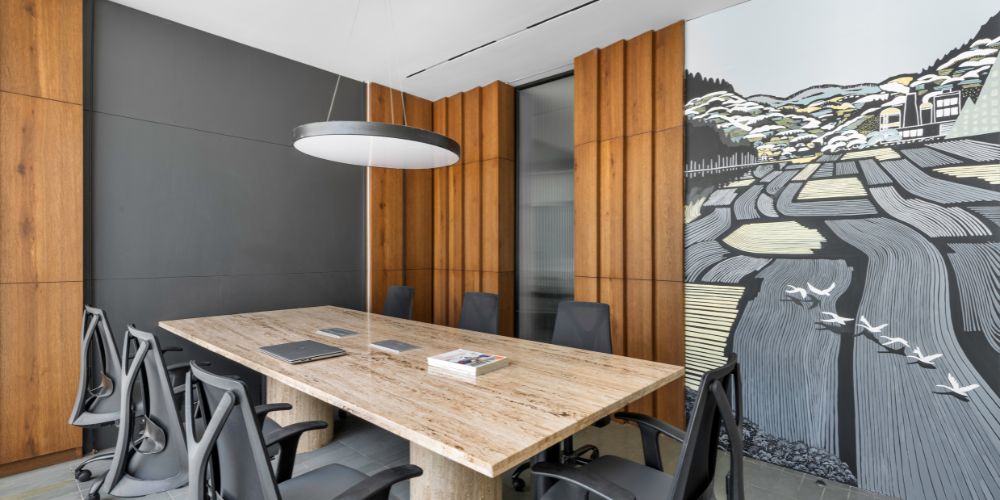
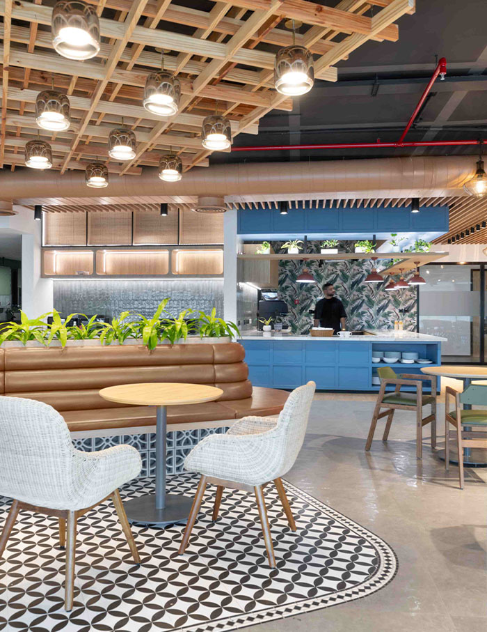
We never really outgrow storytelling and this space is a testament to that. Understanding the significance of designing an office for an industry with rich heritage, Squelette Design introduced artistic elements that resonate with the client’s work in food processing, successfully breathing new life into an ageing facility. Artworks depicting paddy fields and grain leaves adorn the walls, creating a visual connection to their core business. These pieces celebrate the client’s legacy and seamlessly integrate an element of storytelling into the workspace.
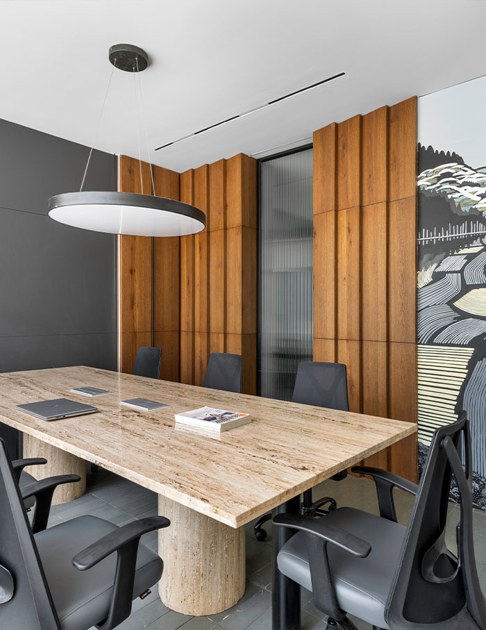
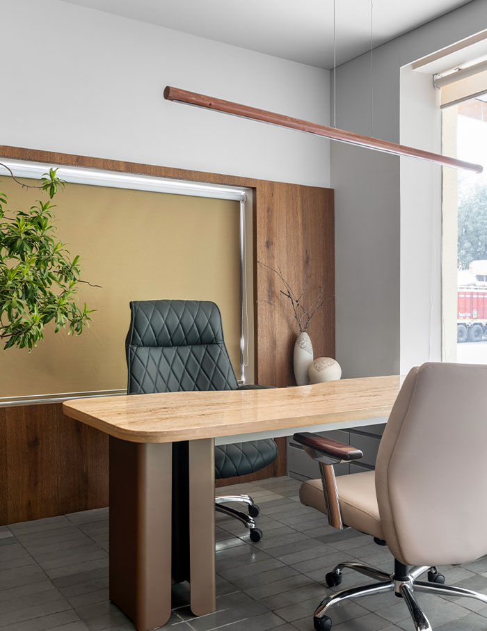
Revving Up Efficiency and Comfort by UnBox Design
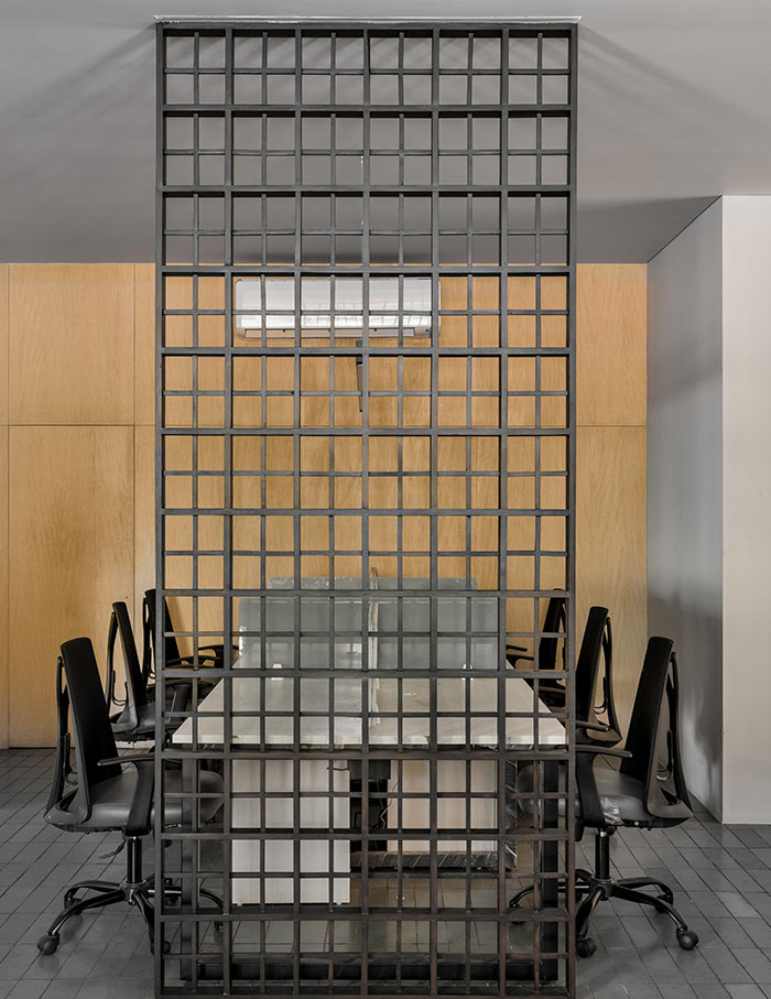
When tasked with designing an office for an automotive parts company, Aman Issar, Founder of UnBox Designs sought to transcend the automotive industries’ utilitarian associations. Throughout the office, metal manifests in various guises, each lending its unique character to different spaces. It is championed to a refined and sophisticated form that seamlessly integrates with the office’s ambiance. This subtle nod to the company’s industrial roots serves as a reminder of its heritage while setting the tone for a space that celebrates both tradition and modernity. Here, the company’s journey unfolds visually, depicted through a growing timeline, showcasing milestones and achievements.
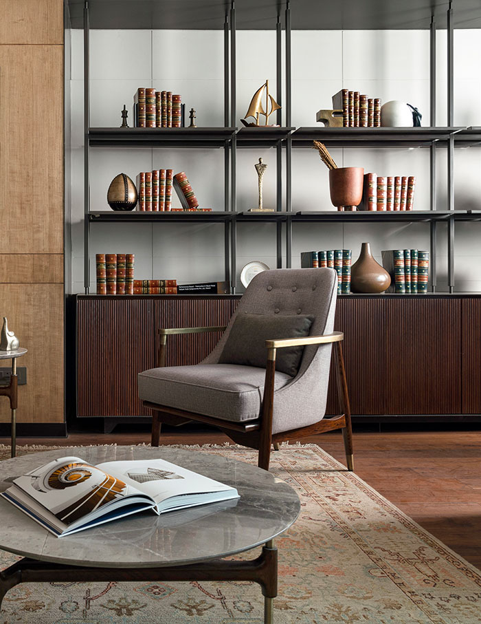
The WorkEz by VM Design Works
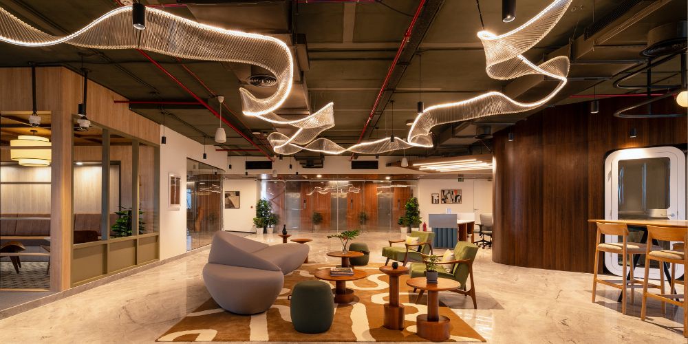
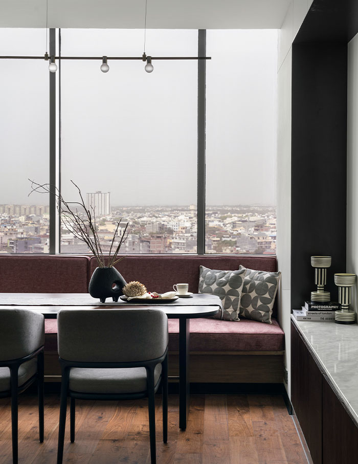
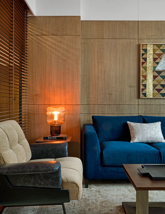
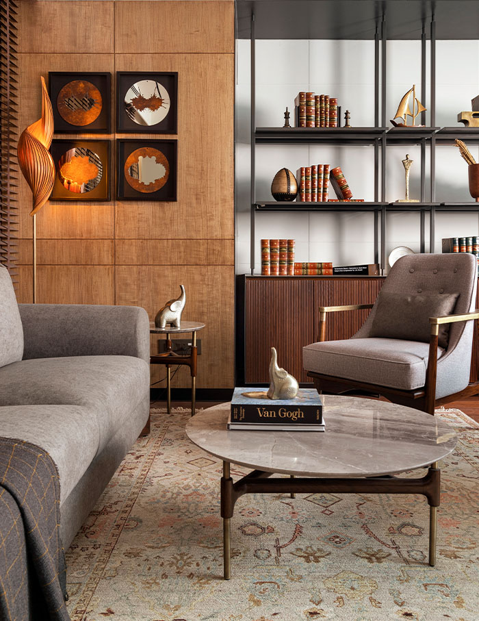
When designing this coworking space, principal architect Varsha Menon of VM Design Works quickly realised there was a magic word: productivity! Creating a space to foster creativity, productivity and versatility took precedence. So the space was envisioned to support the current agile office trend, with facilities like individual workstations, informal breakout areas, private conference rooms, and recreational zones. Here, thoughtful design meets aesthetic appeal to create a dynamic (and collaborative!) workspace.
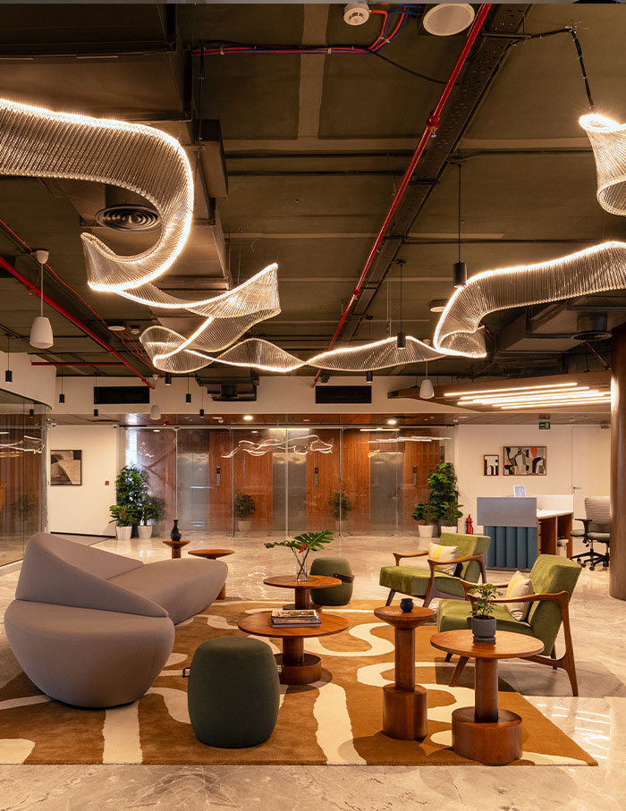
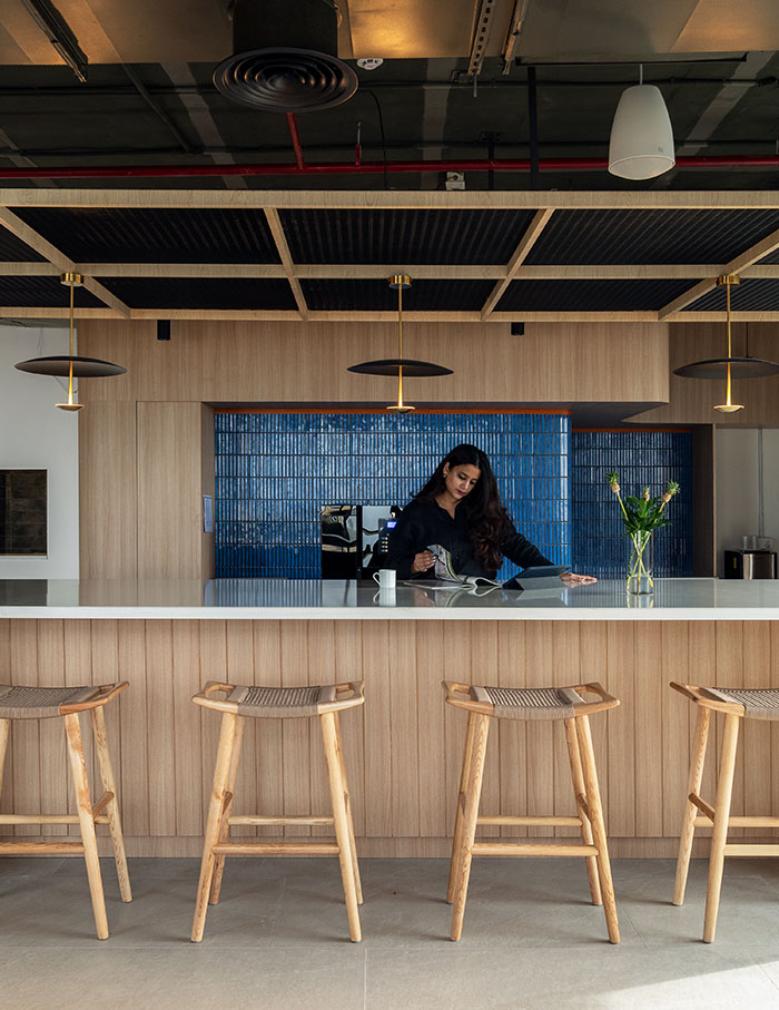
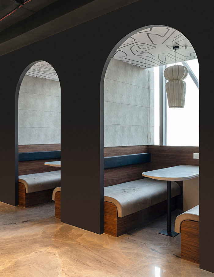
Wabi Sabi by White Luxury Studios
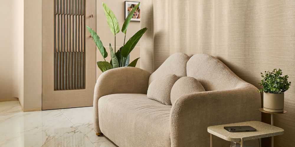
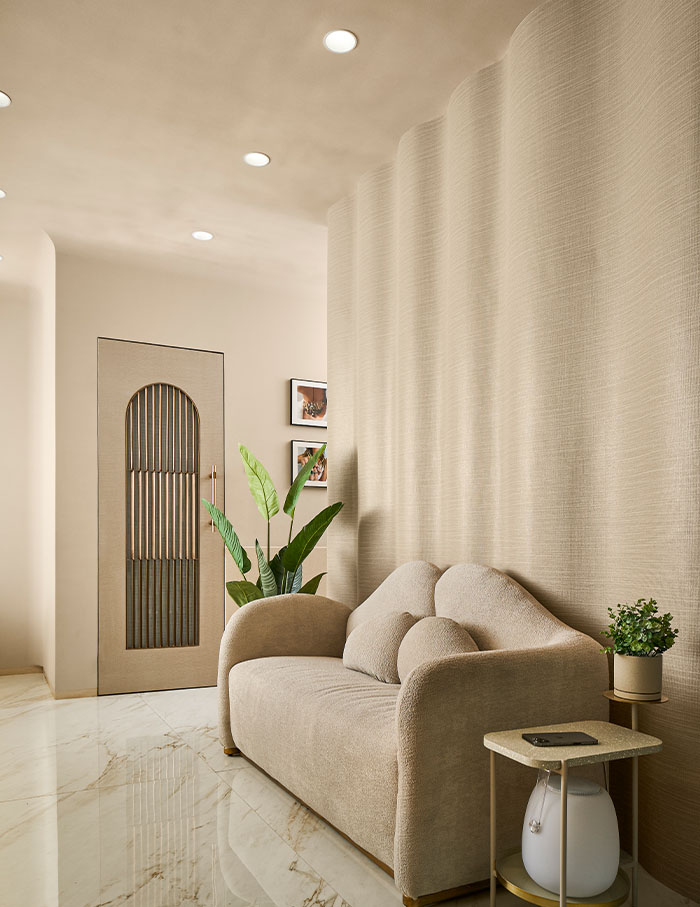
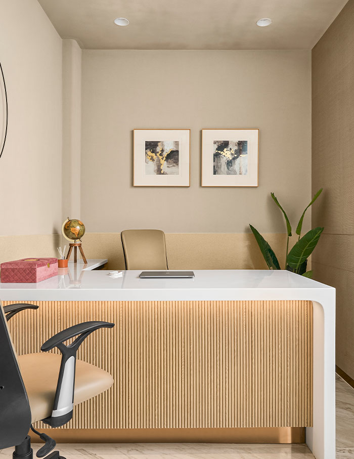
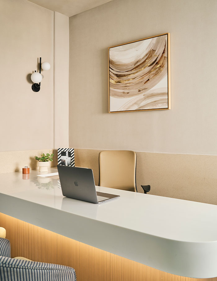
This space is a gem (pun intended)! As timeless and beautiful as a piece of well-made jewellery, this office is the epitome of understated sophistication. White Luxury Studios created a contemporary workplace for a jewellery design company that they describe as ‘a serene sanctuary of sophistication and understated luxury.’ Embracing wabi-sabi philosophy, the design celebrates natural imperfections and the passage of time with muted tones and textured surfaces. The space employs a restrained palette of materials and an overall minimalist aesthetic to enhance productivity.
Now read: Working from home? This Mumbai office by Essajees Atelier feels like your living room

