Homes
Beyond interpretation: This artful San Francisco abode by Nina Magon Studio leaves labels behind
MAY 31, 2024 | By Namrata Dewanjee
Minimalism vs maximalism. This debate is passé. The Classical Age is long gone. The Baroque masters have declared end-scene. Even the surrealists have called it a day (well, Dali did melt time even in his period). In an age where you can be anything your heart desires, why pick sides? This San Francisco residence designed by Nina Magon, plays a daring double act.
“The homeowner, an avid art collector and antique enthusiast sought to create a sophisticated space where her extensive collection could be meticulously positioned and displayed throughout her home,” states Nina, the Founder and CEO of her eponymous firm, Nina Magon Studio. Inside a three-storey 7,500 sq ft Queen Anne envelope perched on Pacific Heights, the designer conjures a sense of constant cohabitation, between the old and the new, experiences and their expression, the art of living and the art of collecting. A negotiated sense of place.
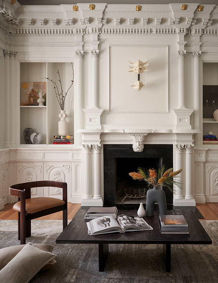
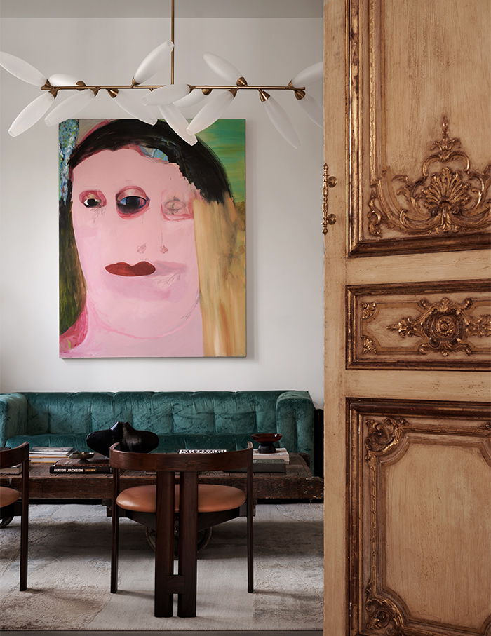
A Neo-classical library and the Golden Gate Bridge
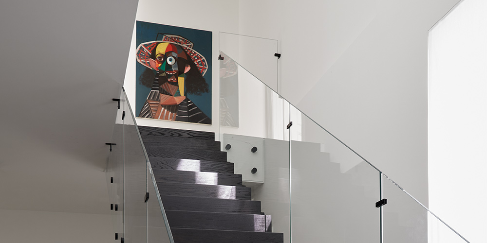
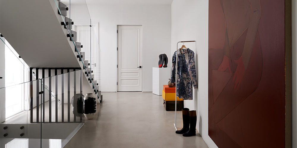
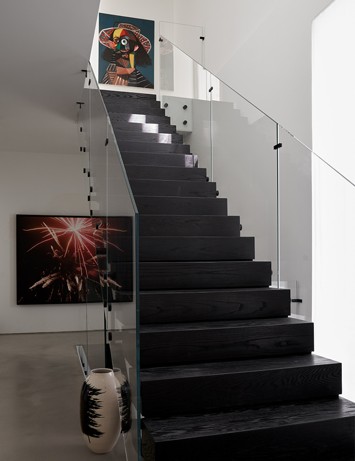
Like artists deliberate on the subject of their artwork, so did the designers. A dark wooden staircase leads your line of sight to lock eyes with George Condo’s chromatic farmer. Behind the soffit rests a feminine form painted by Grace Weaver.
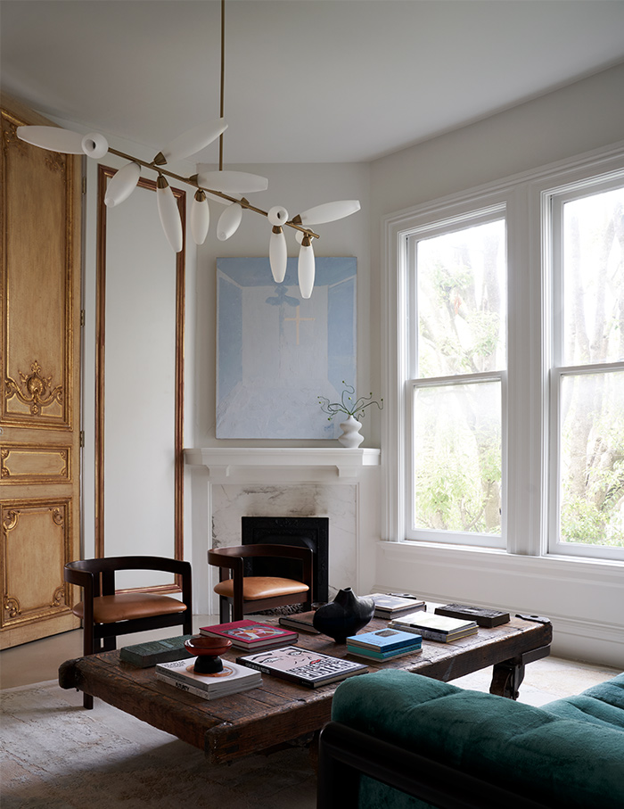
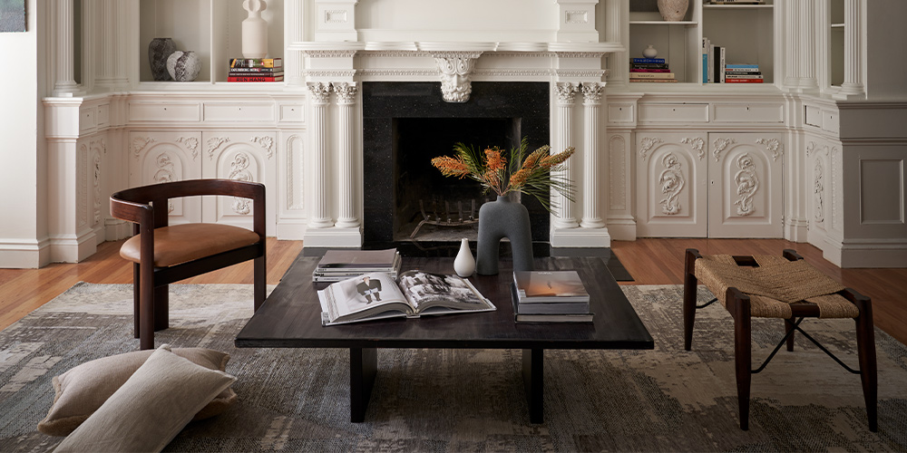
Ascend to the first floor and you’ll find a library decked in neo-classical nuances. Tracing the facades of European antiquity, the space sports an old-world elan, from the splendour of the pilasters and millwork to the choice of furniture from the past and the present.
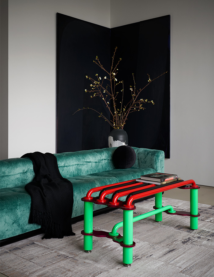
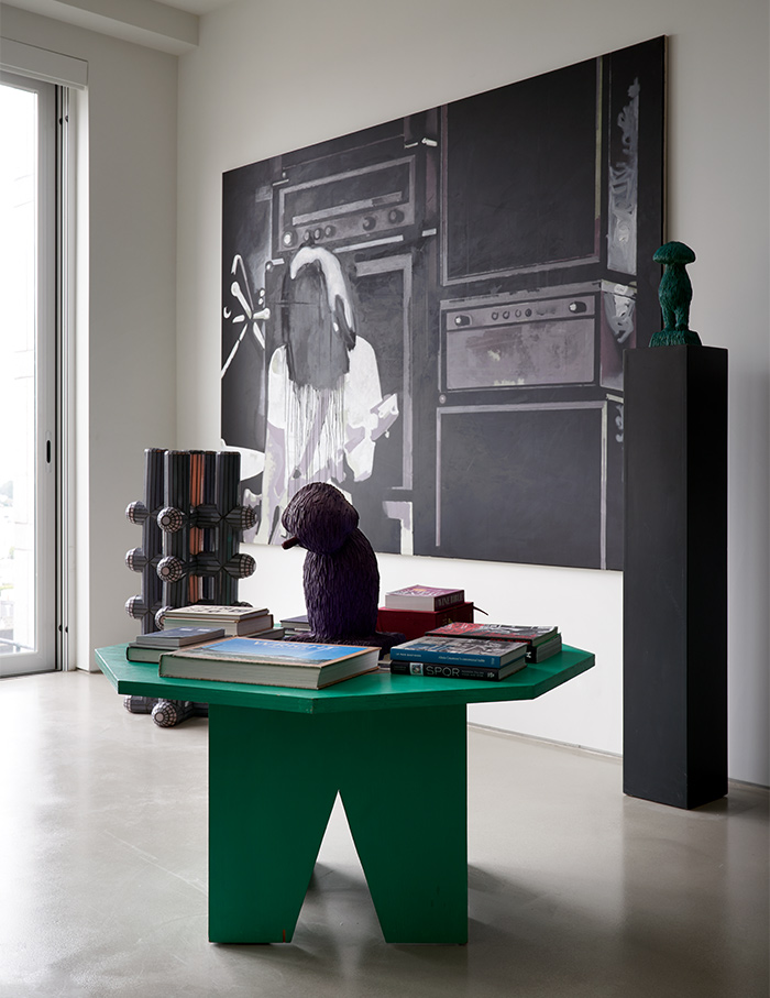
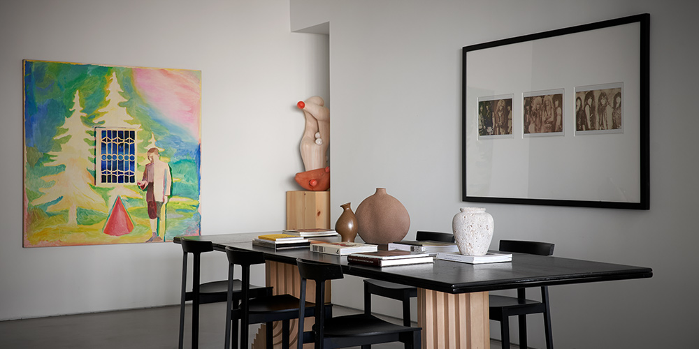
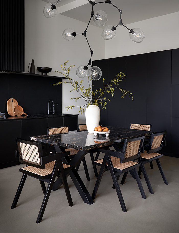
Walk through the home and you’ll find illustrations lining each wall, be it the accentuated corner in the living room or the tongue-in-cheek finds that characterise the hallways. On the second floor, in a rare revelation, panoramas of the Golden Gate Bridge also make an appearance in the dining room. Structure or sculpture? The third floor hosts the master bedroom with an open bath. Why limit yourself to being surrounded by art when you can immerse yourself in it as well?
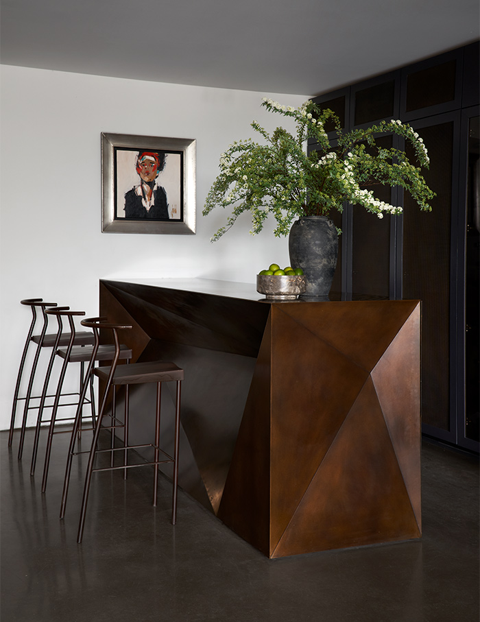
Gallery-esque grandeur
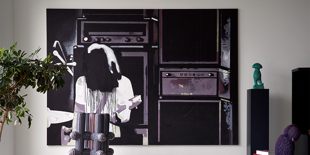
“While the house maintains a robust contemporary essence at its core, each room was approached as a canvas for experimentation,” explains Nina. The homeowner’s extensive collection was placed in striking focal points, creating an allure of an art gallery within a residence.
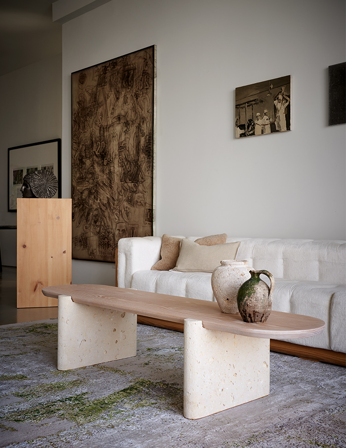
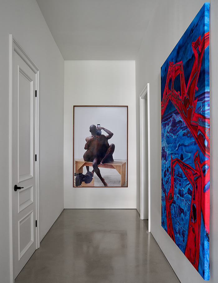
The existing architectural features of the Victorian-era home turn into junctures of interest. However, the artistry crescendos in the corner from a geometric green table contrasted with an aubergine artwork to the light wood pedestal with an arresting sculpture.
According to the designers, the home embraces the Miesian adage, “less is more.” Yet, Mies van der Rohe himself had a penchant for hiding his allegiances with the Classical ardour for ornament in the details.
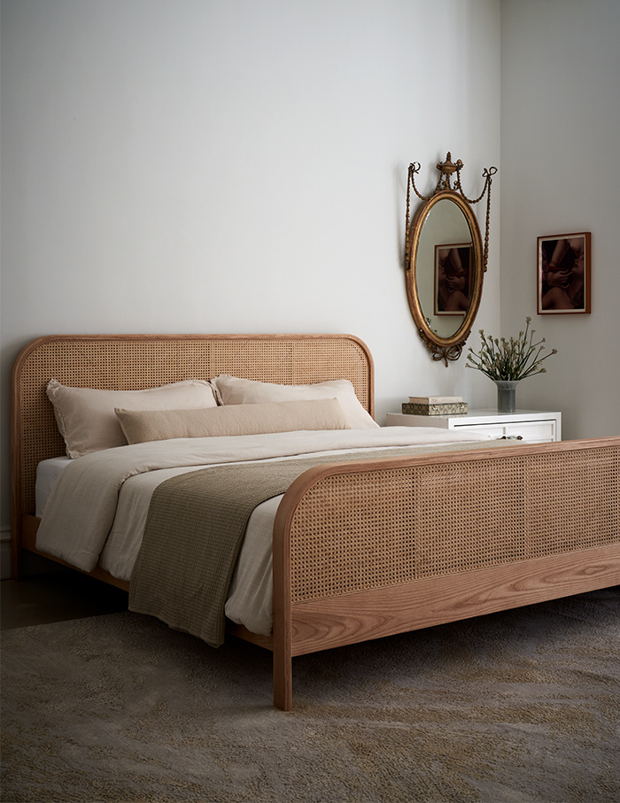
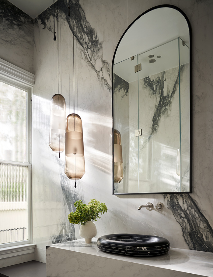
Artful accents
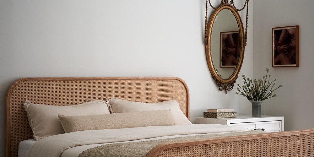
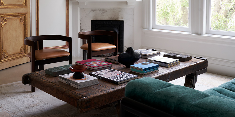
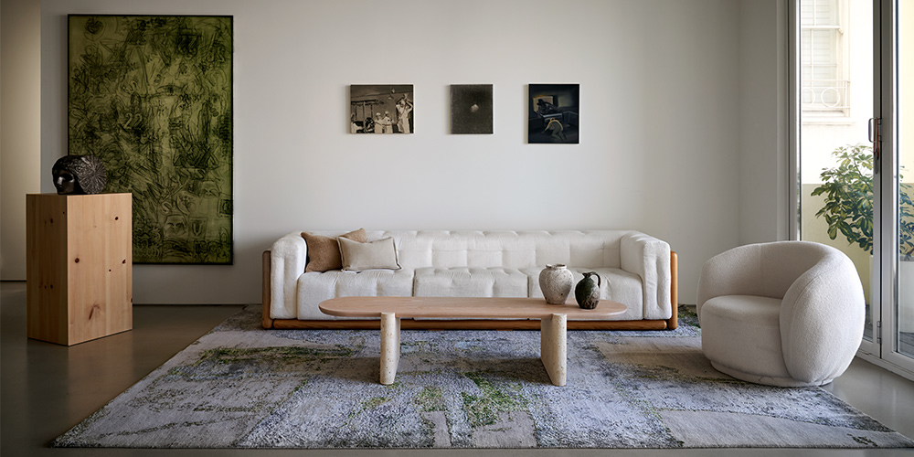
In this abode, the designer chooses the decor with a discerning eye. In the living room, the playful pipes of Jim Drain’s coffee table take pride of place with the unconventional verdant green sofa by Carlo Scarpa. The dining room houses another Scarpa creation that resonates with the artwork. From the Stark rug that appears to almost change colours to the antique mirror that adorns the master bedroom, the home is interspersed with artful details that add to the elan of the space.
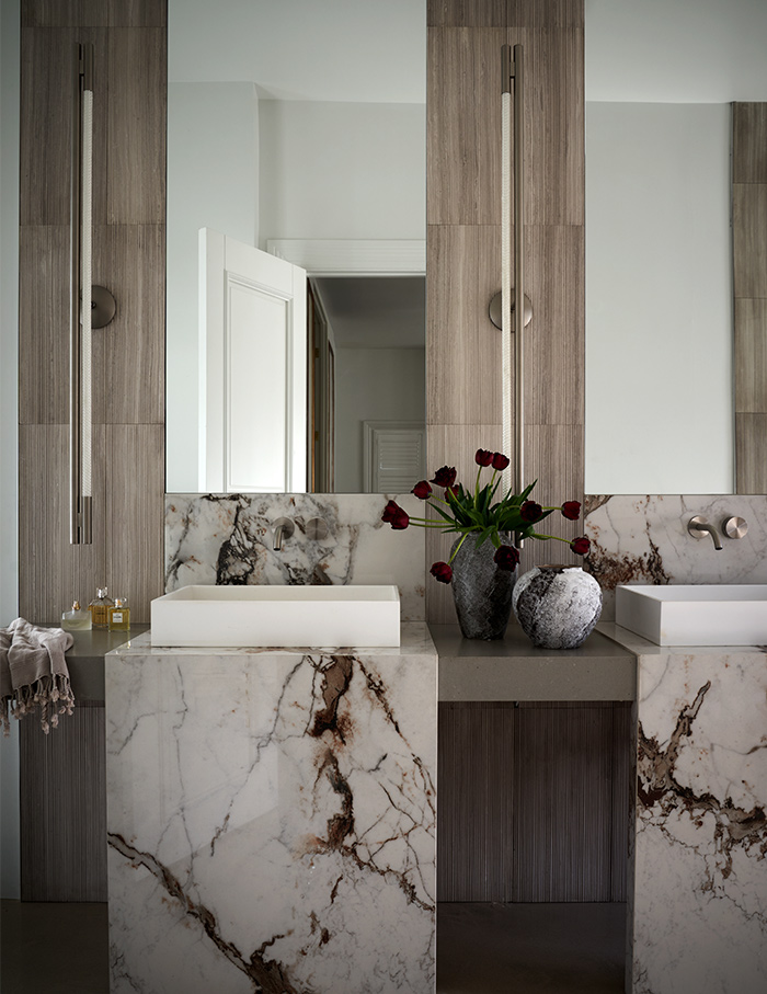
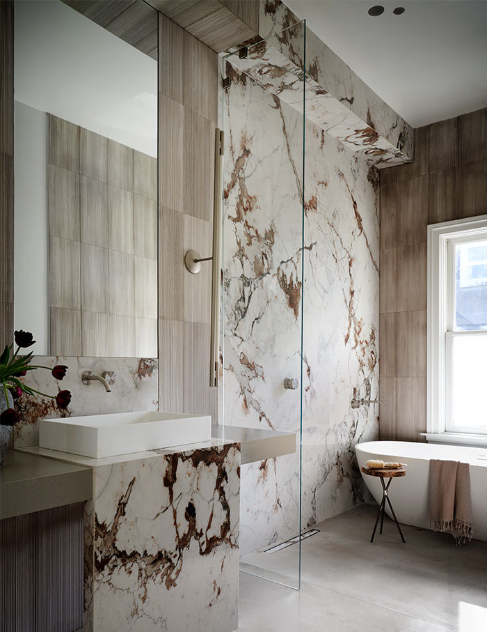
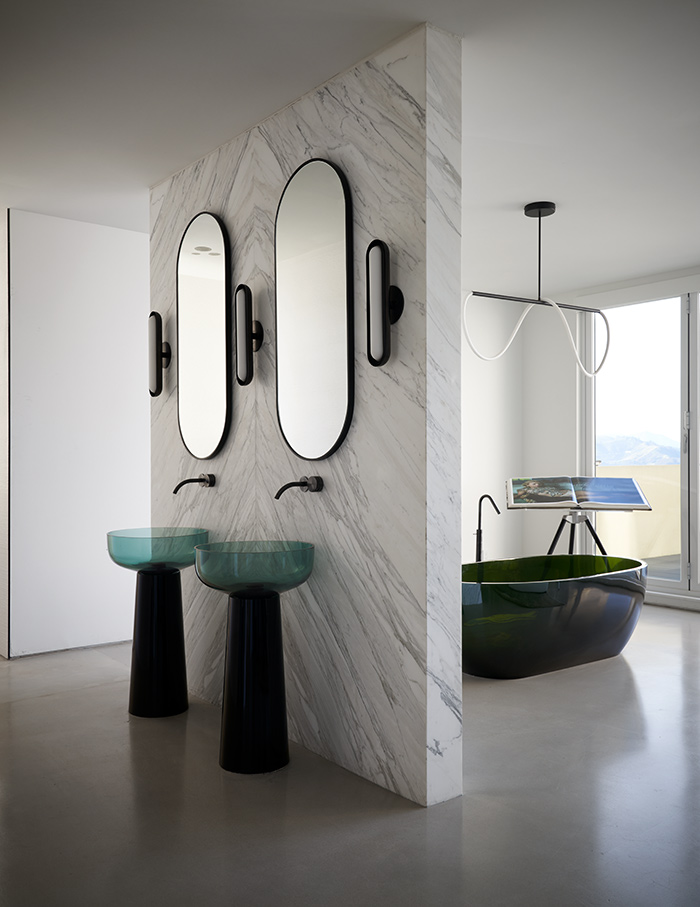
What makes a space minimal or maximal is in the eye of the beholder. Art is both referential and not, it is simultaneously descriptive and is an object in its own right. And like all art forms, design is made richer through experience. Perhaps, in an effort to interpret the tangible, you might stand to lose the sensorial. And to be honest, can labels ever capture a living space?
Read now: This duplex in Mumbai by Architect Naved Designs is rooted in the grandeur of spatiality


