Homes
Less the more! This Mumbai home by The Design House Company draws a simple and subtle canvas
JUN 30, 2022 | By Shriya Goyal
Popularised and coined by Mies Van Der Rohe, the term ‘less is more’ elevates the bare form, revealing the true essence of design and achieving simplicity. Taking cues from this approach and treading on his footsteps is this Mumbai home by The Design House Company.
Located in the suburb Juhu, this 1250 sq ft home is designed by Mansi Pandey, Founder of The Design House Company. “Designing and space planning is the most challenging part in a city like Mumbai where spaces are compact,” expresses Mansi while contemplating her first design thoughts.
You may also like: Linear profiles and rounded silhouettes by Shiraz Jamali Architects in Mumbai
The curious brief
Clean lines, uncluttered simplicity, subtle hues and a limited material palette—these are the terms that pervade our mind when thought about minimalism. Owing to the homeowner’s brief and sprucing up orderly aesthetics, the spaces and furniture are organised to utilise every section of the home and establish a neat layout.
Tour every turn of the home
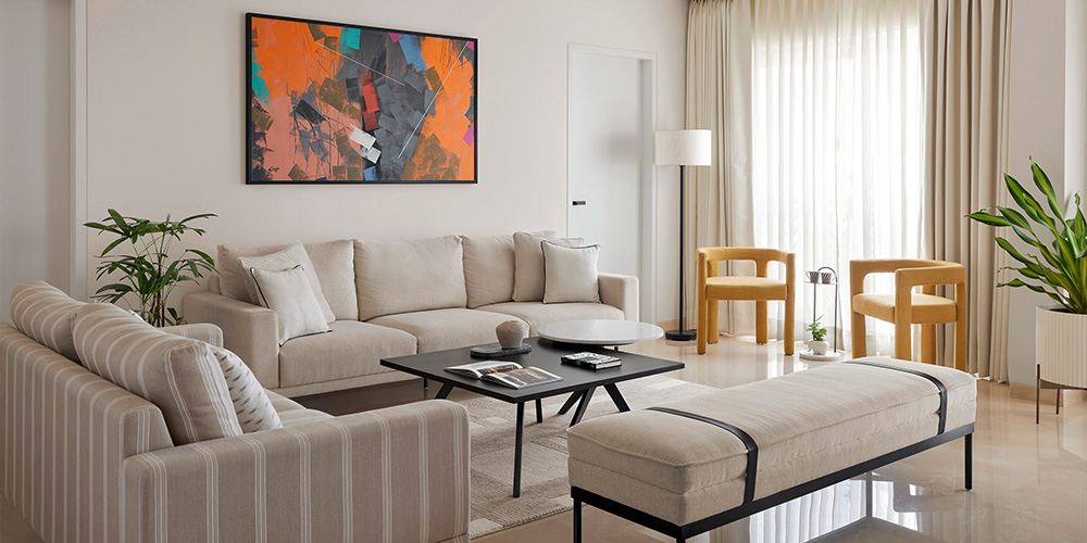
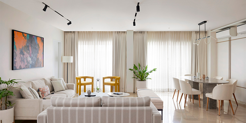
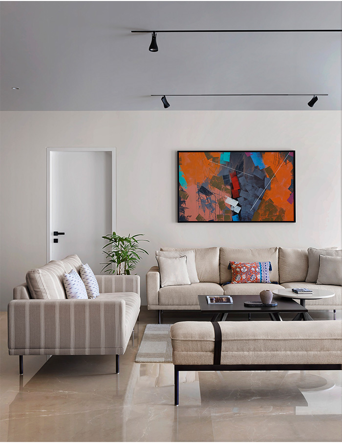
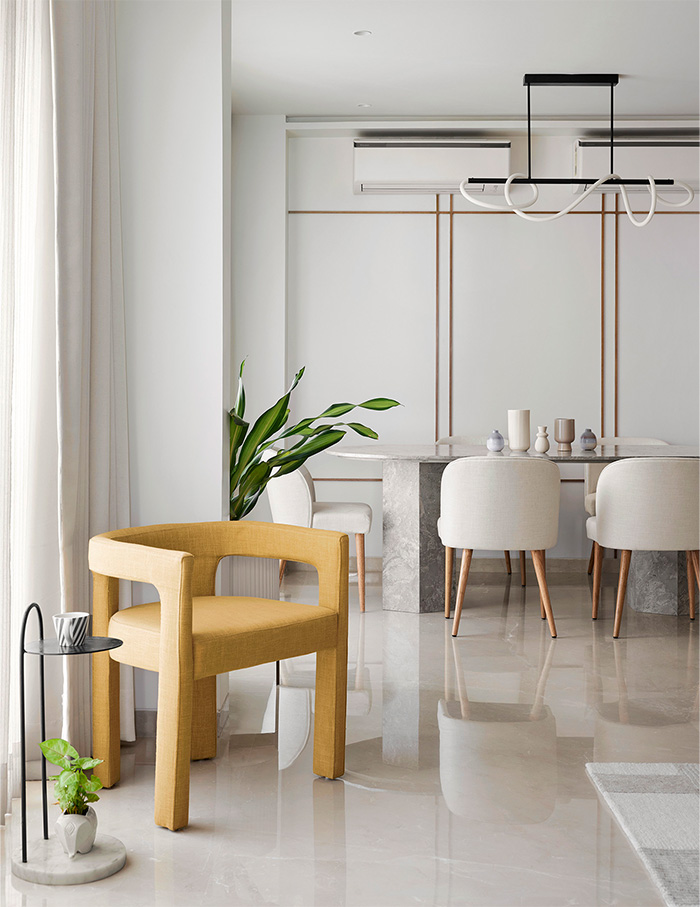
Embarking on the home tour through the living room showcases off-white sofas paired with an overlapping back and white centre table and two statement mustard chairs placed near the window.
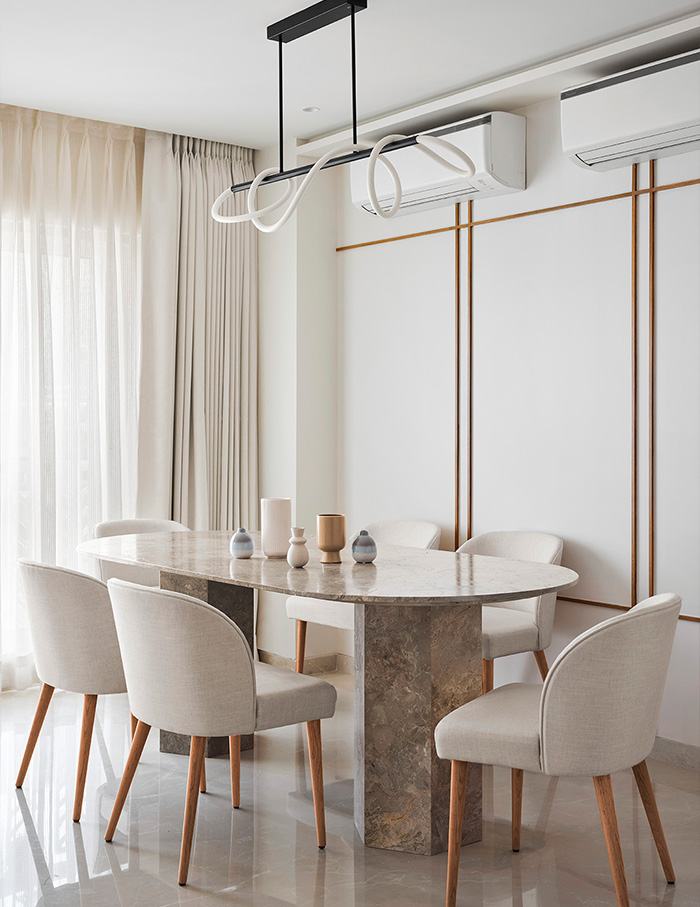
With an open plan layout, the dining table is placed on the other edge of the living space and highlighted by wooden strips on the wall. The kitchen in white cabinetry and shelf is accentuated with a lemon green backsplash.
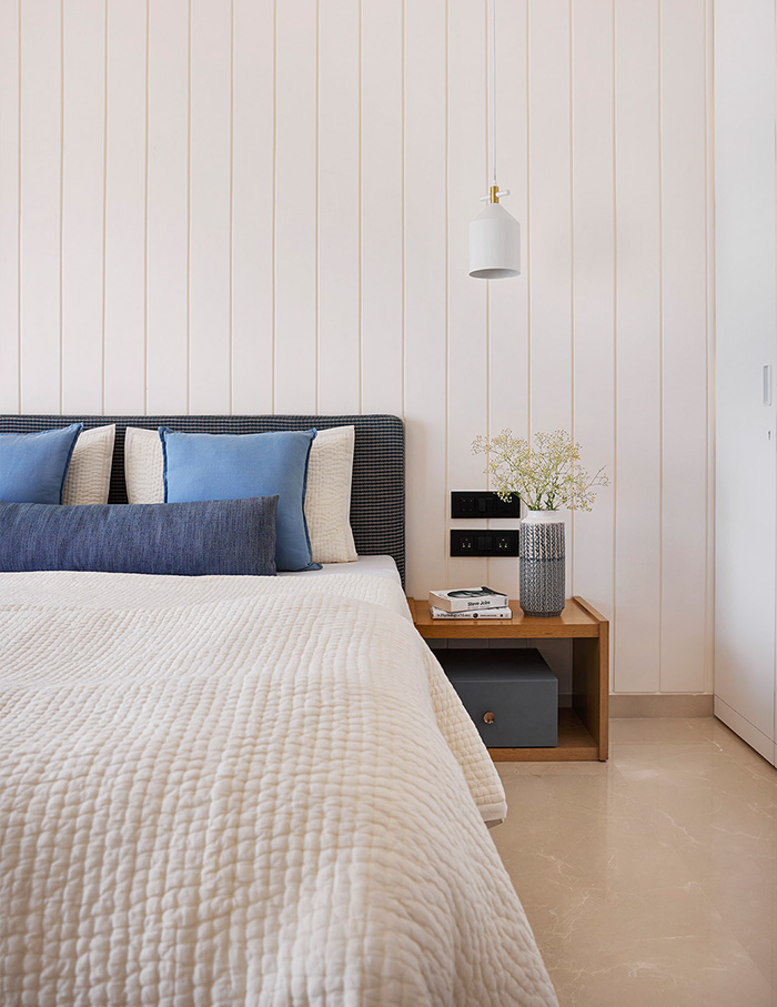
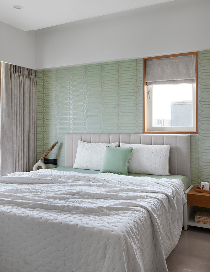
Rendering calm in the main bedroom is the white grooved wall, supported with a black chequered bed back. A mint green wallpaper with silver patterns furnishes the parents room in vibrance and comfort.
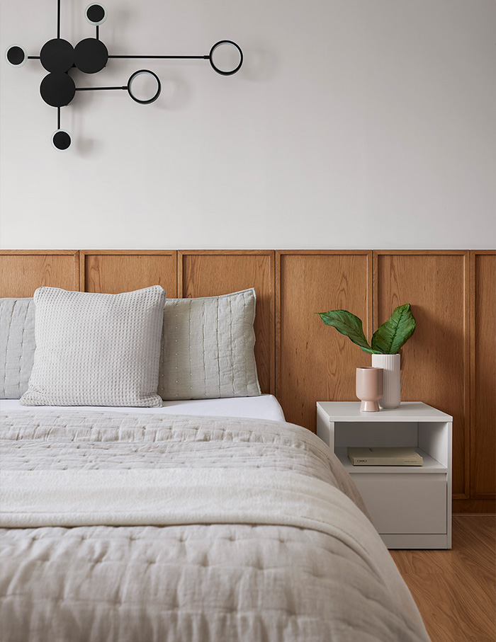
The warmth of oak wood and the allure of a black eclectic lighting fixture crafts the guest bedroom into a charming space. Camouflaged in veneer wall panelling, the powder room is an integration of black and white marble flooring, white wall tiles and wooden accents.
Ideas to bookmark—colours and materials
The contemporary allure of the home is dominated by a white and neutral colour palette. Infused with natural light and warmth, matt finishes and rustic textures are employed throughout the home. Each space harbours pops of colour through distinct furniture and furnishings—a dash of mustard in the living room, sprinkle of lemon green in the kitchen and mint green splash in the bedroom.
What the designer fell in love with…
Culminating her design approach, Mansi says, “The most challenging aspect of designing a home is to come up with ideas that cover all aspects—space utilisation, owner’s brief and our aesthetics. We designed every space in a modern minimalistic way. The decor is selected to fit harmoniously into the space and furnish a warm vibe with a pleasing atmosphere. The living spaces were the most fun to design with the different applications of Italian marble.”
You may also like: An oasis of vibrant cityscapes by Studio Osmosis in Mumbai


