Homes
Studio Aline transforms this 740 sq ft Mumbai abode into an exquisite and intimate affair
MAY 15, 2021 | By Urvika Barua
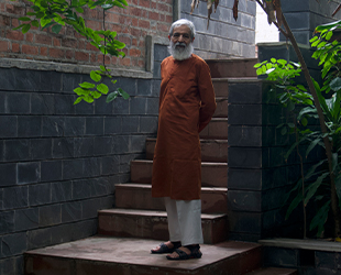
Studio Aline’s principal architects Natasha Naik and Shahid Merchant breathe new life into an old and dingy Central Mumbai apartment, fashioning a pleasant and cosy living space.
Infused with a mid-century theme as well as hints of eclecticism, the apartment’s layout prioritises natural light, reducing clutter and establishing a serene, elegant atmosphere of neutral colours and simplicity.
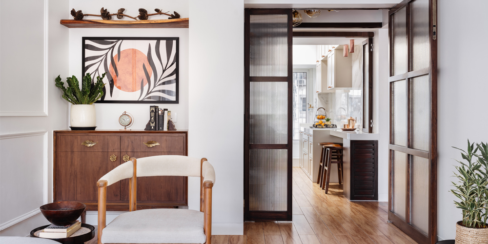
The original plan had two brick walls separating the entrance passage, kitchen, and dining space, causing them to look much smaller. These walls were demolished, and the whole space was opened up.
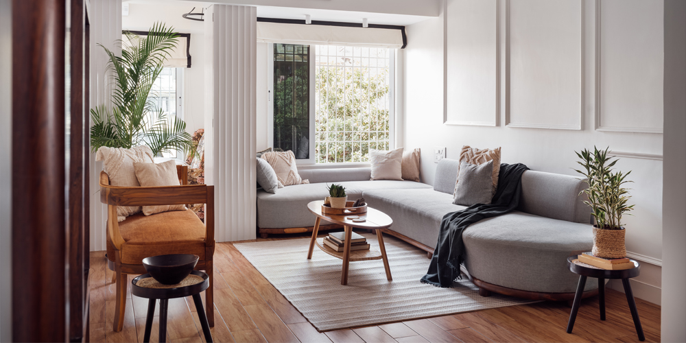
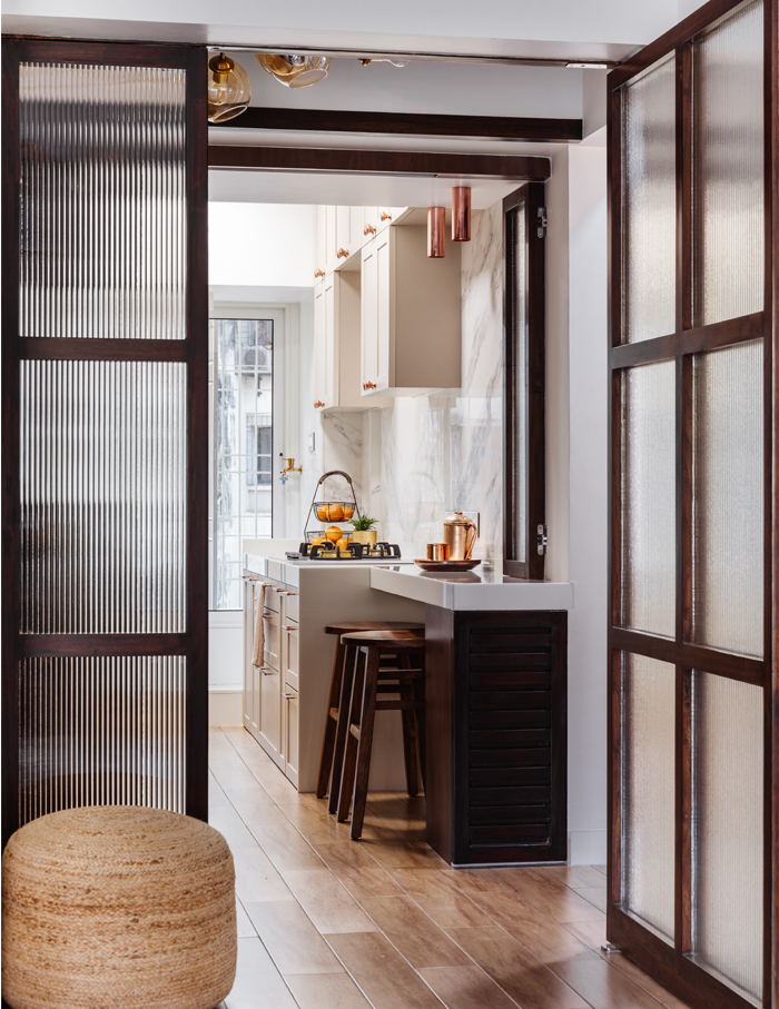
Teak wood chamfered glass partitions were installed in replacement of brick walls, generating a seamless design that encourages light to stream in and give the space an expansive appearance. Appreciated by the clients, who indulge in hosting many gatherings, the living room and kitchen are linked creating a relaxed dining room for a large number of guests.
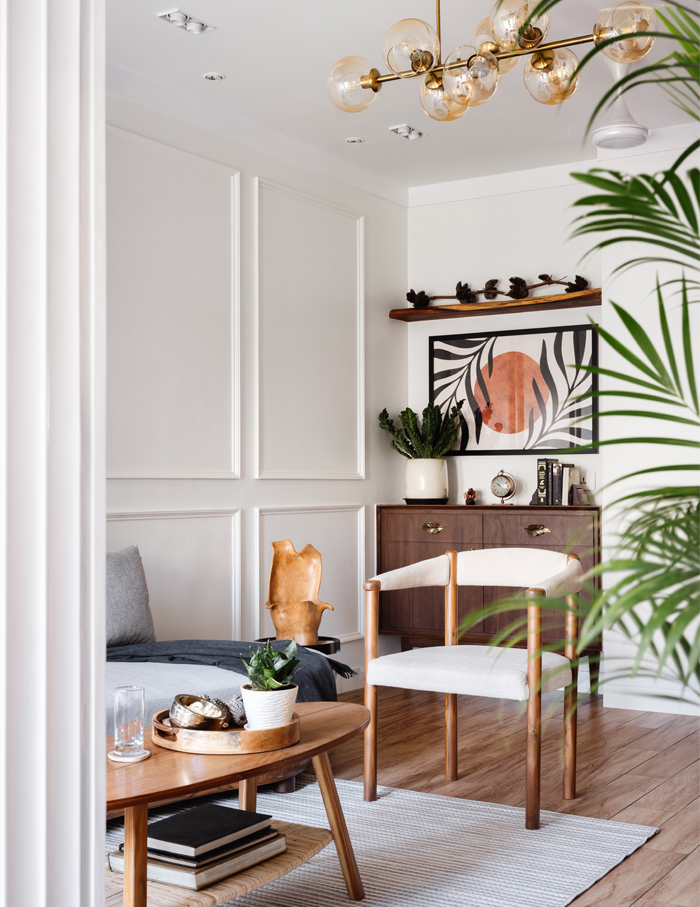
Wooden flooring tiles and white shades extend all across the space, creating a sense of harmony, allowing Studio Aline to experiment with various ambiences in each room while also maintaining a sense of comfort.
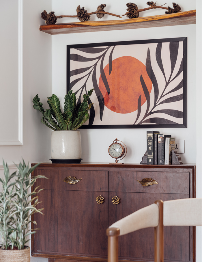
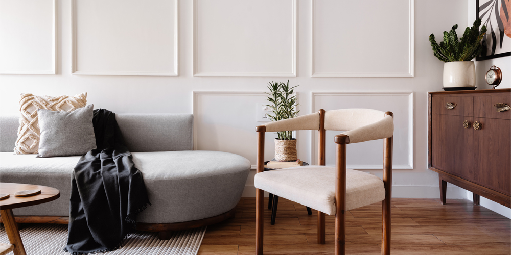
This 740 sqft abode starts off with the living space drenched in a pristine white hue and is adorned with customised teak wood furniture. “The best part about this space was that the furniture did not have to be arranged around a television or an ‘idiot box’!” divulges Merchant.
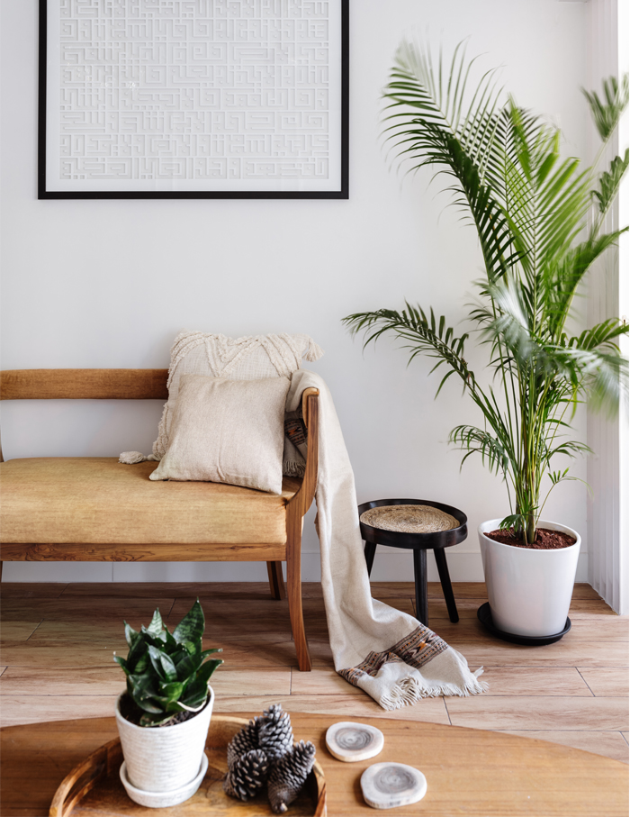
The fusion of a bespoke antique Arabic Kufic script religious artwork, an abstract boho painting and the wooden console underneath it all creates the subdued sophistication and playful allure, as aimed by the designers.
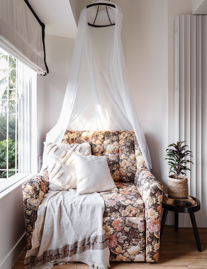
An end extension in the daughter’s bedroom is turned into a reading nook with cleverly disguised storage. A bespoke chair in this space also doubles up as a bed and a sheer canopy over it curates a calm atmosphere.
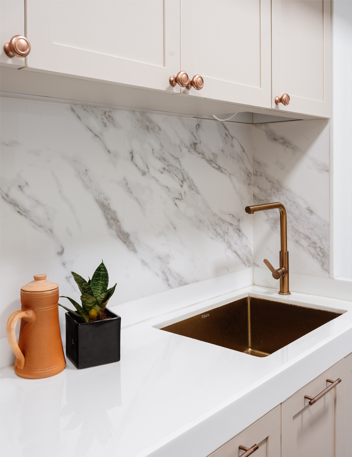
An all-pristine kitchen captures the light that pours in from the inter-connective living room. The compact kitchen has a classic appearance thanks to the composite marble countertop and the book-matched Carrara marble backsplash. Cabinetry in a taupe hue fits in well with the white space.
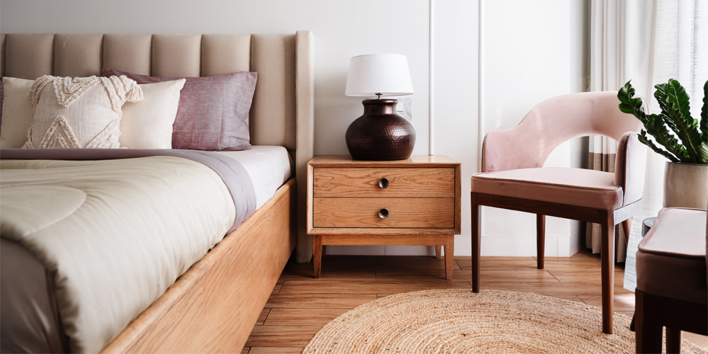
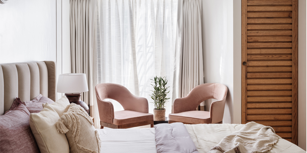
The material palette includes red oak wood for furniture, soft fabrics, millennial pink velvet seats and soft floating curtains in dual shades, all of which provide an understated romance in the main bedroom. To make the room look spacious, the designers installed a white wardrobe with mirrored panels.
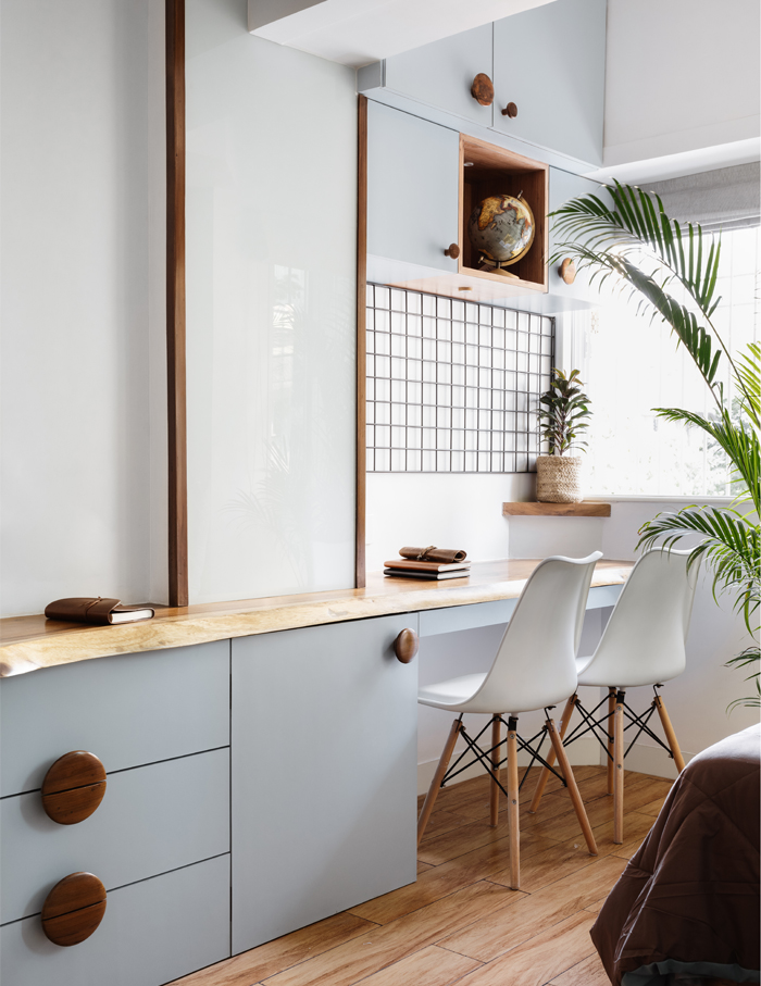
For the kid’s room, a chic, formal yet playful environment is built. A balanced aesthetic is maintained to provide each brother with his own space in the shared bedroom.
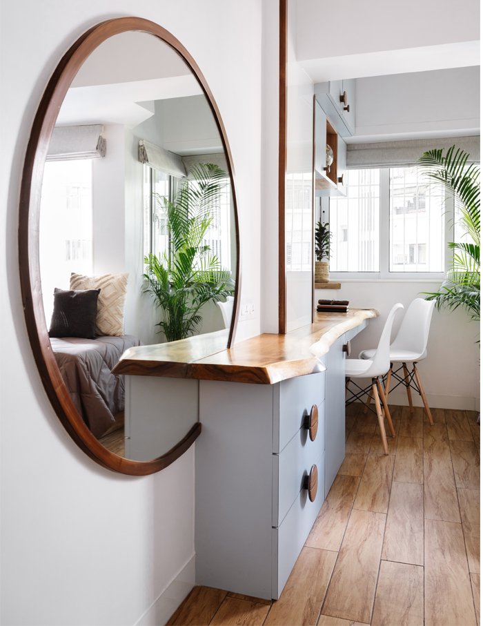
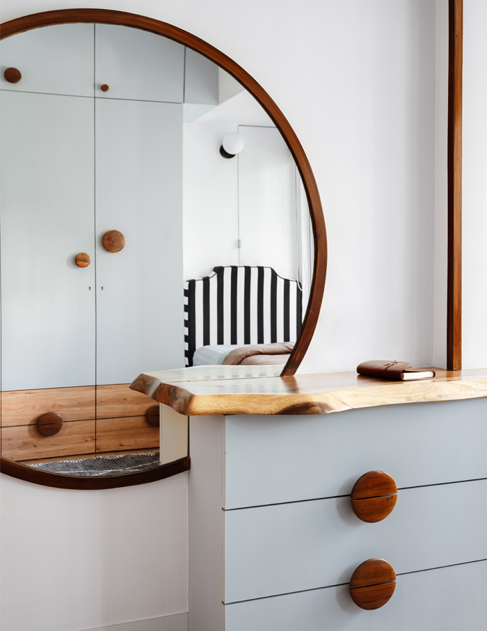
Brightened and expanded by a large circular mirror, the kid’s room uses wooden handles that complement the tall, tapering research table made out of a single piece of wood. The black and white striped headboards and window blinds bring a touch of whimsy to the space.
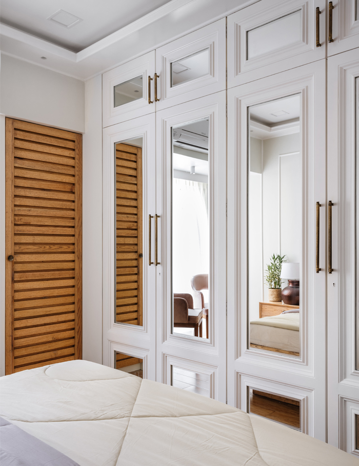
The sky blue closet divides the two beds, and the lower half of the wardrobe blends in with the wooden flooring, giving the impression of more floor space. The formality of the bright white walls is counterbalanced by the fun circular handles.
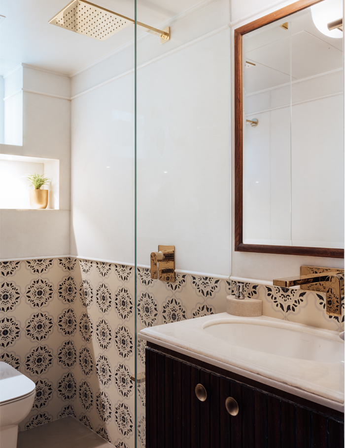
The whole concept was to use a colour palette that would make the apartment seem larger. The space is decked in a gentle wash of pastels, white and wood, and it looks much larger than its actual footprint.
“Our philosophy is simple—we strive to make the room as functional as possible while maintaining its aesthetic. We take an empathetic approach to the environments we create and designing someone’s house, which they can use for a long time and call their own, is a huge responsibility,” concludes Merchant.


