Photography courtesy of Herman Miller
Featured

A new palette for design’s most enduring chair

Jasper and Nightfall bring fresh colour to a design icon, without changing a thing about what makes it work

BY

Every so often, a chair transcends its function and becomes something closer to a cultural marker, the object you picture the instant someone says the word office. The Aeron is one of those rare designs. It sits as comfortably in a design museum as it does in a corner office, as familiar to design historians as it is to anyone who has spent a working life at a desk. Now, more than three decades after it first entered workplaces, Herman Miller‘s most recognisable chair is doing what any true design classic eventually does: evolving, thoughtfully and on its own terms.

Aeron was designed in 1994 by Bill Stumpf and Don Chadwick, two of the most influential figures in American industrial design. At the time, an ergonomic chair typically meant little more than a slightly more generous cushion. Stumpf and Chadwick approached the brief rather differently. They dispensed with the padded seat altogether, engineering a taut, breathable suspension material that moulded to the body instead of trapping heat beneath it. It was, by most accounts, an unusual-looking chair when it first appeared. It also proved to be an enduring one, eventually earning a place in the permanent design collection of New York’s Museum of Modern Art.

That same spirit of enquiry, a willingness to keep asking what a chair is truly meant to do, and to refine it as the answer evolves, continues to guide Aeron‘s latest update. This time, the change is not structural, but chromatic. Two new colourways join the family, and the thinking behind them reveals as much about how Herman Miller approaches the modern workplace as it does about the chair itself.
Photography courtesy of Herman Miller

Designed for better work

“Our research suggests that strategic use of colour can have a powerful effect on workplace engagement and individual productivity,” says Joseph White, director of design strategy for MillerKnoll. It is a simple observation, and yet one that workplace design has often overlooked, where neutral tones have long been treated as the safer, more practical default.

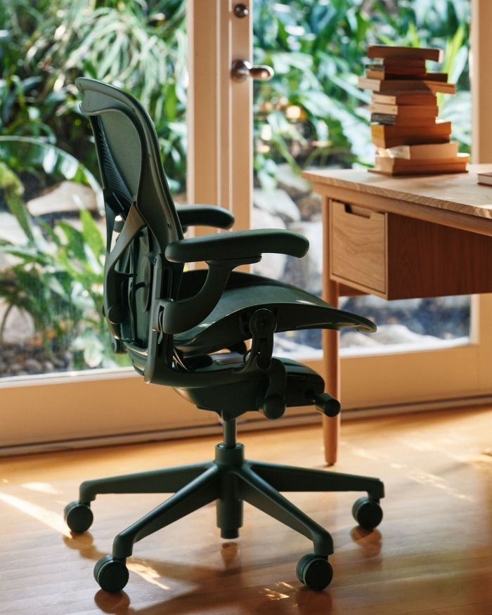
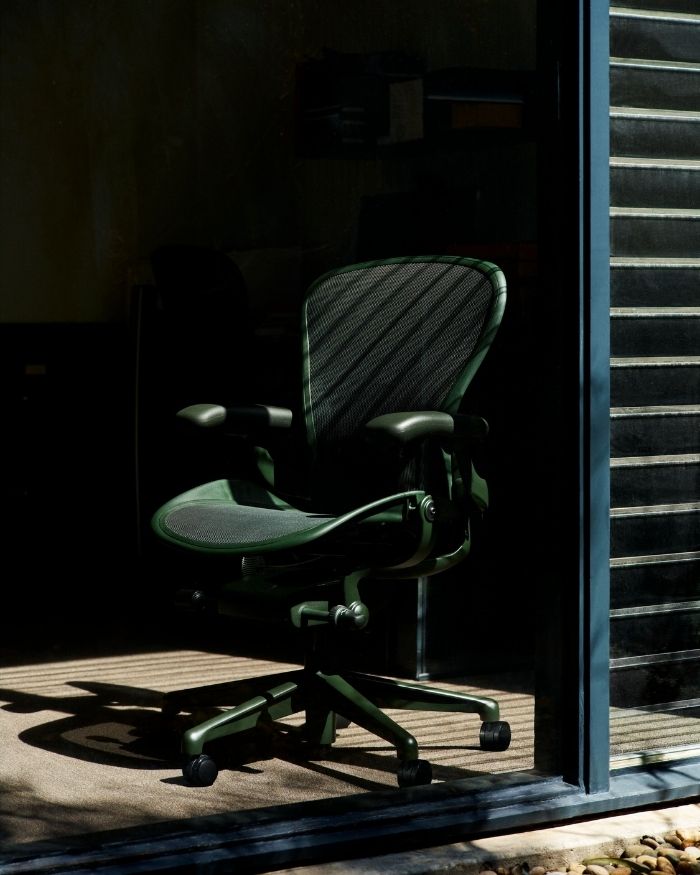
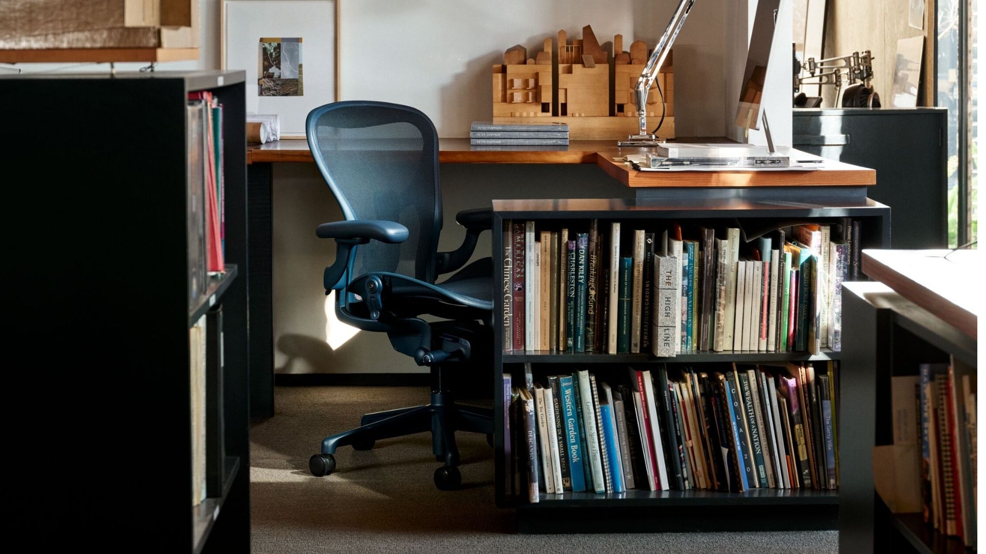
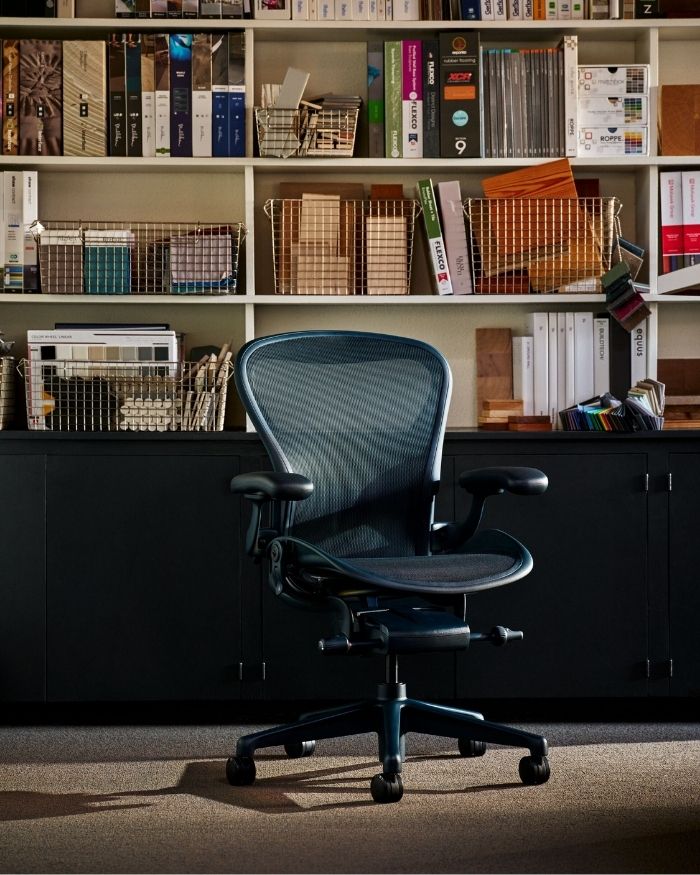
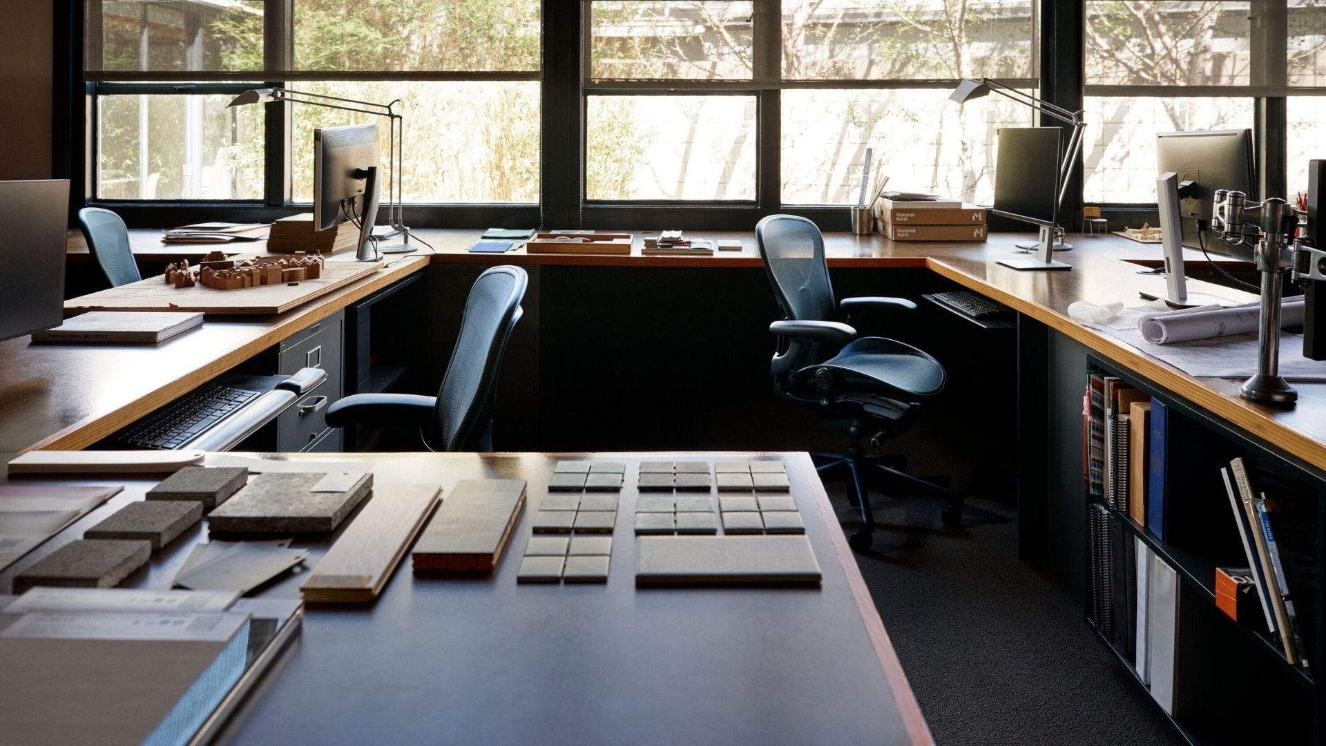
Enter Jasper, an earthy, dark olive green, and Nightfall, a deep, sophisticated midnight blue. Both draw their inspiration from the natural world rather than the conventional corporate palette, and both join the existing lineup of Onyx, Graphite, Carbon and Mineral. Individually, they read as grounded and considered; together with the existing colours, they give architects, designers and workplace clients a noticeably richer vocabulary to design with the means to imagine a workspace that feels deliberate, rather than simply furnished.

It is a modest shift on paper, but it speaks to a broader change in how workplace design is being approached: less about filling a floor plate with identical desks and chairs, and more about creating environments that genuinely support the people working within them.

Photography courtesy of Herman Miller

A material philosophy, not just a colour story

Colour may be the headline, but it is far from the whole story. A continued curiosity for new materials and processes has long distinguished Herman Miller as an innovator, and that shows up here, too, in ways that are easy to overlook if one is only considering the finish. The brand continues to incorporate more post-industrial recycled content and bio-based nylons into its manufacturing, reducing its carbon footprint on a global scale, not as an afterthought, but as a design constraint that informs decisions from the outset.

Built to last, and built with the right materials in the right measure, Aeron stands as a clear example of what circular design can achieve at scale, rather than as an isolated gesture. None of this comes at the expense of performance or durability; if anything, quite the opposite. Aeron continues to combine generative design with genuine engineering expertise, offering individuals, organisations, A&D firms and GCCs a rare alignment of employee experience, workplace wellbeing, sustainability and design quality within a single object.

Photography courtesy of Herman Miller

Aeron, redefined

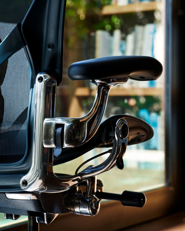
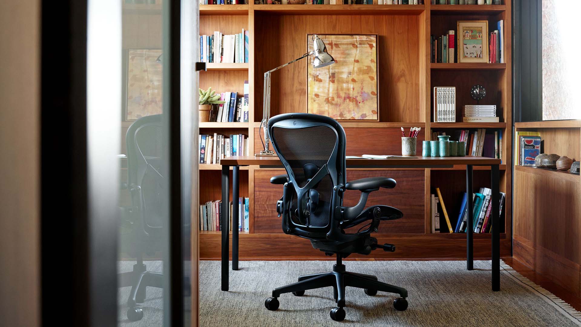
Set the colour story aside for a moment, and what remains is still one of the more quietly considered pieces of design found in any modern office. By bringing together every technological and ergonomic enhancement gained over the last three decades, Aeron supports the body’s natural movement across every posture—from upright and focused to reclined and reflective—improving comfort, productivity and efficiency across a workday that, for most people, no longer follows a fixed nine-to-six rhythm.

It is this willingness to keep refining a design classic, rather than resting on its own legacy, that keeps Herman Miller relevant to the evolving needs of premium workplaces, ones where comfort, performance, durability and aesthetics are no longer treated as separate considerations, but as a single, unified brief.

More than three decades since it first redefined what an office chair could be, Aeron remains proof that a design classic need not stay frozen in time to remain iconic. Sometimes, all it requires is the confidence to keep adapting one’s considered decision, and now, one new colour, at a time.

Discover the new Aeron

Photography courtesy of Herman Miller
SHARE THIS ARTICLE

You May Also Like

Watch

No results found.

Search
Close this search box.