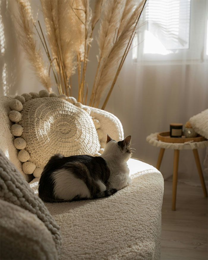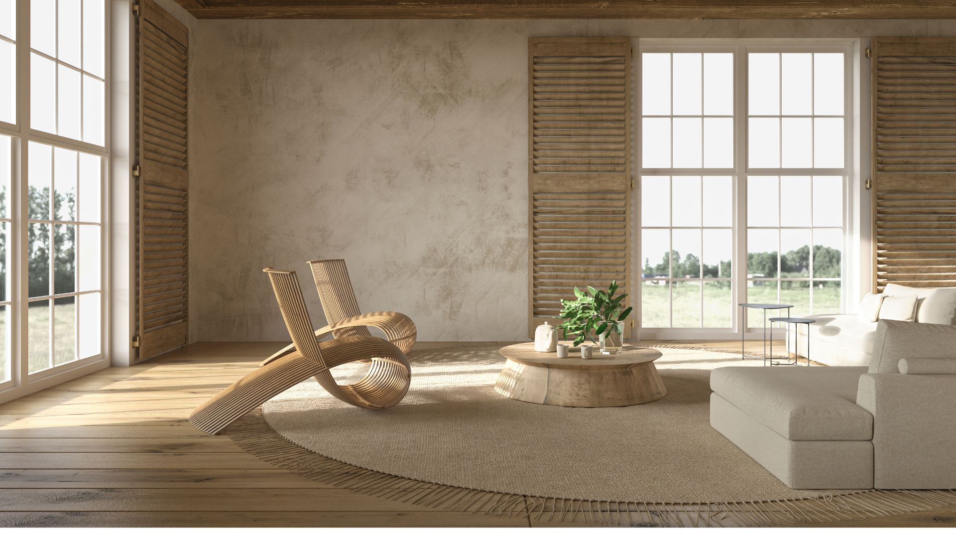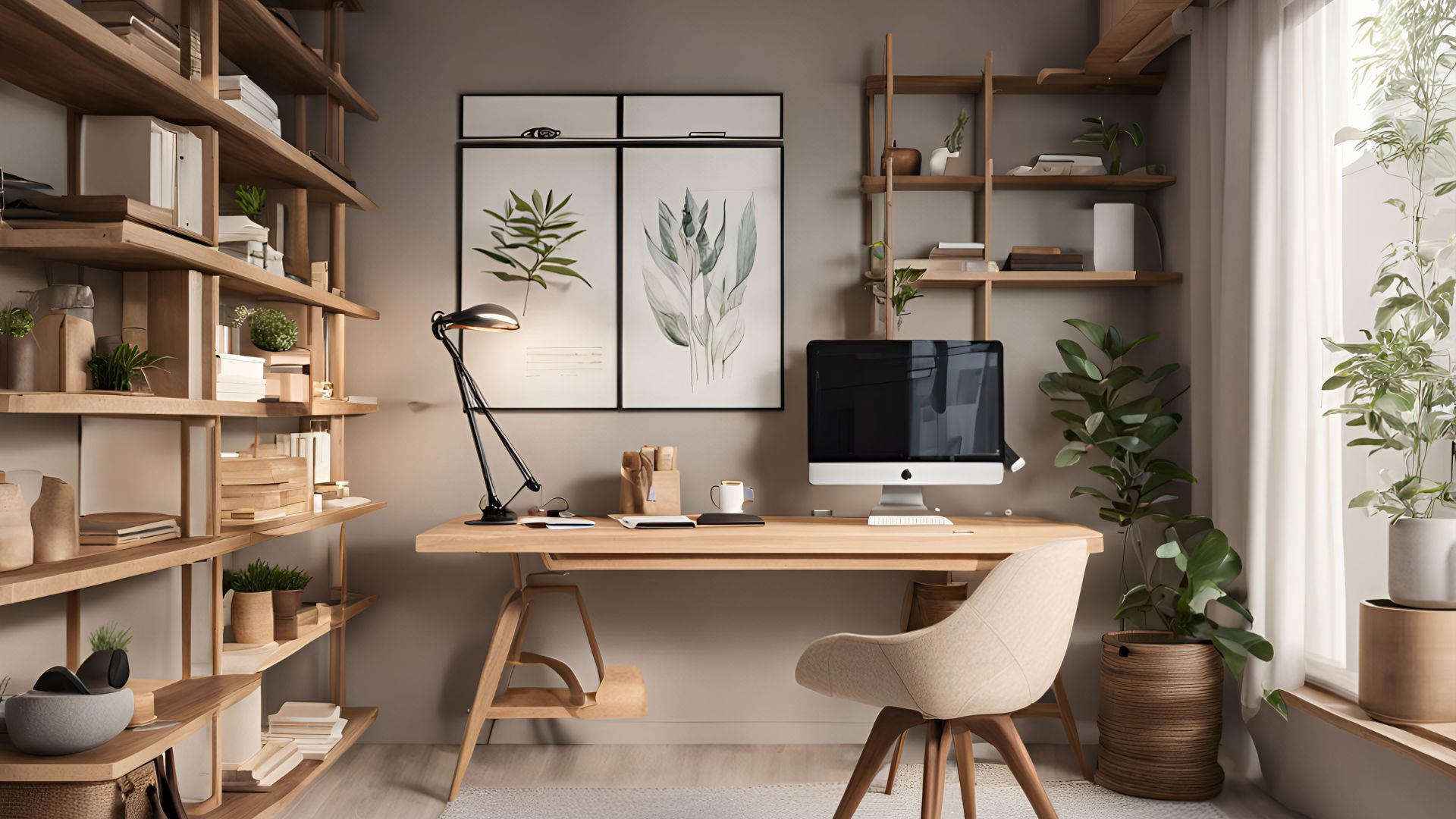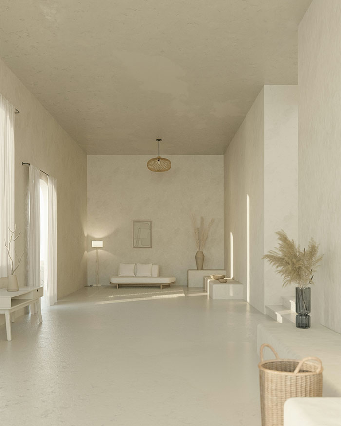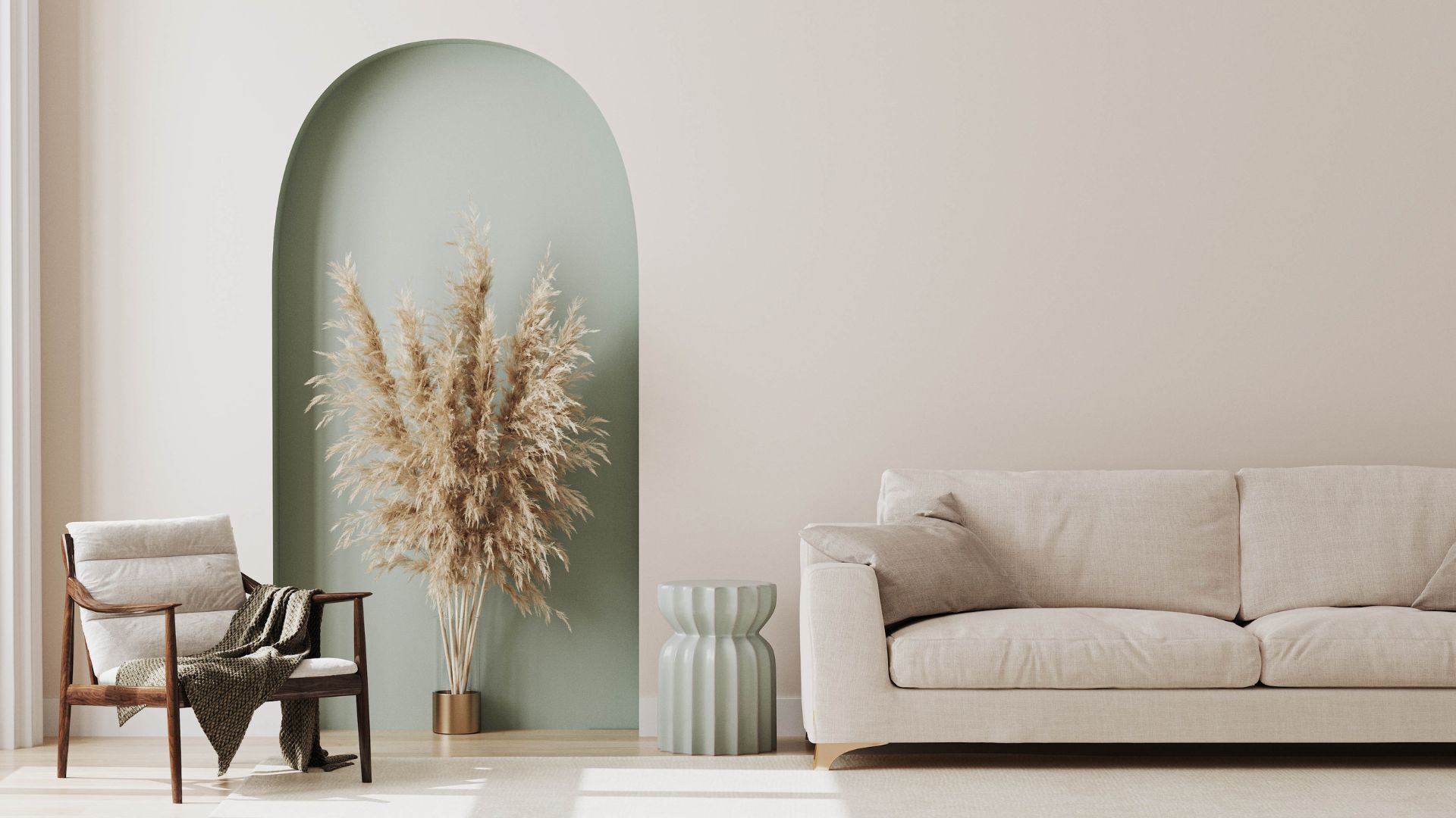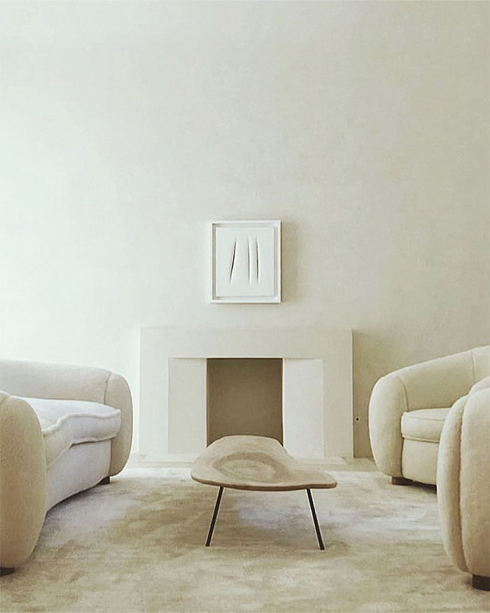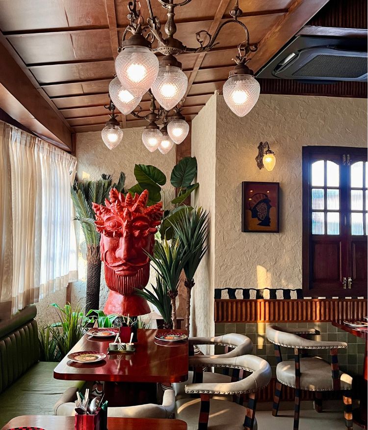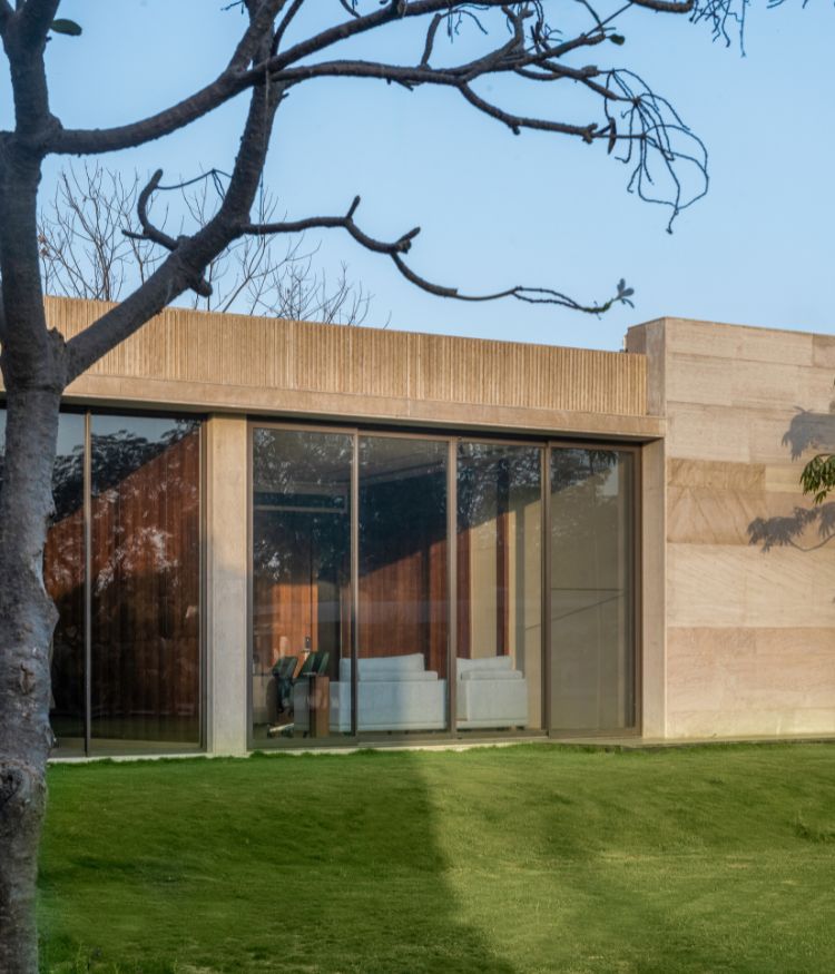
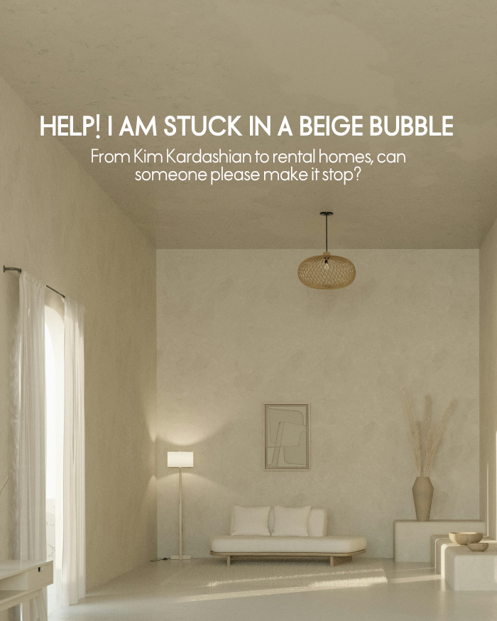
Every morning I wake up in a beige house, scroll through Instagram on my iPhone, and look at more beige interiors. A few familiar words show up: Japandi, wabi-sabi, minimalist interiors. Then others float in. Some from the comments, some from my own mind: basic, overdone, boring. I close the app. Enough Instagram for now. I pull on a beige shirt (or white, if I’m feeling rebellious) and step out into a sea of glass buildings filled with more beige interiors. It feels like the built environment has turned into a sensory deprivation tank sans the deep relaxation. Welcome to the era of the sad beige aesthetic.
HOW DID BEIGE INTERIORS TAKE OVER?
The sameness is numbing. But why doesn’t anyone question it? When did we all consent to live in this beige bubble? My search for answers led to some strange places: Freudian psychoanalysis, Nazi design history and late-night stalking of Kim Kardashian’s mansion. Who’s responsible for the beige interior trend? A major clue lies in the aftermath of the Great Recession.
A glaring suspect also hides in your own phone. Pinterest. From “live, love, laugh” signs to faux marble to pastels, there is hardly an aesthetic that does not get pinned. Endless shares with dubious origins lead to a strange performativity. Even more so than other social media platforms, Pinterest thrives only on visuals. Whatever looks good on a 1920×1080 px phone screen reigns supreme.
"It is time to ask ourselves, who gets to call the shots when it comes to creating culture? Is good taste a matter of social capital?"