Chennai chic: fluidity, flavour and function

A 7,000 sq ft Chennai home by Chestnut Storeys embraces a burst of colours and individuality

BY

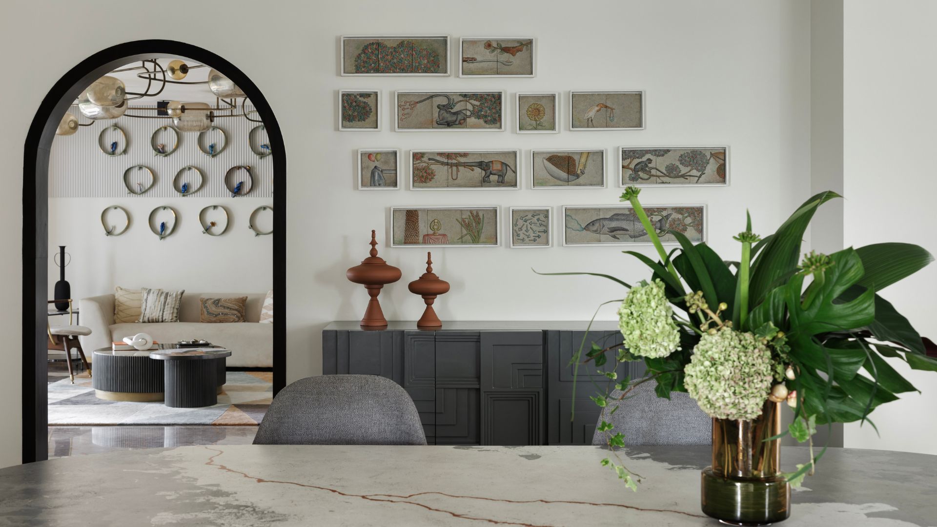
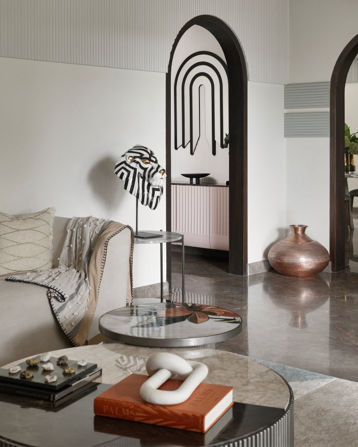
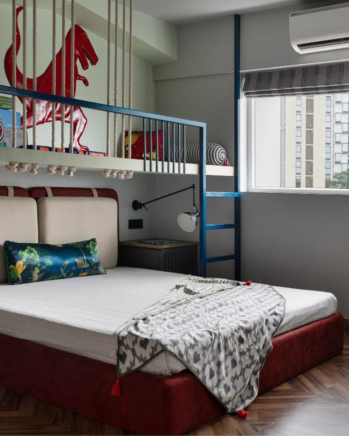
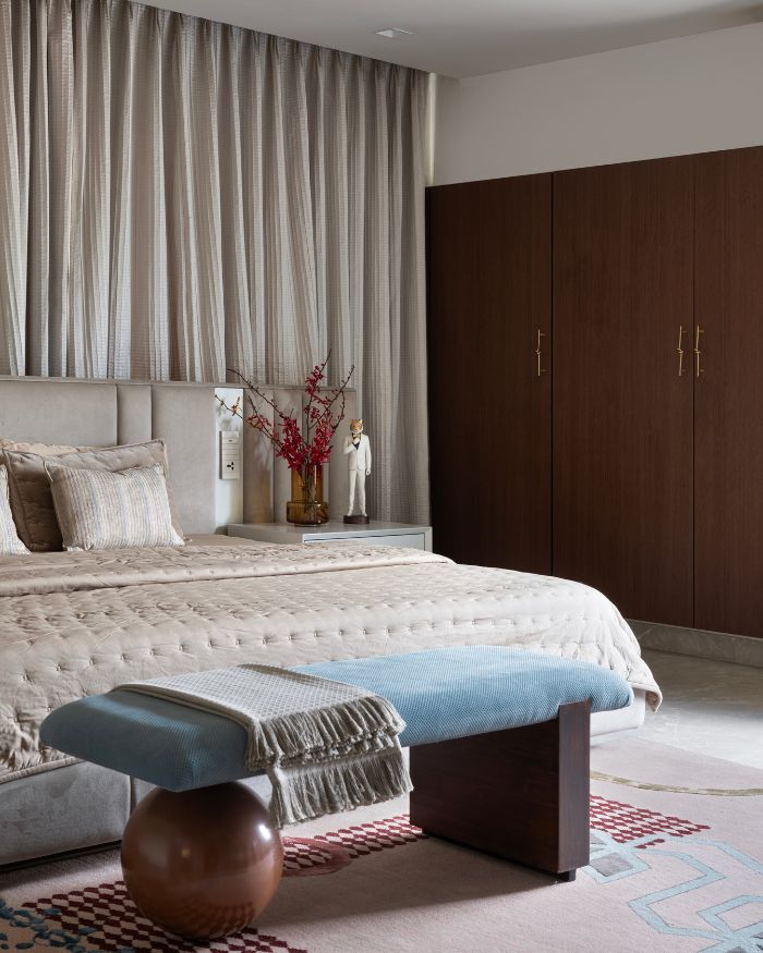
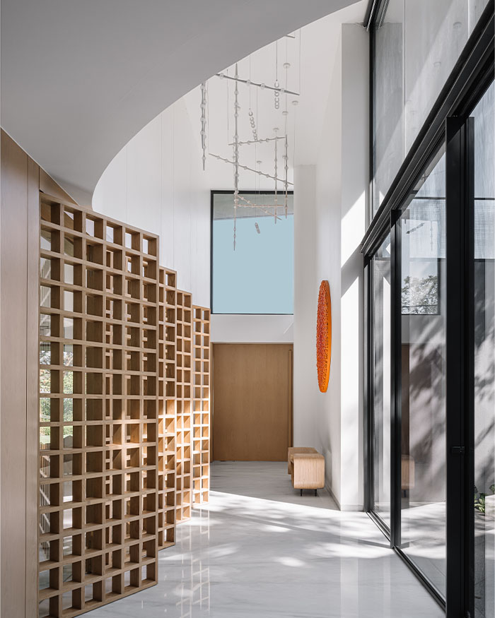
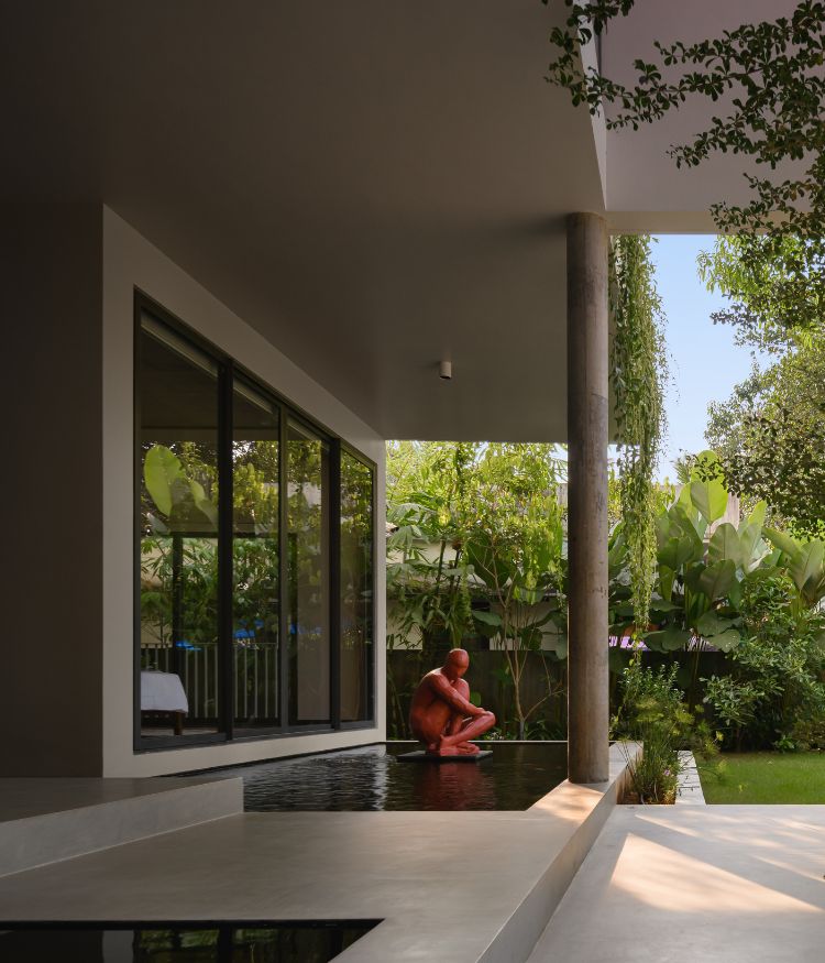
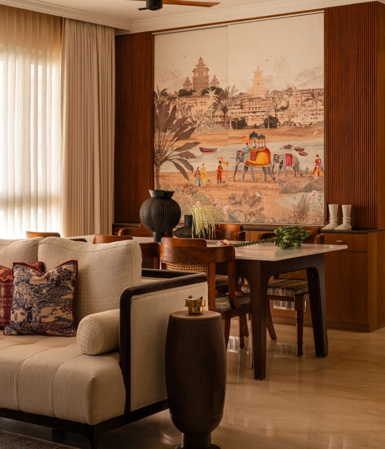
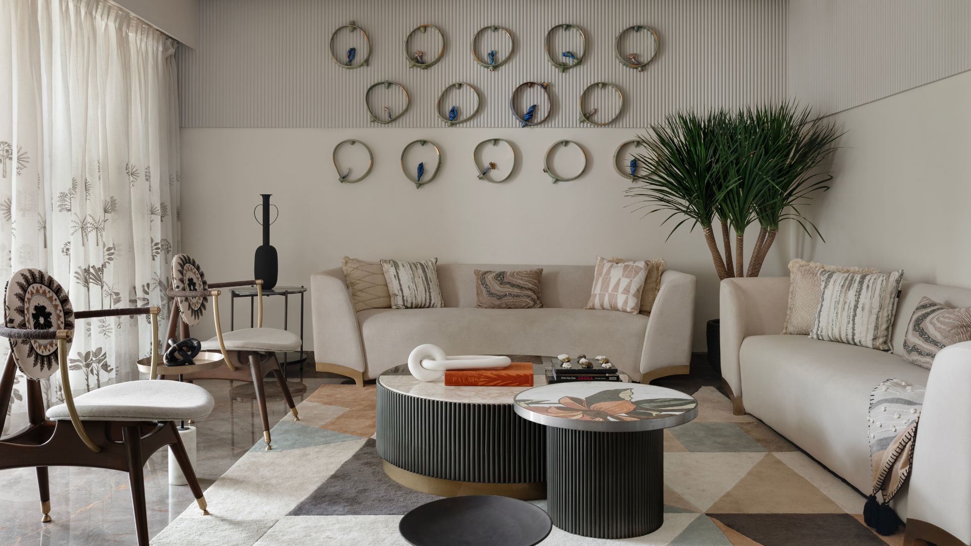
Balance. In the realm of design it could usually mean a sense of symmetry and structure. This sprawling 7,000 sq ft home in Chennai stands as a robust testament to the concept, striking a balance between staying true to contemporary design trends and breaking away from traditional expectations helmed by Chestnut Storeys. And clearly, the star of the show is fluidity.

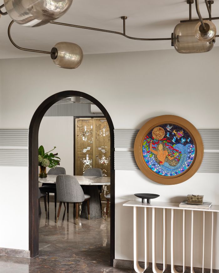
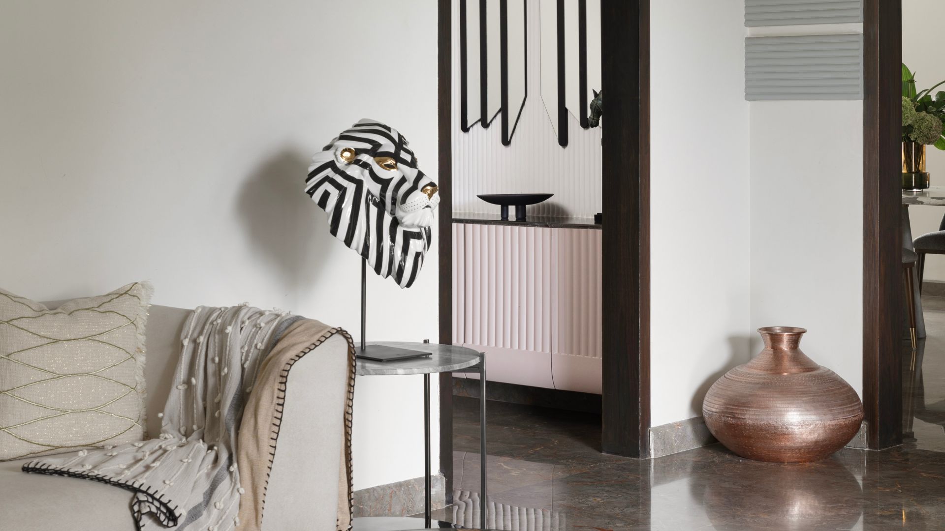
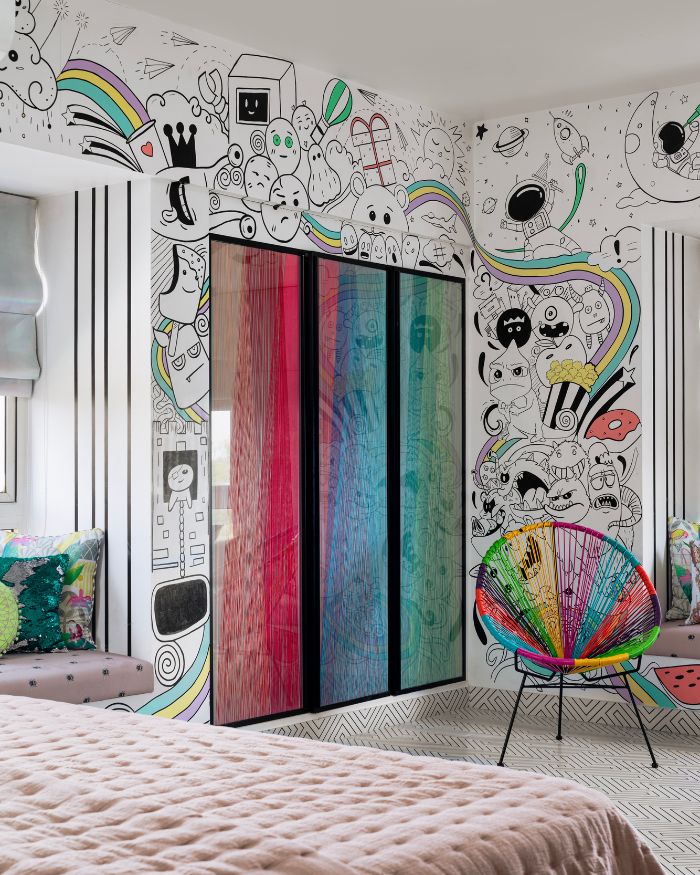
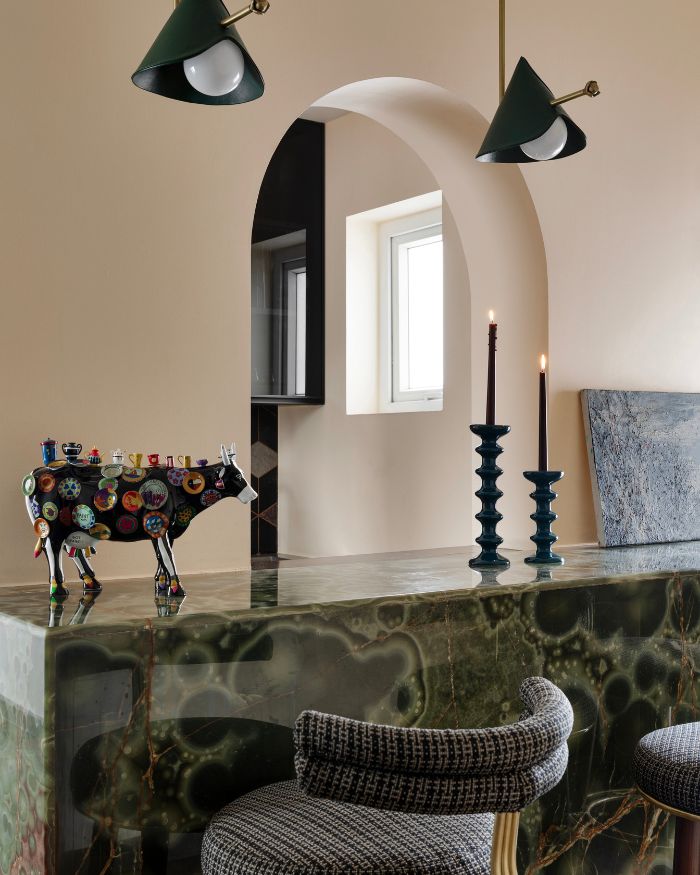
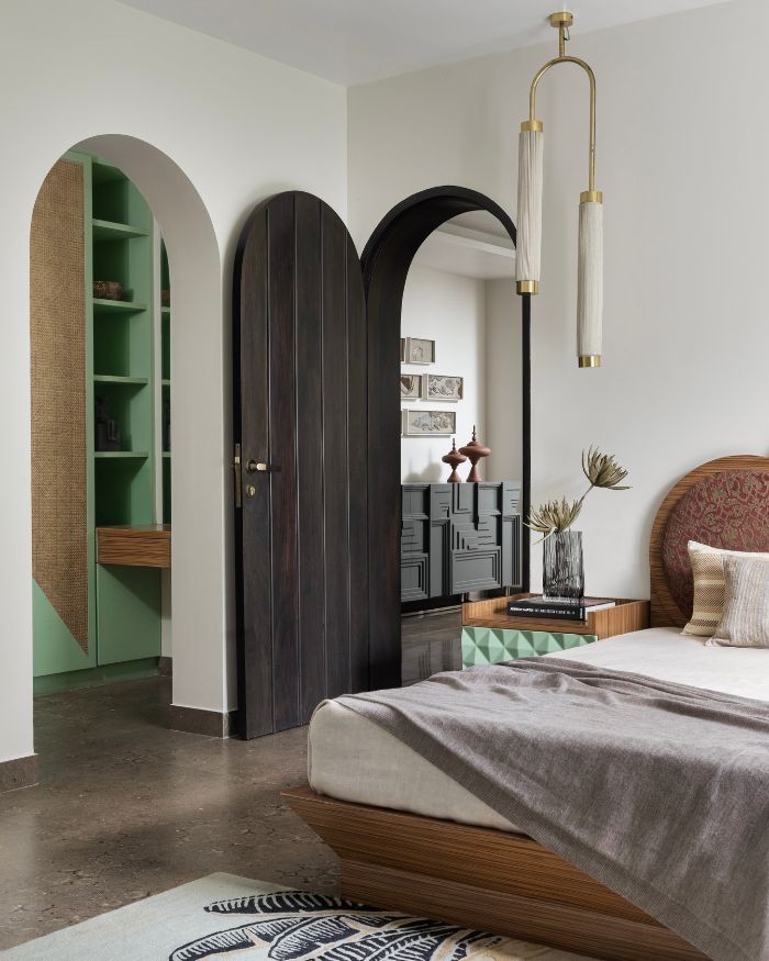
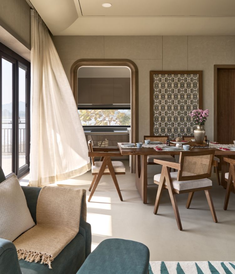
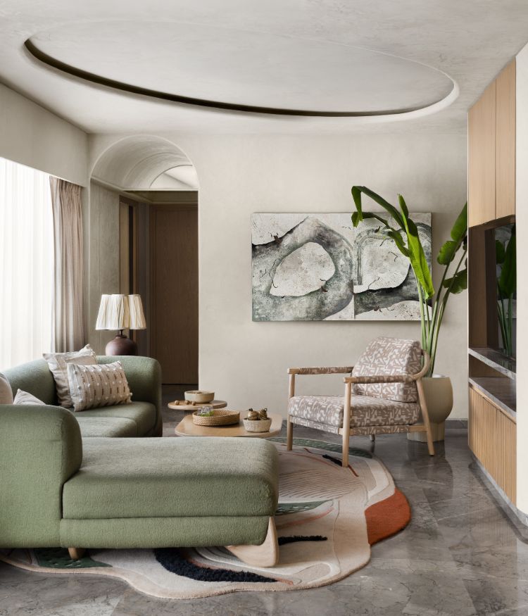
“The fluidity between the public and private areas, particularly the cohesive flow from the neutral-toned living and dining spaces into the more expressive, personalised private rooms — reflects openness, connectivity and flexibility,” says Farah Agarwal, Principal Designer at Chestnut Storeys. This trend is further echoed through the generous use of bespoke elements such as custom chandeliers and etched brass doors that elevate the design without overpowering it. Steering clear of ubiquitous trends, this home avoids the muted-minimalist trope, instead embracing playfulness, groundedness, and personal expression.

"In the formal spaces, arched doorways and bespoke pieces like etched brass doors and custom chandeliers add a touch of sophistication" — Farah Agarwal

COHESIVE AND TRANSFORMATIVE

A noteworthy aspect of the overall design is its overarching play of harmony. “It’s a home where stories are told through design, with every corner infused with character yet bound by an underlying cohesion,” tells Farah.

The public areas, with their neutral palette and carefully curated pieces, establish a serene, welcoming environment. The private spaces—including the children’s rooms—embrace a design sensibility that promotes openness, connectivity, and flexibility, where bold graphic furniture, whimsical murals, and unconventional patterns celebrate creativity and individuality.

The outcome, though impressive, came with its share of challenges. Balancing the individual desires of each family member while maintaining a harmonious flow across the two distinct floors of the apartment demanded careful thought and precision.

“The solution was to create subtle threads of connection through design elements like colour, texture, and art, ensuring each space felt like a natural extension of the next.”

Staying true to the underlying theme of cohesion, the home’s colour and material palette leans toward a calming core.

“This calming core allowed us to layer in more expressive and bold elements that catered to individual tastes. In the formal spaces, elegant arched doorways and bespoke pieces like etched brass doors and custom chandeliers add a touch of sophistication. The contrast between soft neutral tones and these unique accents helped us create a dynamic yet balanced aesthetic, ensuring the home felt both luxurious and personal,” concludes Farah.

As she takes us through the home, it’s evident that balance in the palette emerges from the interplay between a neutral base and bold, expressive accents—creating a home that is harmonious and authentic in its entirety, yet deeply personal for each family member.

Now read: A restored Chennai home by Gowri Adappa with bridges time and generations

SHARE THIS ARTICLE

You May Also Like

Watch

No results found.

Search
Close this search box.