If you’re giving your home a makeover, it makes sense to start with the biggest canvas: the walls. You’ve scrolled through Pinterest boards and Instagram photos, filled with neutral greys, comfy blues and pastel pinks that only seem to define what you want in your home. But how does a shade transform into a global trend, or a hashtag that is “liked” by everyone? We decided to find out from the experts.The predictionThe Dulux Colour of the Year sets the tone for the year, with their annual unveiling. Behind the scenes, months are spent in research by the AkzoNobel colour experts that involve analyzing previous trends, conducting research and tapping into the consumer experience.
“The aim of our research is to know what colour preference our consumers are going to have in a few years’ time, without yet knowing it themselves,” explains Heleen van Gent, Creative Director at the AkzoNobel Global Aesthetics Centre, the colour design and trend analysis branch of Dulux’s parent company which conducts colour research.
Throughout the year, Van Gent and her team immerse themselves in colour and design trends, while consulting annually with leading architects, designers and trend watchers to compare notes and perspectives – to ultimately translate it into the colour of the year.
Comparing timesVan Gent believes there is a huge difference in the colour trends from 2004 to now, and it is almost always related to the mood of the moment. “In 2015, we had Copper Blush, this very warm, orangey colour which translated the positive outlook on life. Last year with Denim Drift, we saw that consumers had more of a need for balance and calm,” she says.There has also been a shift in the way we perceive colours like pink and blue. Emily Murray, founder and editor of the award-winning interior blog The Pink House, agrees. “Colour has always shaped trends —and even our values and behaviour — on a macro level,” she says. “The fact that pink has in recent years been seen by less imaginative retailers and marketers as being ‘for girls’, while in Victorian times, it was a ‘boys’ colour, is just one example. Our colour choices are strongly affected by societal pressure, which in turn, alters our perception of a colour’s message.’”
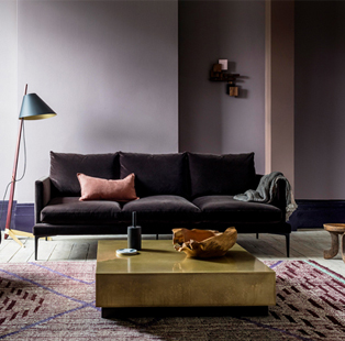
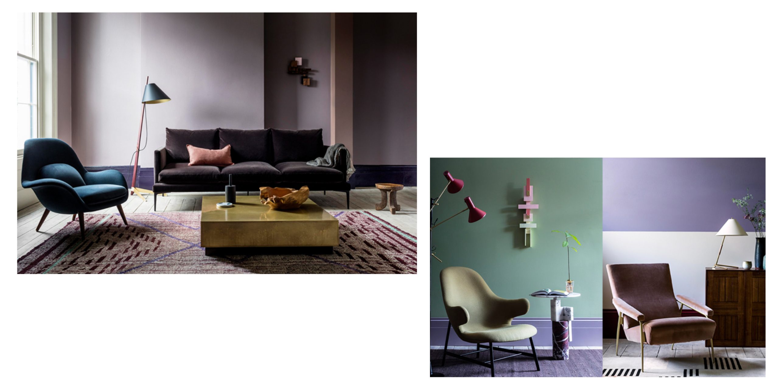
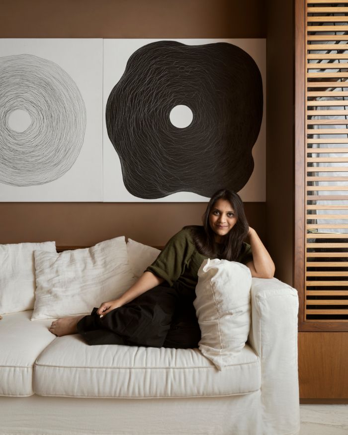
Heart Wood for a Welcome HomeThe 2018 Dulux Colour of the year, Heart Wood, does seem to fit today’s mood then. Van Gent describes it as a “beautiful, warm, grown-up pink”. Inspired by warm tones of leather and wood, Heart Wood signifies a shift towards a comfortable life that people seem to crave in their busy lives.
AkzoNobel Global Aesthetic Center created four palettes that craft “A Welcome Home” for everyone, from a family-oriented homebody who likes entertaining to a busy digital native looking to come back home and relax.
The Future of ColourVan Gent paints a bright future; “Colour is the more democratic and cost-effective interior decorating product and the effect of colour per square metre is incomparable to something as small as a cushion or a vase.” In a world of endless complication, noise and stress, colour scheming could well be the way to empowering people to create spaces they feel comfortable, and most importantly, at home in.