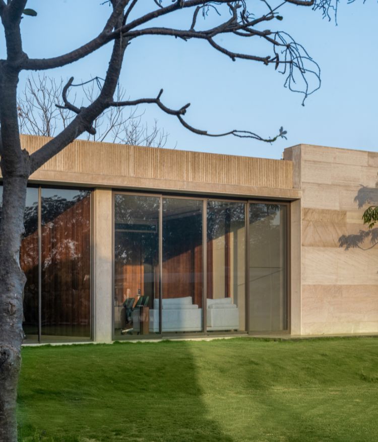
The Long House is simply named for the fact that it’s a combination of two homes to make one. Having worked with the homeowners before, Mumbai-based Anushka Shetty has conceptualised the residence with one thing in mind—the manipulation and reflection of sunlight, especially considering it is cocooned by trees.
“The apartment lies on the first floor of an old building in Mumbai. It didn’t come with high ceilings or large windows, so we based our entire design on filtering ample sunlight into the home,” explains Shetty.
To create more space, the home is redesigned to have three bedrooms and an expansive living room, where an adjoining bar and dining area is accommodated. The designer’s raison d’etre was to avoid visual clutter because of the narrow site.
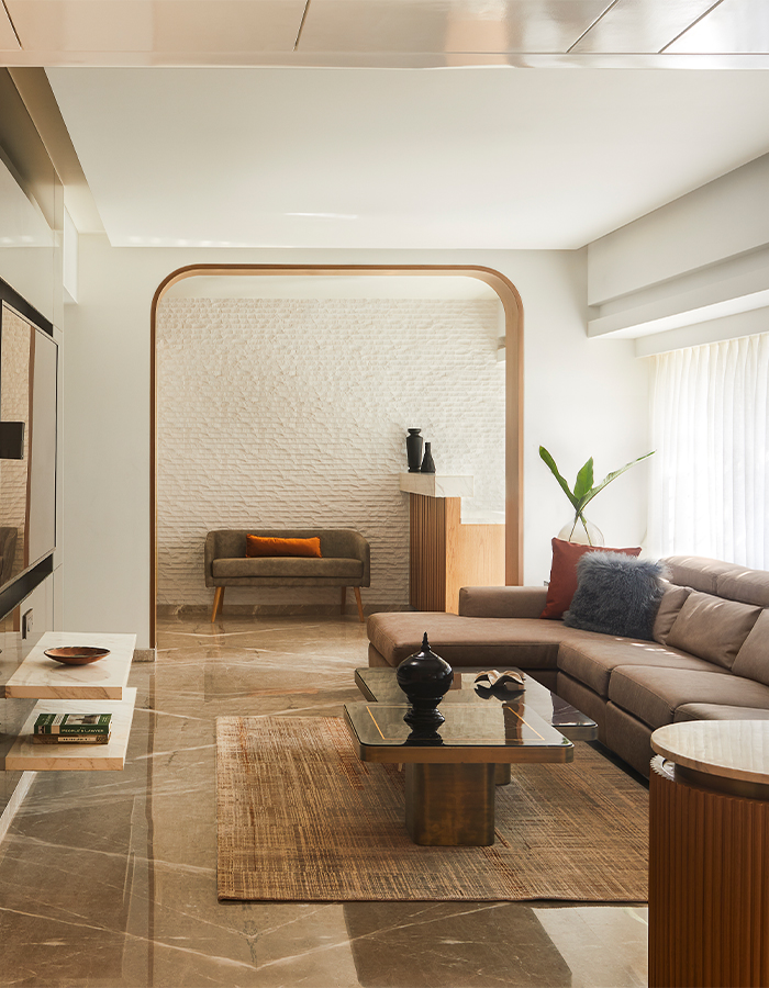
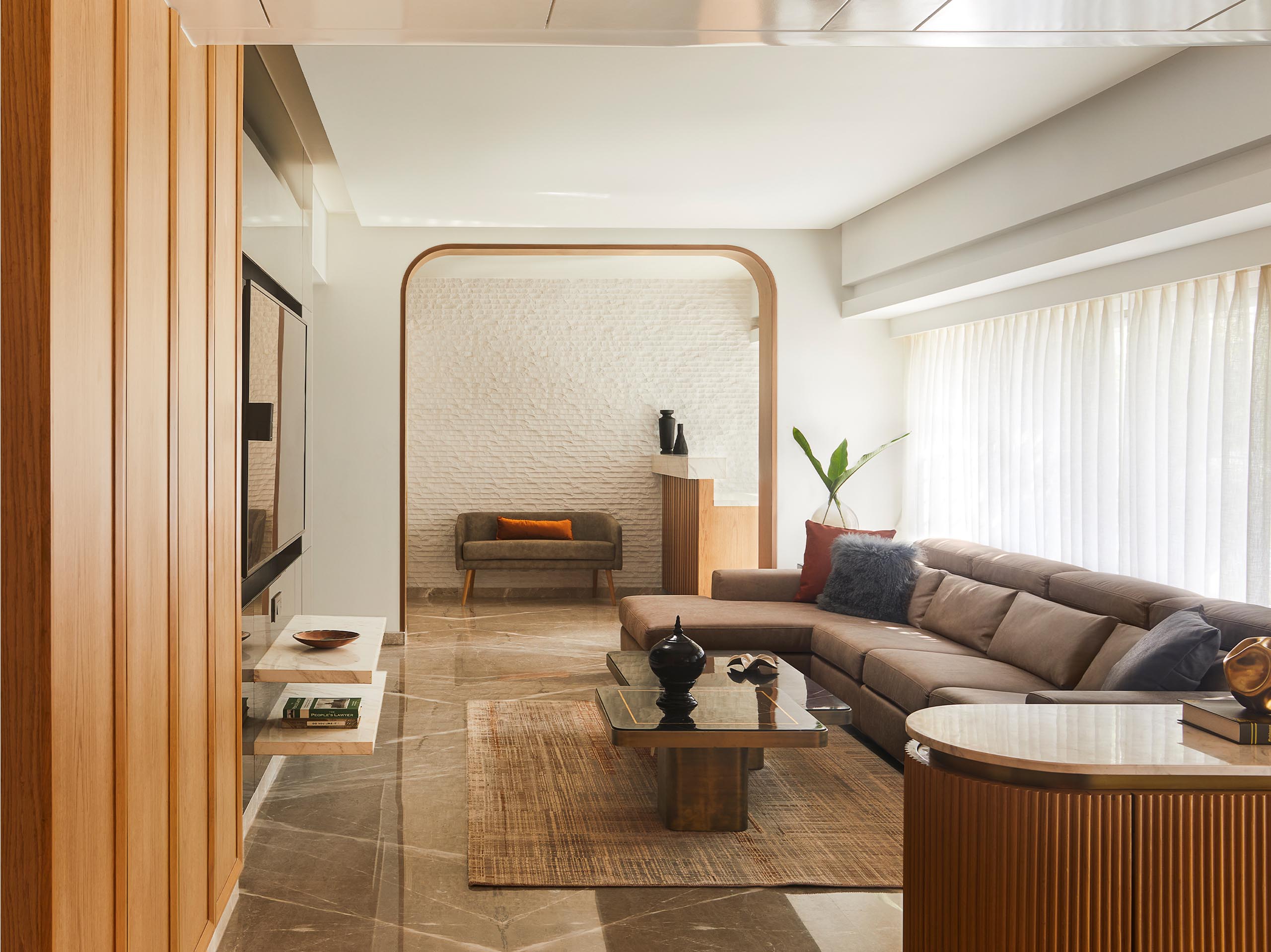
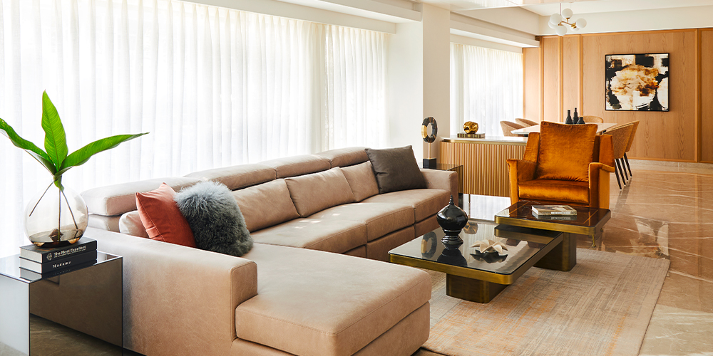
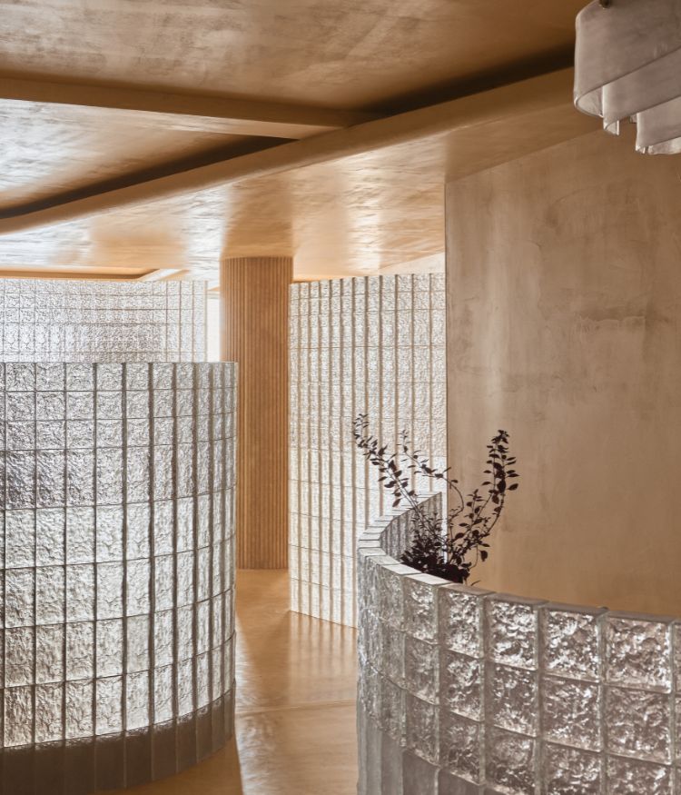
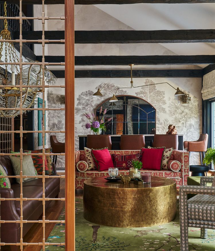
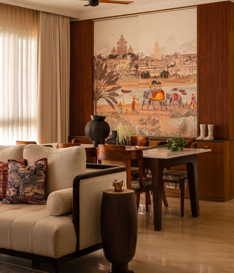
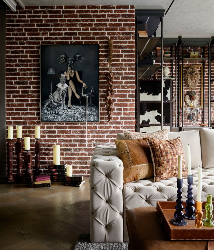
The mood-based home is light and airy. It boasts a unified design language that’s infused with a play of subtle colours and textures. Bold forms and clean lines are seen throughout with a neutral-toned material palette of oak wood, textured stone walls, grey and white marble, linen wallpapers and more. A pop is added through colours such as dusty rose, cyan, olive and rust seen on handpicked art and artefacts.
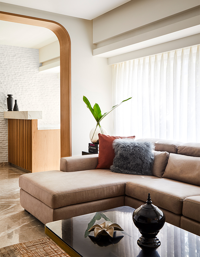
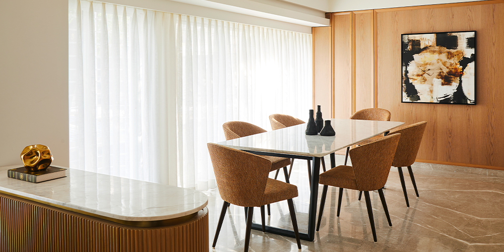
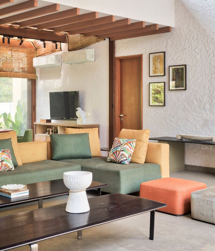
An arresting arched wall separates the living and bar areas. Oakwood panelling conceals the room’s storage spaces and an abstract painting is mounted on the centre-most panel. A bespoke ribbed console divides the dining from the living, which is an expansive space featuring a large sectional sofa and a concealed TV unit in black glass.
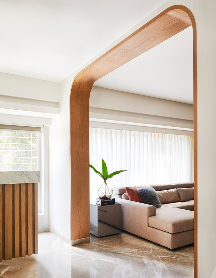
The living room lies at the heart of the house and a long passageway runs on either side. The kitchen and master suite lie on the right of the hearth, while on the left are the powder bathroom, daughters’ and guest rooms. The kitchen is done up in glass and lacquer in white and taupe, paired with cement tiles from Bharat Floorings and a handmade subway taupe dado tile.
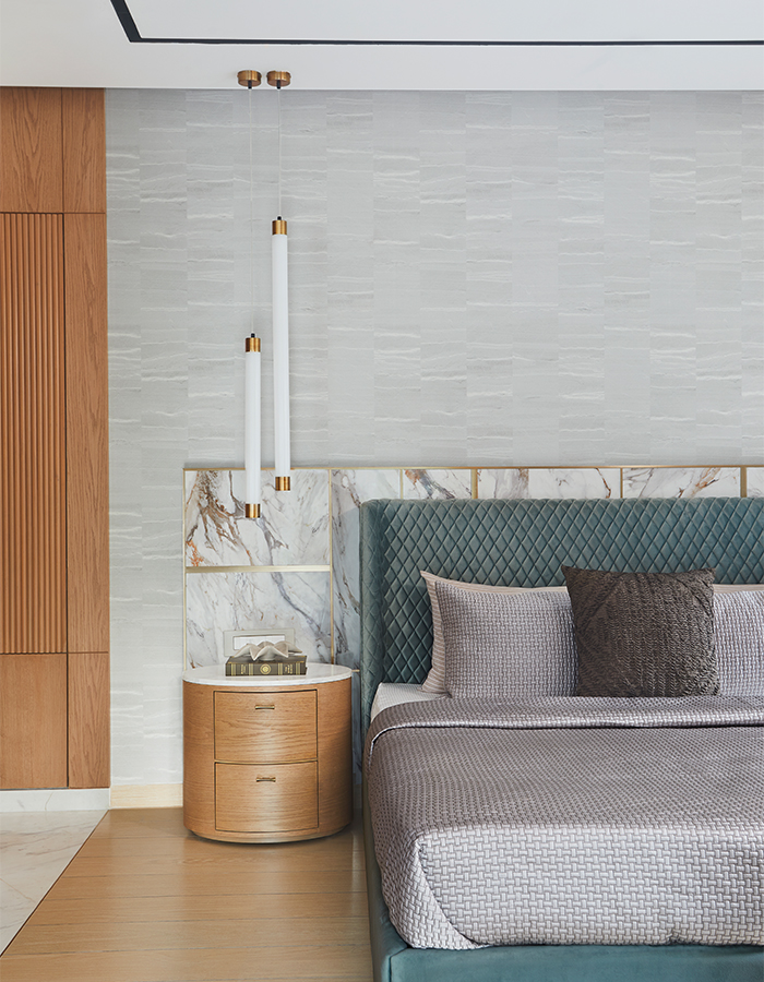
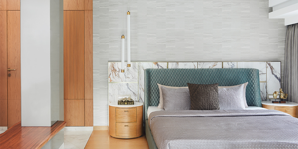
The custom-designed master bed is a cyan quilted, softly winged element that breaks the monotony of the neutral colours seen in the rest of the house. It greets us with an entry to the walk-in closet. Nearby is an oakwood panel that conceals the ensuite facility.
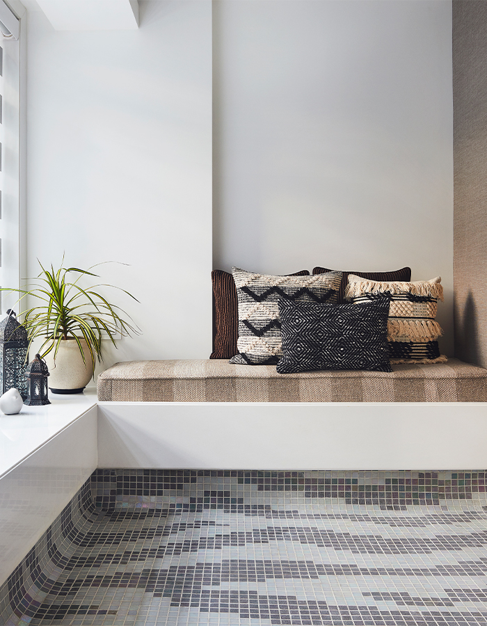
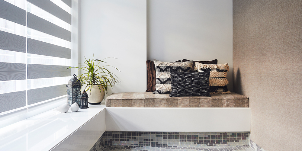
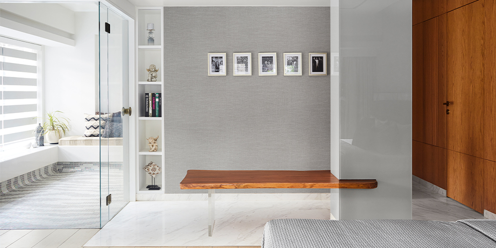
Shetty says the master bedroom “was fun to create because of its many clever design interventions such as the plug-in bench seating and the outdoor lounge space, which I really loved designing especially because such features make a space more exciting to the user and are perfect for downtime.”
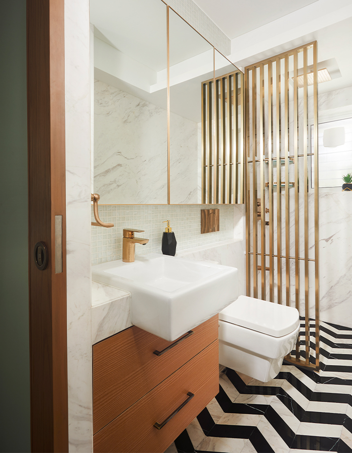
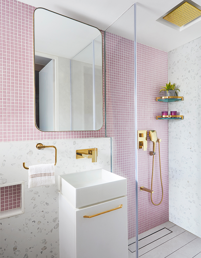
The powder room is bold with chevron-patterned flooring in black Marquina and white Bianco Oro marble. Next in the hallway is the daughters’ bedroom, which features a walk-in wardrobe and an ensuite, dusty pink bathroom, which is nothing if not chic!
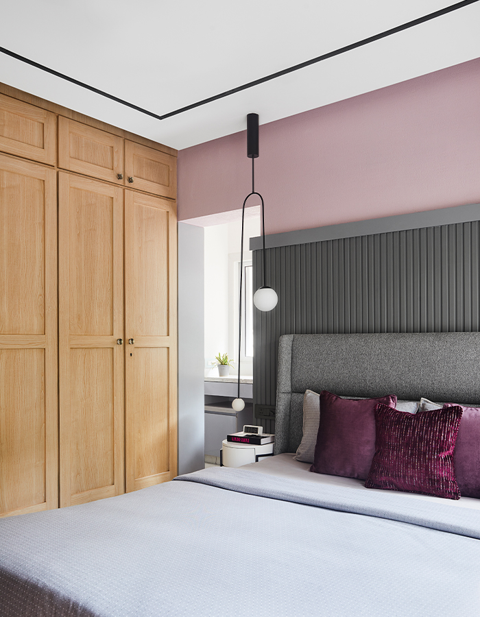
The daughters’ room also features a bed back with a ribbed panel. This acts as an indirect source of light washing the rose coloured stucco wall. Balancing this is a balcony-turned-study nook, which brings natural light in.
The last door on the left passage is the guest room, which is rather quaint in comparison with the others. It is washed in muted tones that align with the theme of the house.
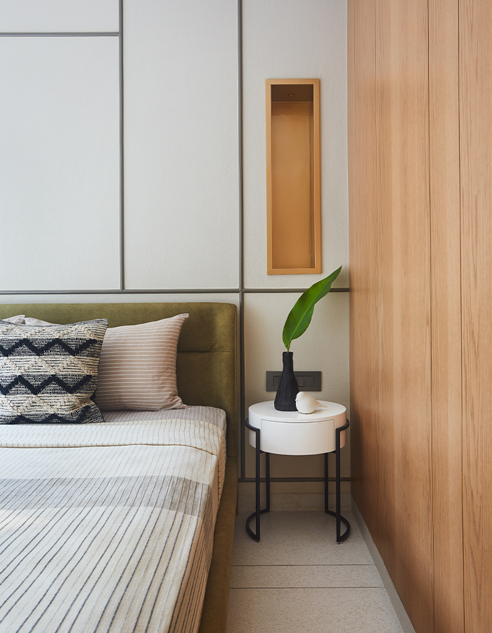
“My design philosophy is to avoid visual clutter and unnecessarily or over-complicated detailing. I like to practice restraint while designing such that only a few masterstrokes speak volumes and eventually result in understated elegance,” concludes Shetty.

