Why should maximalists have all the fun? Designed by Tanya Mallavarapu Studio, this minimal apartment in Chennai is an undeniable classic, unafraid of a pop of colour (or two).
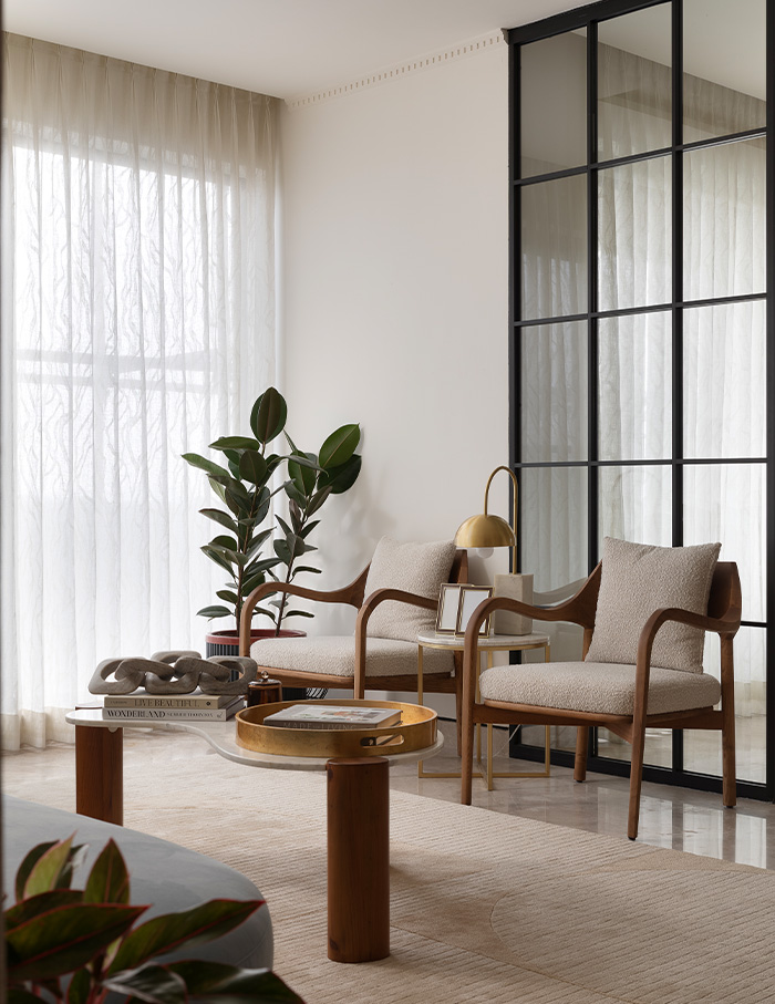
Extending across 2,500 sq ft, the space sports an abundance of toasty-hued wood, containing curves and sharp angles in equal measure. Ample daylight gushes in through its windows, bouncing off the cream-hued walls. Despite being minimal, one spots a plethora of prints and colours in doses potent enough to dispel any beige-induced boredom.
Giving peace a chance
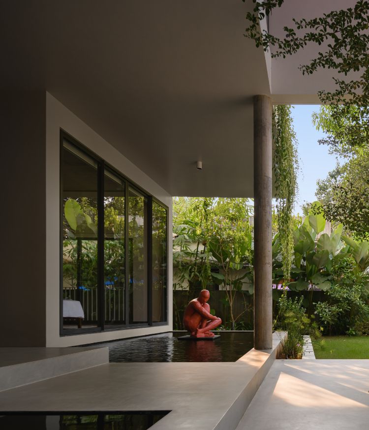
In an unexpected turn of events, nature emerged as the driving force behind the overall design — a fact that we’d wager romantic poets like Wordsworth or Coleridge would approve of. Throes of trees and lush greens sprawl below the apartment, inspiring the homeowners to craft a serene space where they could kick back and relax. Tanya, the founder of her eponymous studio, found this blank canvas perfect for cooking up some delectable design. She states “The home breaks away from many design clichés and is designed as a timeless space. Each space in the apartment has its own identity.” Containing a bevy of contemporary elements and tonal textures, an open layout was prioritised to make the best of the fresh breeze that pours in.
Classic with a twist
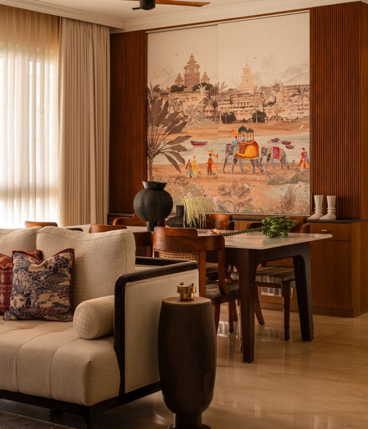
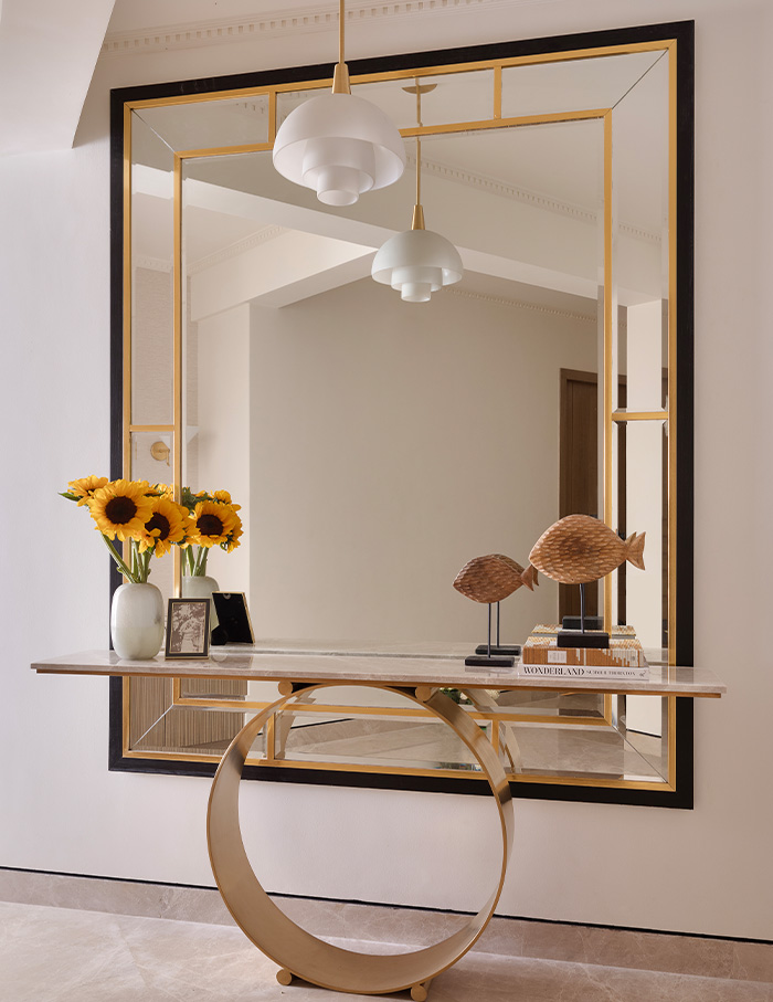
Distinctively contemporary yet grounded, the space does not shy away from experimentation — especially of the tactile kind. Bevelled mirror panelling in brass and black decorates the foyer. The living room, dining space and kitchen are interconnected, separated by partitions one can push and pull at their own will. Three bedrooms and a den lie further within, each one containing a varied array of materials and textures.
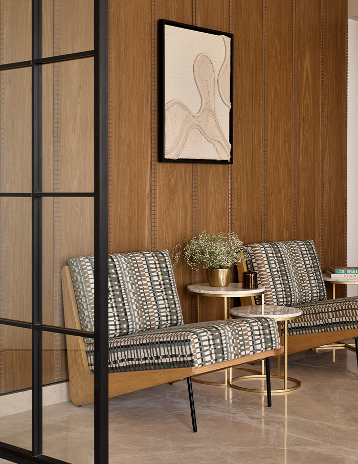
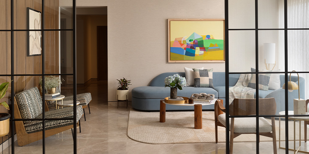
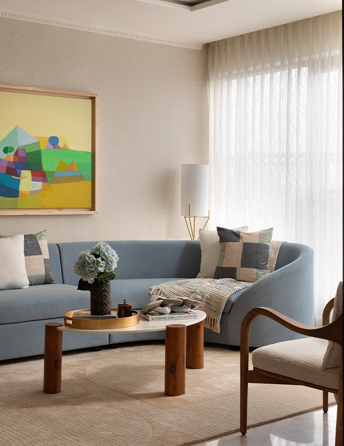
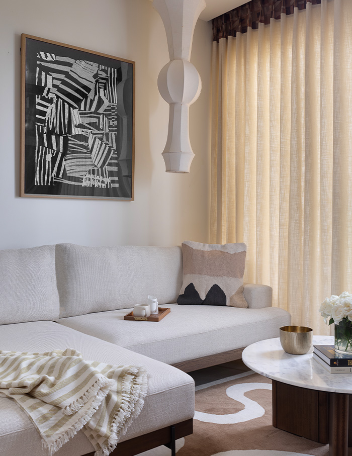
The powder blue sectional in the living room may take you by surprise. A vibrant abstract painting by Agathe Patil basks in the spotlight, a lone figure on the walls enjoying its fair share of attention. One dark veneer-panelled wall clad in brown nestles to the side, the metaphorical wallflower that clings to the space’s periphery. Adding to the whimsy, geometric motifs exist in harmony with languid curves splayed across the home.
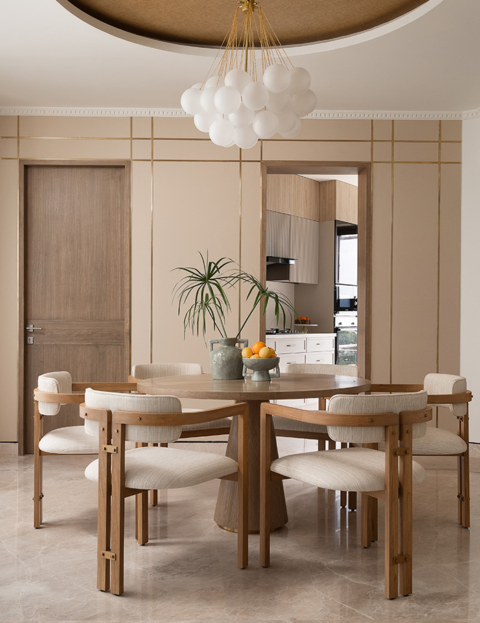
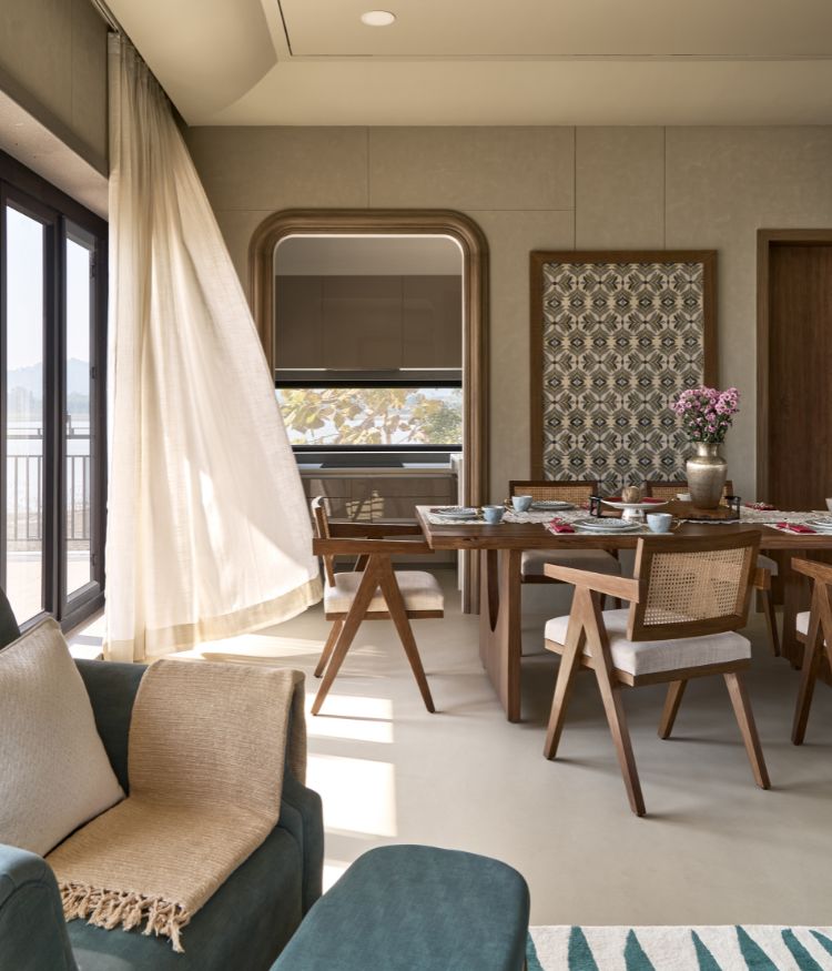
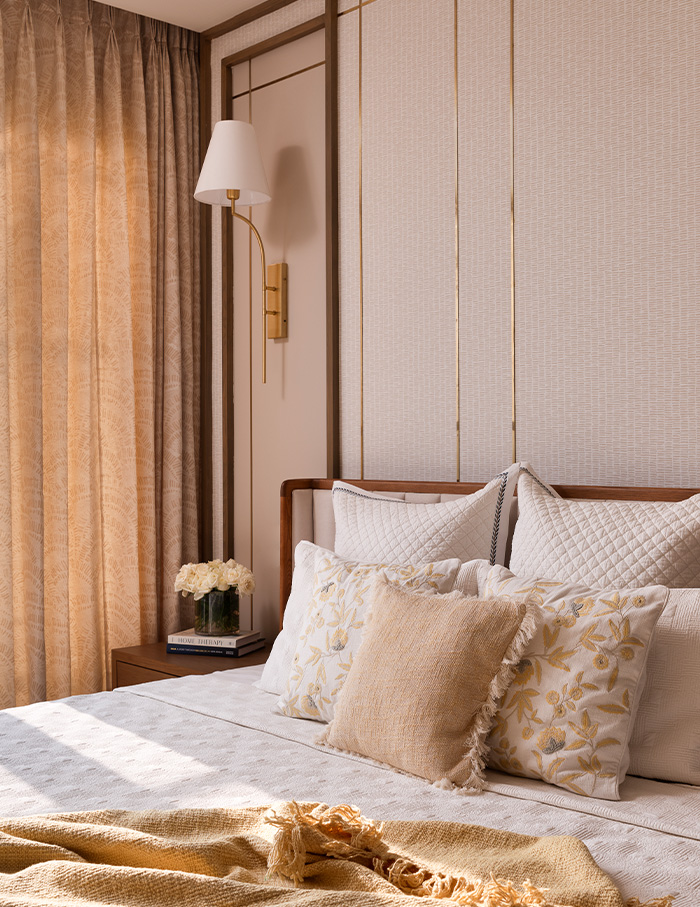
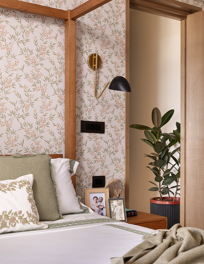
Within the dining space is where the neutral palette shines the brightest, egged on by a dramatic cove ceiling and a textured fabric wallpaper in gold. A chandelier crowns the circular tables, the chairs echoing the curve. This carefully stitched neutral palette takes on newer forms within each of the three bedrooms. Fluted accents and metallic accents like brass appear in the master bedroom, while the second bedroom is plush with a boucle bed. A subtle, geometric wallpaper lines the walls with a barely imperceptible sheen. Contrary to this, the kid’s bedroom encourages playfulness with a canopy bed occupying centre stage.
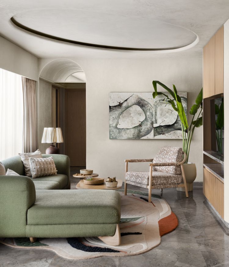
Replete with another plush sectional, the den emerges as a third space ideal for the family to converge in. The built-in bookshelf makes the space ideal for lounging and entertaining (and a great source of delight for bookworms, too).
A little colour never hurt anybody
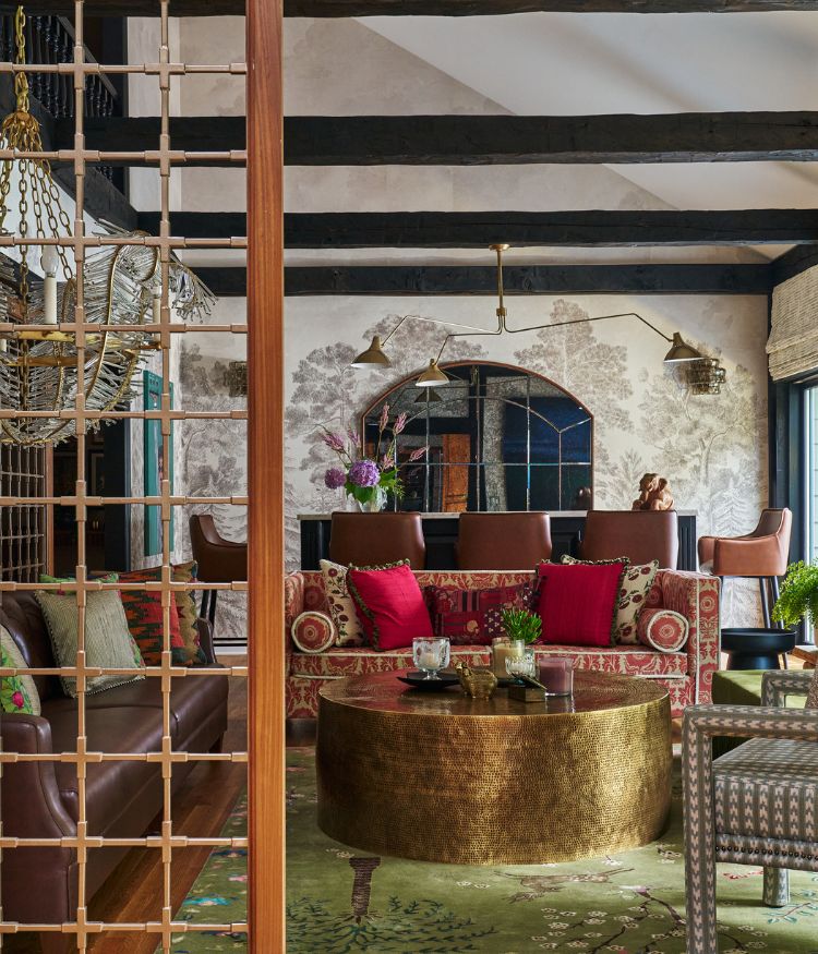
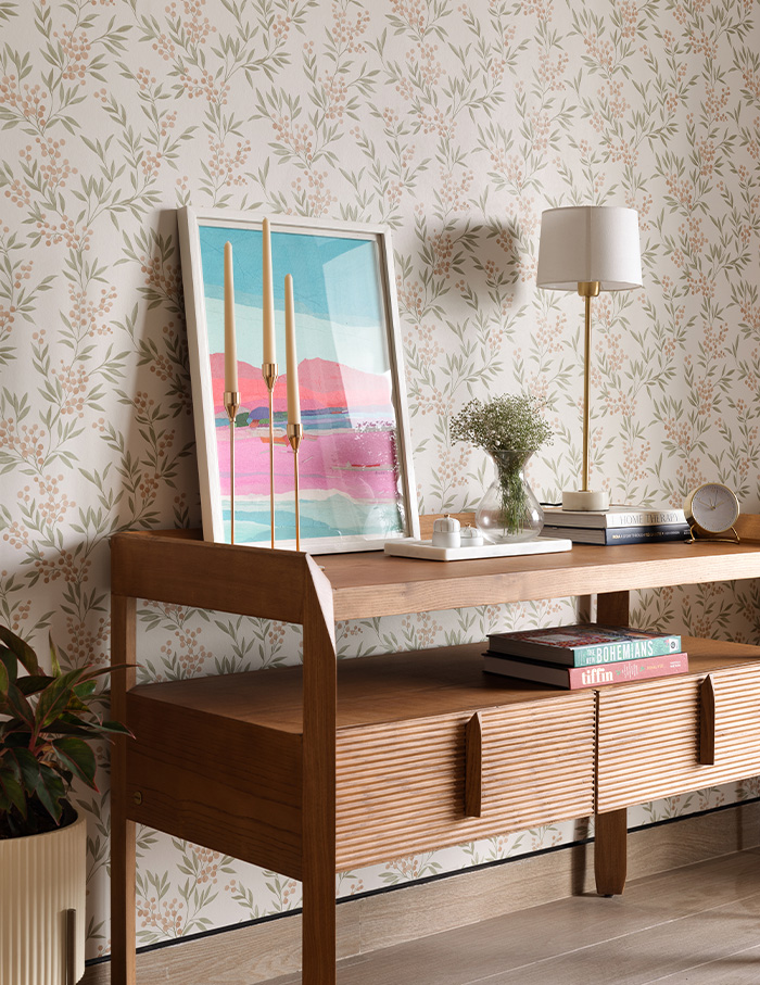
Containing multitudes, the colour palette veers between neutrals to energising bouts of colour. The minimal palette emerges as anything but monotonous, owing to dollops of fluted wood, glossy veneer and patterned wallpaper that make an appearance. Eclectic decor and abstract forms line the walls, as the overarching neutral palette forms a fail-safe base ideal for experimentation. After all, naysayers may label beige as basic — but one cannot deny its universal appeal.
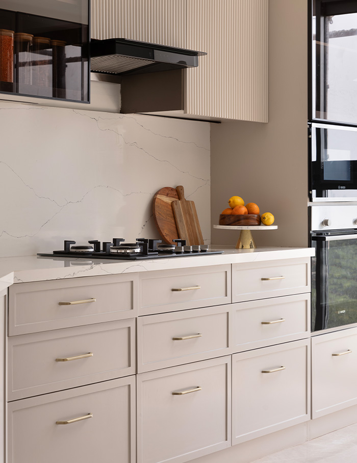
Timeless design harbours multiple definitions depending on who you ask, open to interpretation. Experimenting with this very notion, the apartment emerges as the design studio’s own rendition of this elusive quality, tailor-made for a family and their needs.
Now read: This maximalist Kolkata home by Untitled Design Consultants is daringly glamorous and artful


