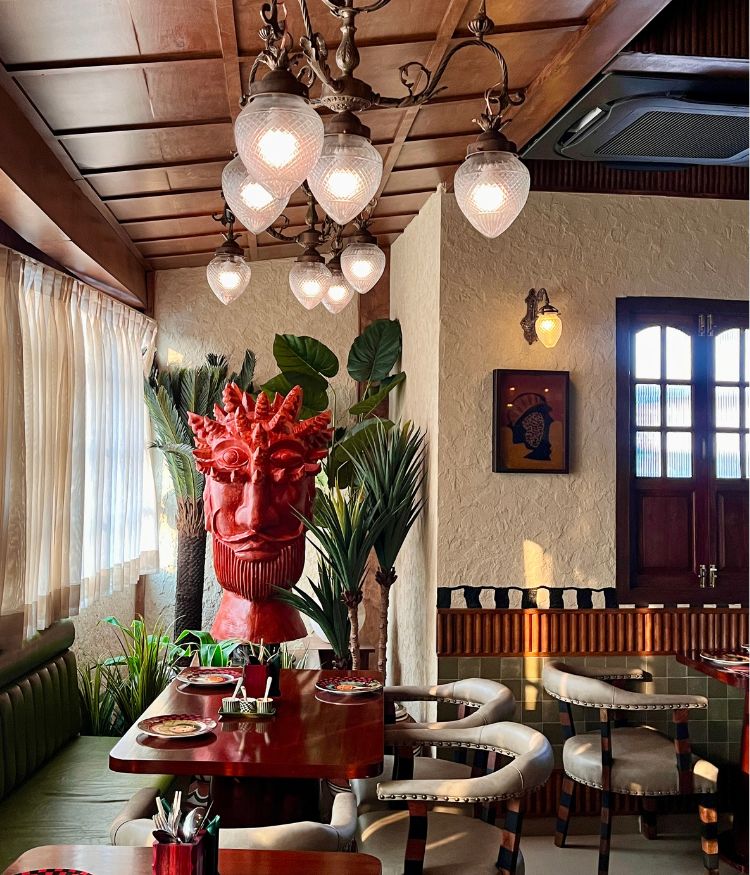
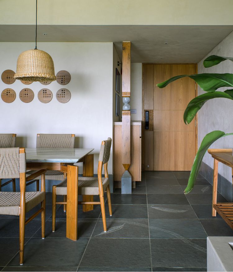
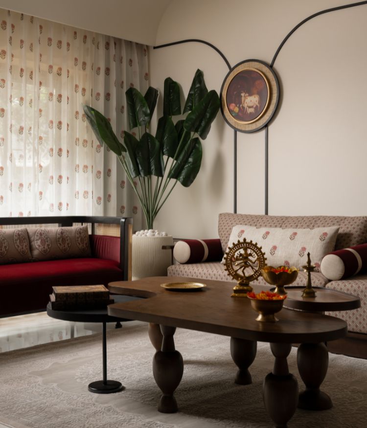
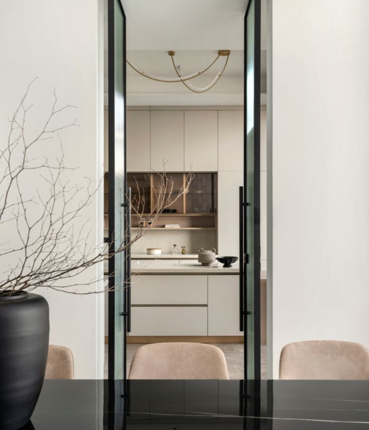
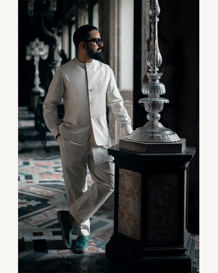
If you’ve ever made a scrapbook, you know it’s fun — assigning a theme to every page and picking pictures to fit as if it were a puzzle. There’s a feeling of intimacy that comes with personalising a scrapbook. Now imagine doing this with a home. Anu Chauhan, Principal Architect and Stylist of ZERO9 along with Prashant Chauhan, embraces this exciting experience in a 4,200 sq ft home in Nagpur.
Although a blend of two apartments on the same floor, the spaces flow into each other naturally, as if originally assembled that way. Like a collection of colours, decor and textures, every room brims with a different theme and eclectic clues, all so unapologetically.
Contrasts and experiments
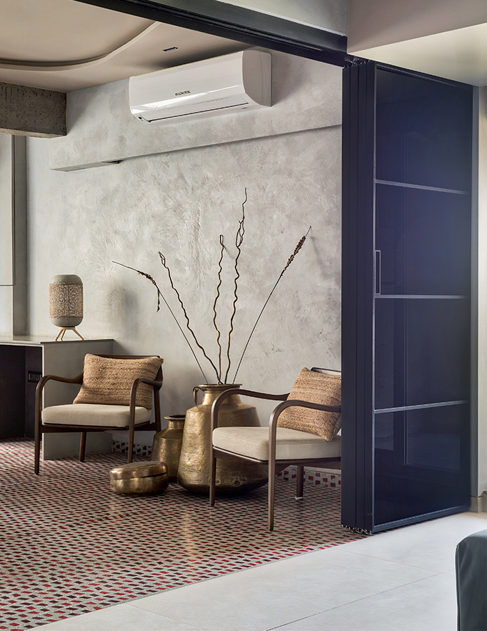
With a desire for rustic yet elegant spaces, the owners entrusted Zero9 to craft the abode in a way that made contrasting themes complement each other. Hence, it was decided to hinge their design direction on the patrons’ love for experimentation, while enhancing space-making by decking up sliding partitions instead of any structural changes.
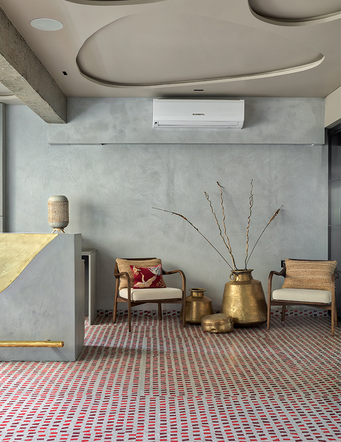
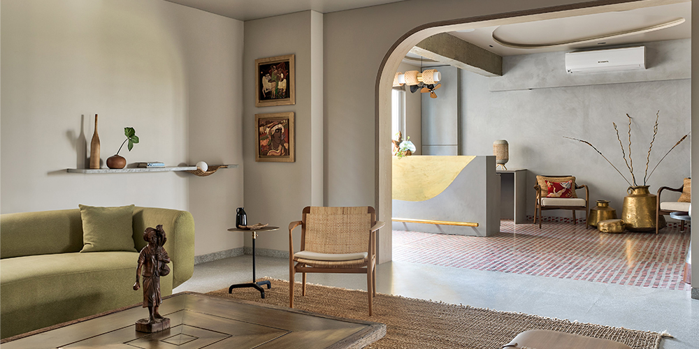
“The bar area was the most enjoyable space to design. It was a lot of fun, experimenting with flooring patterns, the bar counter, the ceiling, the lighting and the synchronisation of it all with music,” remarks Anu. Seemingly, multiple elements dancing to the music.
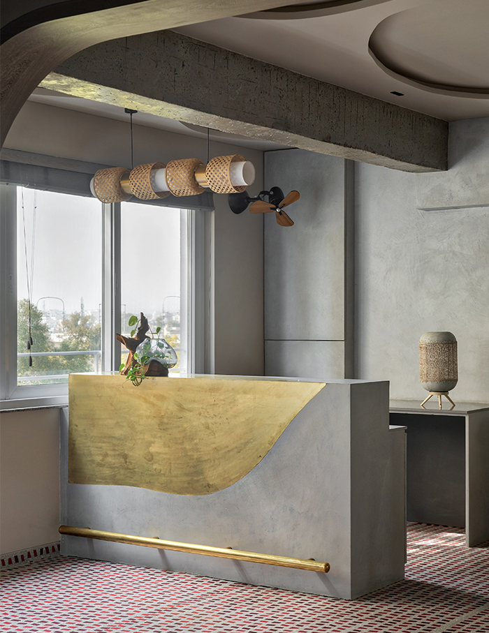
Customised terrazzo flooring with red mosaic chips disperse on the floor like confetti while nebulous forms wobble on the ceiling. To contrast the quirky flooring, Anu uses a subtle grey backdrop as gold-plated pots accessorise the room. As colour-changing lights complete the lively character of the abode, contradicting elements come together to create a surprising harmony.
A love for rustic
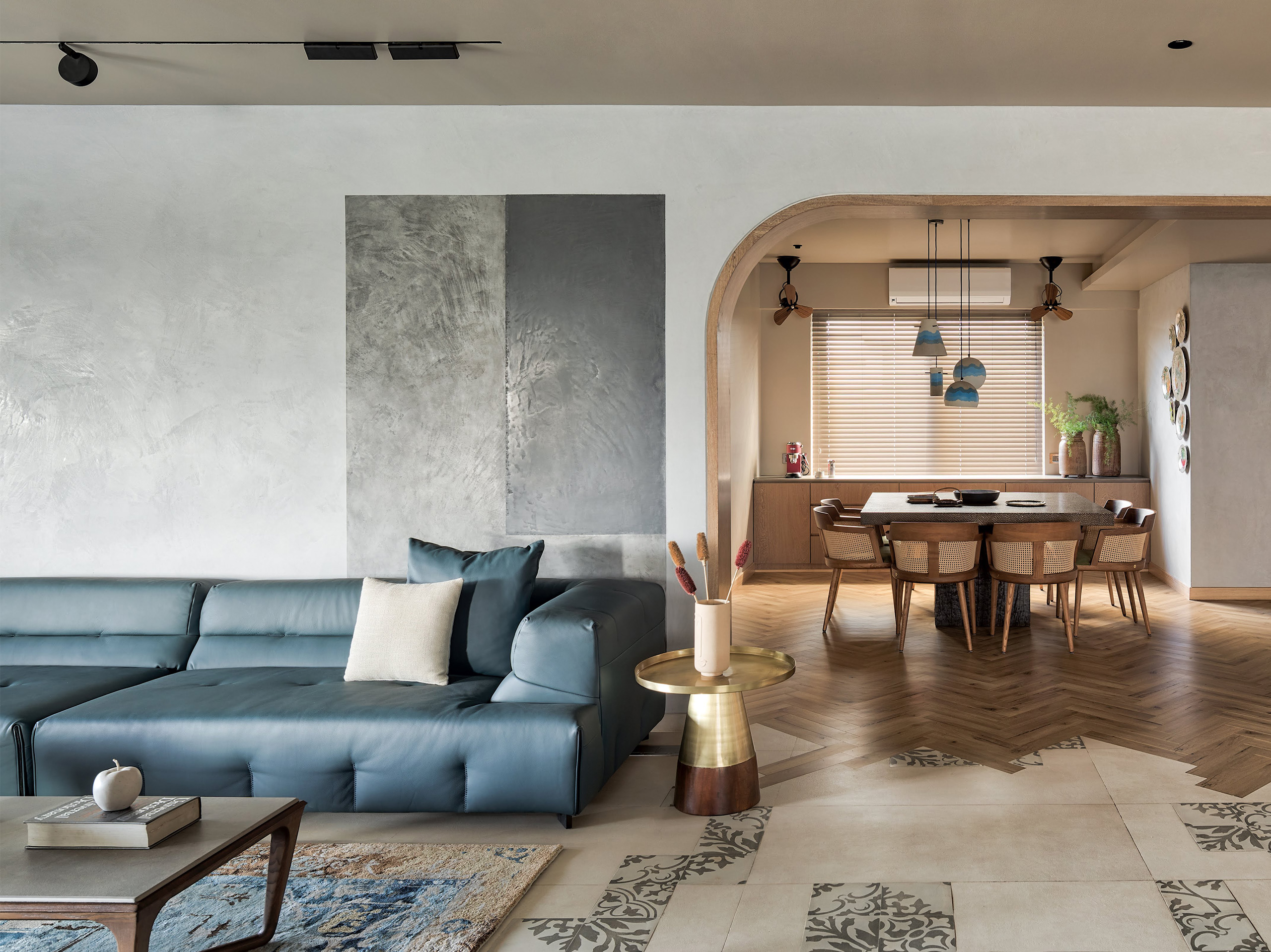
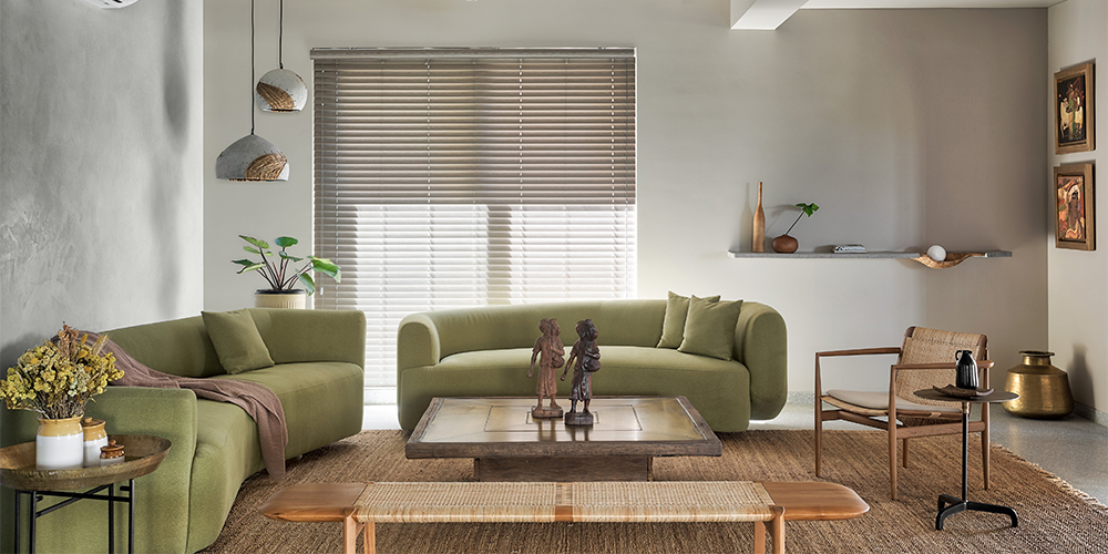
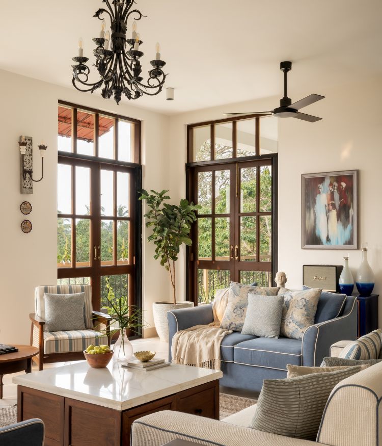
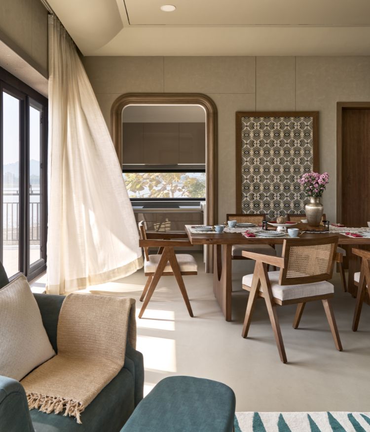
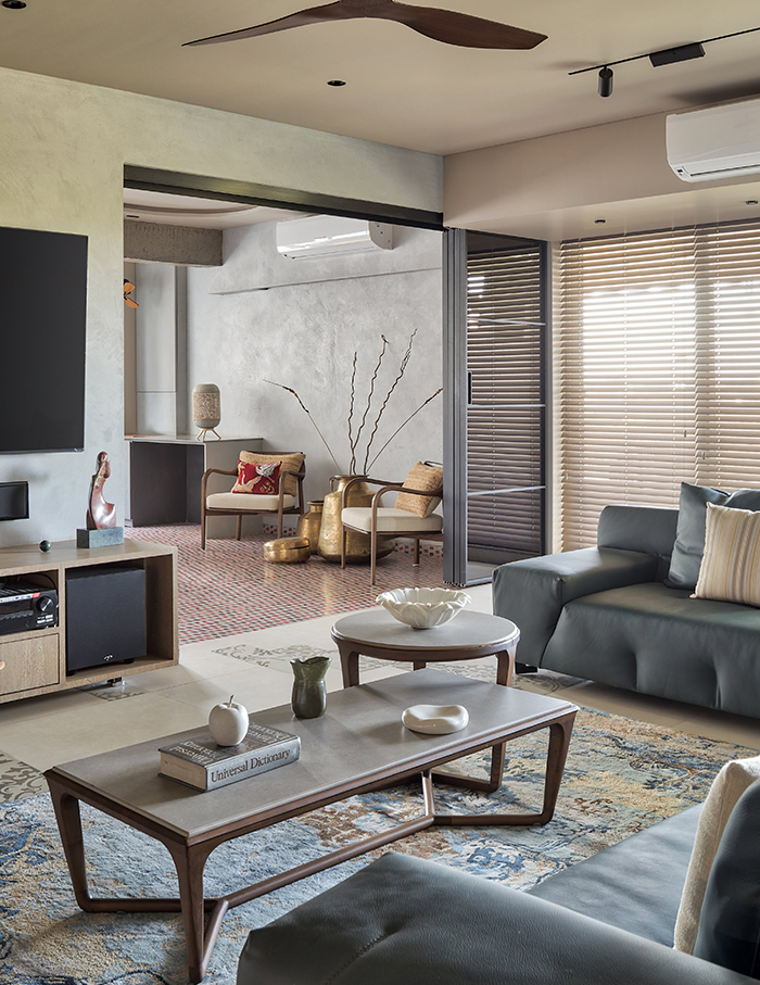
The entrance opens into an open space that harbours the family living room, balcony, dining area, a formal living space and a bar. Although distinct in style and essence, the rooms float into each other naturally.
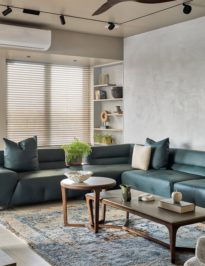
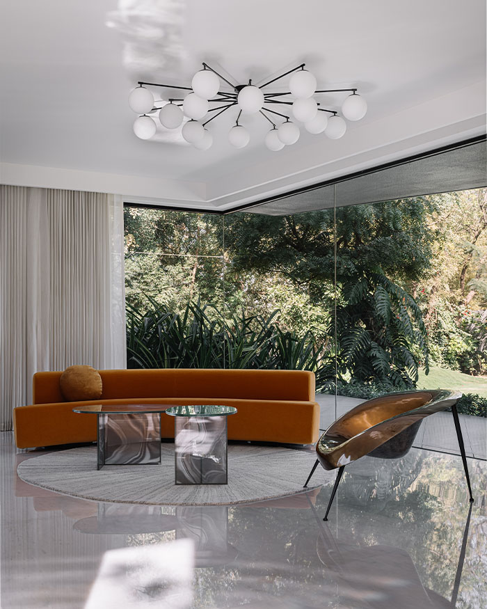
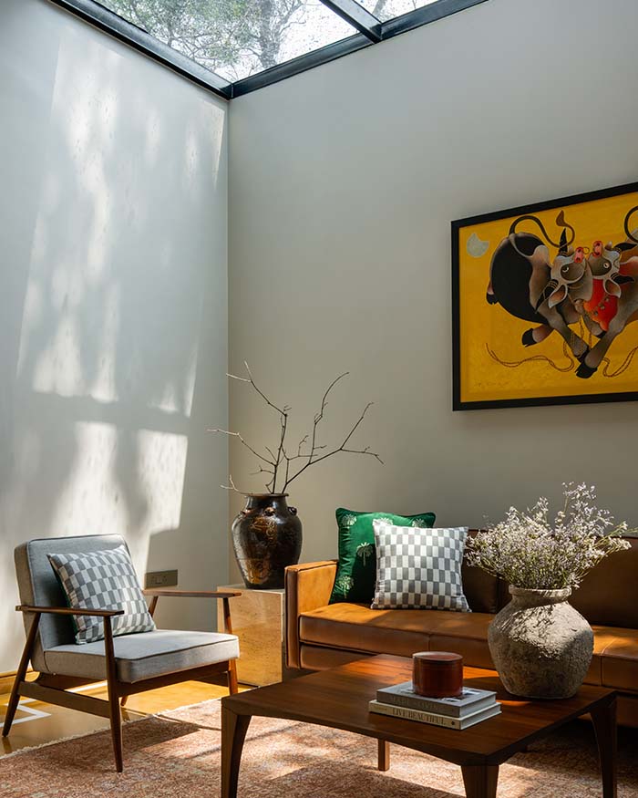
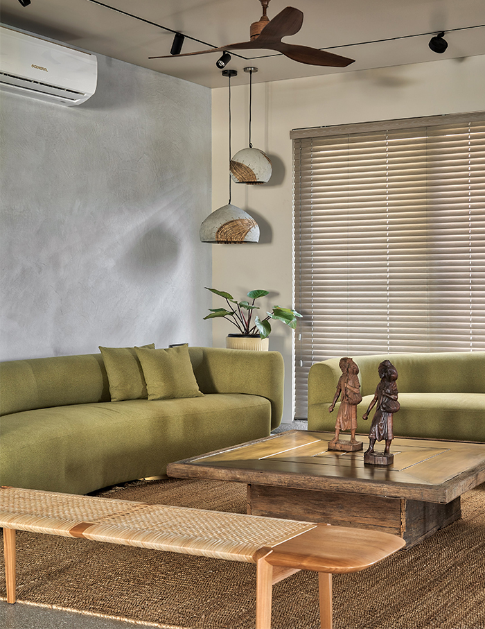
The family living room anchors the whole area. Ample comfortable seating space here calls for family gatherings. On the other hand, the formal living fosters simple cosy furniture. While one embraces hues of green and leans on light-coloured wooden furniture and decor, the other chooses to pose in dark, elegant shades. A lime plaster backdrop maintains uniformity and flow in the rooms.
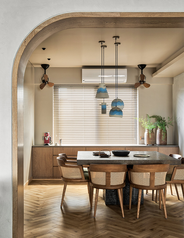
The rooms are connected to a quaint, cornered dining room that then leads to the kitchen, guest bedroom, and powder room.
To ‘serve’ the owners’ love for cooking, one-fourth of the home’s area is transformed into a kitchen. A marble island pivots the cooking hurricane that forms every evening. The owners’ personal kitchen and utility kitchen surround it. The elegant arches and rustic hexagonal tiles on the wall add a vintage look to the rather urbane area. The kitchen resonates with the residents’ inclination to a rustic palette, reminding you of a cute Italian cafe with an open counter.
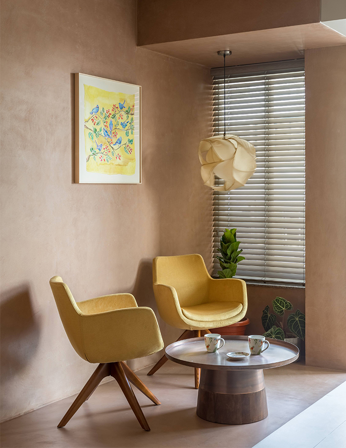
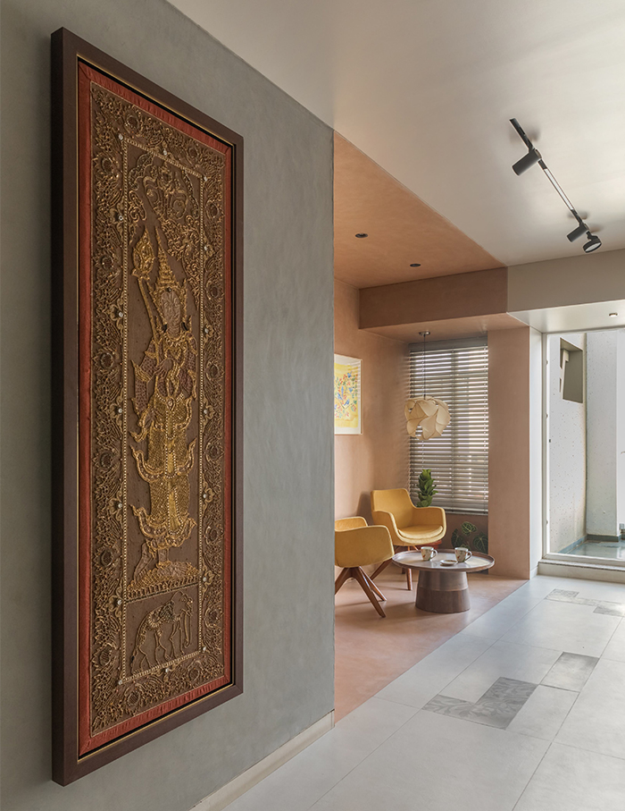
A hallway, lined with mirror shutters and art that adds some playfulness, leads to the other part of the home that accommodates the bedrooms and study. Mango yellow couches lounge comfortably at the end of the hallway to make a small balcony area that doubles as a kitchen garden.
Colour, colour, on the wall!
“The home has a rustic zen theme. The spaces have individual colour and material palette. The living room is muted and subtle while the bedrooms play their own colour story,” says Anu.
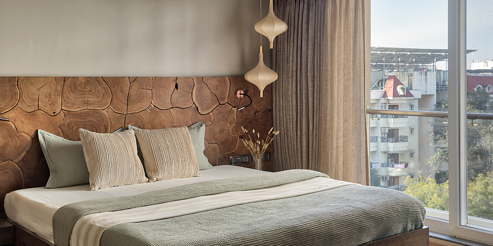
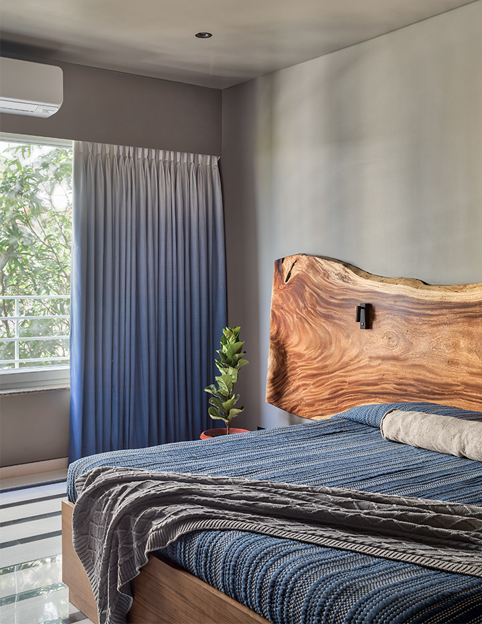
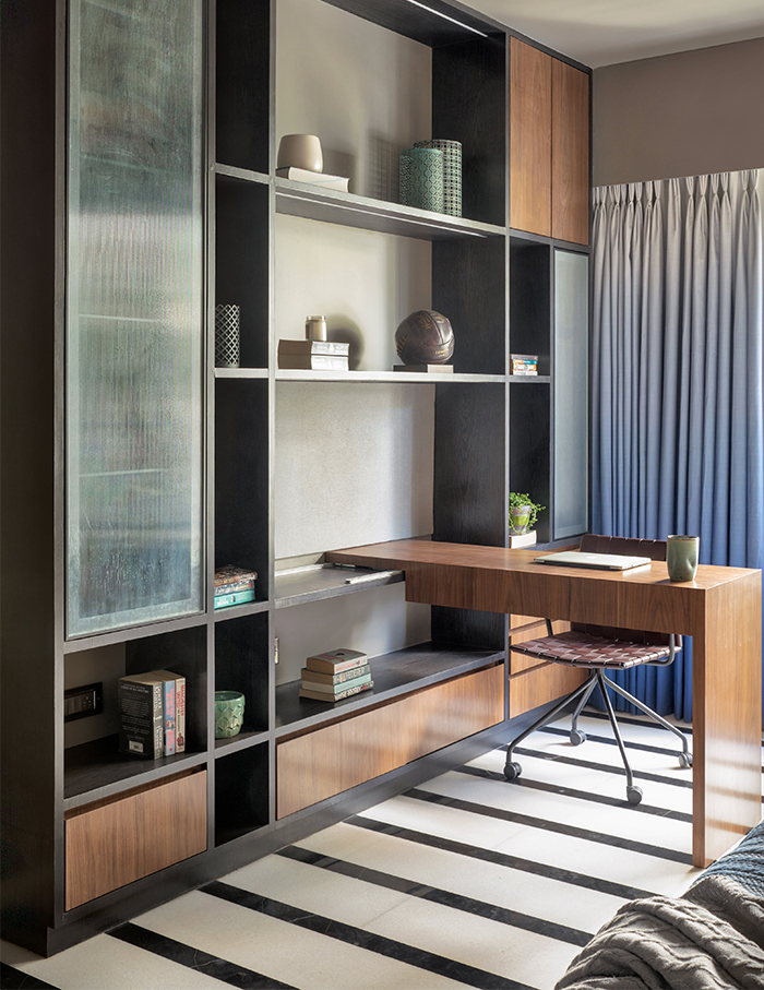
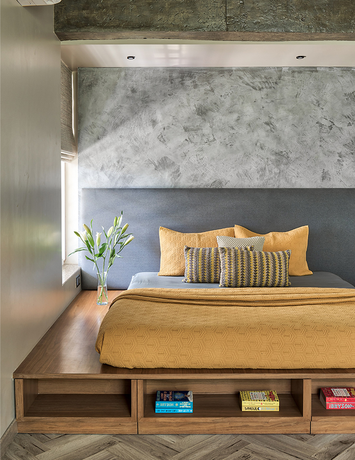
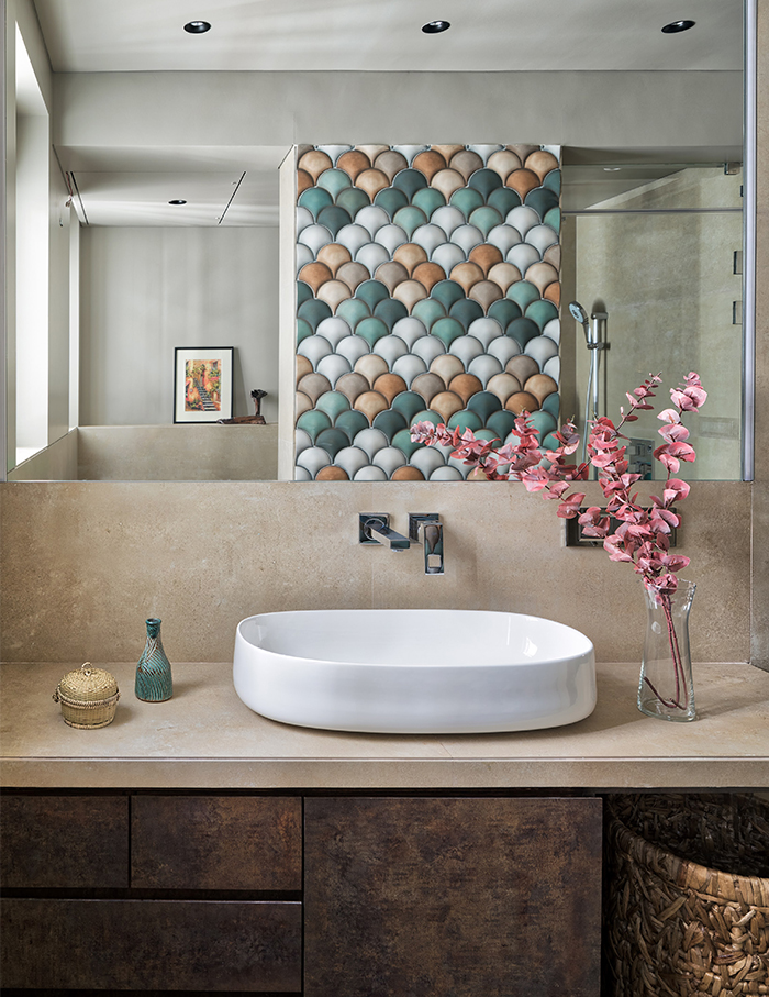
Each bedroom has a distinct style. While wood slices adorn the bed back and warm wooden flooring runs in the master bedroom, black and white marble takes the floor to complement the room’s grey walls in the son’s room. Blue subway tiles with a grey tile base impart a mature impression in the bathroom here. The daughter’s bathroom is more playful as grey, pink, and blue subway tiles grace the wall.
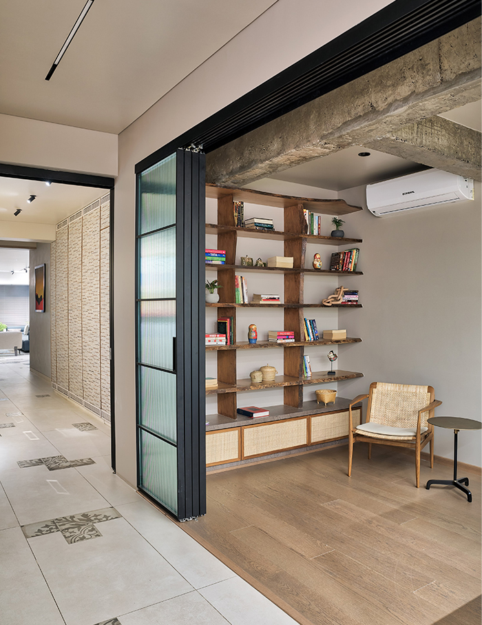
Eccentric decor pieces grace the various rooms to add some whimsy and accessorise the room. As unique as each area is from the other, they seem to complement each other — like a scrapbook with just the right layouts.
You may also like; Sreya and Swapan Seth’s 6,050 sq ft duplex is the perfect backdrop for bold patterns, contrasting textures and multidisciplinary artworks

