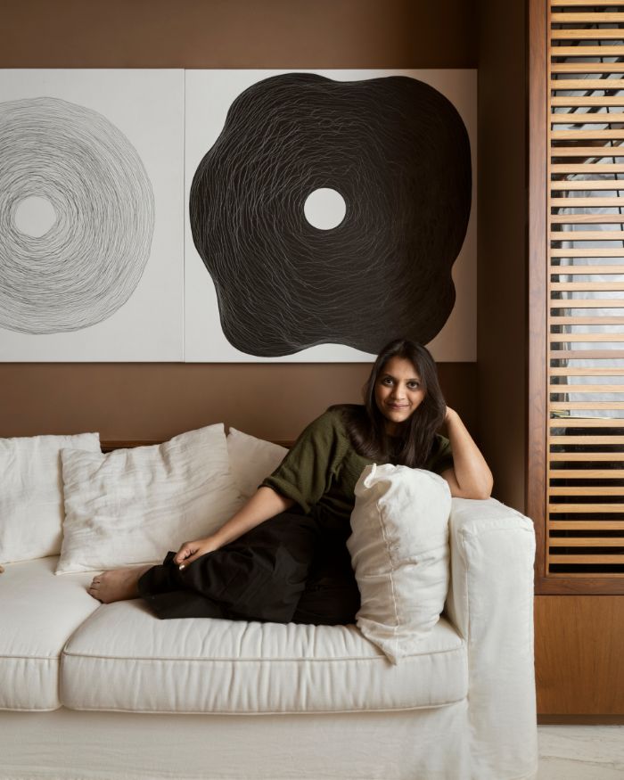
For a designer, the satisfaction of designing a home that is elegant, comfortable and loved by the homeowners is far greater than any other. This is particularly true for Pune based Akash and Poonam Mehta of AMPM Designs, who share the journey of fashioning the Clover home, right from the brief to the final product.
“We designed this house by simply adding classic influences to modern design. Given the petite size of the space, we opted for furniture that was more functional than bulky, keeping agility in mind. We strove to make the home look more spacious and clutter-free by adding simple yet elegant elements,” they say.
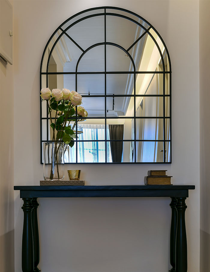
Upon entering the abode, we walk through the mini foyer that features a bold wooden console polished in charcoal tones, accented with a black metal mirror that reflects the balcony, giving the zone an illusion of being expansive. The passage leads us to the living room that personifies “form meets function” perfectly.
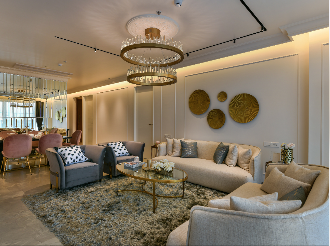
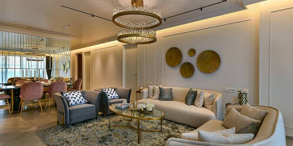
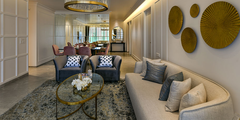
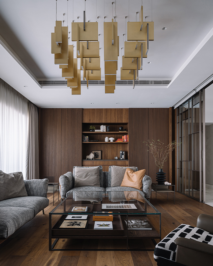
Illuminated by natural light through glazing windows and offering views of Pune’s lush Wanowri landscape, this space plays with soft shades and minimal yet sleek furniture. Our favourite is the embellished crystal chandelier that hangs in the centre of the room, complementing the chic roseate armchairs with quilted fabric and ivory seaters. Gold tinted end and coffee tables with a dark grey rug add the right contrast against the suede curtains.
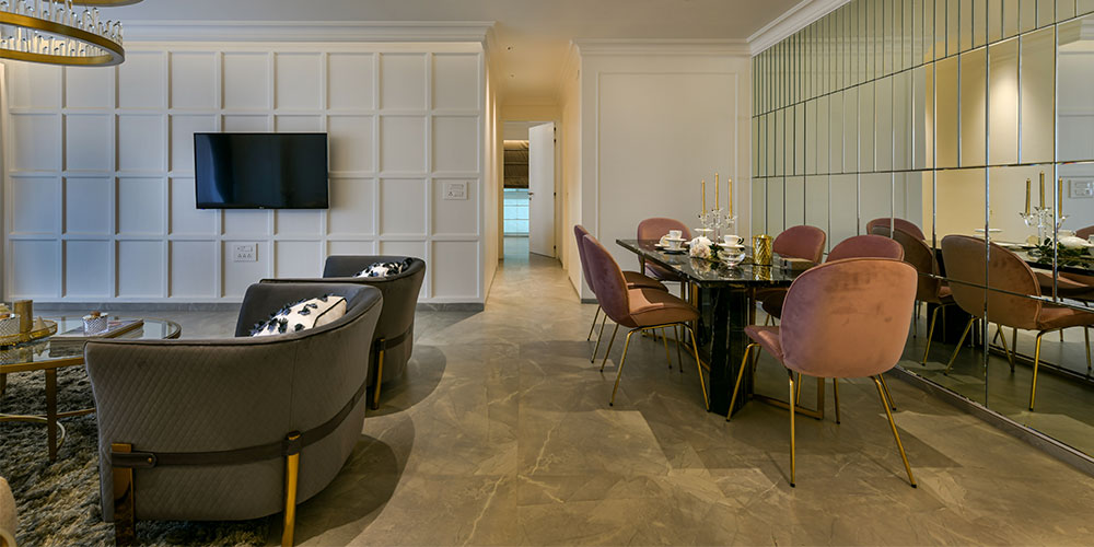
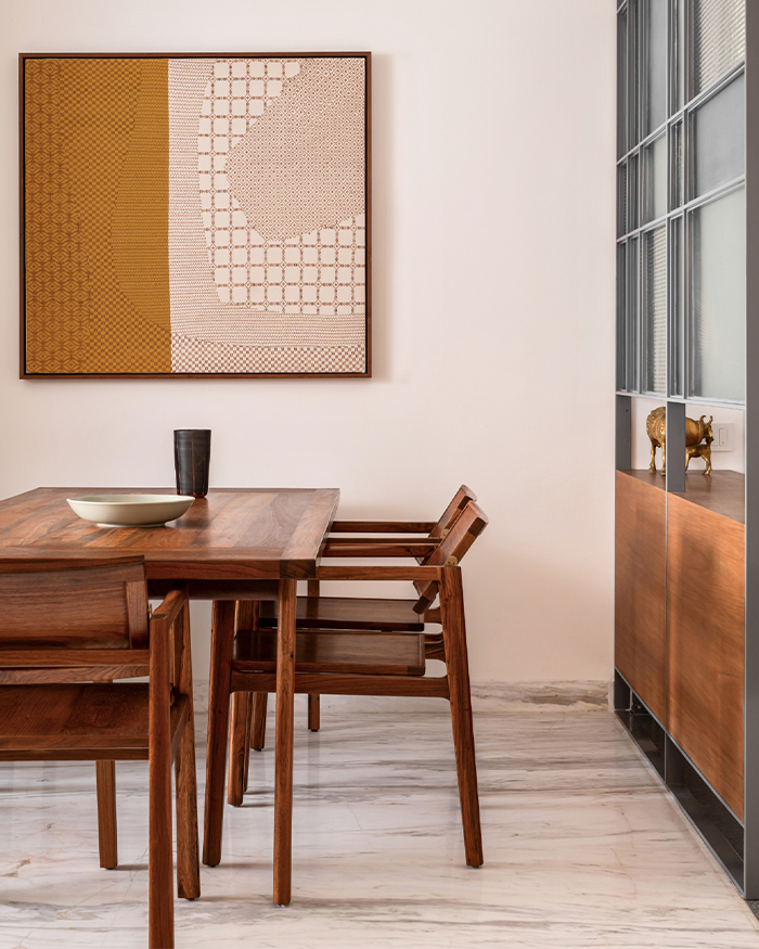
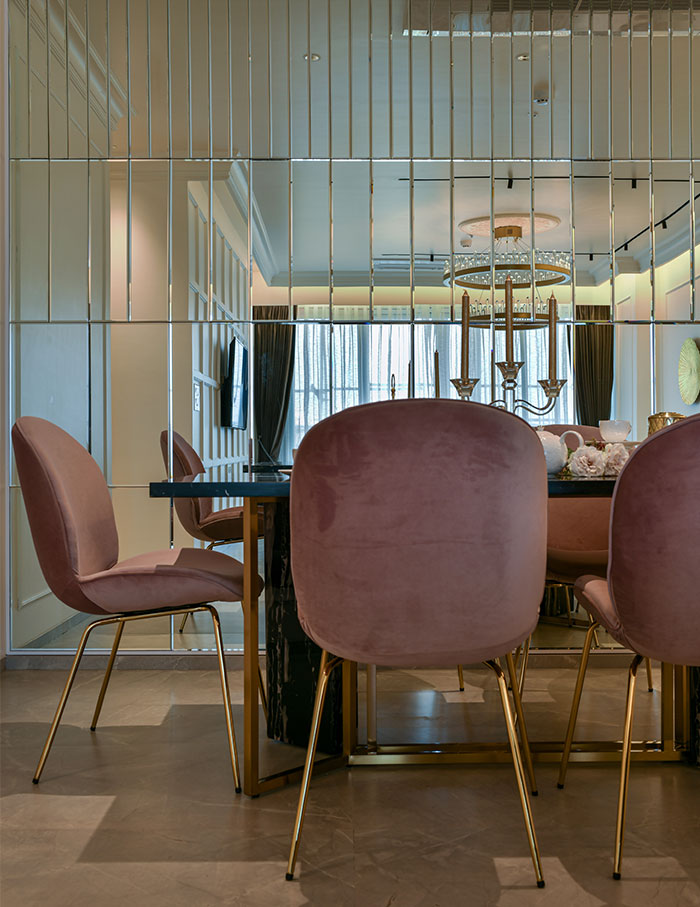
Like most homes, the dining room is tucked into the living space, with an extravagant mirror wall that makes the space look bigger. The long walls are decorated with classic mouldings and ceiling cornice details that add panache to the room.
A white stone countertop is seen in the kitchen, with subtle ice blue-tinted glass shutter cabinets, creating a fresh atmosphere. Further inside, we step into the home office that was built for the owners to use as per their convenience. Fashioned with simplicity, this room is ideal for unwinding. It features classic wall moulds and a ceiling cornice merged with modern fluting. Art adorns the walls behind a modern and sleek wooden desk with chairs. The attached powder bathroom daubed with teal shades houses a vanity making it convenient and stylish.
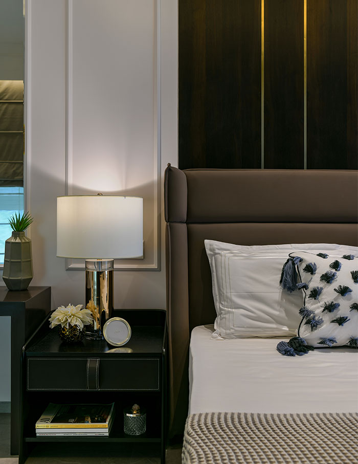
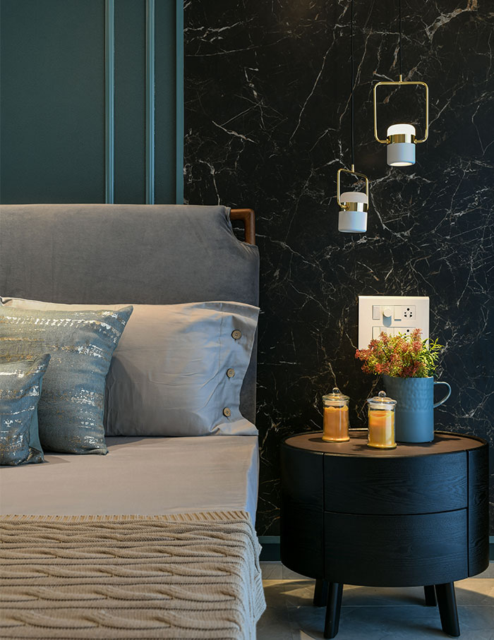
The master suite emulates a simple yet refined aesthetic, with a wardrobe and tv unit that was designed to look like a leather panelled wall with a matte polished veneer. The guest room is shaded in a deep teal green coloured wallpaper with matching moulds. A contrasting matt black finished tile adds a sense of drama to the space.
Lastly, the kids’ bedroom was made with the idea to maximise floor space, with vibrant colours. A sliding wardrobe with subtle fluting increases functionality. The room also features a custom bunk bed, study unit and is characterised by quirky cartoon and striped wallpapers to add zest.

