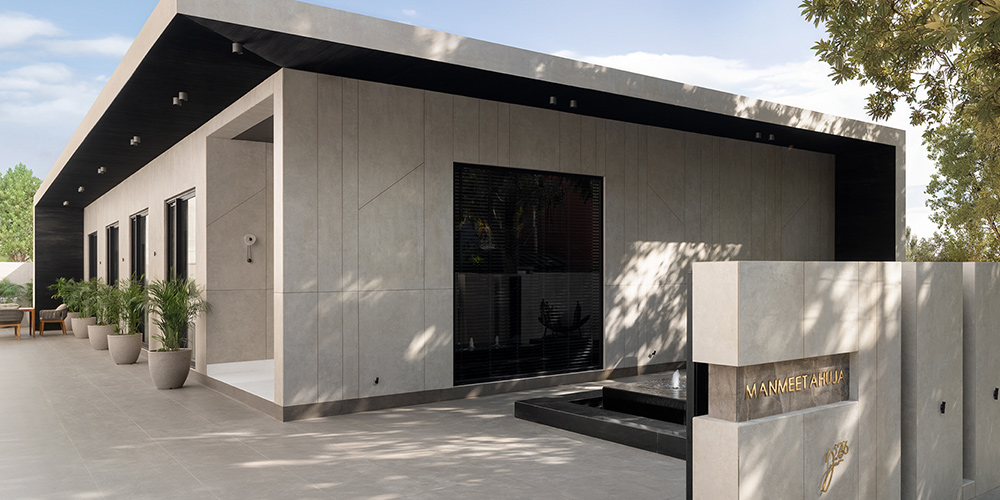
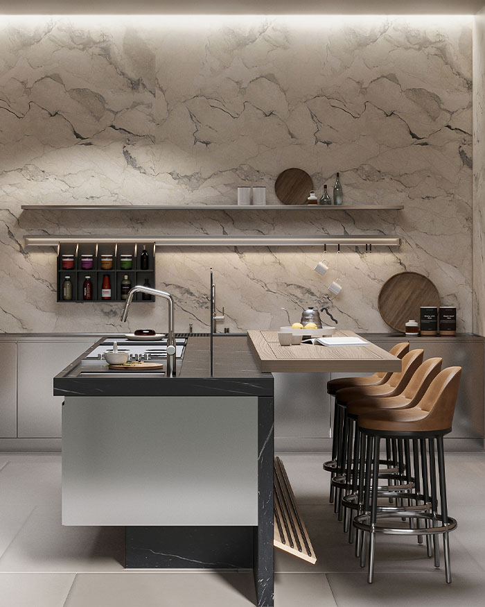
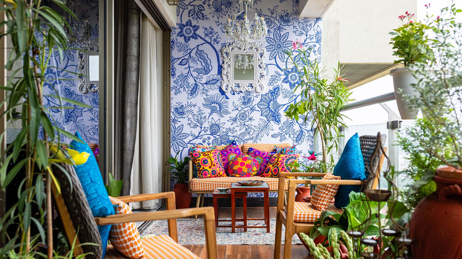
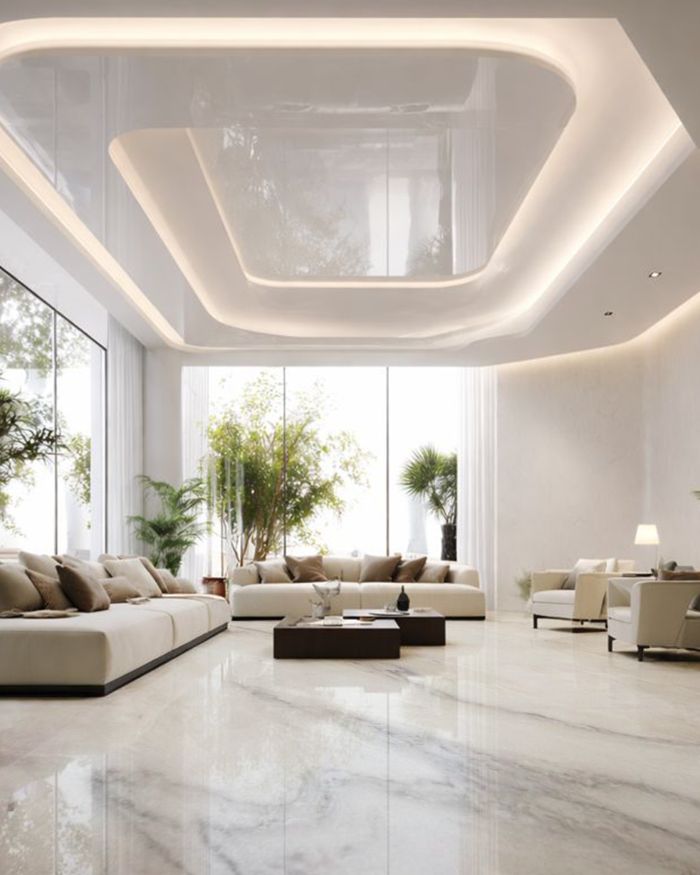
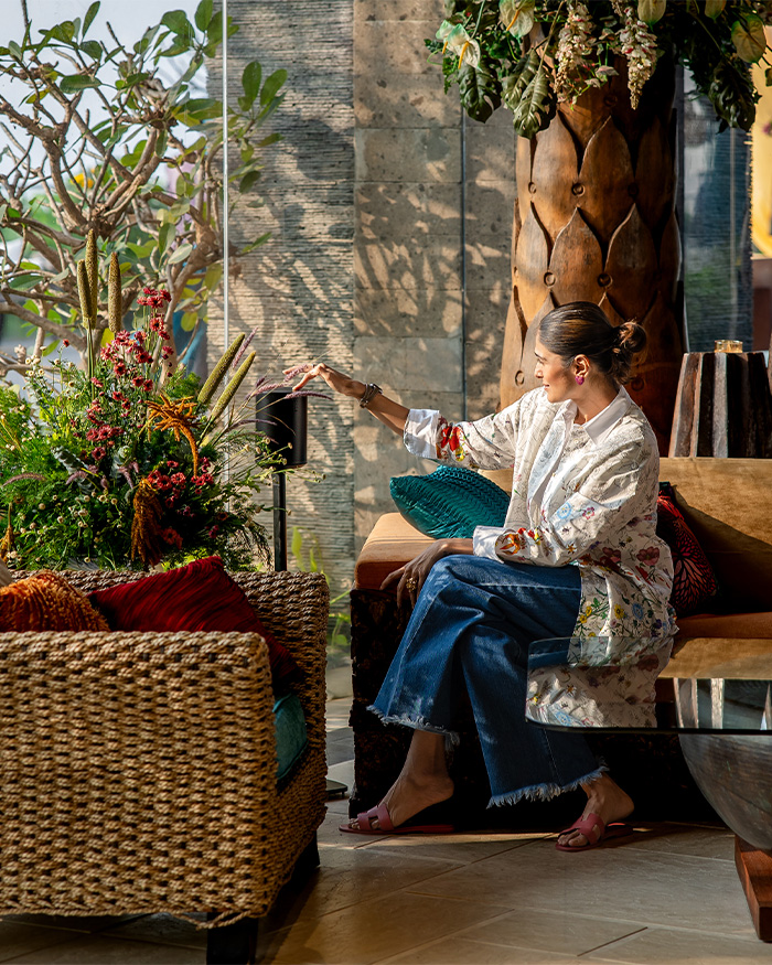
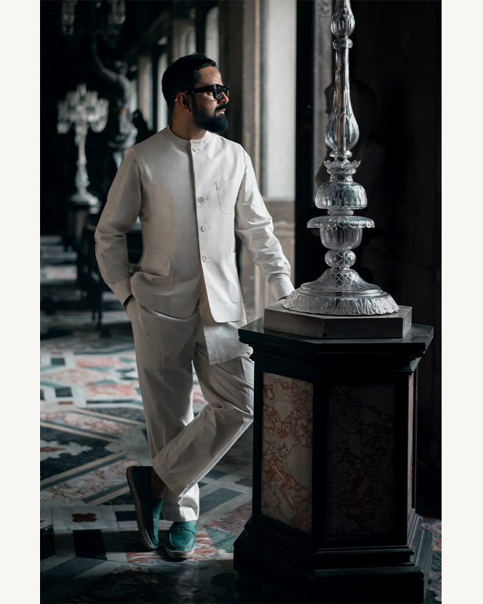
The luxury of respite meets the imperative of productivity at this office in Gurugram, which in fact is more than just a workspace. The 4,500 sq ft design studio is the creative ground for Manmeet Ahuja — a wholesome sanctuary of artistry celebrating multitudes of existence.
“The project was born from a deep desire to create an environment that transcends the conventional notion of a workspace,” the eponymous founder-architect reveals about the inception of the space. As a response to this need to break the mould, Manmeet alongside Dimpy Ahuja layered functionality with visual captivation to craft a haven that at once inspires and enables.
Distinctly dressed
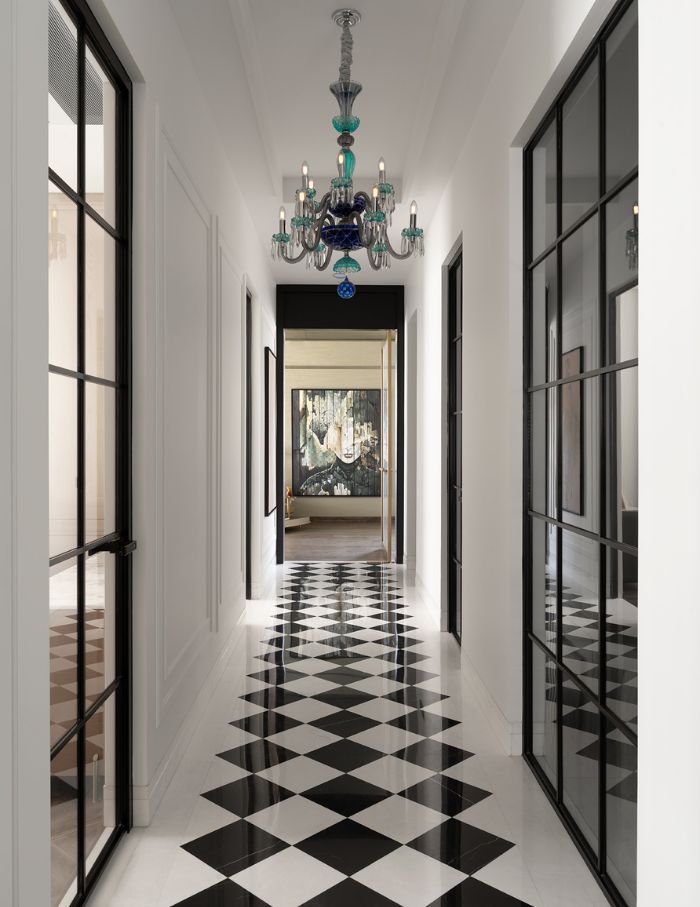
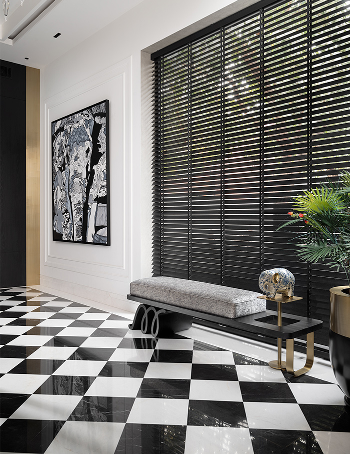
The office follows a linear blueprint with a narrow corridor branching out into different functional rooms before ending at a common lounge area. However, a blend of classical European design elements and contemporary materials adds horizontal layers to the walkthrough experience.
Where the usual working booths and meeting rooms convey the drab mundanities of office routine, those at Manmeet Ahuja’s studio offer an imaginative narrative in every corner.
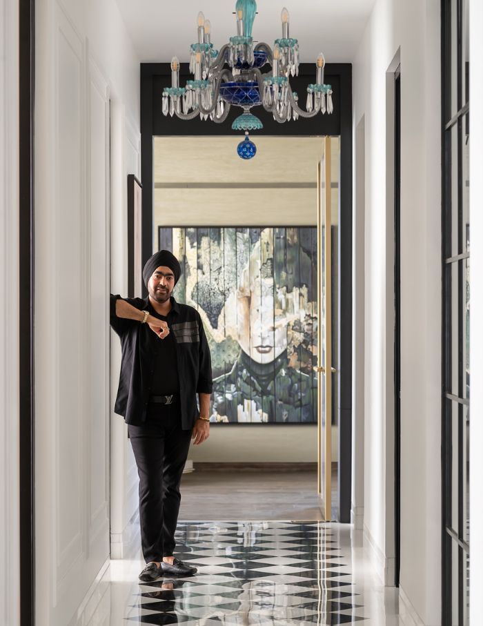
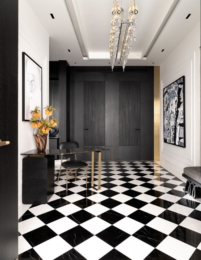
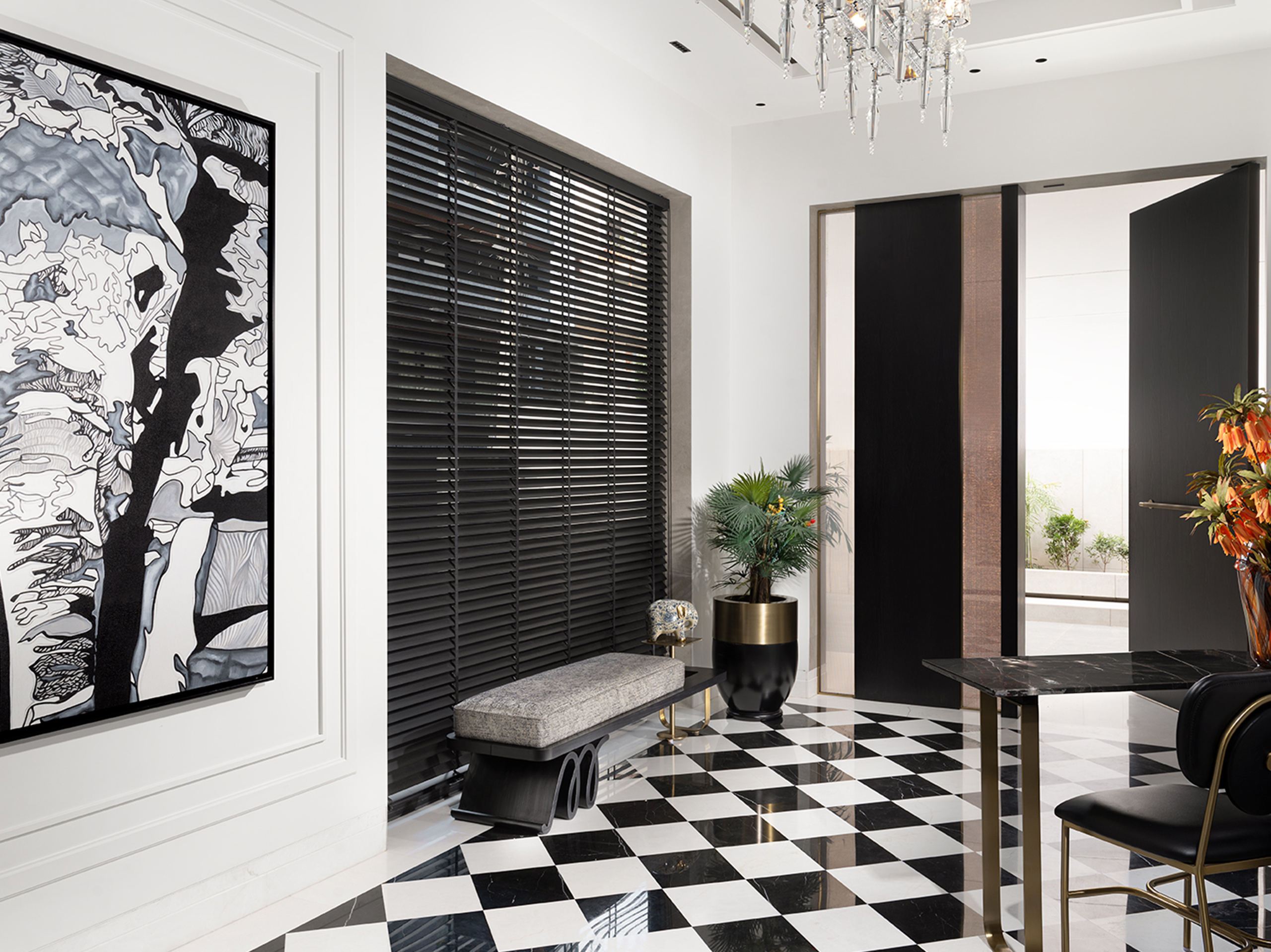
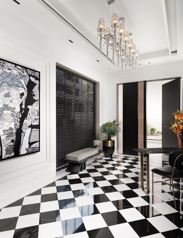
A classic dual-toned marble checkerboard floor invites you in through the entrance, keeping you company throughout the spine of the space. Against this symbol of harmony, each of the two directors’ offices reflects their unique personas.
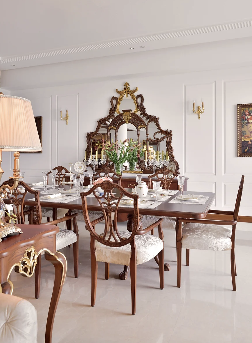
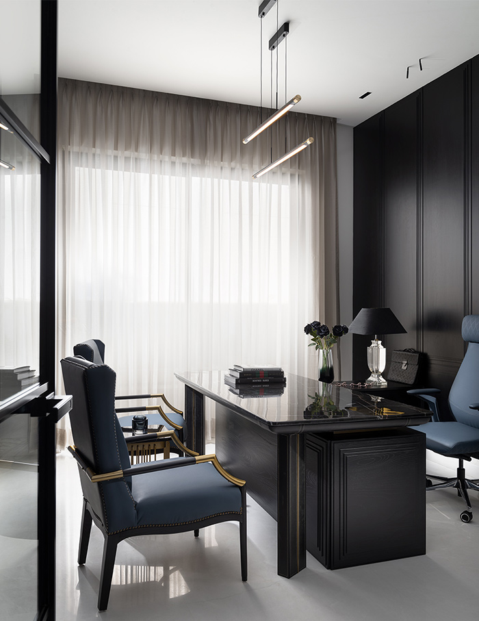
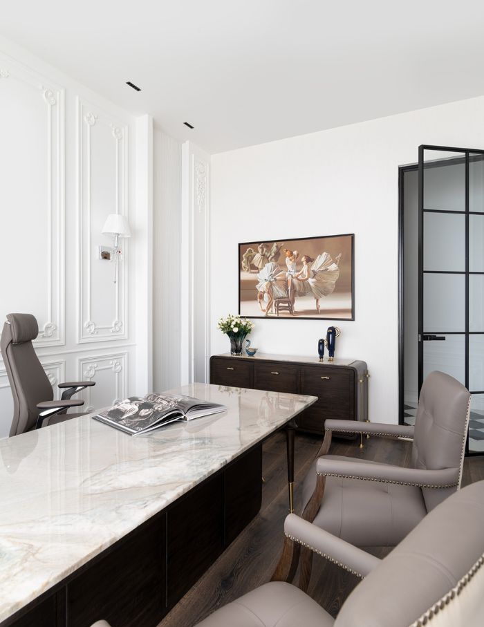
The intense black palette of Manmeet’s den is anchored by a black onyx desk, alluding to infinite depth. On the other hand, Dimpy’s room is a confluence of Indo-French design with gilded accents and warm tints.
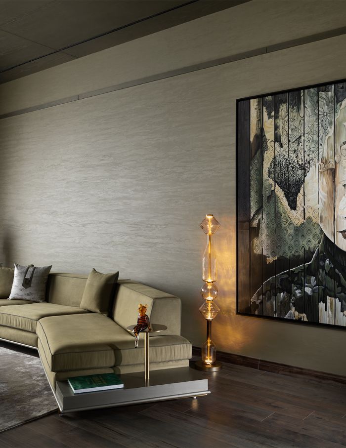
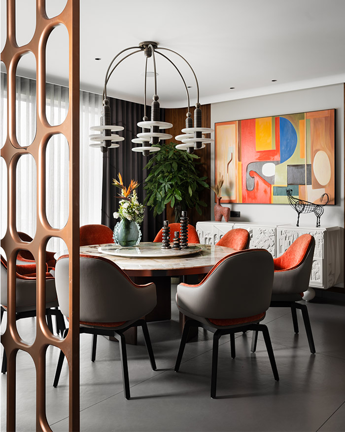
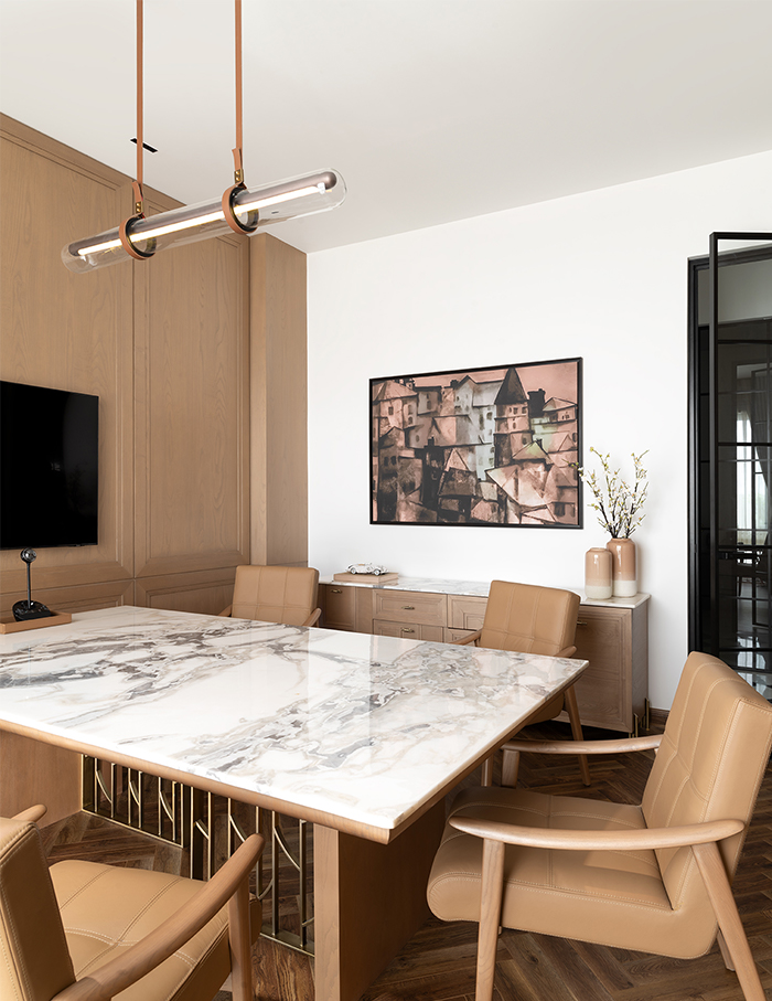
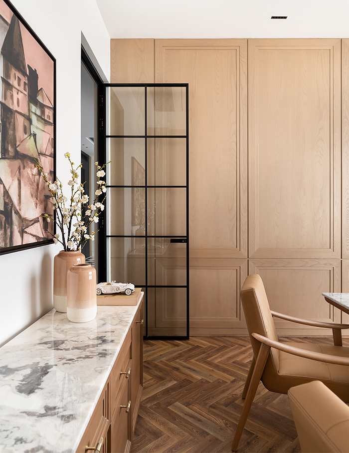
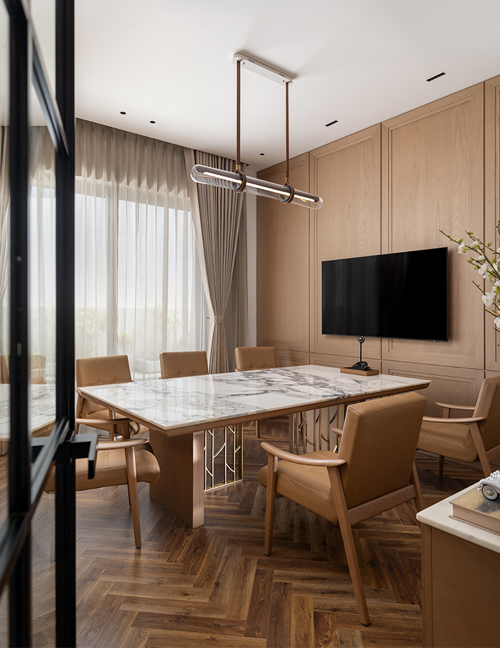
The offices flank a conference room, which exudes an airy elegance that offers a space to collaborate. Here, the soft tones of wood lend an unassuming backdrop for its occupants to steal the focus.
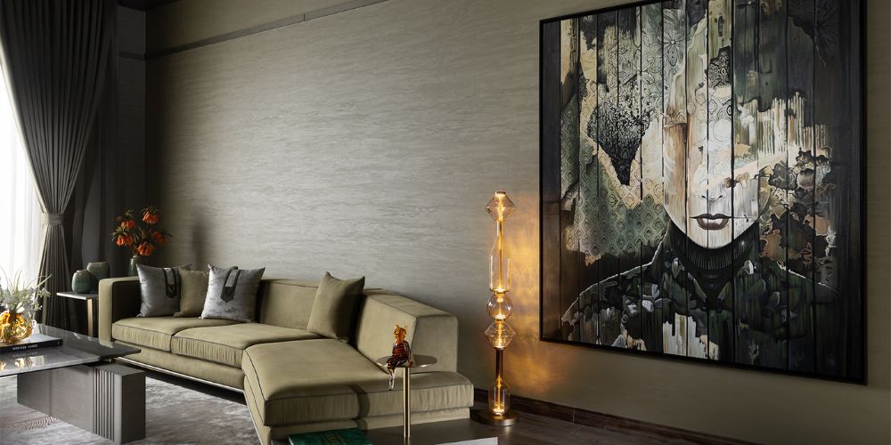
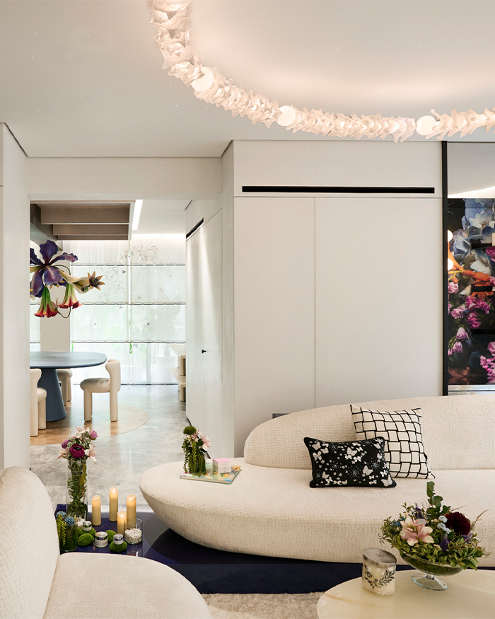
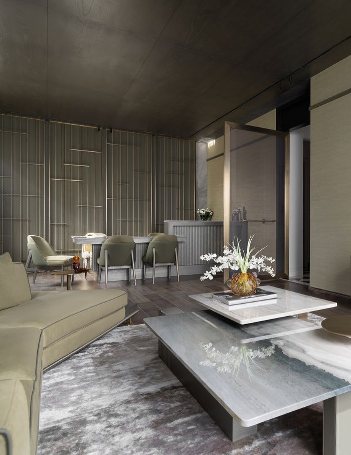
The lounge area is the ideal culmination of these eclectic influences, complete with Baroque moulding, contemporary materials and a sophisticated layout that pulls you in for its colours and keeps you for its textures. With a bar and seating area, this room is straight out of a modern-era dream home, true to the confluence of hybrid lifestyles that add restful pauses to the marathon of work.
A statement of purpose
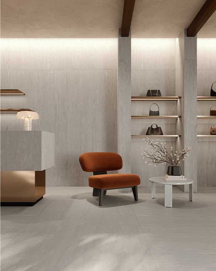
But making a statement is a delicate balance of the said and the unsaid. With the floodlights turned on the design, the duo maintain a soft spotlight on the functionality of the space. This thought is evident to whoever notices the interior styling. Statement pieces steal the show in front of a deliberately muted colour palette of charcoal blacks and pearly whites.
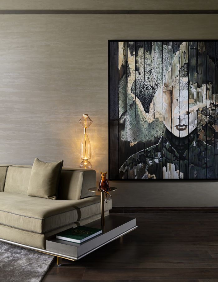
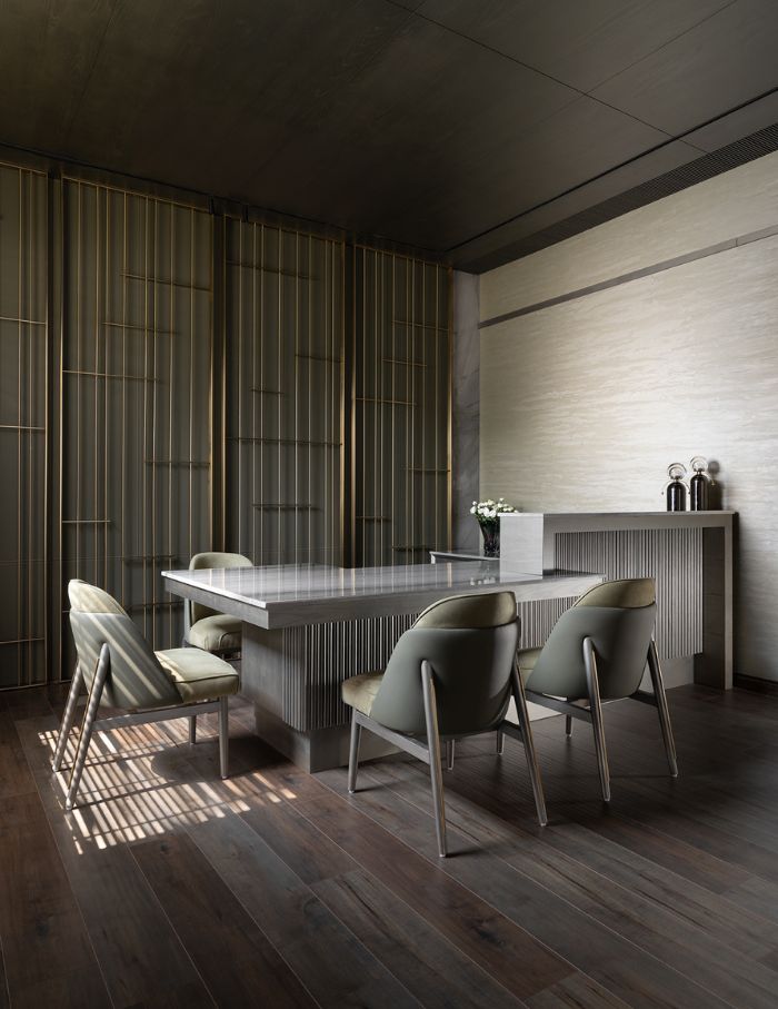
Each room thus tells a story of its own while contributing to the cohesive narrative of the studio as a whole. The furniture, understated and minimal, speaks volumes by guiding visitors on where to rest and where to work.
By the end of the tour, the memory left behind is that of a space that makes you pause, ponder and engage with your surroundings in a meaningful way.
Scroll down to catch more glimpses of the studio…
Read more: 15 office interiors that make a 9 to 5 feel like 9 to I’m fine doing overtime!

