A layout geared towards keeping conversations flowing, a brick wall of some sort and quirky accessories—these are the hallmarks of your regular neighbourhood coffee shop. While it sounds standard for a cafe, that’s not what the folks at Soros Coffee wanted.
They wanted the space to look at once transposed in a different time and space and grounded (pun intended), just like their coffee which is sourced from different parts of the world. Akshita Mehra, creative director of Studio Goya took on this brief and fixed her proverbial gaze on a different design direction.
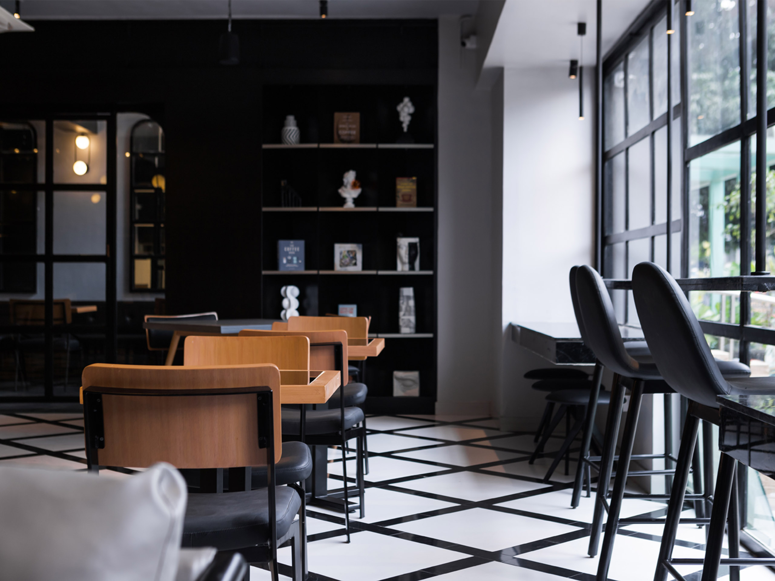
Located in the centre of Cunningham Road in Bengaluru’s shopping hub, the 1,670 sq ft cafe is straight out of a coffee table book with its monochrome colour palette and minimalist vibe. “Chic, understated, luxe and minimalism define the space. We’ve worked with a monochrome schematic and offset it with chrome finishes. It’s moody and sexy and gives off a very swanky vibe,” says Mehra defining the theme of the space.
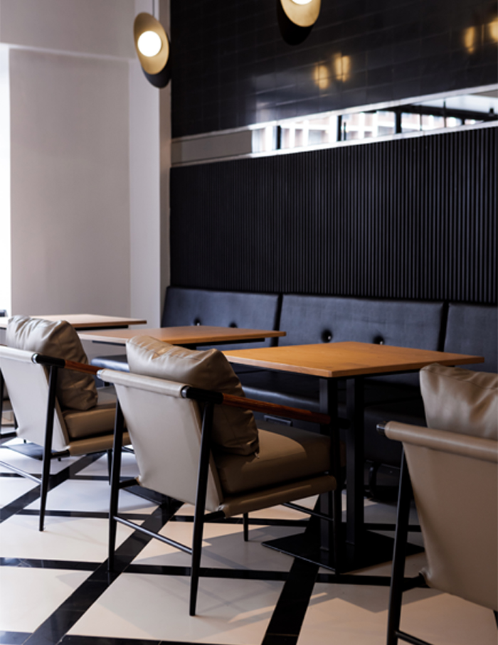
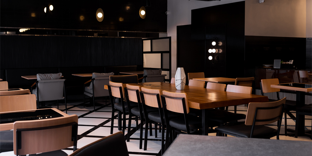
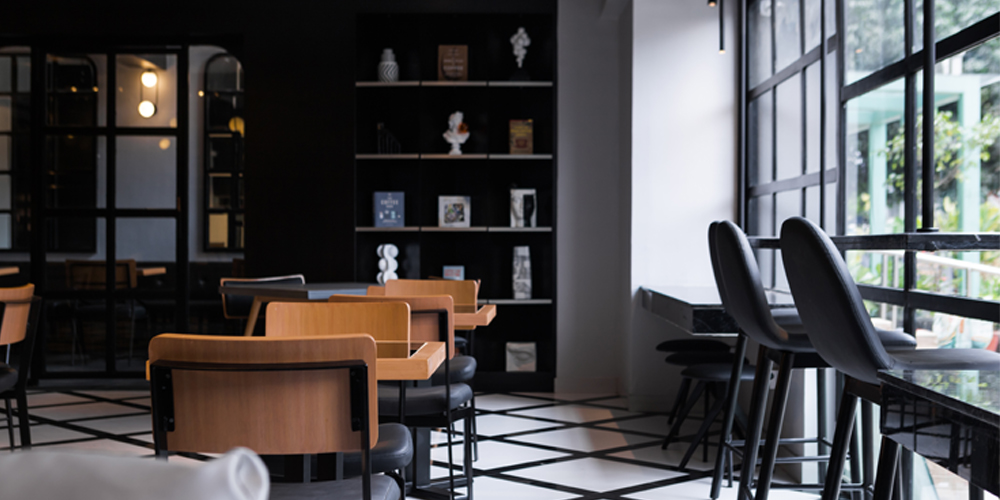
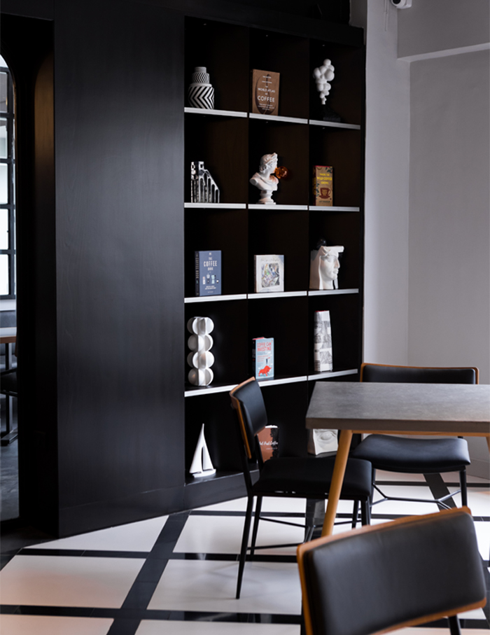
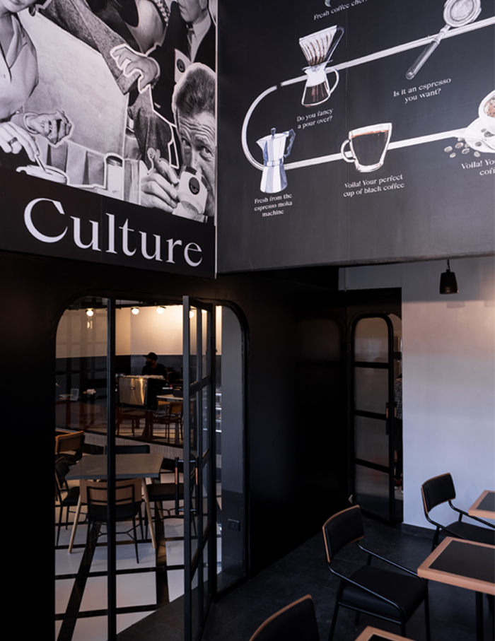
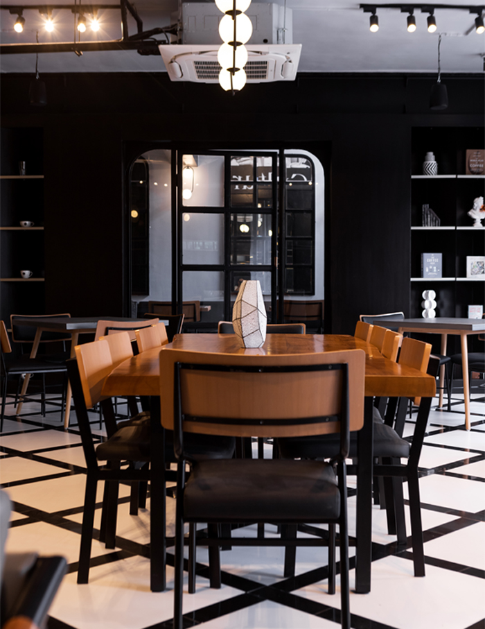
Upon entering the cafe, coffee lovers will find themselves greeted by a 20 ft high ceiling and walls featuring back and white graphics. The main cafe area has a striking pinstriped flooring in black and white that lends the space its chic vintage vibe.
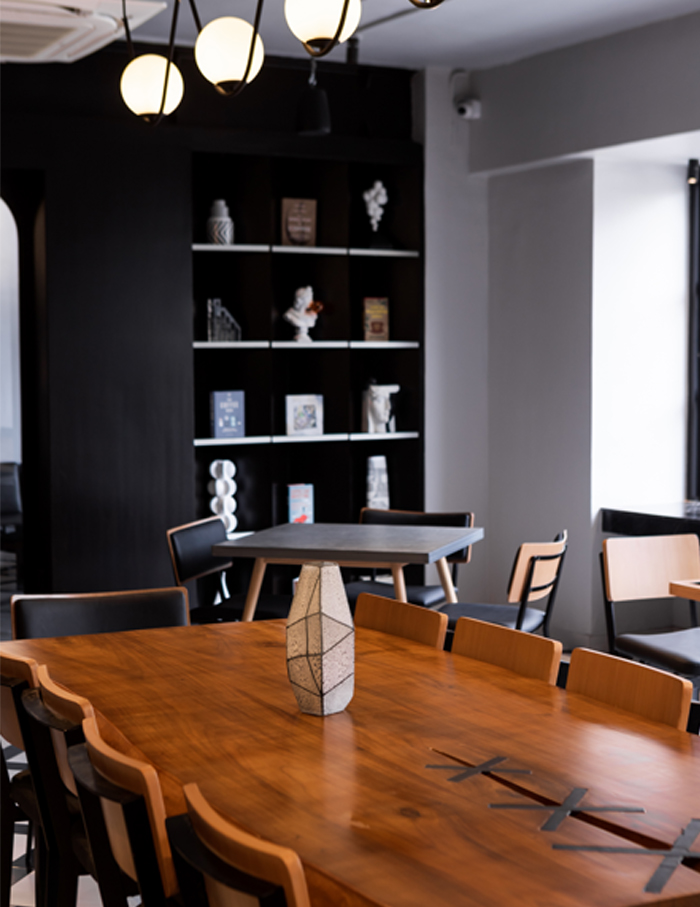
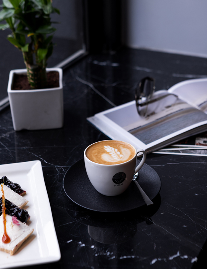
A wooden community table sits at the centre of the cafe surrounded with four seaters while a black marquina floating marble table faces outside towards the bustling Cunningham road.
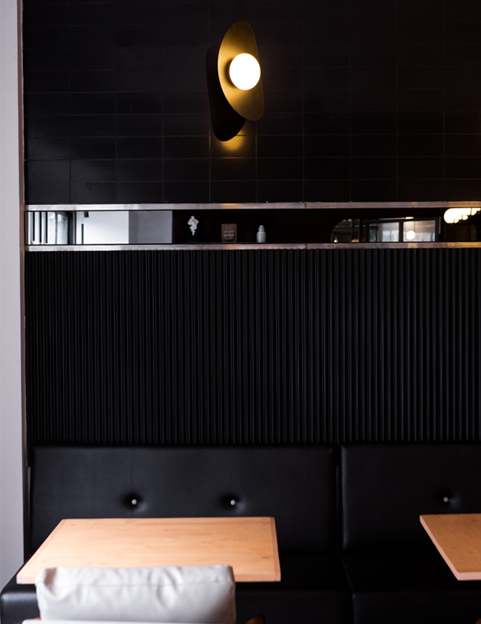
Talking about the unconventional, dark colour palette, Mehra reveals, “The colours used are mostly monochrome balanced with oak and teak wood tones. Metallic chrome finishes add a very stark contrast to the warm wood finishes. This palette was derived from the branding & the logo—that language has carried on forth in the space.”
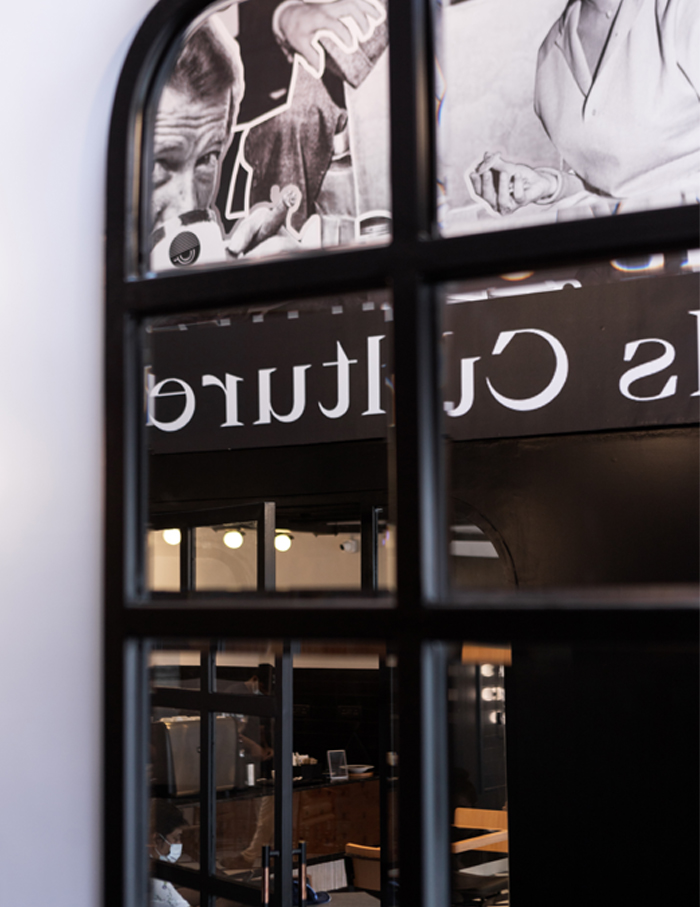
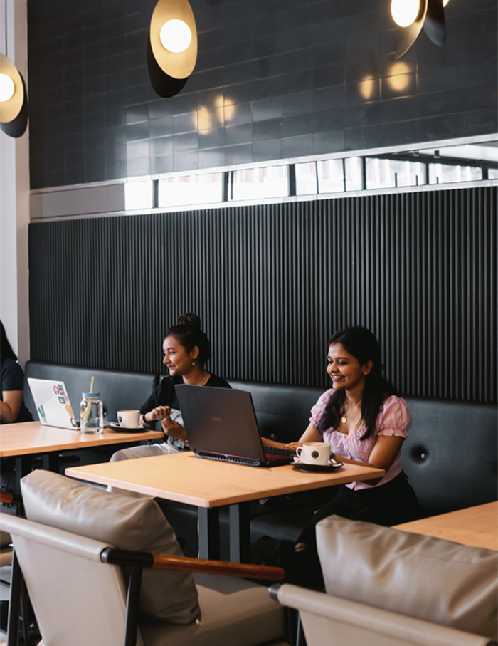
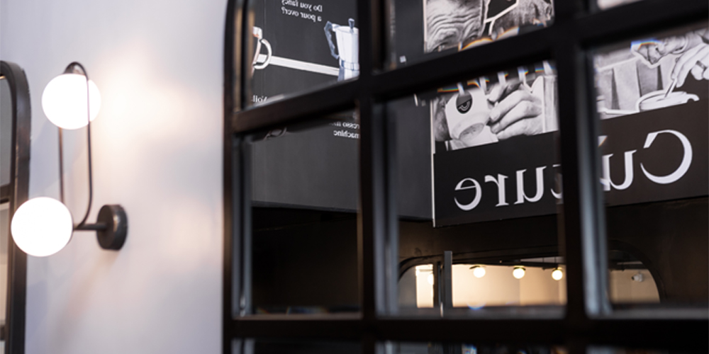
While the design doesn’t adhere to a specific trend, an interplay of materials emerge through experimentation with chrome pipes, fluted glass, black dyed veneers, ceramic tiles, black marquina marble, bevelled glass and more.

To conclude “We at Studio Goya are absolute fanatics of experiential design. Our work reflects quiet, understated, handcrafted luxury with a hint of nostalgia for the discerning user. We design spaces that are to be remembered, that leave an imprint on you,” says Mehra.
If this cafe looks like your next favourite hang-out spot, make sure you go through the maximum city’s latest urban lifestyle club The Quorum!

