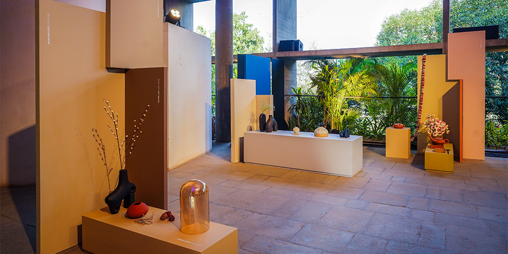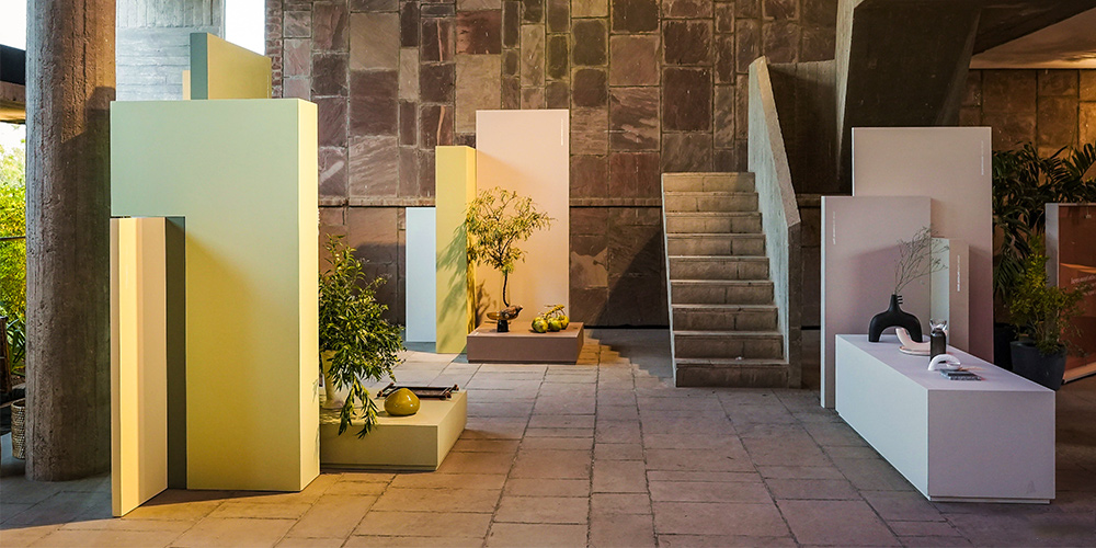
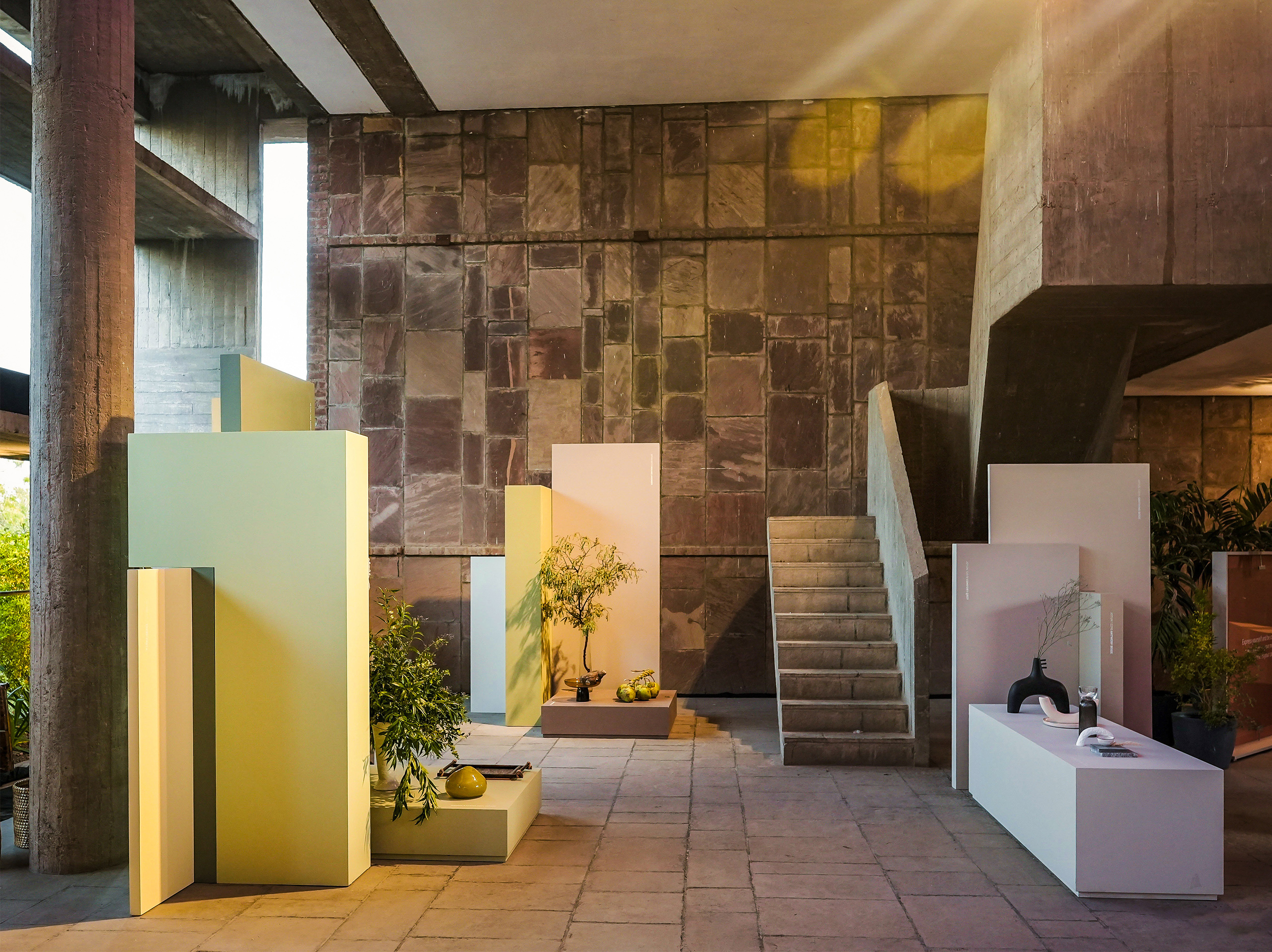
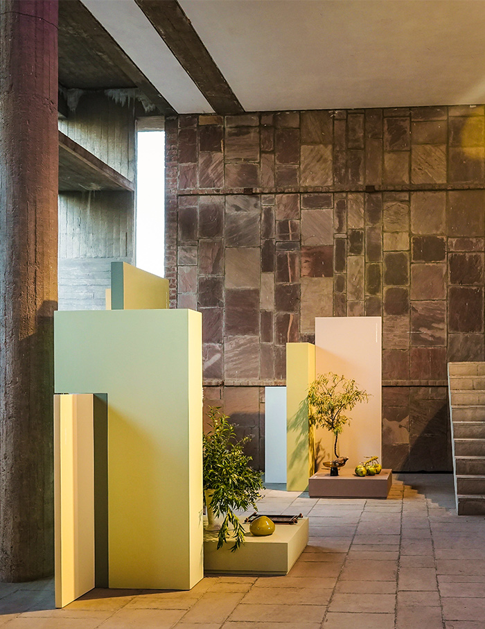
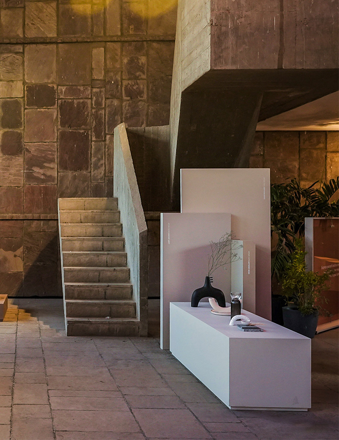
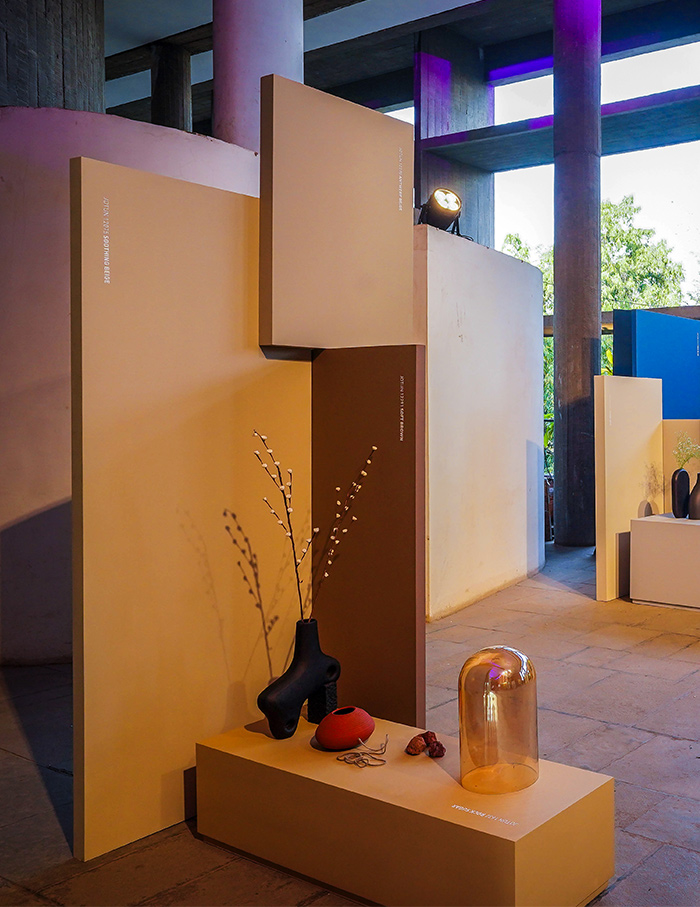
Why did Jotun Paints choose the Brutalist backdrop of Le Corbusier’s Atma House in Ahmedabad to present their CANVAS collection? Walking up the iconic ramp and witnessing the subtle shades stand out against the austere walls, their bold intention is clear as day. The Norwegian brand unveils a 23-colour palette inspired by the global shift towards tranquillity in the aftermath of pandemic-fuelled standstill. In ELLE DECOR India’s tete-e-tete with Rana Khadra, Regional Colour and Communications Manager of the Middle East, India and Africa, she maps the journey of the collection.
“In order to trend forecast, whether fashion, design and in turn colour, they all apply the same rule and it’s to watch human behaviour and to understand human beings and the way they live,” states Rana, before continuing, “Currently, if you notice, you will be seeing a lot more vibrant colours, a lot more happy colours and a lot more colours together. And I think it has a lot to do with the fact that we went through a pandemic. We went from muted, monochromatic, to bright, vibrant, expressionist, pattern-on-pattern, fun stuff. People wanted to let loose, release and express a lot more.”
How does this translate into their curation of the serene shades? Rana breaks down the process, “We don’t just adopt trends as they are, because we are after all a paint company. So what works for fashion or what works for furniture, doesn’t necessarily apply to a wall. You have to imagine a home where the walls are the largest surface area in any space. You can have vibrant colours, but not all colours are vibrant. So you have colours that are more calming, for example, in the bedroom if you want to sleep.”

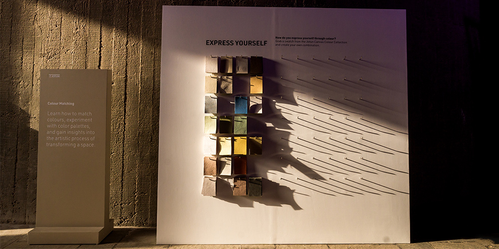
Behind the creativity, is an intense scientific exploration, touching on subjects from psychology to colour theory to chemistry. Mr Ashish Nimbark Sales & Marketing Director – Decorative, Jotun said, “Colours play a pivotal role in shaping the ambiance and mood of one’s personal space. At Jotun, we understand this significance and strive to offer a palette of hues that resonate with individual preferences and nuances. Through our extensive research and development, we aim to not only influence but also enhance the choices individuals make in colour selection, enabling them to create environments that truly reflect their unique personalities and lifestyles.”
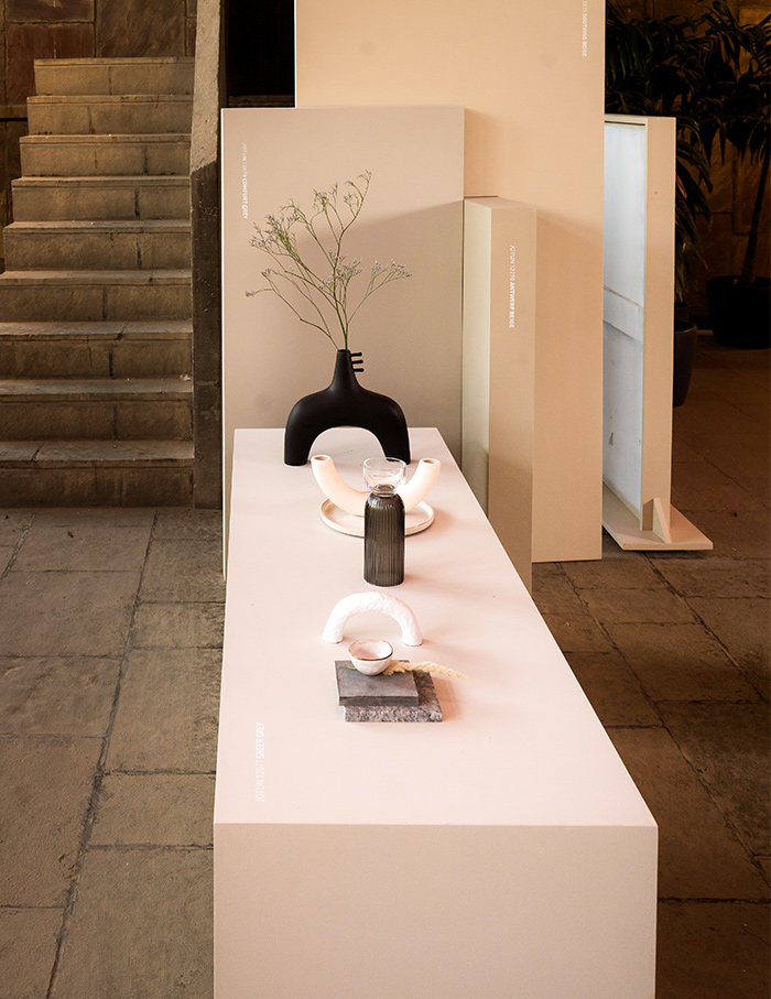
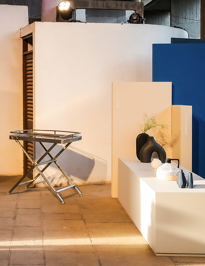
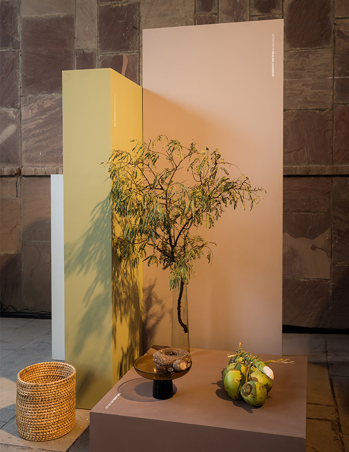
Taking cues from the country’s culture, the set design by Oslo creative studio Kråkvik & D’Orazio fuses Scandinavian minimalism with elements from the Indian subcontinent: their Indi Pink finding its echo in a garland procured by Rana on her morning bazaar visit and the Pistachio shade matching a fresh Tender coconut.

But what does the idea of luxury mean to the Lebanese creative? “Luxury is comfort,” she answers in an instant. And how does she conceptualise colours for a dwelling? “In general, I consider light entering a space. I always think of a human being living in that space.” What a Corbusian thought! At the heart of the European brand are their “Penguin values” – loyalty, care, respect and boldness. Outside, as the sun sets, the once avant-garde brises-soleil, glow from the inside with Jotun’s vivacious colours, contrasted against the purity of the primary shades and the sombre béton brut.