Does colour have a gender? It feels strange to ask when the right answer is staring right at you. Does gender have a colour? It is self-inflicted, presumptuous, outdated, but yes. Gender has claimed colour. A larger question looms in the backdrop. What is gender? I have never been able to define it or defend it.
Growing up in an all-girls institution we graduated from a pink dress in primary school to a ludicrous blue skirt and a pinstripe shirt in high school that was more convict than convent. Barring the black headband, hair ties and shoes, no other shade was allowed in our uniforms so we made do with the quintessential teenage question, “What is your favourite colour?” Turns out, that answer would not only define our social hierarchy within our fresh-faced peers but scale the walls of our institution and somersault right into contentious discourse.
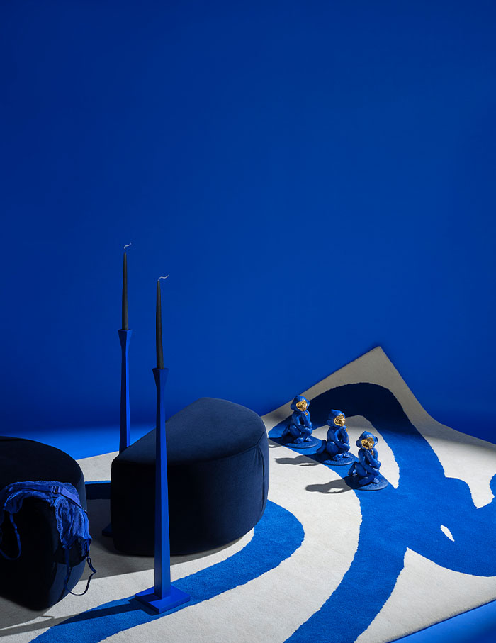
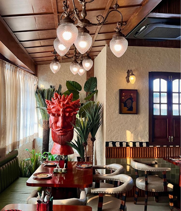
How can we disassociate the signifier of colour from its signified meaning?; Photograph by Ankush Maria; Trend and Style Direction by Yashika Punjabee; Styling assistant Juhi Agarwal
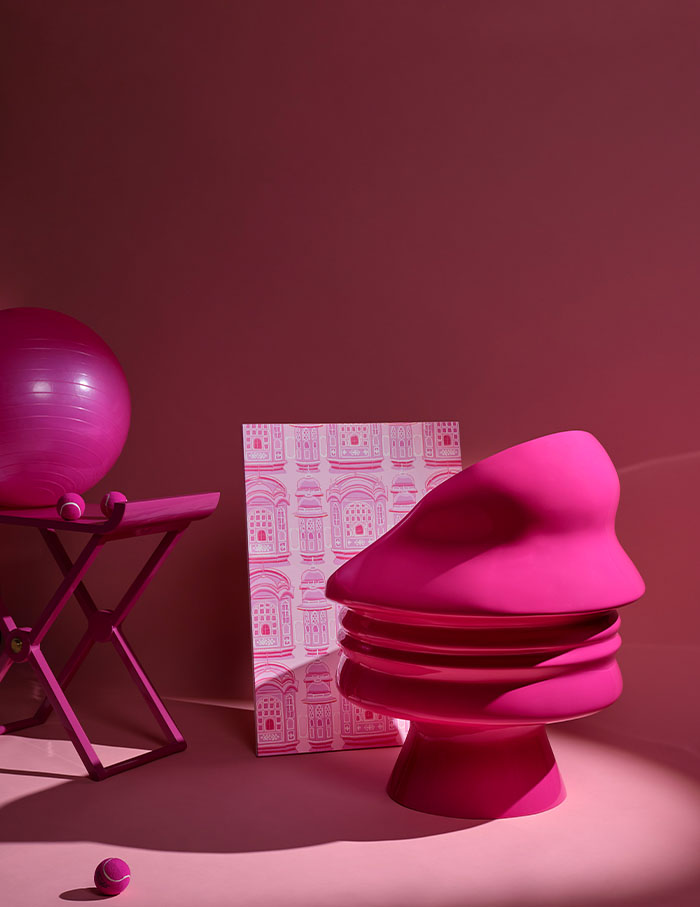
Rigid preconceptions of colour leave little room for fluid expression; Photograph by Ankush Maria; Trend and Style Direction by Yashika Punjabee; Styling assistant Juhi Agarwal
The big white lie
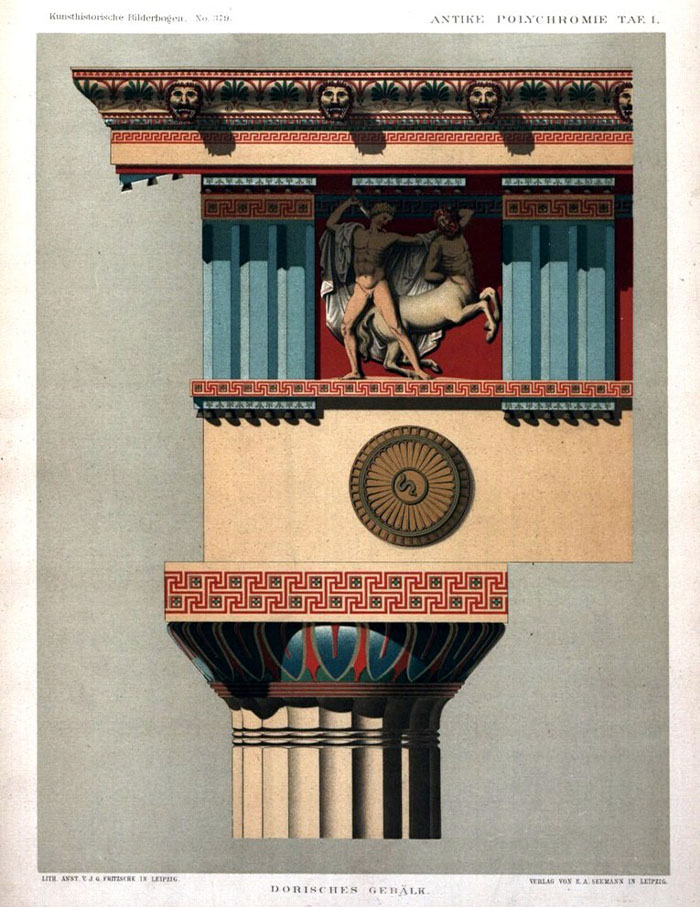
In the mid-1800s, subscribers of the purist school of thought (remnants of which still exist today) were in search of the absolute truth, believing in the stark purity of Classical monuments. Victorian critic John Ruskin went so far as to call white the “material truth,” a “strange, heavenly paleness in the midst of the flushing of the colours.” White, the colour of colonial fantasies! The Maximalists among us might wonder, how an entire civilisation survives with only one shade. How dull. Turns out they didn’t. The white was a result of polychromatic hues being washed away over the years. Presumption is a dangerous thing, wouldn’t you say?
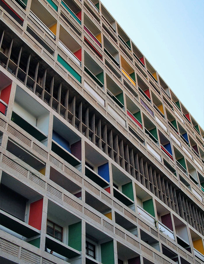
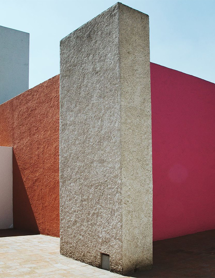
By the 1920s, colour had distilled into the architectural consciousness with Le Corbusier famously employing hues at different saturation levels to indicate visual hierarchy. However, his interpretation still carried an air of European restraint. Luis Barragan was one of the few Modernists who broke out of this stupor. The hot pink and orange walls of his oeuvre were inspired by the flowers of his home country, Mexico. You can almost hear the defence from the Modernist Boys’ Club. “Pink was from bougainvillaea, rust from tabachin, light-purple of the jacaranda. His pink, unlike that of Barbie’s, is not shallow!” Why must we take ourselves so seriously?
Le Corbusier’s Unité d’Habitation references ruins from antiquity. Against the brutalist envelope, the colours reflect the vibrant inner lives of the residents; Photograph by yu1ro, PixabayPink’s tryst with femininity is a relatively recent phenomenon, established only in the 1950s. Around the same time, Luis Barragan presented pink without its gendered connotations in his home, Casa Barragan; Photograph courtesy www.casaluisbarragan.org
White is not the absolute truth, it turns out! Classical monuments were polychromatic, losing their colour and their intended outlook over time; Image courtesy Wikipedia from Wikimedia Commons
Colouring outside the lines
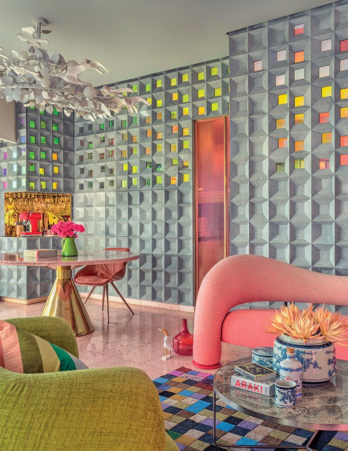
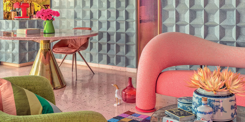
Closer home, ELLE DECOR India’s June-July 2024 cover home takes a novel approach towards softer hues. While the bold swaths, iridescent specks and a sweeping suaveness of the shade make an unforgettable impression, the context in which the image exists is what makes the difference. The home belongs to Bhupal Ramnathkar, a veteran graphic designer and advertising legend.
When it comes to designing your home the stakes are different. The space is interlinked with your own biases and beliefs. But Bhupal says, “My approach to designing is different since I’ve not studied interior design. While others have a methodical way of doing things, there is no logic to my process.” For what is cast off as frivolous, colours carry the weight of our prejudices and preferences. And most of us prefer to spend a lifetime on the monochrome sidelines where it is supposedly safe. But designers today are stepping out of the box and into a new beginning. And what is colour if not a litmus test for the winds of change?
And then we have Geoffrey Bawa’s Lunuganga. Being one of the most celebrated architects of all time, Bawa’s architectural legacy is unquestionable. However, in his most private quarters in the wake of imposed colonial criminalisation of queerness, was there an intersection between his practice and his personal life? Maybe the garden that surrounds the built form holds an answer. Subverting the notion of the popular Italian and English gardens of the time, the green in Lunuganga is still untamed. Free.
Nature is replete with colour. In Geoffrey Bawa’s Lunuganga, green takes over the built form and the garden — untamed and free; Photography by Banuka VithanageBuilt and unbuilt, grown and created — Bawa’s architecture subverts the formal design language of the time; Photography by Banuka Vithanage
The cover of ELLE DECOR India’s June-July 2024 issue featured Bhupal Ramnathkar’s nouveau approach on the contentious hue in his home in Mumbai; Photograph by Fabien Charuau; Produced by Mrudul Pathak Kundu
The pink problem
Is rainbow the salvation we need today? Back in school where the real world seemed too distant, we had assigned personalities to every colour like a demented Buzzfeed quiz. There was the blue camp with self-important edgy erudites who thought they were better than everyone. There was of course the black clique which I firmly swore allegiance to, owing to the company of the 2012 Tumblr emo kids who listened to Linkin Park and read Pinterest poetry. We had the weirdos who liked orange, green and the other “lesser” colours, but they weren’t important. And then there were the rebels in hiding. Camp Pink, full of saccharine nice girls everybody loved to hate.
However, I wonder how much of our hatred for pink and love for the “masculine” shades was because of the colour. The real vitriol was against our perceived gender. In a school filled to the brim with the second sex, within our halls, there was no man to join forces with. Alas, there was. We were women, or rather girls, as Margaret Atwood writes, “Unconscious of the ever-present watcher peering through the keyhole, peering through the keyhole in your own head, if nowhere else.” In some twisted naive capacity, we too were our own voyeurs. And pink was wildly emasculating.
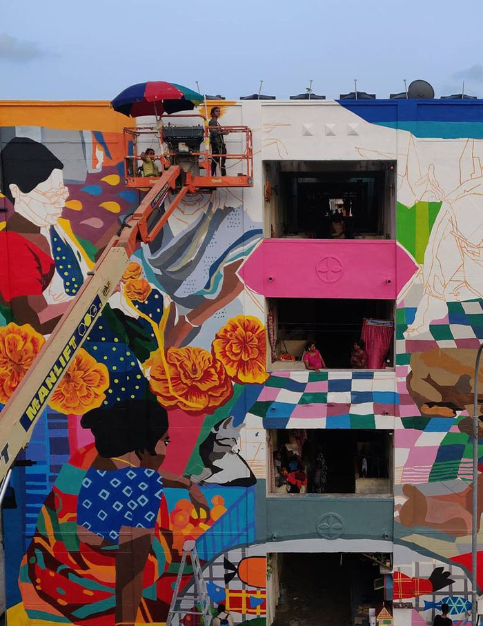
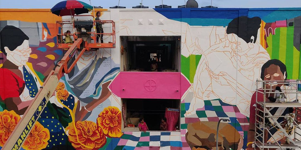
A group of trans and cis women at the Aravani Art Project paint murals in the city, reclaiming public space. Colours can invite a plurality of narratives in a metropolis; Photograph courtesy Aravani Art Project
The tables have turned. Pink in the post-Barbie era is “liberating”. The first choice of the feminist man. Careful, before you absolve it of its crimes. Simon de Beauvoir wrote, “The relation of the two sexes is not that of two electrical poles: the man represents both the positive and the neuter.” Beyond the skin of the built form, exist interior lives where colour becomes an identity, a burden or even a sigil. Yes, gender has claimed colour but can we not see gender as an ombre? Fluid to the core. Can colour not be a greenscreen backdrop or an exciting ambiguity?
At the peak of the Modernist era, architect Eileen Gray designed a striking all-white residence for herself and her partner. The villa E-1027 was the subject of adoration (and envy) of many, including Corbusier who painted a series of explicit murals on the walls in the late 1930s. Infuriated, Gray declared it an act of vandalism, detesting the defacement of her beloved home. Corbusier, in retaliation, wrote how his colourful murals improved the “dullness” of the walls.
Murals and graffiti also share an important legacy of reclaiming public spaces. Across Indian cities, the Aravani Art Project invites artists from the transgender community to paint bright artworks across building facades and walls in pivotal locations, increasing the visibility of plural narratives. Like most devices of design, the fate of colour depends upon the designer’s intent. However, like its much-maligned captor of gender, colour is never neutral.
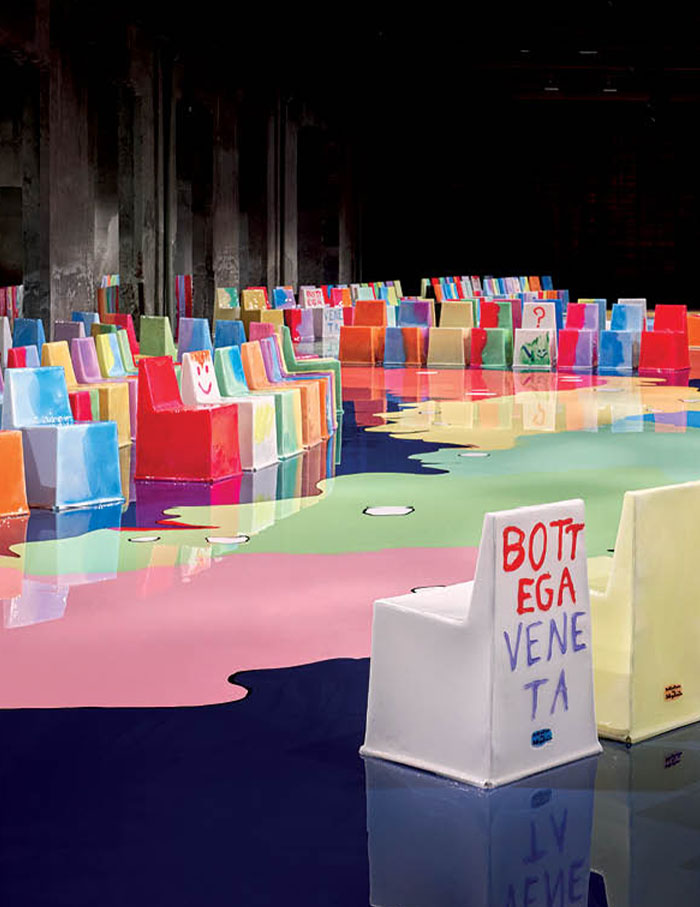
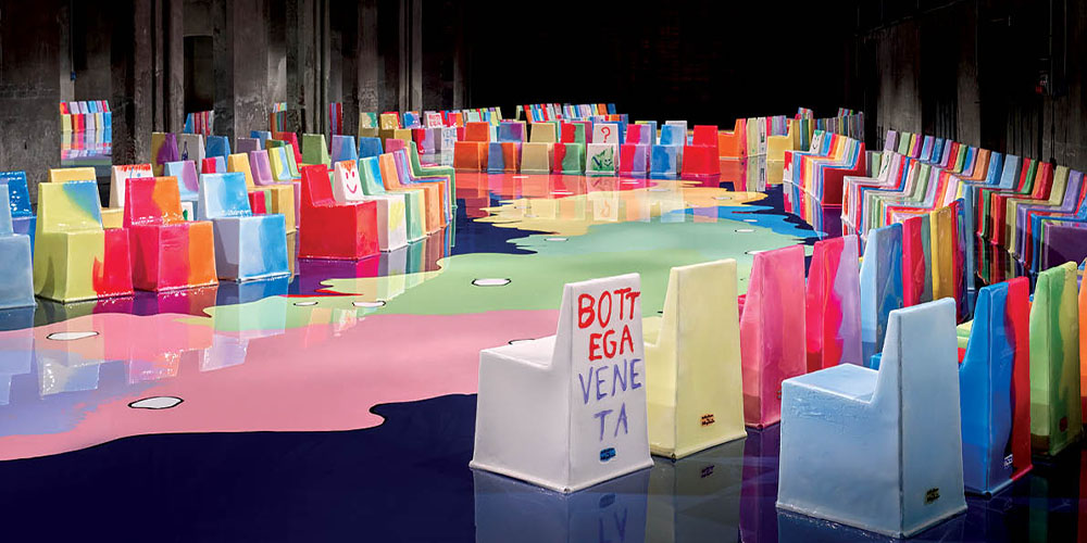
Bottega Veneta collaborated with Gaetano Pesce on their Summer ‘23 show. The designer explains, “This space is a tribute to diversity. It is about the human being; we are all different”; Photograph by Matteo Canestraro
Staged within Aditya Prakash’s house in Chandigarh, Double Framed uses layered photographs and archival fragments to examine memory, photography and the afterlife of modernist architecture
A panoply of the greats awaits from a church designed (and redesigned) by Charles Correa to what caricatural representations of Dr BR Ambedkar during the colonial period mean today. DAG brings the second edition of City as a Museum to a metropolis where over centuries, creative practices have thrived owing to its irrepressible pulse