For the past 14 years ColourNext, Asian Paints’ annual colour and decor trends’ forecast, has provided direction to the design industry in India. Taking into consideration the year-round scientific study carried out by a panel of experts, the brand unveils an understanding of the current consumer mood in the country.
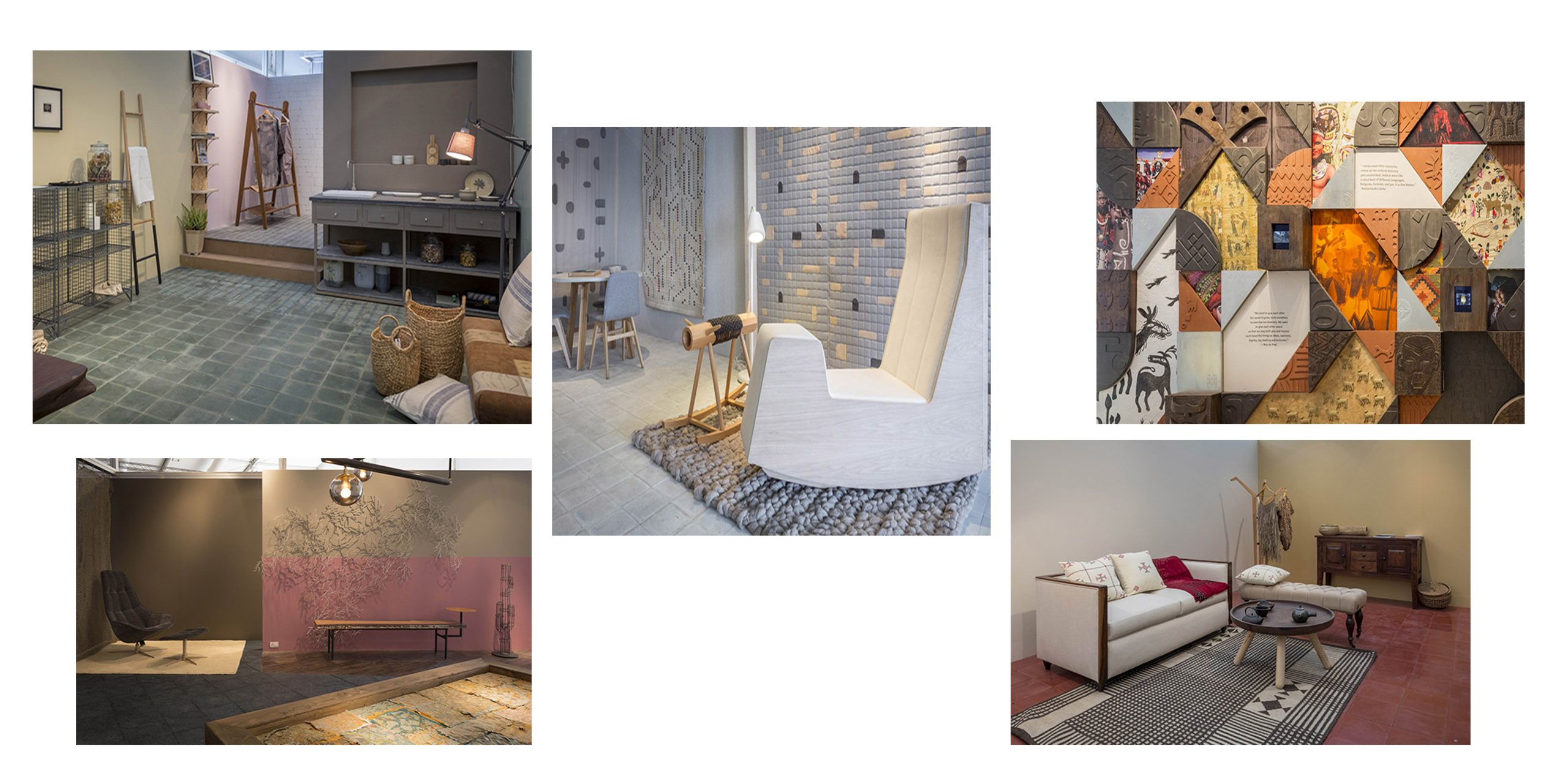
At the launch of ColourNext 2017, held at the Trends Pavilion at India Design ID, New Delhi, they mapped a beautiful new shade, Intense Ocean as the Colour of the Year 2017 along with four supporting trends – Local Pride, Bot Is Human, Elixir and Slow Living. These palettes were given tangible representation through spatial settings by Ram Sinam of Wari Watai in the exhibits at the fair. Here’s everything you need to know about the trends.
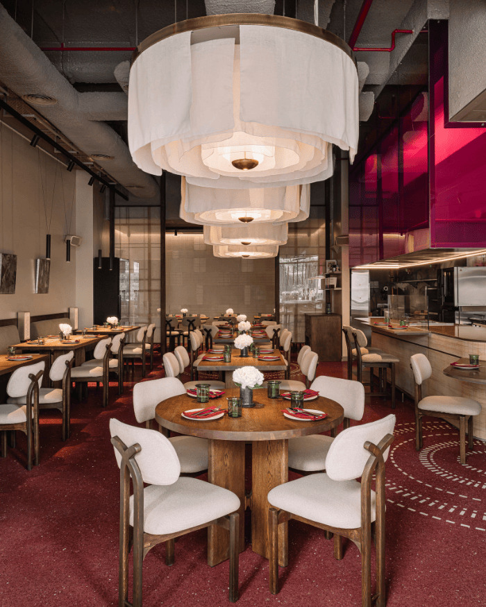
1. Local Pride
The world that we are living in today is a homogenised one. Assimilation of different cultures has resulted in cities becoming more cosmopolitan. Ironically, this has made people cognizant of their innate individuality and thus more appreciative of their traditional roots. While we love indulging in fancy continental dishes, it is not as comforting as a warm, home cooked meal. The Local Pride palette reinterprets the idea of being Indian or global but bringing forth an expression of the self and a sense of belonging. The lead shades are Abyss, Copper and Balsam Brown paired with materials like coconut wood, bamboo and cala cotton.
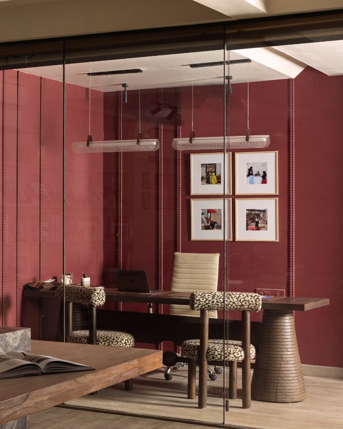
2. Bot is Human
There was a time when machines were considered lifeless, voiceless and characterless but that didn’t matter as long as it was efficiently delivering the desired output. But today, technology has evolved to become an inseparable part of our daily life. Our want for human connection is not waning; we have just found a way to fulfill it through the increasingly intuitive and responsive bot. Devices now talk to you, offer you suggestions to enhance your day-to-day activities, but ultimately accept your decision like a friend. The Bot is Human colour palette represents this intersection between the real and virtual world with lead hues of Olive Path, Pale Sisal and Burgundy Plus coupled with materials like beech wood and felt.
3. Elixir
We often underestimate the significance of resources that nature has selflessly provided us with. Water has been considered to be the elixir of life since ages bygone and yet, exploited for years leading to its scarcity. Water assumes dual roles – it can be nourishing as well as destructive, vast yet disappearing. Elixir plays on this contrast by reflecting lead tones of Teal Magic, Botanica, Vintage Rose and Igneous Rock along with media like Oak wood, titanium and velvet.
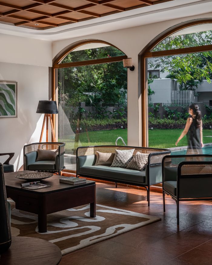
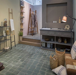
4. Slow Living
With the constant struggle to survive in this competitive world, we hardly have time to relax. Taking a vacation from it may not be a practical solution but it is imperative that we slow down. We need to cherish life’s small joys, become more conscious of our inner selves, experience every moment to its very core. Holding that thought, the Slow Living palette radiates a warm, lived-in vibe with lead shades of Lilac Dash, Dusty Trail and Grazing Land combined with materials like Burma teak, ceramic and leather.
Website: www.asianpaints.com/colournext
Also read: How to experiment with Asian Paints Colour of the Year 2017 in your living room