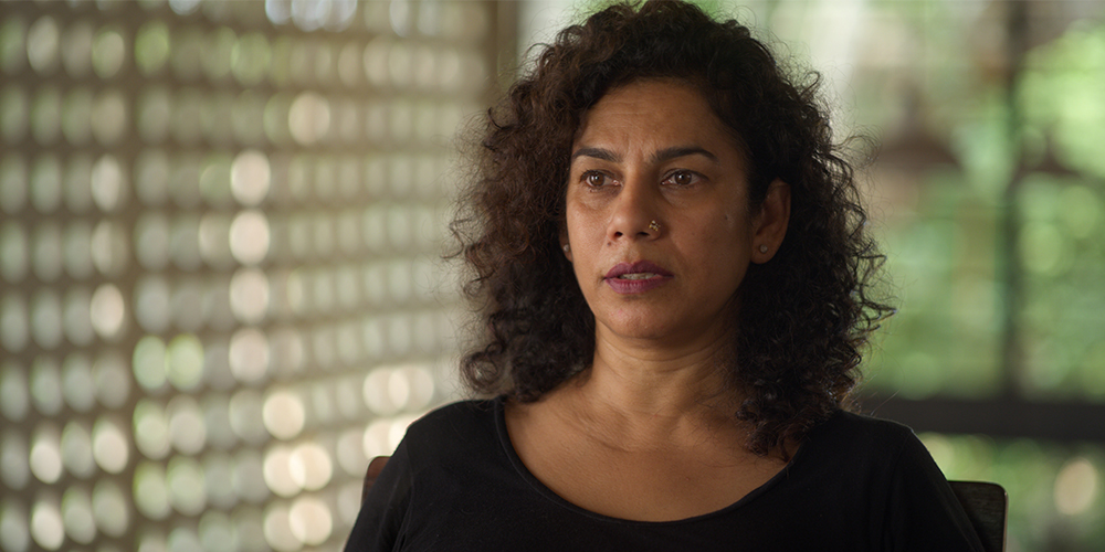
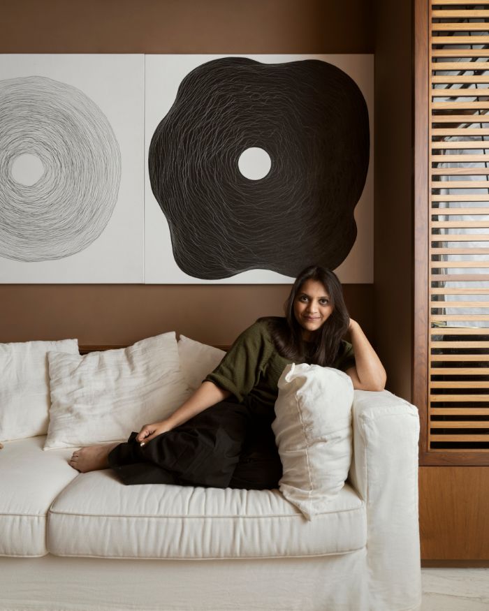
Following the release of Anupama Kundoo’s episode of the Apple TV+ original docu series “Home” in April 2020—the architect gives ELLE DECOR India an exclusive insight into The Wall House’s many features and also shares advise for budding architects looking to build homes such as this. Excerpts…
Tell us how The Wall House came about…
Before I completed the Wall House, I had lived very simply for almost a decade in a basic yet ‘designed’ thatched hut. My notion of ‘home’ as an extension of oneself and my sense of adventure and freedom as well as my values as an architect naturally led to build house for myself that reflects my outlook of architecture in the background allowing life to happen in the foreground.
The spatial experience is quite clutter-free and not dominated by possessions one accumulates in one’s life, but a free space to wake up in each day and write a new page. It is not shaped by the definition of home as an overly protective space, where one becomes too comfortable and stops walking the tightrope of life.
The house is therefore not all that closed to the outside, as an appreciation and regular reminder that our lives coexist beside many others in this fascinating world that is a miracle and a source of constant discovery. It is not a regular house which is driven by regular expectations of rooms and corridors. It is a space designed for celebrating life.
The materiality of the architecture is based on the recognition that time tested local materials have not yet been fully explored, and there is a lot to discover. Then there’s the view-point that the fruitful use of human resources such as intelligence, muscle, and personal time, can significantly reduce the dependence on natural resources that are in short supply. Or, that investing in local skills, can help build knowledge and community, while creating a holistic habitat that is appropriate to the context, environmental, social, economic and climatic, among other considerations.
Which native methods served as inspiration while creating this home?
First of all it was the discovery that pre-industrial brick technology was still alive in many parts of India. Achakul bricks that I came across in nearby areas were made pretty much in the same way that the earliest bricks seem to have been made, where the kiln is part of the brick stack that has to be fired.
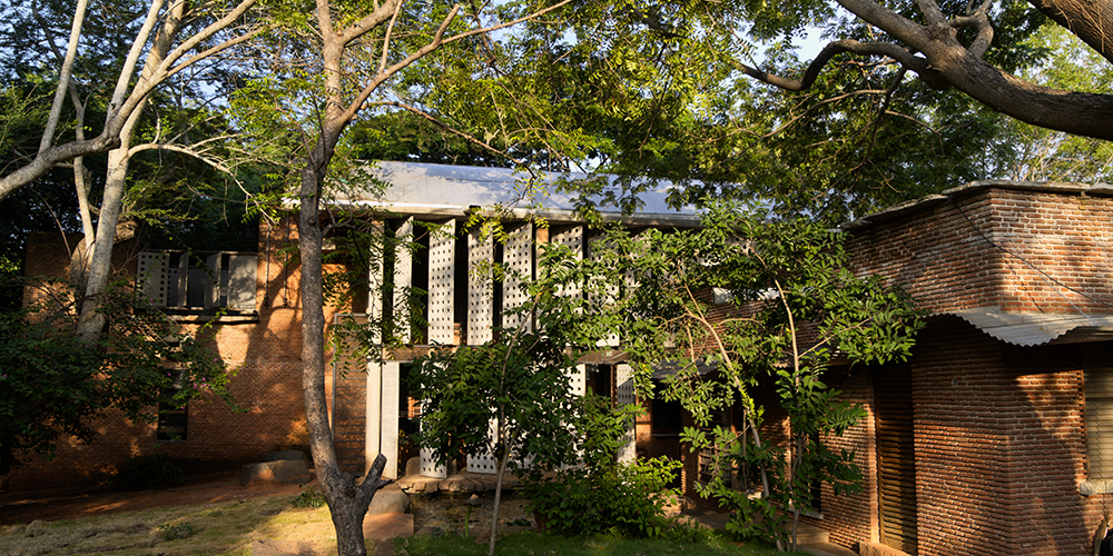
It was my realisation that cheap handmade bricks, unlike the wire cut stronger bricks we chased after graduating from architecture school, was superior in many ways to the factory bricks. They were weaker no doubt, but they used local clay, twigs and branches out of their plantations as fuel instead of coal, and were affordable not only in monetary terms. They were slim, light and easy on the masons’ hands. The weakness of the brick meant that walls needed to be thicker which also improved climatic comfort.
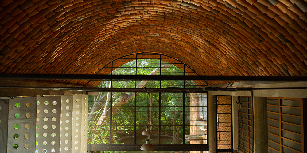
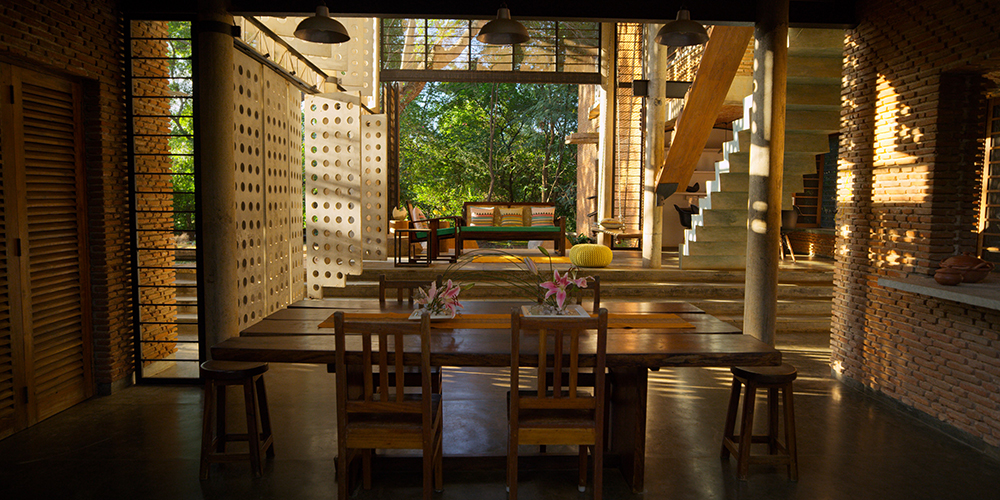
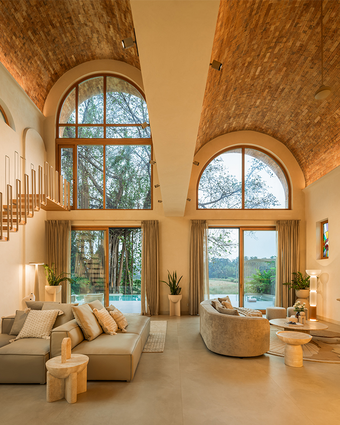
So the exposed brick wall is a celebration of the discovery that these weak local bricks are, in fact, more appropriate. Lime mortar instead of cement has also been adopted from native methods. However, there are inspirations from contemporary architects too. The catenary roof takes cues from the experimental work of Rajendra and Rupal Desai that I encountered when I visited Valod in 1988. And the filler slab over the dining area was inspired by my meeting with Laurie Baker around the same time.
I was also greatly swayed by the engineer and concrete specialist Remedios, from whom I learnt about reinforced cement concrete in depth. Finally, the spatial concepts pay hommage to the early modernist architects who put forth the ideas of ‘open plan’ architecture for homes.
What are the project’s other low-impact features?
The house is largely handmade with no dependency on electricity or machines. The emphasis was on local materials and indigenous skills. The house was designed to be powered by photovoltaics and solar thermals.
The structural materials are often the finished materials, to economise but also reveal the natural beauty and potential of materials. Rough granite slabs and cement oxide floors characterise the bathroom flooring. The homeowner’s lifestyle also creates low impact as it focuses on essential well-being and minimalism.
Did you face any challenges?
They were mostly to do with how to realise the envisioned ideas and to materialise what was drawn, as it required a lot of collaborative work. I overcame almost all those challenges by simply taking the time, and not rushing for ‘solutions’ that one was not really convinced about. I realised, over the years, that this capacity to simply be able to wait, and do nothing sometimes is, in fact, a very valuable attitude. And it is this quality that perhaps led to my success as an architect.
Today, I really value time for self reflection, not being over eager, and rushing about in the name of ‘work’. My upcoming solo exhibition at Denmark’s Louisiana Museum of Modern Art is called ‘Taking Time’ as I believe that time is the most important and undervalued resource in modern life, and we can see some of this being understood during our current lockdown.
Walk us through the home, please…
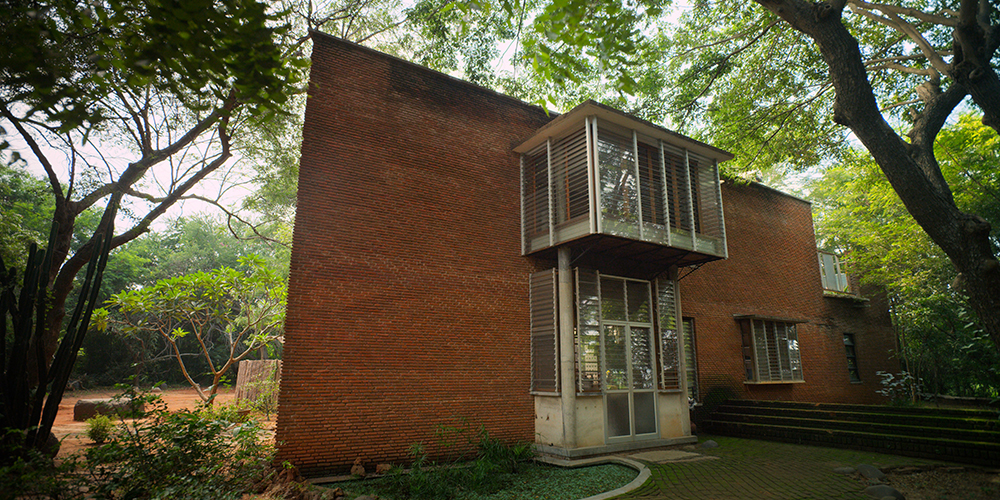
The entrance does not reveal the house at all, as it is a simple opening in a long wall that has a fort-like heavy quality. But when one steps in there is a sense of intimacy in a tunnel-like long space containing the kitchen, and a study area. From there, a large verandah space twice as wide and high opens up, to once again bring you to the outdoors.
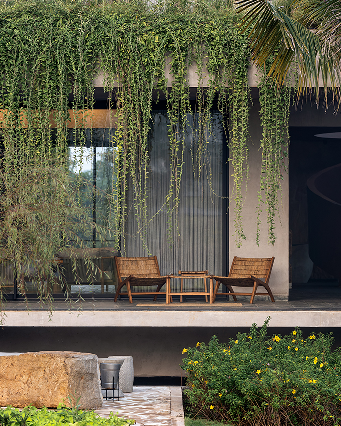
This is the main living area, and a perfect social space for meeting other people but also other creatures who sometimes wander in. Long steps, quite like the ones seen in temple tanks, take you down to the dining area and a guest bedroom. A single flight of stairs take you upstairs to the upper part of the long tunnel like space within the wall element.
Here, the main bedroom juts out of the wall to inhabit the space below a huge rain tree, stepping out of the house as it were, with other spaces arranged like in a train. On the right is the children bedroom, and on the left is a corridor leading to the open to sky bathroom. On the way there, a large desk and wardrobe area are snugly fitted, allowing each activity to be a concentrated space for itself, and invisible to the rest.
From the bed platform on the other perpendicular axis, one can step under the vault of the living area, as if to enable a more private version of a living area. Beyond this space one can further step onto an alfresco terrace partly sheltered by the dome of another rain tree. This sequence ends in a little water body where water is stored and where one can cool off on hottest summer afternoons, and gaze at the stars at night.
Which is your favourite part of the house?
The bedroom and the bathroom. These are spaces of rejuvenation, where one needs to be absolutely private and yet, if possible, in touch with the larger universe. Both spaces step out of the social spaces of the house leaning out towards the outside. I am most happy within these spaces as they allow me to reflect on the essentials on a daily basis.
Any advice for upcoming architects?
Our profession and the architecture we create will outlive us. It takes generations to build cities, and the impact of our action lingers long after we are gone. I would like to insist that it’s worth taking the time for due reflection on what one is creating and how it really impacts the users as well as the others, now, and for years yet to come. I urge the younger generation of architects to value long-term thinking, and snap out of the seduction of short-term gratification. If we take the time to reflect, we all do know what is good, what is necessary and what is superfluous.

