Located in the Jio World Convention Centre at Lakme Fashion Week, designed to maximise visual appeal, allowing every corner to be ‘instagrammable’, the 600 sq ft pop-up store is a collaboration between Ajio Luxe, the production company—Magnanimous group and the designer—Ayesha Puri kanoria of Sanjay Puri Architects.
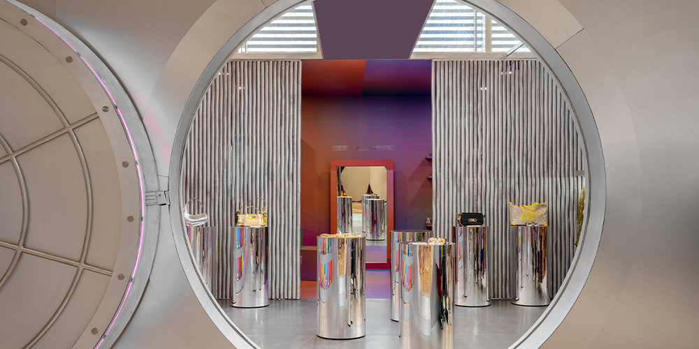
The pop up store, built as a huge life size vault, was done so to showcase exclusivity and in turn intrigue the people passing by. Built from scratch using a steel and wooden framework with aluminium cladding, the Ajio Luxe vault is a confluence of style, authenticity, opulence and craftsmanship.
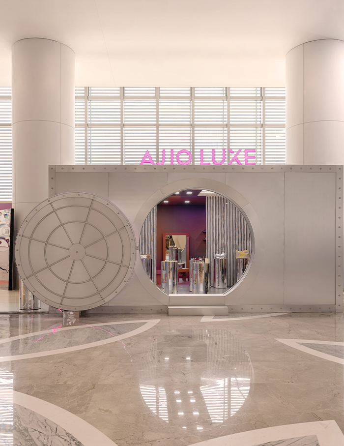
When one approaches the pop-up store, one is confronted with a large round metal-clad door that opens up to invite visitors inside. The idea to clad the entire exterior in an impermeable material was so that one’s interest is peaked and they would have to step inside to see what’s going on.
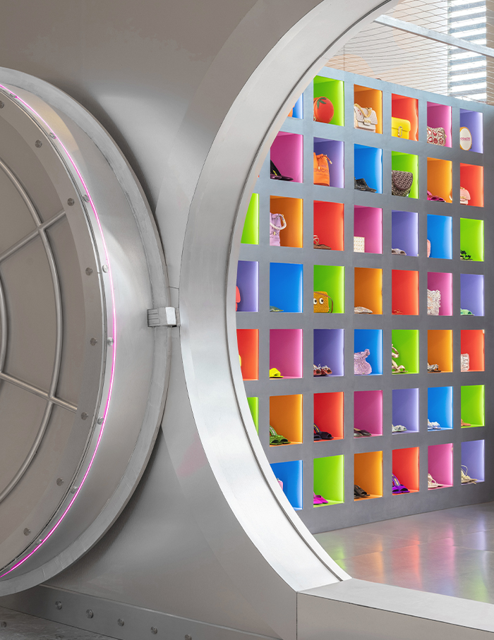
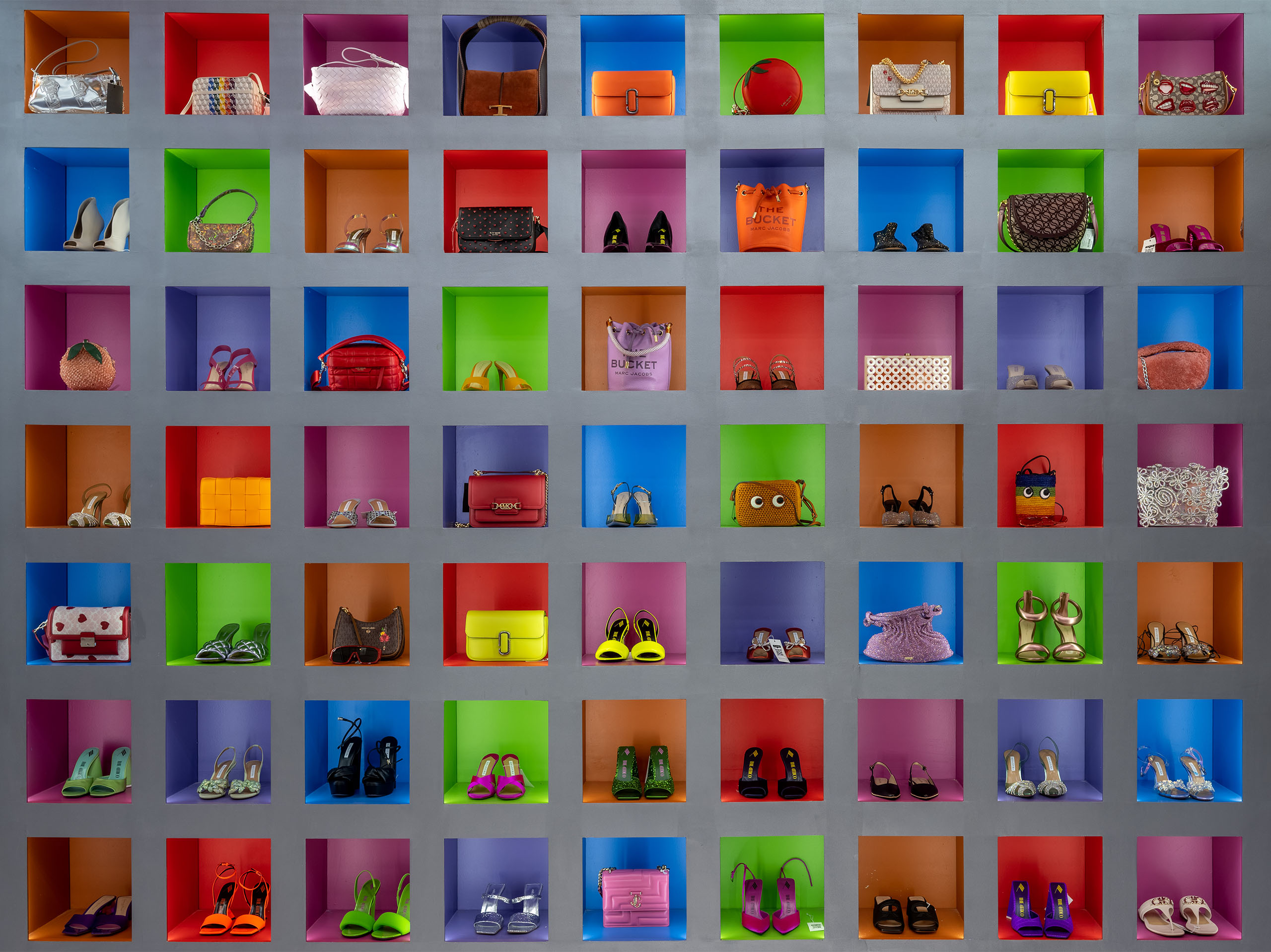
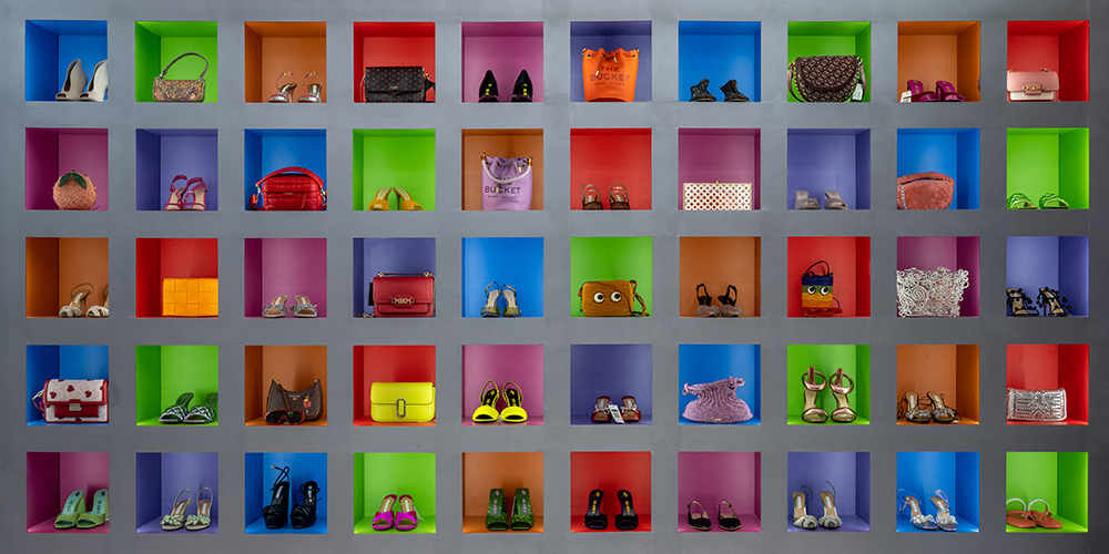
The use of technicolour depicts the constantly evolving trends. The specific colours chosen represent the brands that were showcased inside. The highly reflective metal surfaces throwing back those bright colours give this space an extremely radiant energy.
“The whole vault uses several different shapes, forms and colours and lent to a ton of experimentation. We went through numerous iterations of shapes for the racks – both wall mounted and free standing, furniture ranged from blockish to circular and wavy bench like pieces” says Ayesha.
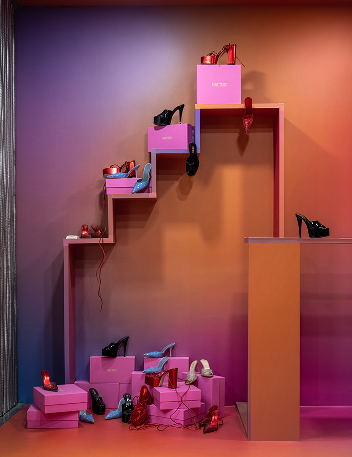
The ladder is symbolic of the cyclical nature of fashion and trends, where styles are constantly changing.
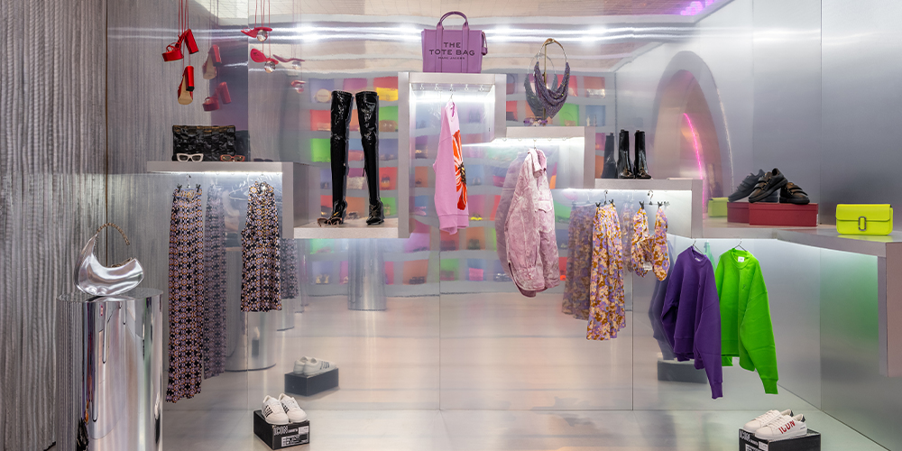
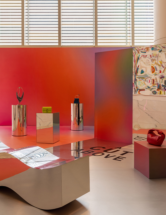
The play of reflective and brushed steel juxtaposed together was done to reflect the colours in more interesting ways, amplifying the visual impact. There’s something about neon that is extremely eye-catching , whether it appears in a neon sign or on clothes, bright neon colours offer a vibrancy that regular colours lack.

A large mirror placed in the centre of this space reminds one to always reflect on one’s style. The overall material palette was a mix of different steel finishes and multicoloured surfaces – either painted or printed as vinyl to illustrate the theme of the space; the juxtaposition of a changing industry (shown through changing colours) and that of staying true to oneself (shown through reflections in steel and mirror).
“I think the best part of this project was that it combined my love for fashion and design in a way which really challenged me to make sure both were used synchronously to bring out the best in the other,” says Ayesha.
You may also like: Sabyasachi’s latest store in New York

