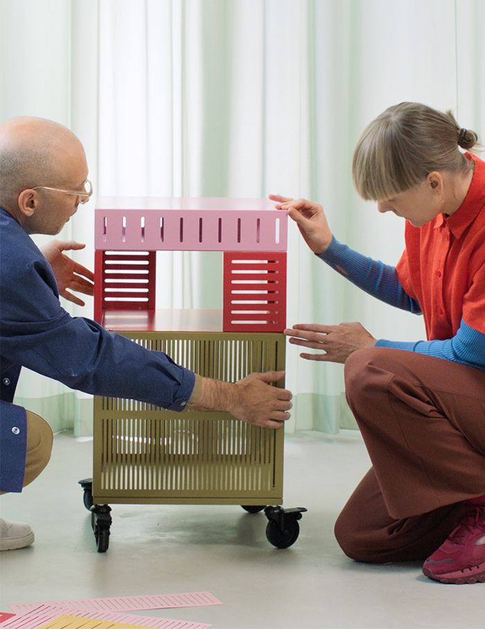
I largely associated IKEA with their pristine whites and pragmatic pieces with just the right edge to elevate the everyday. Taking this idea a notch above is TESAMMANS, one of its most anticipated collections for 2024. Created in collaboration with Christoph Brach and Daniera ter Haar from Dutch design studio Raw Color, this limited-edition line features 18 unique products centred on colour-blocking, with vibrant hues and playful textures. We caught up with Christoph Brach to gain insight into what inspired this departure from IKEA’s signature style and how TESAMMANS aims to redefine the boundaries of design.
What was the starting point of the collaboration with IKEA?
That this collection should be about small-scale living and interaction between users, objects and the products. IKEA asked us if we could make a collection of around 20 pieces. So that, and then obviously colour has been an important part of it, since that’s also the role of the studio. Globally speaking, colour has become prominent again. Like we live in a world that’s developing in a decolourization in a sense.

Colour can do a lot and can have benefits on how we feel and how we surround ourselves and it can give us energy or it can give us calm. And I also have the impression that there was a big curiosity on IKEA to kind of investigate this. Looking at India also, their colour is much more natural, it brings so much energy to your life. From a point of view of extracting some ideas out of you and to also understand how our readers and users would like to play with the collection.
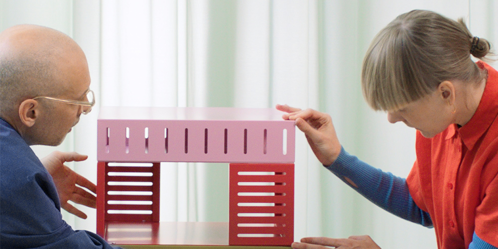
Also colour is never alone, never isolated. The interaction of colours became an important and crucial point of the collection. There was this togetherness, because, to interact you need two parties — two colours or the product and user. And that’s what TESAMMANS means — together. In the collection, many pieces are available as a set of two or have a similar aesthetic. Like the candle holder, you can nest them. The same with the ceramic vases. Colour is never alone.
What is the secret to blending vivid colours on a mood board?
People should just start and dare to combine. There is no wrong or right. Sometimes it can be overwhelming, that also tells about the power of colour. It will evolve, grow organically, and create beauty. It’s like the Indian concept of jugaad, when you improvise and find solutions.
That’s also what we try to embrace as a studio. Life isn’t always planned or controlled. Despite having navigation systems and tools for everything, there’s a unique energy in being spontaneous and organic
Could you pick two pieces for us that are special to you from this collaboration?
The ceramic base and pot.
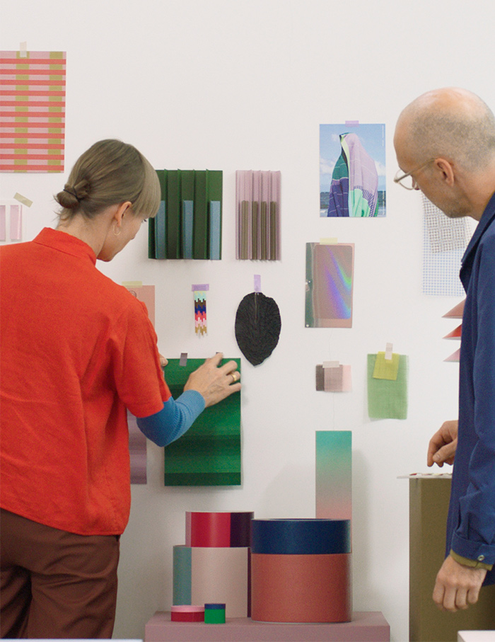
We had never worked with ceramics before. Things can be surprising, even when planned. For example, we designed cylinders with different coloured stripes that change appearance depending on how you arrange them. You can rotate them to show warmer or cooler tones. A pleasant surprise was discovering how plants or flowers interact with these stripes. We hadn’t considered this interaction initially, but now we see that the colours of the plants and flowers can match or contrast with the stripes, creating a beautiful effect. This unexpected element adds a delightful layer to the design.
Are you a maximalist or a minimalist?
Maybe a combination of both. Our studio’s heritage is rooted in graphic design, with experience in brand identities, corporate design, and graphic work. This background influences our approach, often starting with a 2D graphic perspective to create iconic shapes. An illustrator even made drawings of our collection, which highlighted this graphic style. Our designs reflect both minimalism and maximalism. While we appreciate the simplicity of minimalism, we also enjoy incorporating vibrant colours and bold elements to avoid things becoming too plain or boring. This blend creates a unique balance in our work.
What has been the most cherished moment or memory of this association?
There have been many happy moments during this collaboration because the open briefing allowed us a great deal of freedom. For instance, we are currently working with another design brand that pushes us towards minimalism—fewer colours and simpler shapes. This was never the case with IKEA, where we enjoyed significant trust and creative freedom. This trust likely contributed to the positive reception of our collection, which has a strong identity. The team’s belief in our vision, such as choosing beige over white or using one colour instead of three, has made this collaboration especially rewarding.
Head here to shop the collection