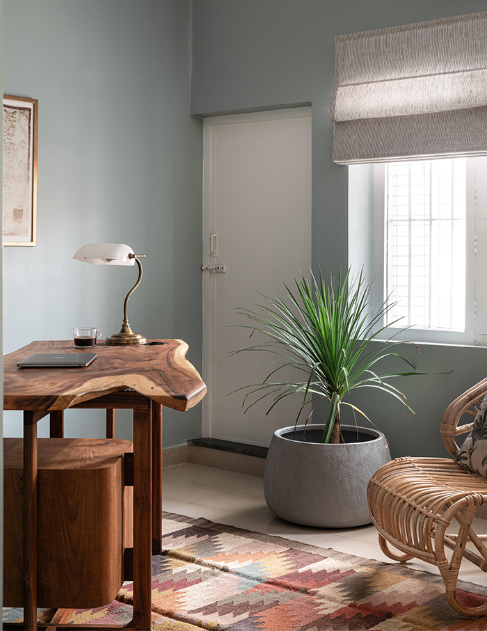
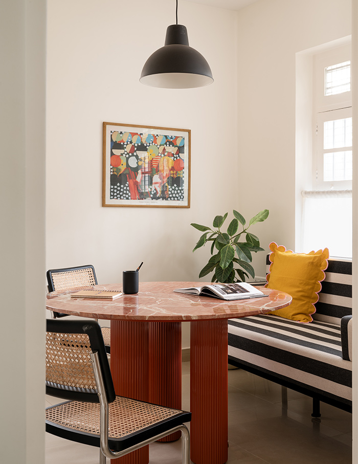
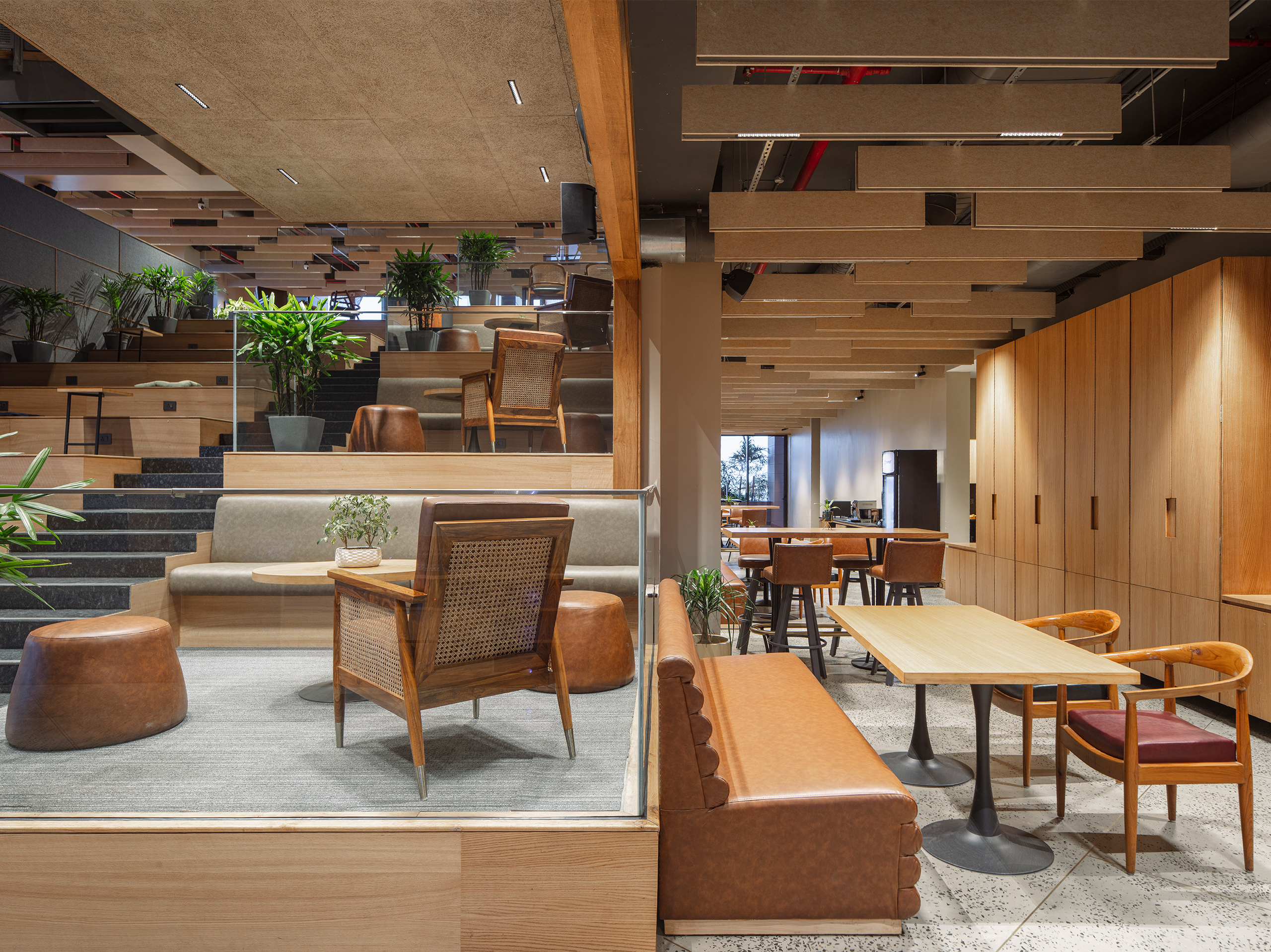
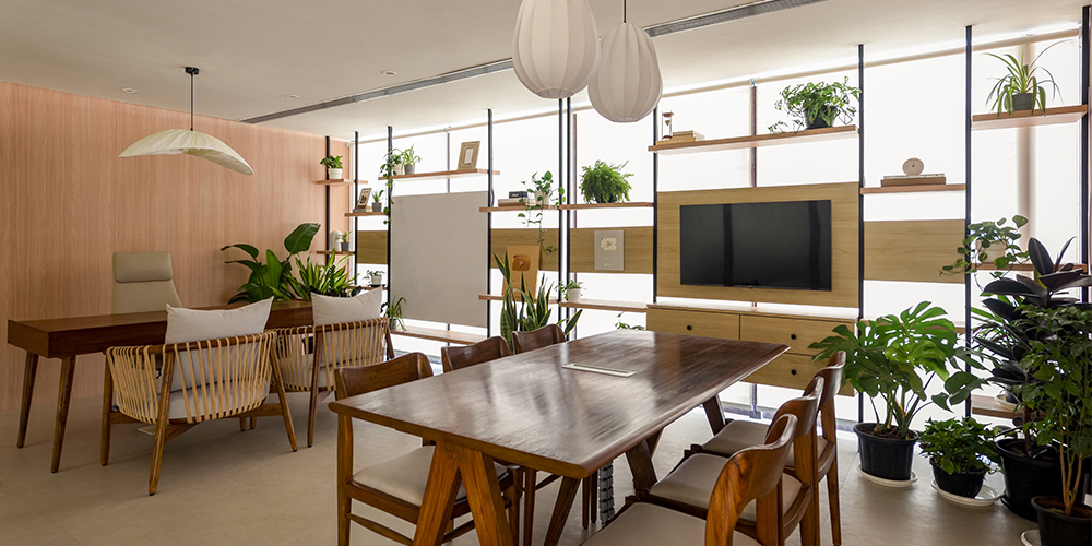
As the maxim goes, you are the sum of the five people you spend most time with. But what about the spaces that we spend most time at? Author Jessica Pryce-Jones, in her book, Happiness at Work, estimated that the average person spends 90,000 hours working. That is one-third of an average person’s life spent in offices. Our focus is on office interior ideas that spark productivity with creative fun, no less!
Gone are the days of soporific cubicles and plain white offices. ELLE DECOR India brings to you a series of 10 office interior ideas where the space with its colours, textures and layouts, inspires productivity and collaboration at its best.
A content One-derland by Eight Degree Design House
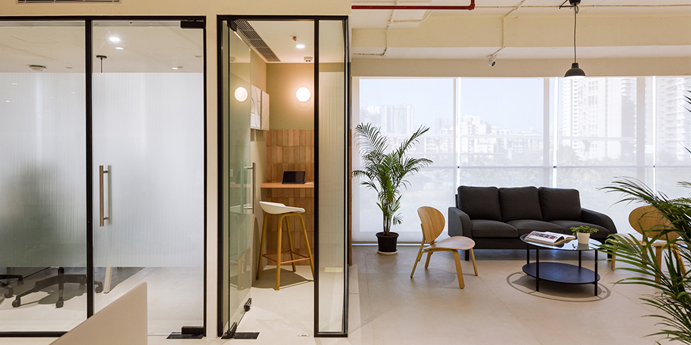
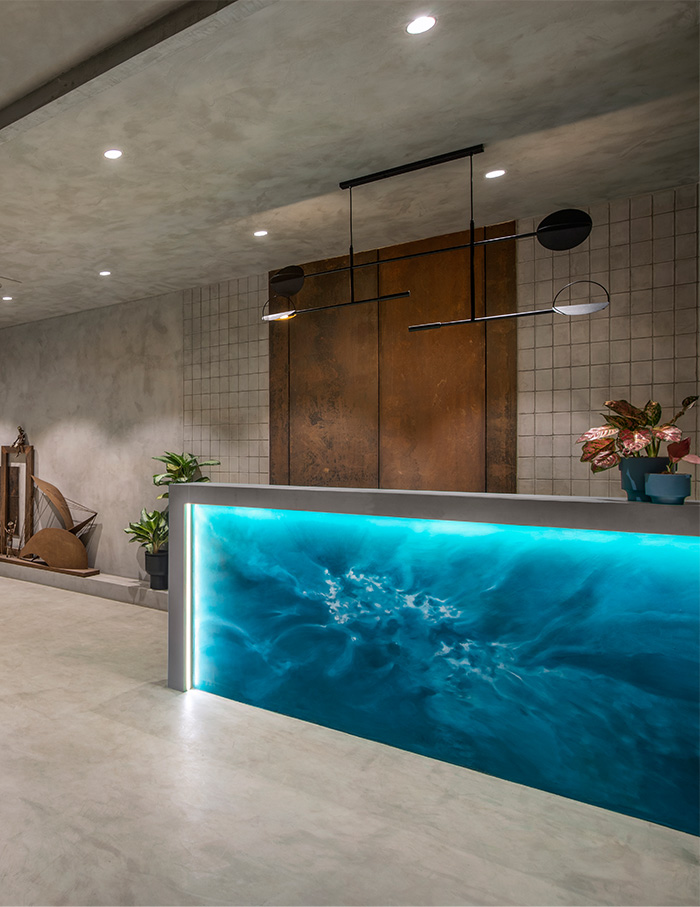
The One Percent Club office is a modern take on start-up offices. Designed by Chrisann Rodrigues, Founder and Architect at Eight Degree Design House, the office belongs to Sharan Hegde— India’s leading finance content creator. The owner’s vision of a luxurious, premium and modern workspace clearly comes through in the architect’s work. From its neutral colour scheme to soft lighting to the abundance of plants, every corner of the workspace brings about a sense of calm.
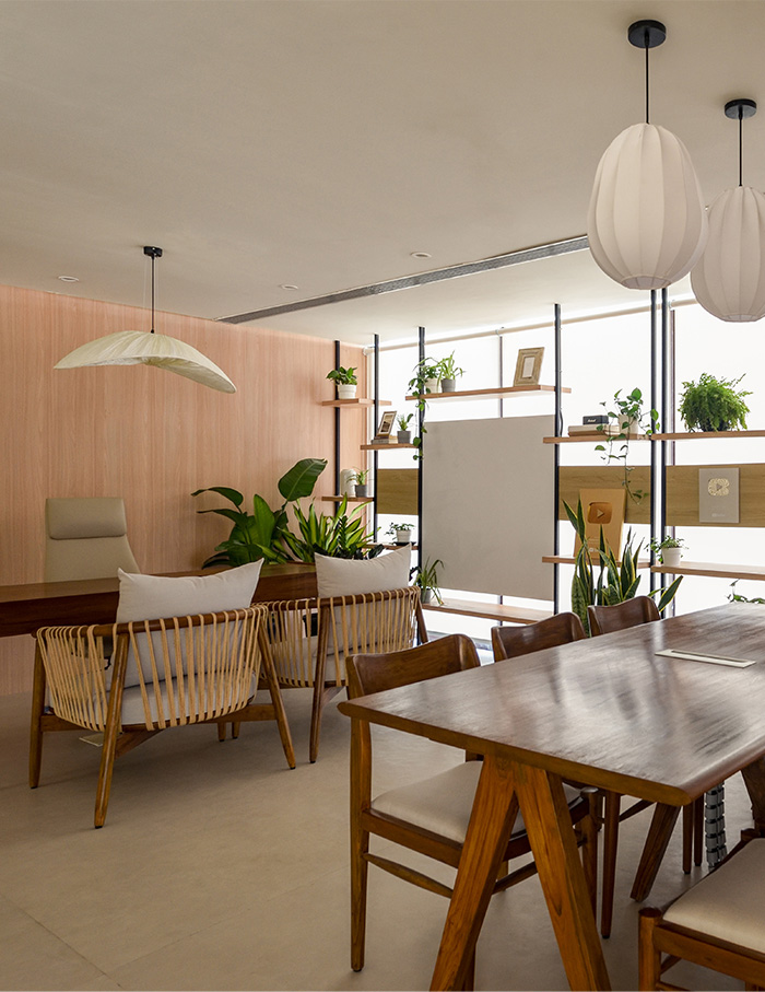
With a capacity for 65 people, the office comprises cabins, conference rooms and meeting spaces along the periphery, while the central area fosters informal discussions and collective seating. All of these spaces are delineated by black metal frames and glass partitions, adding to the open and collaborative concept of the workspace. The main cabin boasts of a custom-designed mid-century modern desk; and a discussion table at the centre of the room. The open pantry, adorned with plants, provides for an amazing spot for rejuvenation. The workspace is very thoughtfully designed, encouraging creativity and focus.

‘Fueling’ creativity by Alter Architects
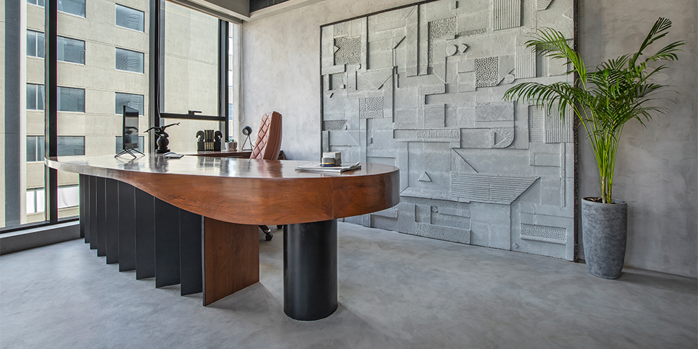
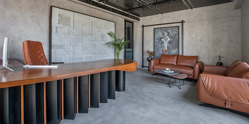
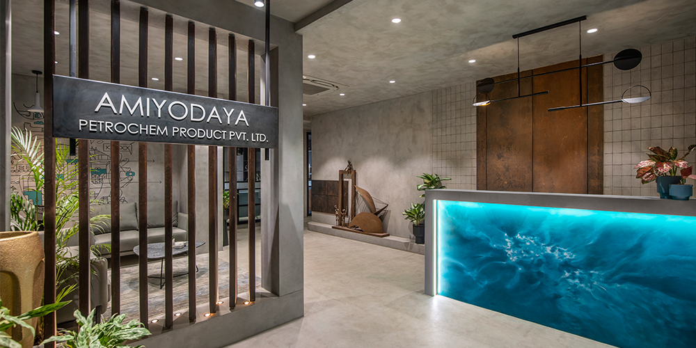
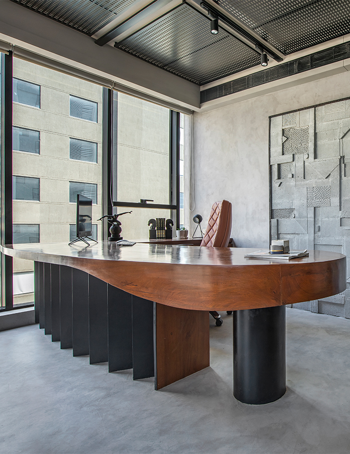
Located in Gujarat, the Amiyodaya office is spread across 2000 square feet in black and grey with pops of colour. With this office, Alter Architects reimagine a petrochemical workspace, to be playful yet functional, ‘fueled’ by art and colour. The industrial look brought in by the grey walls and black metal doors and frames is softened by tan couches, orange walls and art displays. The raw and rustic look represents the nature of the petrochemical industry, whereas the softer elements, such as the doodle-like mural in the waiting room, represent the company’s values and beliefs. The horse painting in the main cabin is symbolic of triumph, strength and success, motivating the people working in this space to be hardworking and productive.
Creating a textile tapestry by raiji.in
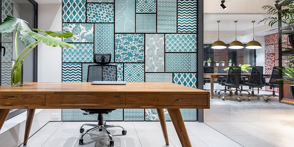
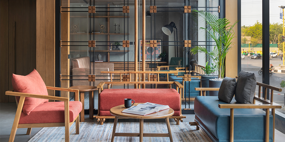
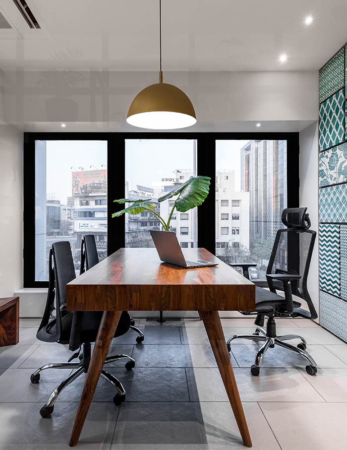
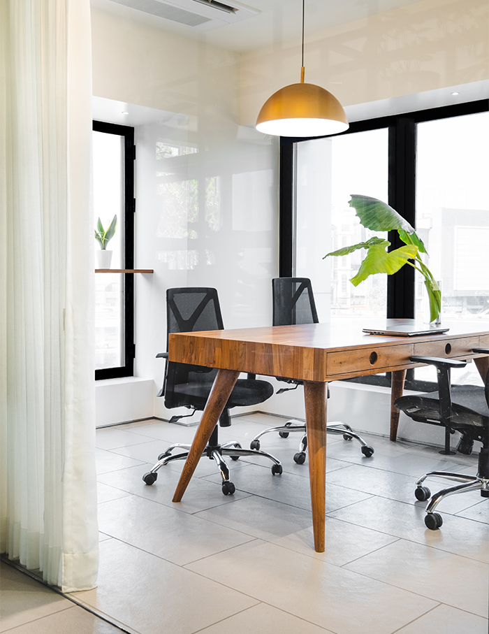
Located in Surat, the Doriwala Polytex office transcends beyond utility and functionality to exude life in the space. Raiji.in, the designers, use wooden tables and metal bars to decorate most of the space. The pops of colour with the blue and red bring fun to the workplace, even the plants breathe life into the space. The office is a columnless one, meaning there aren’t any doors to separate spaces. This creates a sense of connectivity and togetherness. The design uses three main elements to create partitions- the Fabric Walls, the Plant Screens and the Sheer Veils. The Fabric Wall is made of hand block printed linen cloth in beautiful patterns which create the perfect backdrop for the space. The Sheer Veils provide a sense of privacy in the cabin while still being accessible to those outside.
Fluid Rhapsody by Studio Dashline
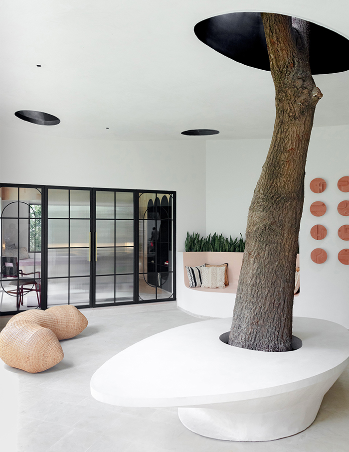
Fluid Rhapsody, as the name suggests, is a project that flows like a song with its beautiful curves and soft colours. Designed by Studio Dashline, it is a study in a residential extension, separated into two areas- a functional study and an outside hangout and meeting spot. The space finds its rhythm in its curves, from the curved walls of the study to the curves of the arches, to even the curve of the table and the seating lounge, making the space look like it’s almost flowing. The warm tan colours on the inside are contrasted by an almost entirely white outside.
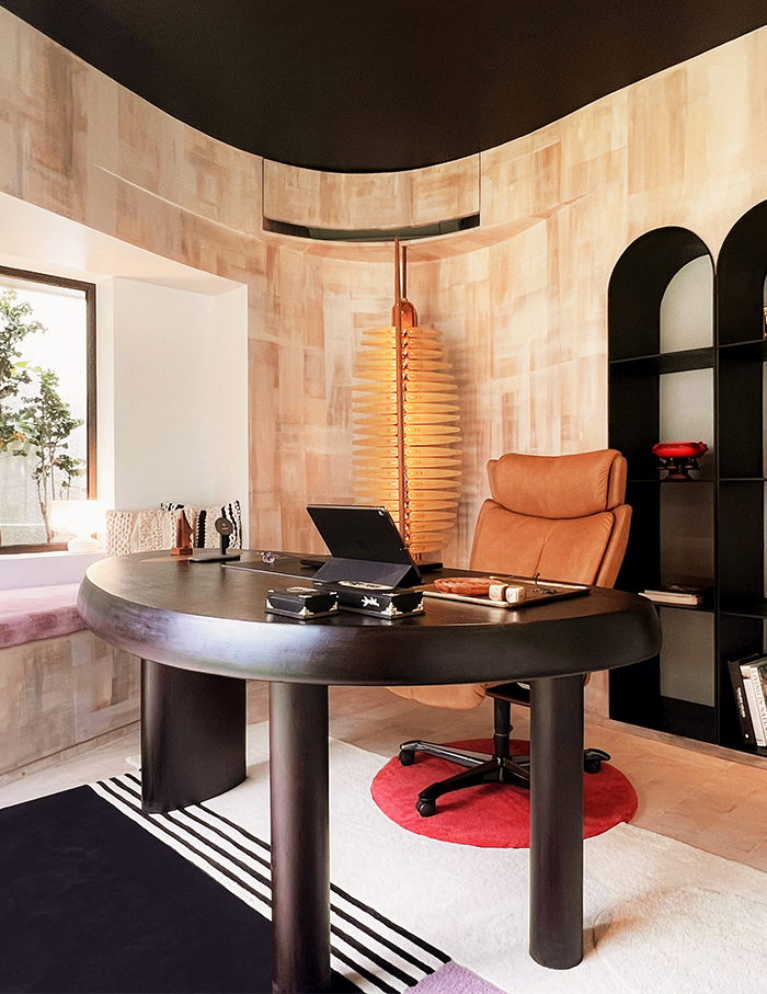
The client’s personality is showcased by a carefully chosen assortment of distinctive items that are brought in from all over the world. The maintained tree and the conical skylights provide a grounded ambiance that draws the user into a vibrant ecosystem where harshness and softness coexist together. Overall, Fluid Rhapsody is song and dance, a harmony of aesthetic and function.
Living in the Ikigai by Ikigai Studio
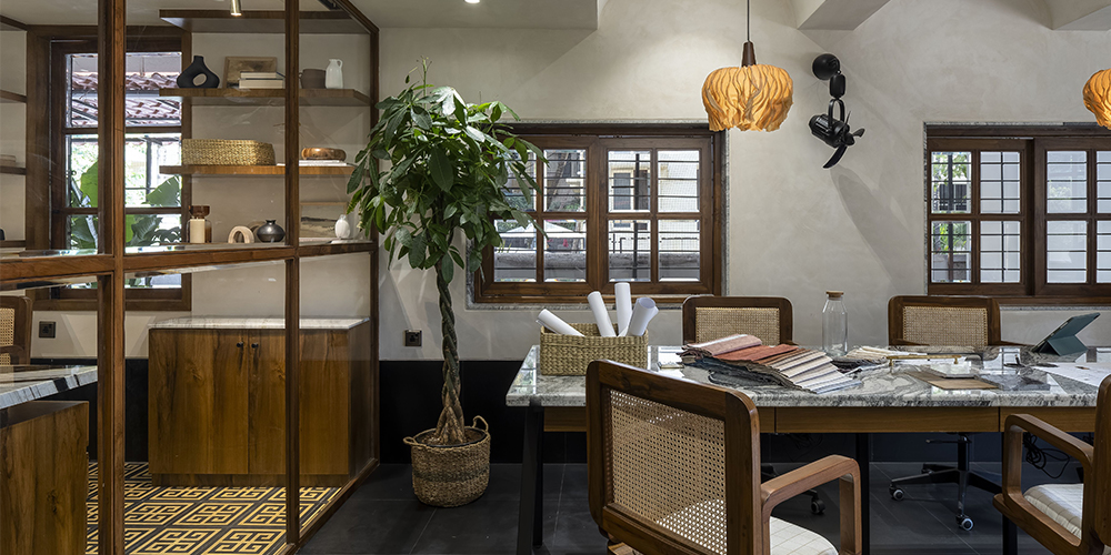
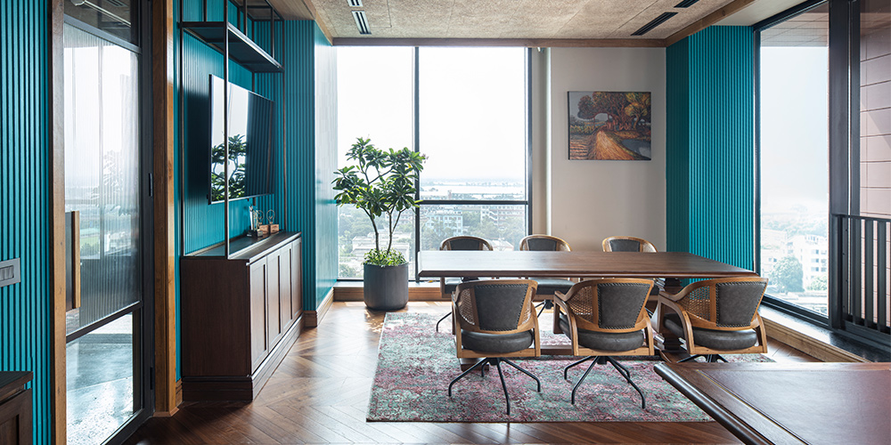
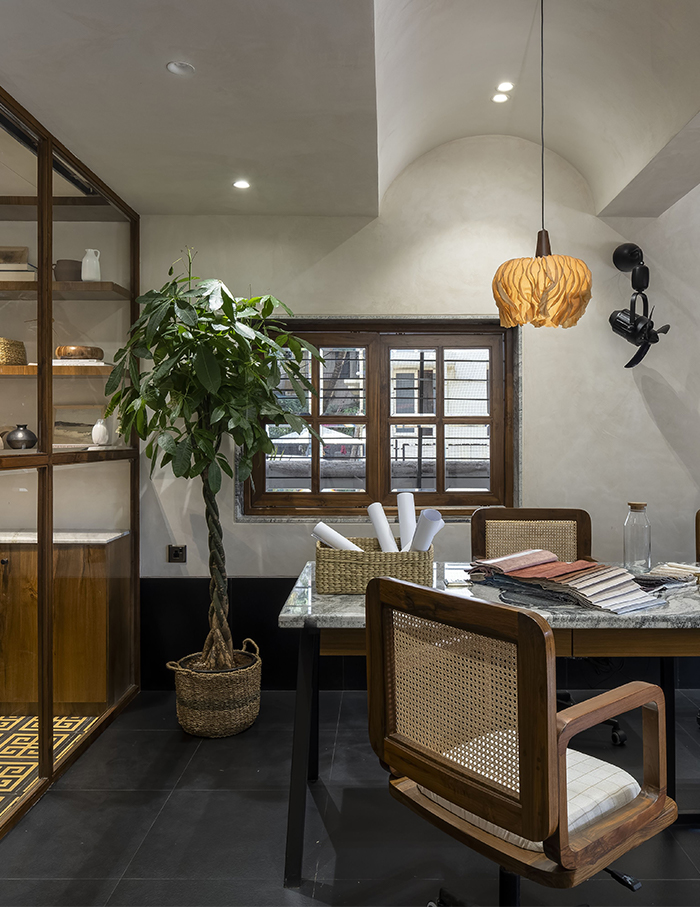
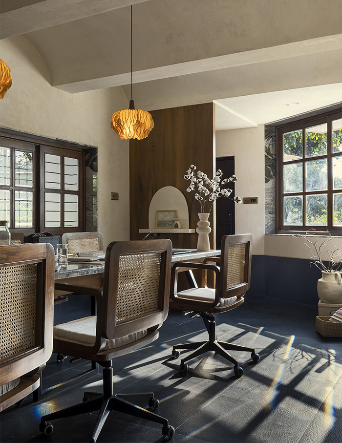
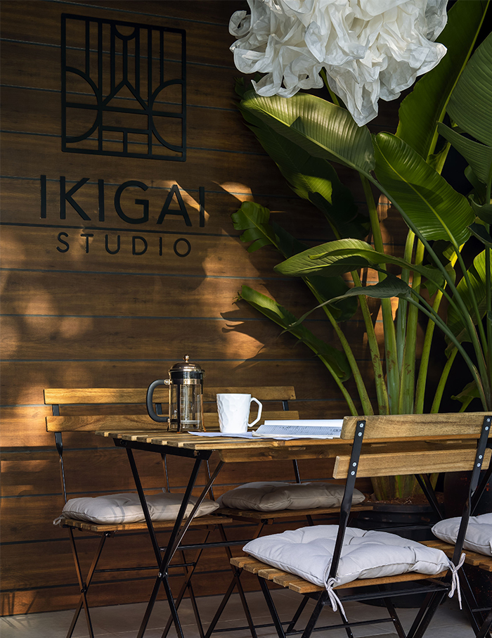
Ikigai is a Japanese word which translates to “a reason to live”. It is a philosophy that encourages one to find their Ikigai, their reason to live and that’s exactly what Ikigai Studio, founded by principal architect Anuja Marudgan, wants to communicate through their workspace. Located in Pune, this office’s open plan, calming colour palette and the plants, all bring a sense of serenity that lets the staff think and work clearly. The main working space consists of a beautiful 18 ft long table topped with Indian granite and chairs that are made on-site. The Pachira plants and flower vases add a splash of greenery which goes perfectly with the wooden furniture, giving the space an earthy feel. The cabin is separated from the rest of the workspace by floor to ceiling glass, creating transparency. A stunning Indian marble table along with elegant leather chairs are installed inside the cabin. The various elements such as vases, artistry and pots bring playfulness into the workspace. The Ikigai office, thus, is a warm and inviting workspace that marries utility and aesthetics.
Minimal medicine by Yellow Door Architects
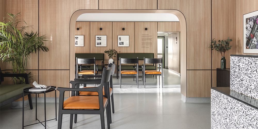
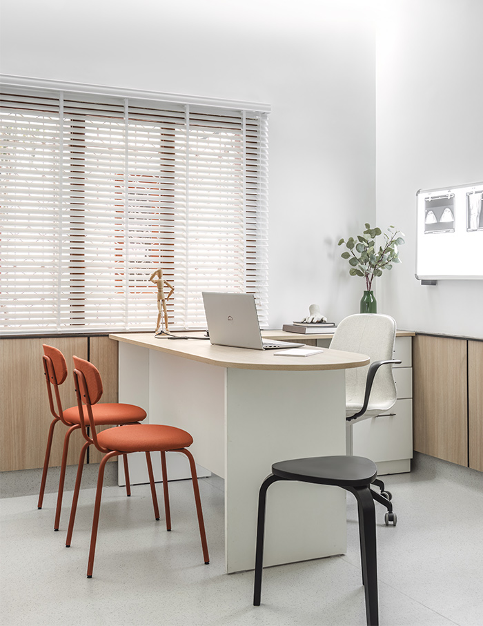
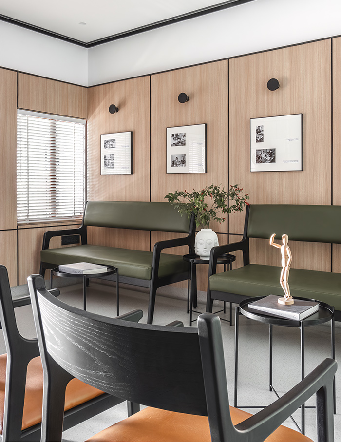
A medical clinic must be designed with sensitivity always on the mind. Yellow Door Architects do just that by designing a clinic that exudes calm and tranquillity, for Dr. Kalyan Banerjee. “With minimalism at the forefront of our design philosophy, we aimed to minimise visual sensory overload, allowing patients to focus on their healing journey from the moment they walk in,” says Yellow Door. Spread across 1400 sq ft, this homoeopathy clinic is plain yet effective. Minimalistic elements and a neutral colour palette bring out the beauty of simplicity.
Primarc by groupDCA
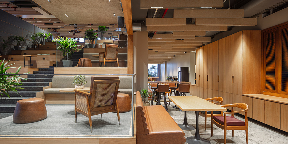
Architect Amit Aurora brings a one-of-a-kind workspace with the Primac office in Kolkata. The design is a refreshing change from closed up cubicles. Instead it’s an open plan, allowing employees to move and work freely. The place is adorned with wooden elements which are perfectly complemented by the fresh green of the plants. The design reflects the firm’s core values, minimises reliance on artificial light, and fosters a vibrant atmosphere. With this workspace, Amit Aurora completely redefines the meaning of collaborative, designing a space that makes collaboration imperative, which encourages its employees to work productively.
Radiology reimagined by CraftsPOD Design Studio
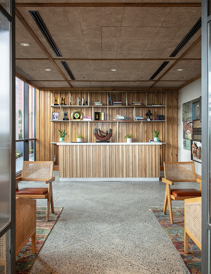
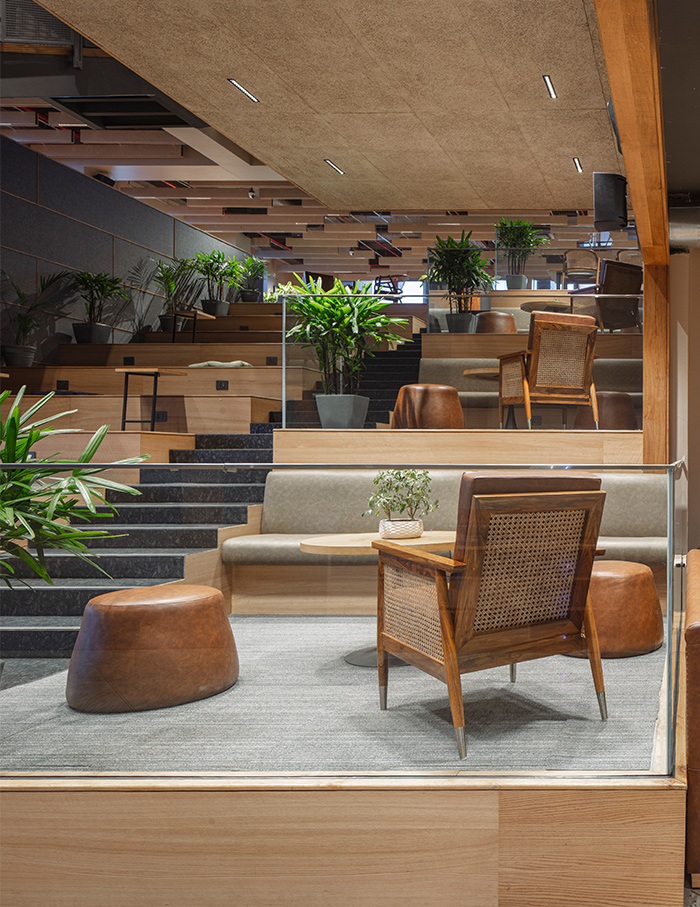
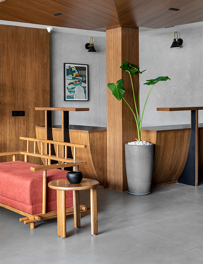
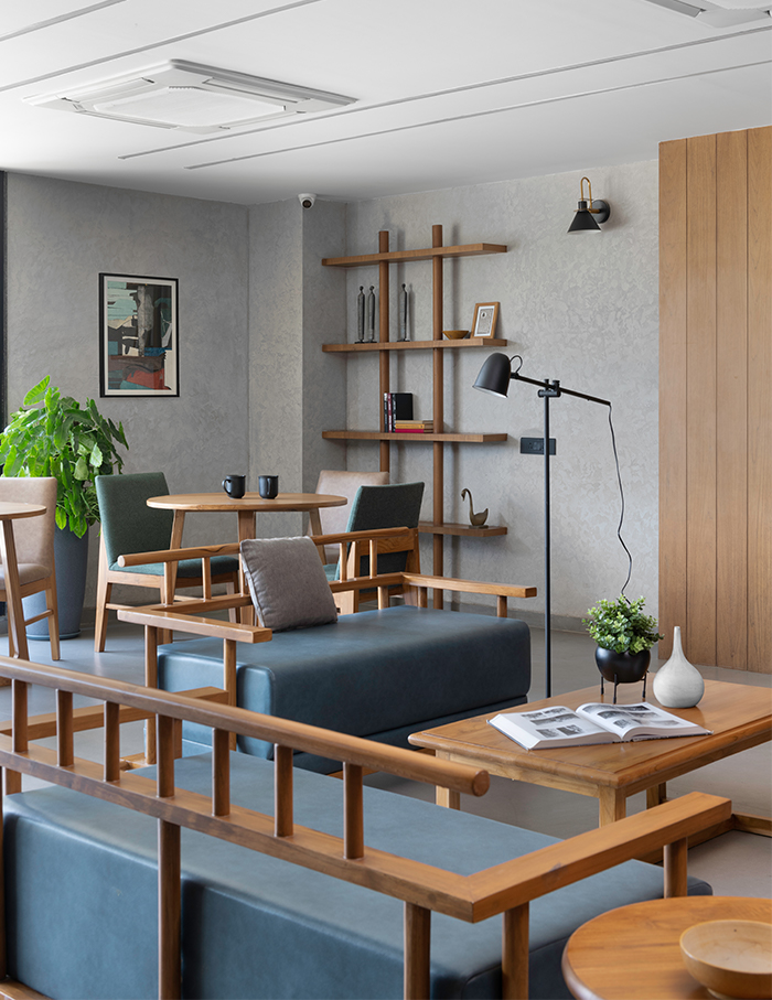
The Gujarat Imaging Centre is an imaging centre for radiology and diagnostic care spread across 10,000 sq ft in Ahmedabad. The centre comprises four stories, each with its own reception, waiting area, counselling and doctor’s room. Working on a medical centre comes with a lot of constraints and design and aesthetics isn’t the priority in the brief. Despite those challenges, CraftsPOD Design Studio has created a functional space that is also easy on the eyes. A certain sense of mass, strength and durability is created by the heavy use of natural teakwood, which is complemented and contrasted by the metal frames. Despite strict constraints that require the flow of activities and movement to go a certain way, the design feels open and vibrant creating a sense of repose for the patients.
The Cloud Odeum by August Eight Designs
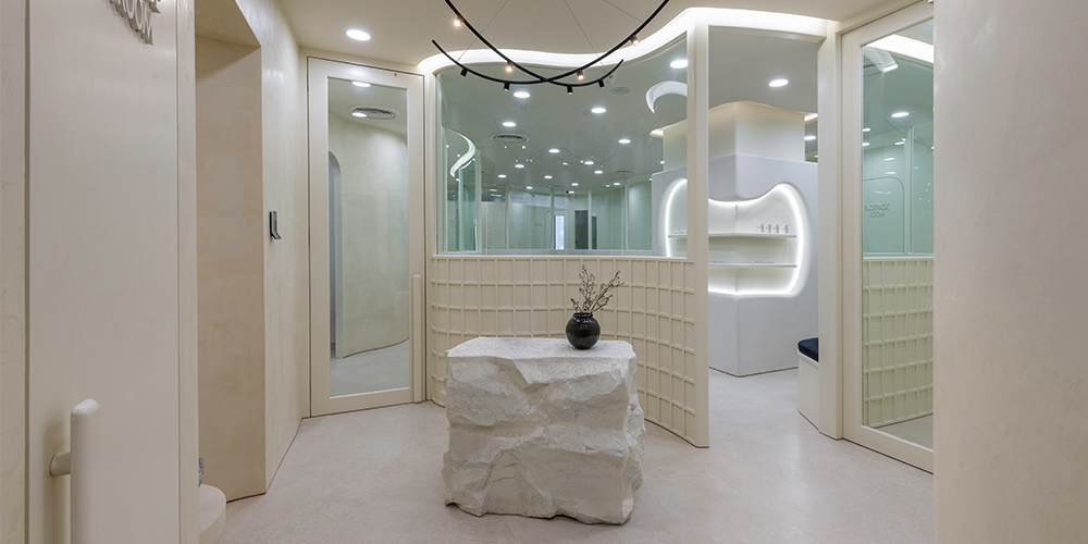
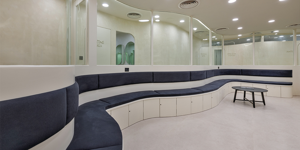
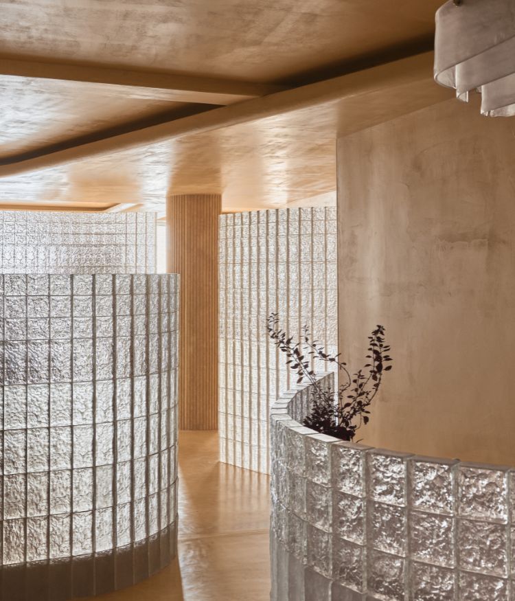
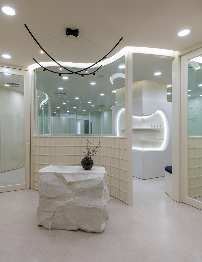
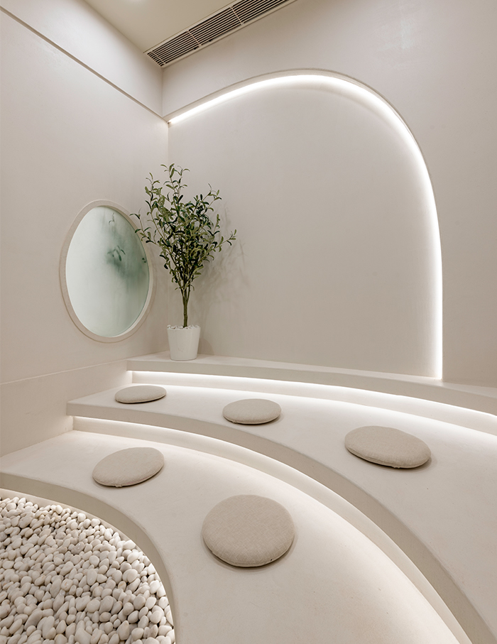
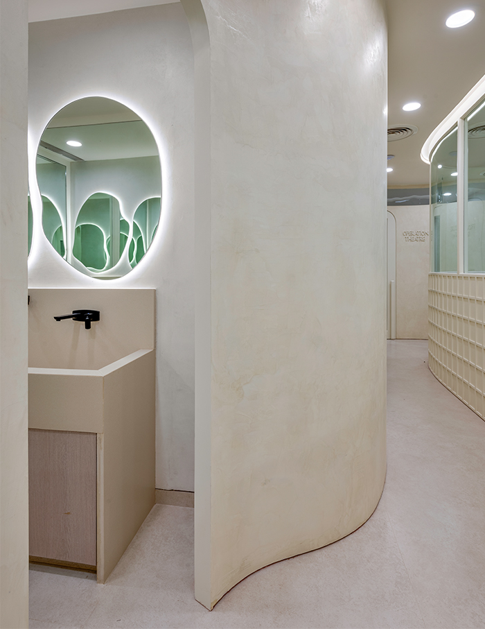
One look at the Ozo Skin Clinic and an instant sense of calm washes over the viewer. Inspired by the softness of clouds, August Eight Designs named this project the Cloud Odeum. Using curves as a cohesive architectural language, August Eight has designed a space that is dreamy and light, where clients would feel as if they were floating. Eggshell hues and limewash paint exude warmth which is balanced by the concrete finishes. The flow of rooms, from the reception to a series of care rooms, is such that the light keeps getting dimmer as one moves further along, creating a sense of depth. Despite the minimalist nature of the design, the little details show a clear vision and design intention.
Weespaces by Weespaces
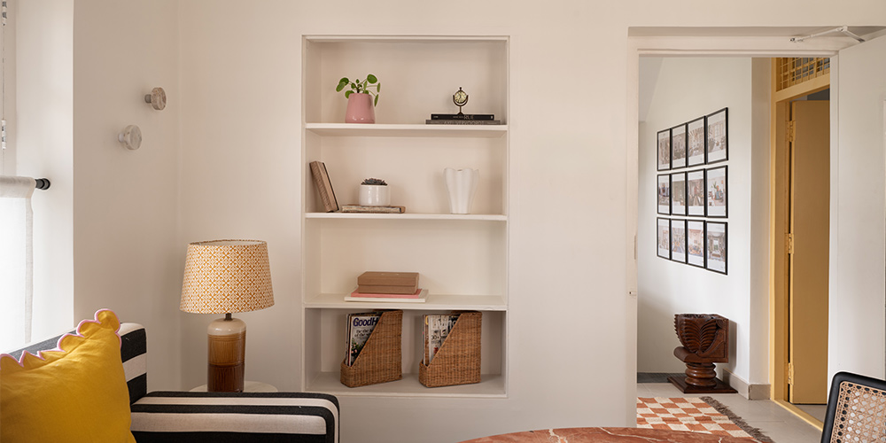
Being your own client has its benefits—with no constraints or interruptions to one’s own vision, an architect is finally free to create what they want to create. And that is exactly what Weespaces has done with their 1000 sq ft office in Bengaluru. A neutral colour palette, which is soothing to look at and brings warmth, is sprinkled with pops of colours to add fun elements to the office. A soft, clean and fun office that reflects their own signature style—a perfect mix of old and new, simple and elevated, classic and interesting.
