Design
An ashram in the maximum city? Colab Company creates an all-white holiday home in Mumbai
OCT 30, 2024 | By Namrata Dewanjee
Back in the 70s when the countercultural hippies secured wellness on the global palette, minimalism was still a rebellious new movement. Half a century later, design has successfully absorbed the two. It has waged a journey across continental lines and the fabric of time, to land in this holiday home in Mumbai by Colab Company.
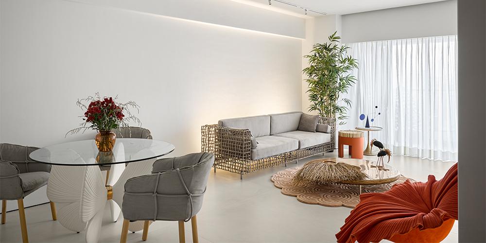
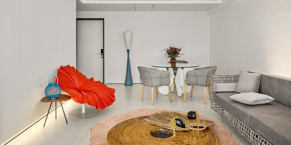
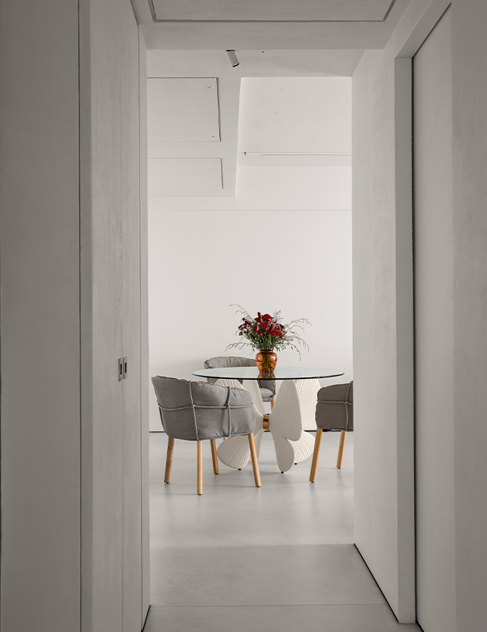
Taking inspiration from the tranquillity of traditional ashrams, the homeowners, Gita and Mohan Bharwaney wanted this 1,200 sq ft residence to be serene and pared back. The space melts into the backdrop with its subdued colours and an air of clarity, both visually and experientally. However, despite its all-white appearance akin to a Malevich painting, the designers resisted the urge to christen the space at face value. “The project was named Casa Fleur to reflect the delicate balance between simplicity and beauty, much like a flower (“fleur” in French),” adds Saloni Ganatra, Founder and Partner of Colab Company along with Hiren Ganatra. However, the Kenneth Cobonpue’s Bloom armchair in the living room is a giveaway.
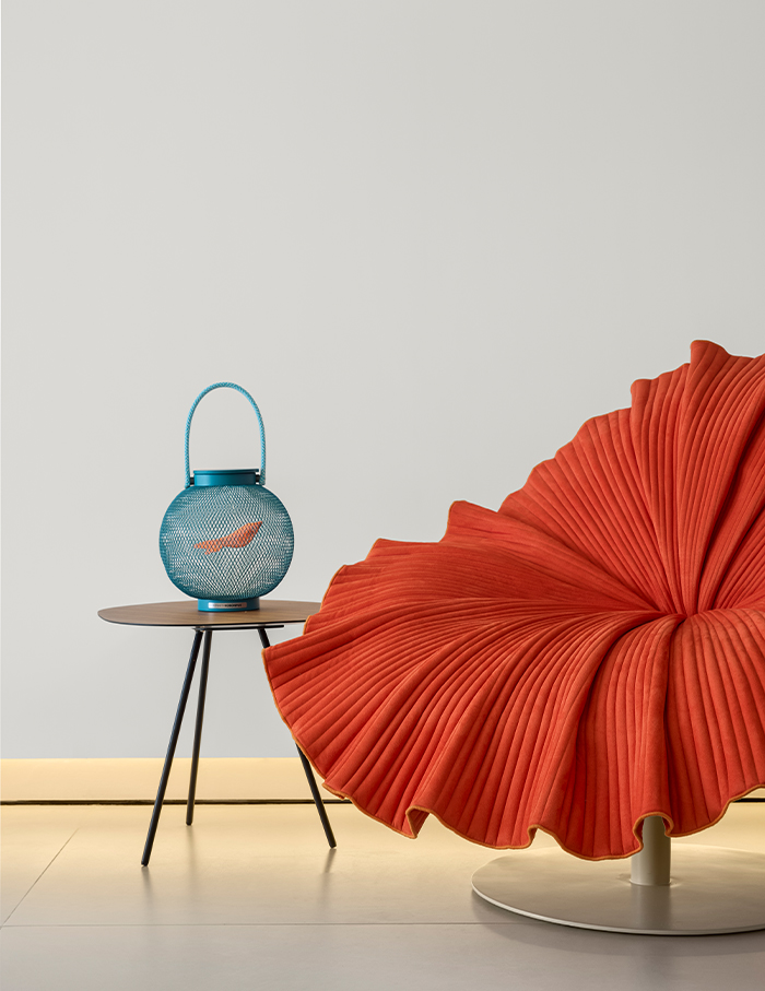
Deconstructing the garden
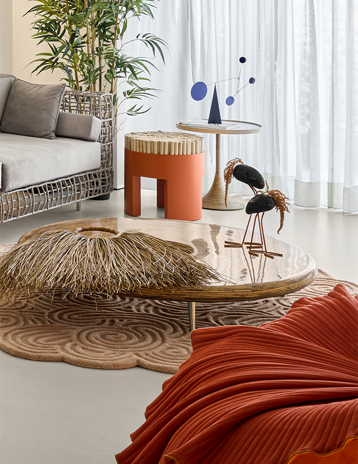
The Malevich reference extends outside the colour of the walls (or lack thereof) as the home itself can be read as a Modern Art installation. First stop, the deconstructed garden. Also known as the living room. Here, the botanical references are aplenty but tastefully placed from a sculptural butterfly holding up a glass tabletop to a settee with a rustic touch. Need a break from the galleryesque setting? Just look outside. The view of Mumbai’s urbanscape is sure to orient you to reality.
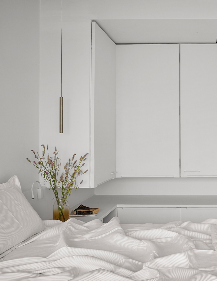
Follow the corridor and to your left, you’ll find the son’s room where the designers play with illusions. A floating wardrobe doubles as a utility table, a bookshelf cleverly conceals a bathroom door, directly opposite, the kitchen is easily concealed by a sliding wooden French door. Next up, two versatile rooms that can shapeshift.
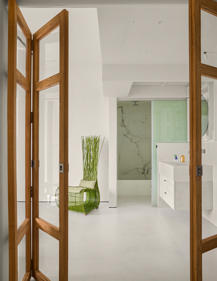
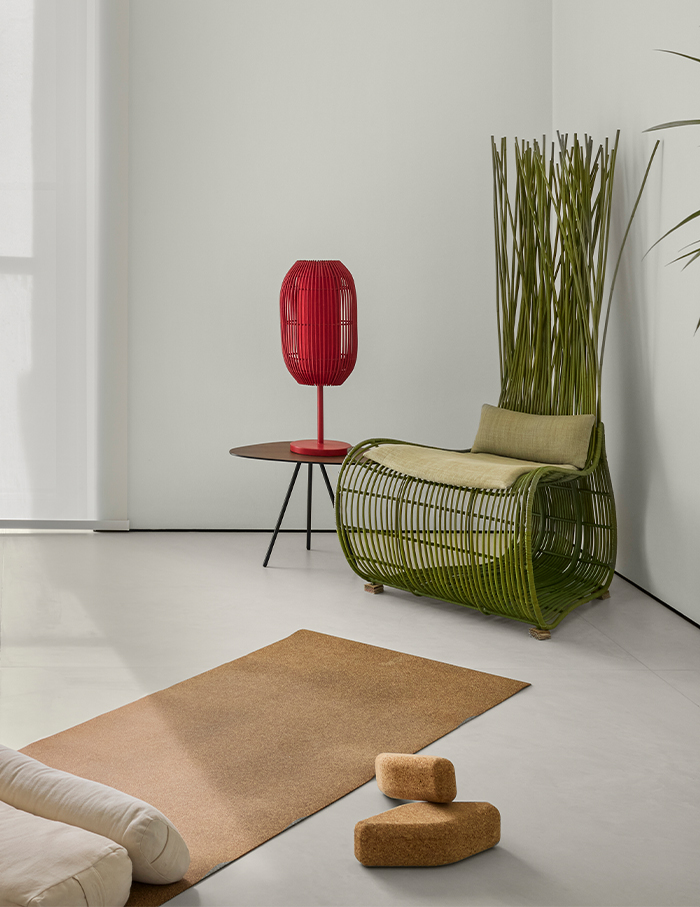
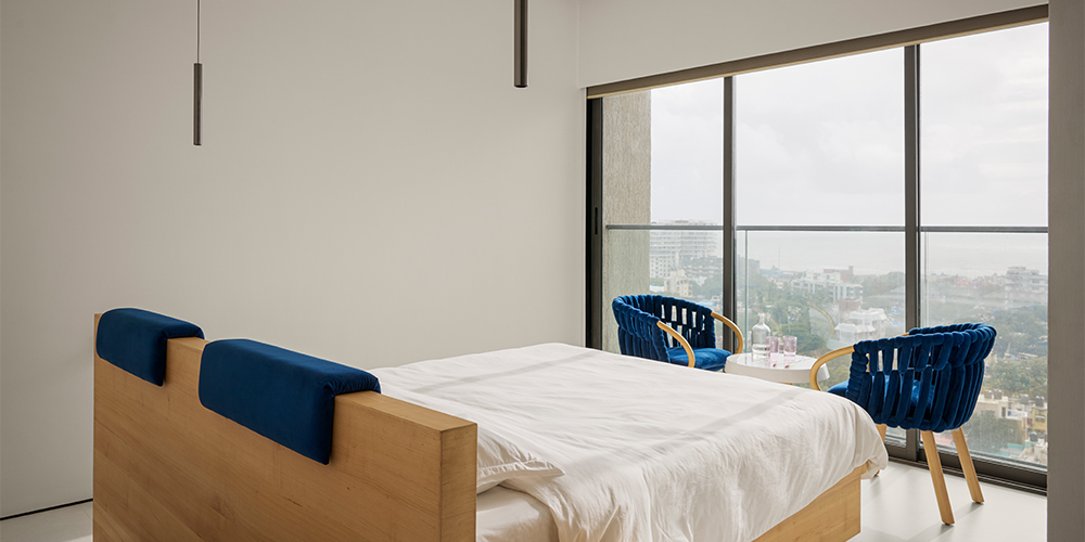
“These rooms have been designed to adapt as either a luxurious two-bedroom suite or separate master bedrooms. A sliding door in the centre of the passage allows the homeowners to transform the space as needed,” explains Saloni. Out of the windows of the left bedroom, you’ll find the Arabian Sea perfectly framed into a motion picture within this curated art world. In the mood for more kinetic art? On the right is the yoga room, which plays a double act as a living space, with a French door and sofa beds. Both the yoga room and the bedrooms have a curious quirk — an open-concept washroom, a feature that heightens the fluidity of space.
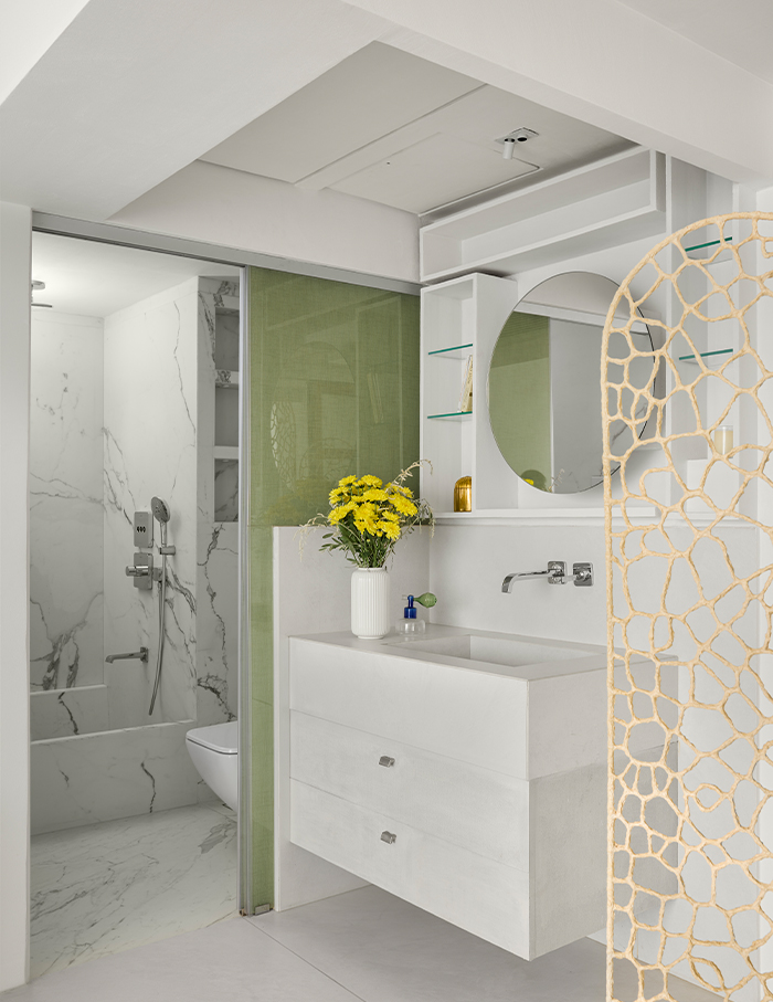
A design composition
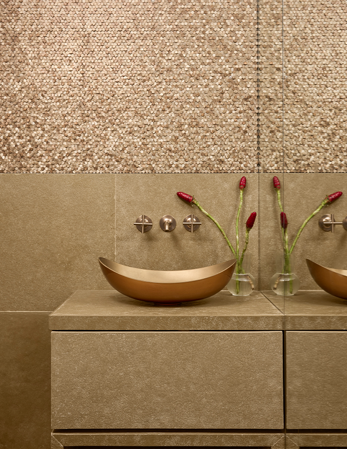
With natural textures and earthy tones, this apartment binds itself to the outdoors. But it is the interior story punctuated by statement collectibles that arrest you. “Kenneth’s furniture already brings a lot of character to the space, so we chose art that complements this aesthetic. With a neutral palette as the base, it was a great opportunity to introduce bold colours through artwork and accessories,” avers Saloni. Keeping in mind the homeowner’s preference for movable furniture, the nature of the home is versatile and temporal, allowing for individual expression and character.
There we have it, the house has now become a gallery for living in and the armchair too has gone well beyond the purview of a machine for sitting on. This house recedes to the backdrop, a canvas or perhaps even negative space for the composition of everyday life to take centre stage.
Read more: Multifunctional and minimal: TCG Studio designs a contemporary yet eclectic residence in Mumbai


