Design
Arsya Designs’ new Pune office makes the case for maximum impact with a minimalist office
APR 12, 2024 | By Bindu Gopal Rao
When designing their own office, Arsya Designs sought a departure from the conventional office setting to embrace their appreciation for nature’s beauty and tranquillity. Mugdha Pathak, the Principal architect, uses minimalist elements to create an office that keeps the mind clean and clutter free, which creates maximum impact. The office is spread across 3300 sq ft in Baner, Pune.
Making room
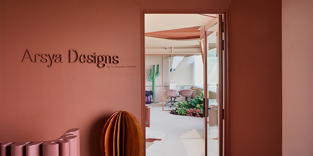
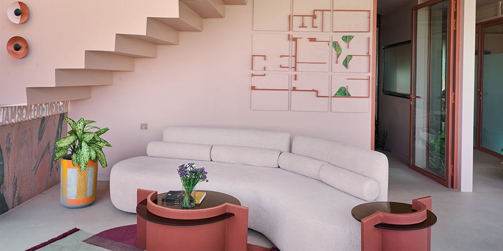
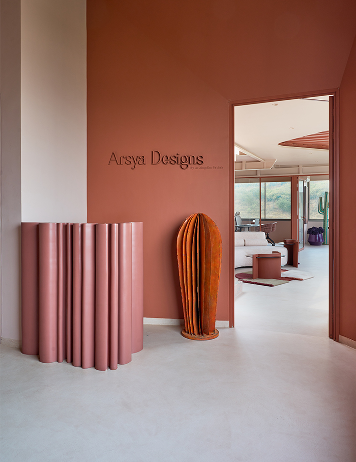
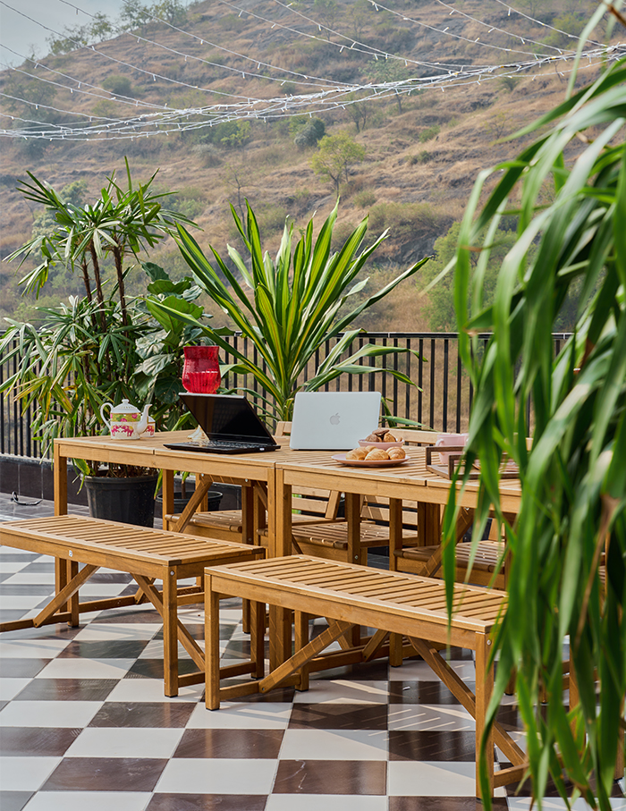
From its origins as an open terrace, the team innovatively converted 1850 sq ft of floor space by installing a deck slab, seamlessly integrating the terrace above into their office environment via a sleek staircase. “As you step into our office, you are greeted by a reception area adorned with inviting decor and comfortable seating, centred around a paper folded reception table. Just beyond the entrance lies a versatile waiting area, designed to facilitate both informal discussions and moments of relaxation. Adjacent to this space, a staircase leads up to the terrace, offering a tranquil retreat,” says Pathak.
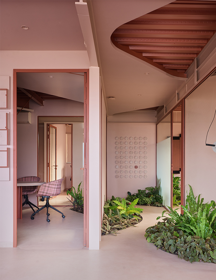
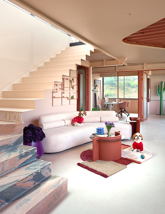
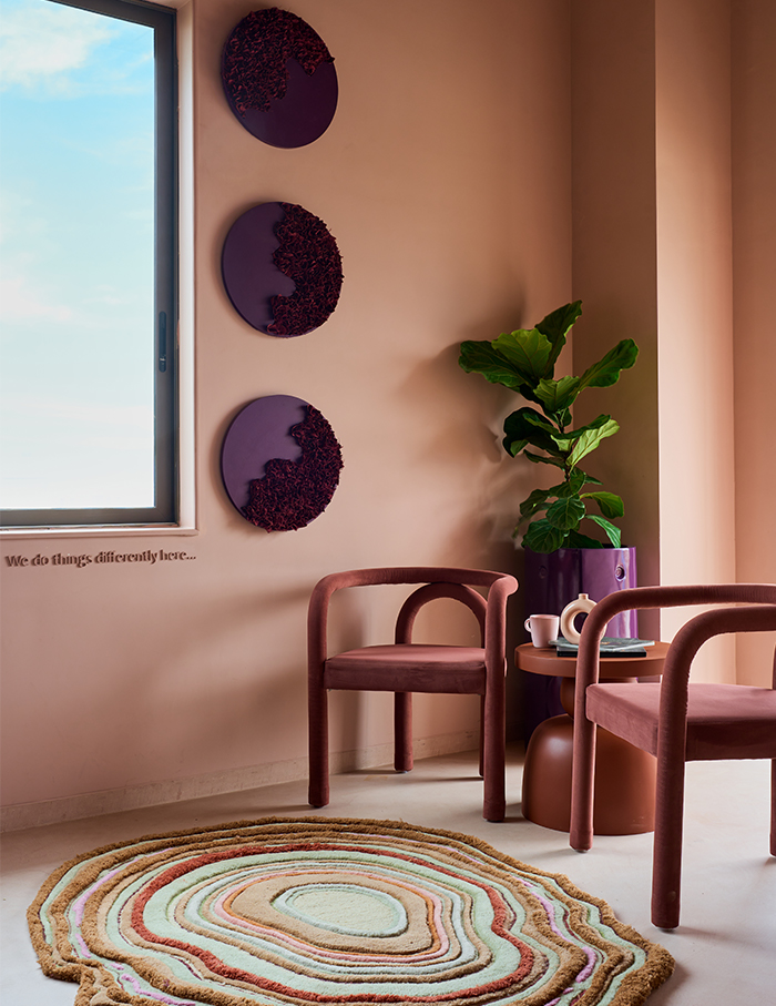
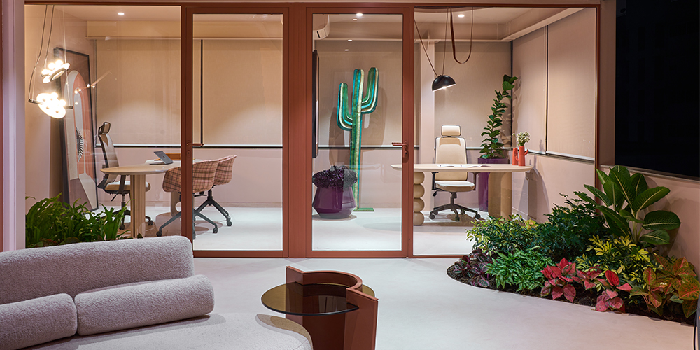
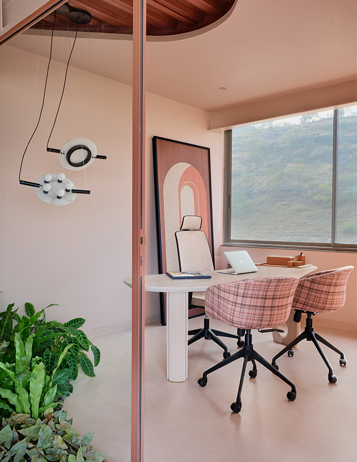
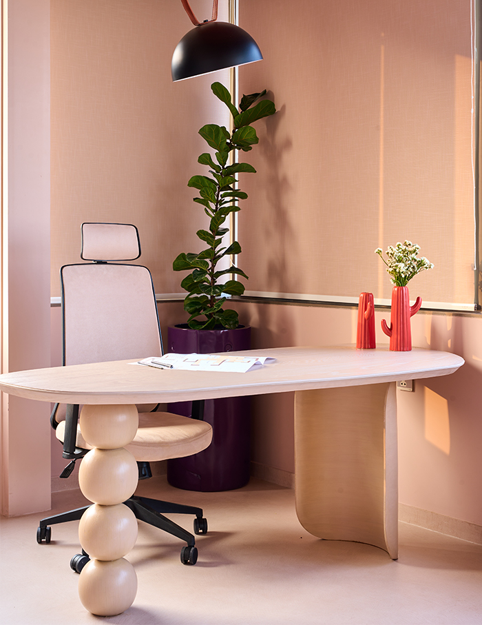
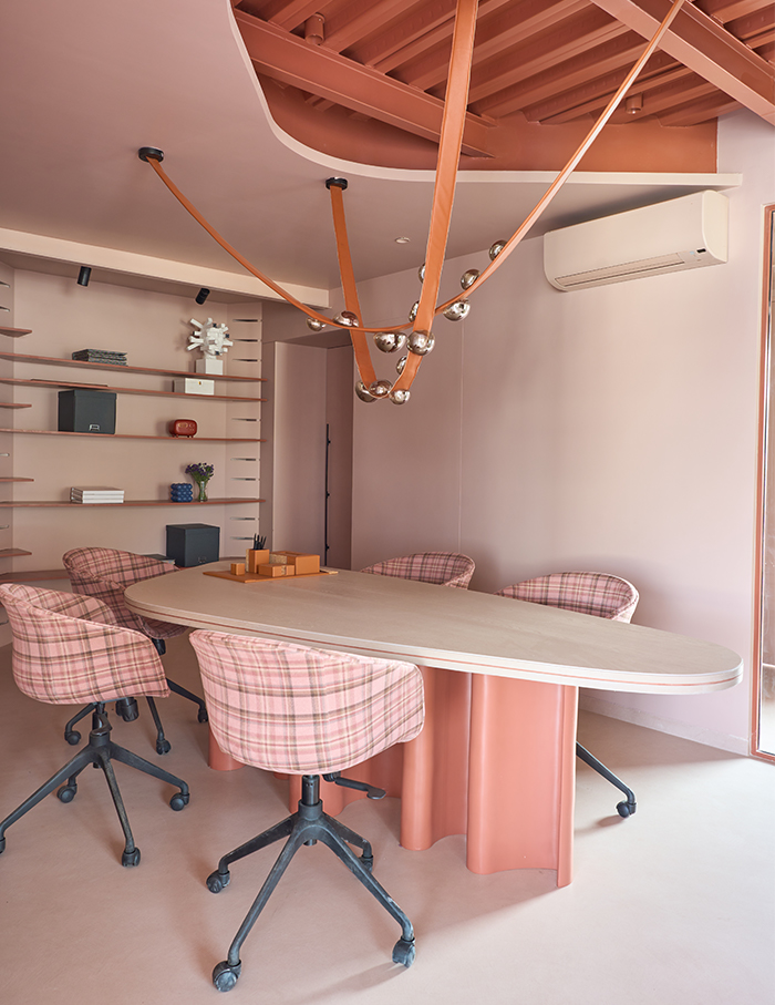
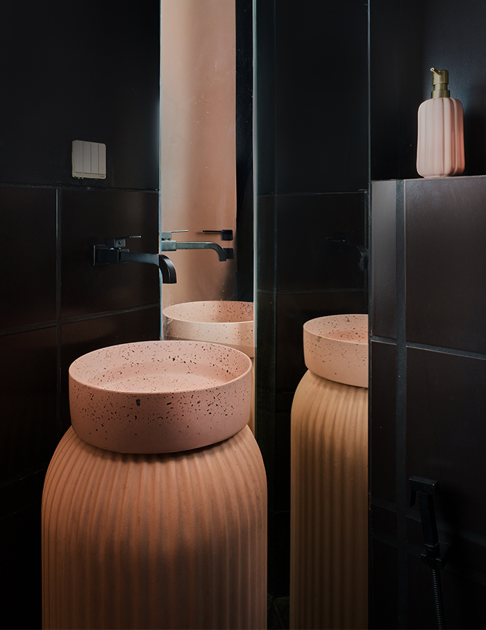
Moving forward, our conference room awaits, complete with a convenient material lab to streamline client meetings. Flanking the conference room are three private cabins, providing dedicated spaces for focused work. Tucked away at the rear is the studio, offering seclusion for creative endeavours. The layout also features a well-appointed pantry and washrooms, conveniently located alongside a passage adorned with a mirror.
Design details
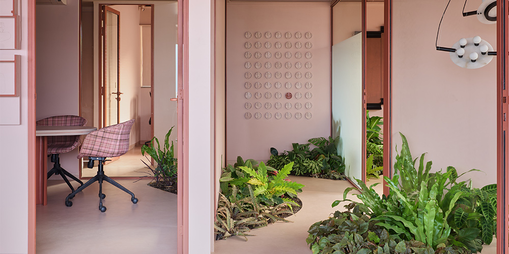
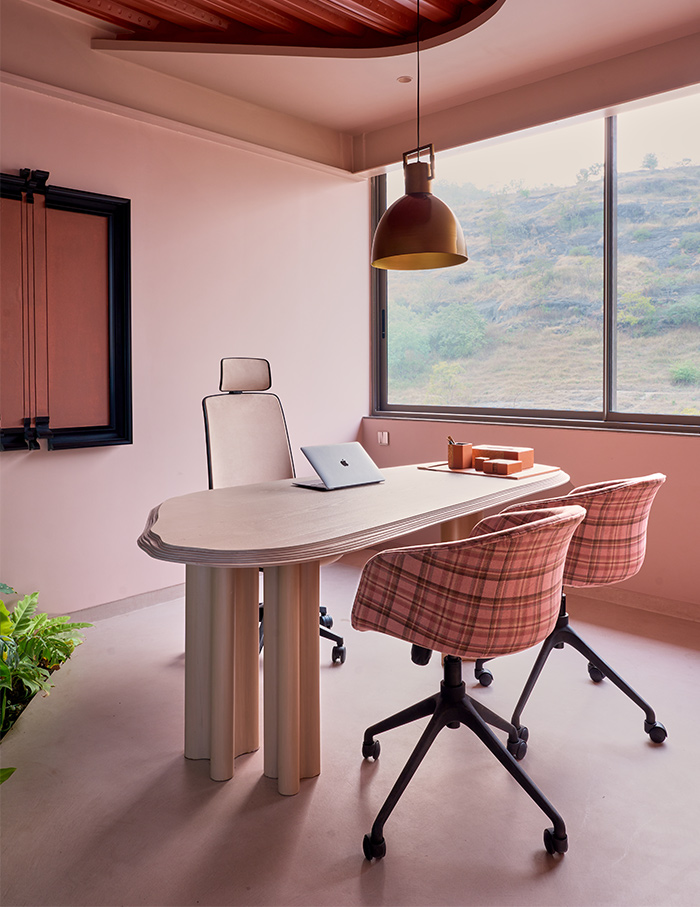
As an all-women firm, the team’s design ethos revolves around empowering women through thoughtful elements such as the elegant floating staircase and a pink monochrome colour palette, striking a harmonious balance of femininity and sophistication. “The indoor pathway adorned with plant beds not only infuses natural beauty into our workspace but also enhances functionality, seamlessly integrating with our studio space. This meticulously crafted design not only embodies our architectural vision but also creates an inspiring environment that reflects our commitment to innovation and creativity,” says Pathak.
Monochrome magic
With the overarching theme of minimalist elegance, the office has a sleek monochromatic palette. “We opted for micro concreting for our flooring not only to provide a seamless aesthetic but also ensure durability and ease of maintenance. The carefully customised colours for our glass partitions and planter beds in the passages infuse vibrancy and personality into our space, while the playful repetition of patterns in the ceiling adds an element of whimsy and visual interest,” says Pathak. The custom-designed frames and mirrors elevate the ambiance with a unique and tailored feel that resonates throughout this architecturally curated office environment.
Owning the space
Designing their own office space proved to be a challenging yet immensely rewarding endeavour for the team. “Every aspect of the process was infused with passion and creativity, making it one of the most enjoyable projects we’ve undertaken as a team. Achieving harmony in pink monochrome and colour coordination proved to be the most challenging aspect, requiring meticulous attention to detail from selecting table top veneers to coordinating wall shades, curtains, and flooring,” avers Pathak. From conceptualisation to execution, each designer in the team has brought their unique perspective and expertise, contributing valuable insights to every corner of this workspace. This office is a great example of how shades of peach and pink can be effectively used in a work space and yet keep the professional ethos intact.

