Design
A sanctuary of serenity: Natasha Shah’s studio Between Walls infuses a breezy minimalism into this Pune office
NOV 16, 2023 | By Virender Singh
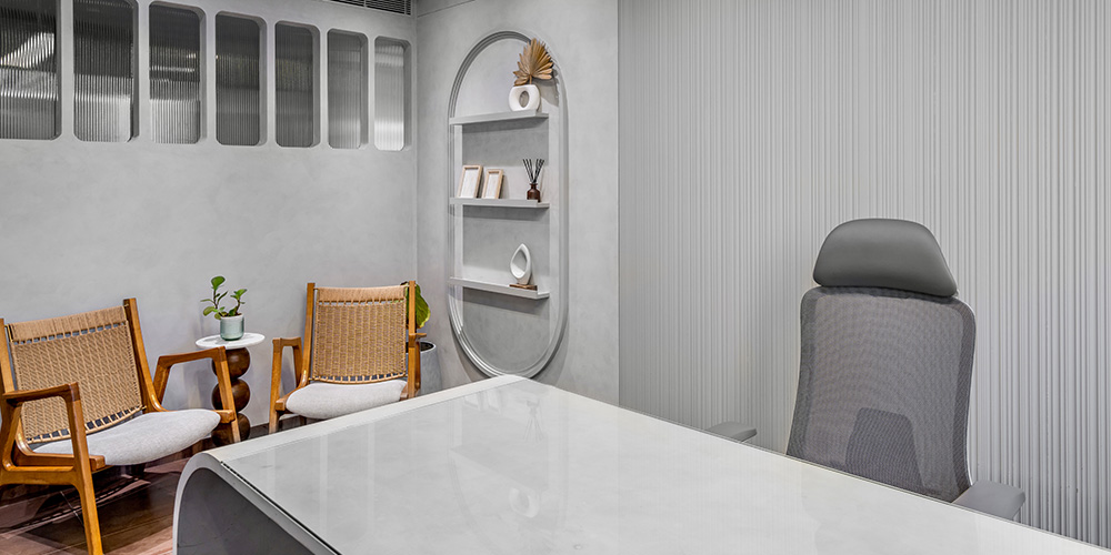
In order to contravene the sobering utilitarianism of designing an office space, one of its key functions must prioritise employee wellness. People spend almost a third of their lives at work. When the premises they inhabit are characterised by ergonomic furniture and minimalist interiors, embellished with sublime art pieces, their collective psyche tends to absorb this unobtrusive elegance. In Pune’s vibrant nucleus, a headquarter for real estate builders Ravima Ventures exemplifies this stylistic typology imagined by Natasha Shah, founder and principal designer of her studio Between Walls.
Tapping into earthy materials and subdued tones, Natasha crafts an environment orbiting around the client’s persona. Consequently, the structural layout of the 1,800 sq ft workspace embraces an unhindered continuity between the segregated areas while sculpting daylight in generous abandon.
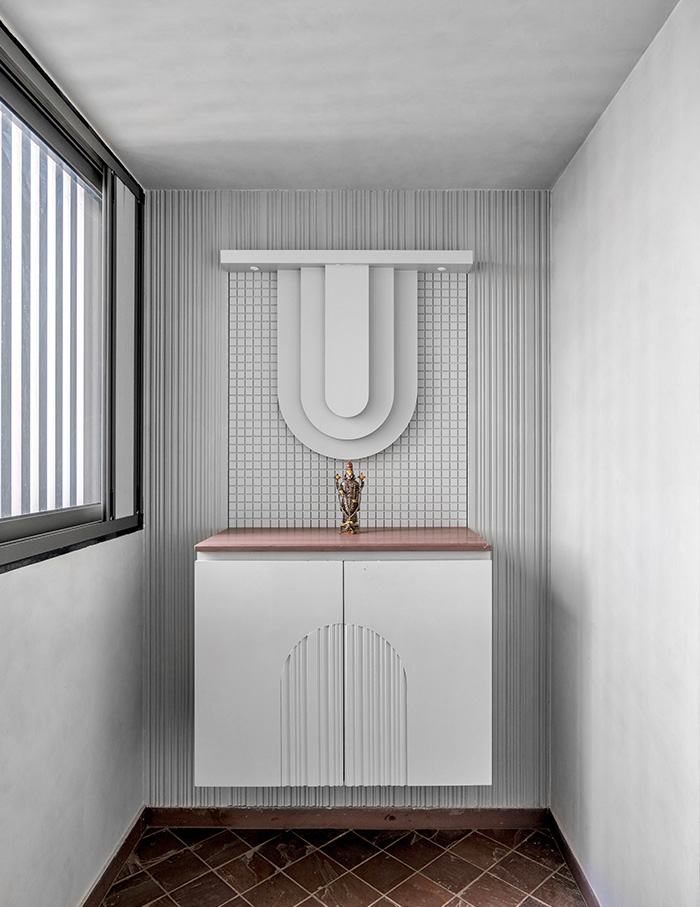
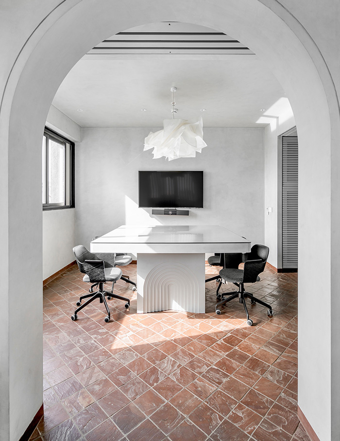
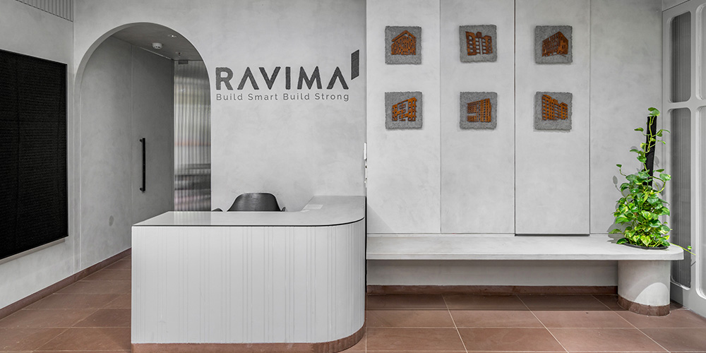
The reddish-brown madani flooring is the standout feature, complemented by a delicate grey tint on walls and ceilings, achieved through micro-cement and duco paint. “We chose to do this because we wanted to show the magic of the most simple materials and colours,” Natasha elucidates. The most challenging aspect proved to be the reception foyer, where the team had to strike a razor sharp balance between spatial harmony and purposefulness.
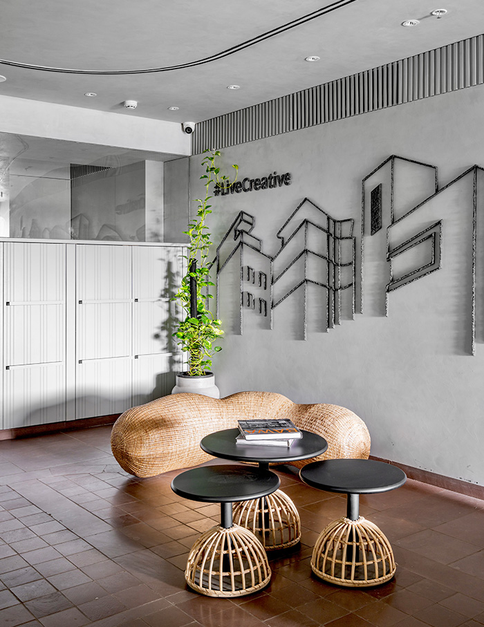
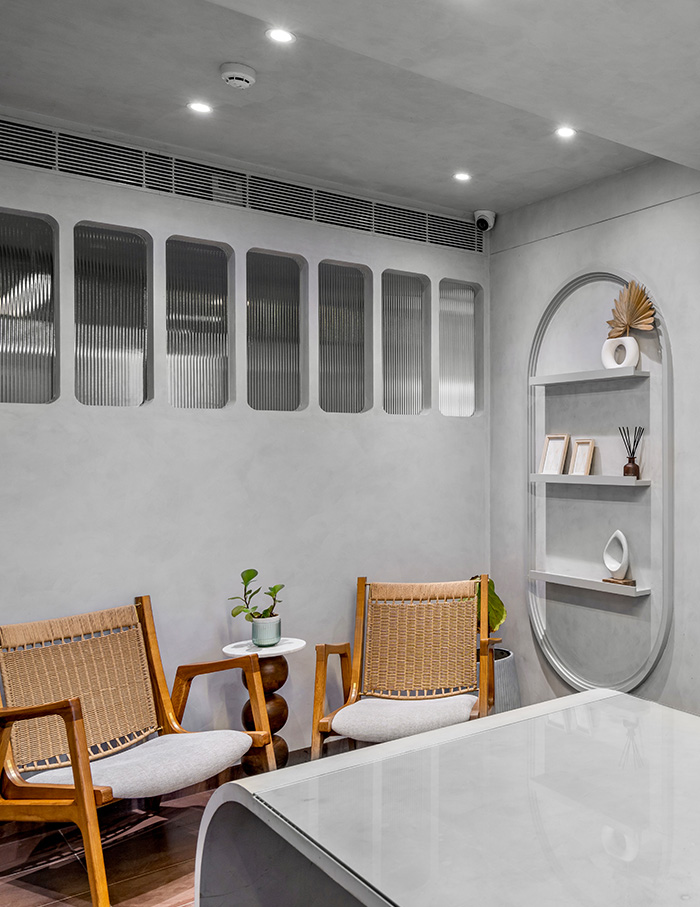
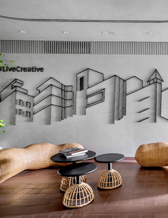
As one enters, a ribbed door ushers them into a waiting area laden with bench-style seating and mirthful wicker ottomans shaped like tamarinds, an inspired touch that introduces a breakaway relief of outdoorsy warmth and texture. Straying clear of vibrant hues, the statement wall accents depicting silhouettes of deconstructed buildings, are made from locally sourced sand and corten steel. A charcoal shade, in congruence with the company’s name and logo, is predominant throughout.
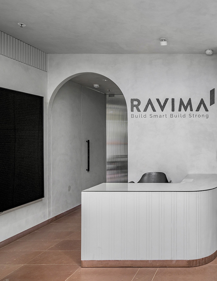
The prominently curved cubicle where the PA sits, also serves as a display for business catalogues, contributing to the cohesive adaptability of spatial organisation. The three directors’ cabins, along with the pantry and washroom, are located towards the rear. Near the waiting area, a private meeting room offers a cloistered space for confidential discussions. Adjacent to this, the purchase, pre-sales and accounts departments efficiently carry out their operations.
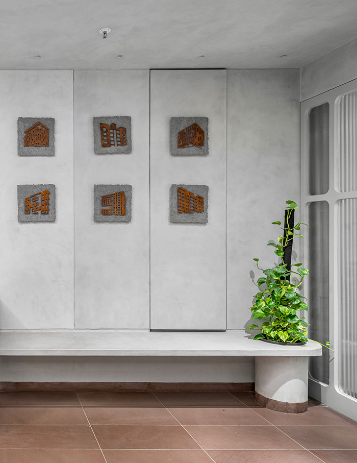
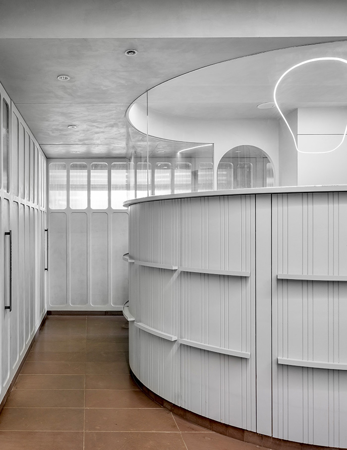
Beyond the reception, a Moroccan archway leads into a conference room that is accompanied by a mandir and a contemplative rocking chair corner, orchestrating a graceful interlude in the midst of the daily grind.
Besides this one would transition to a workstation, as if sauntering into an antechamber, carrying on the motif of fluted wall panels that elicits an ambience of intimacy while large windows facilitate “getting in as much natural light” as possible.
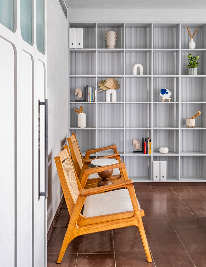
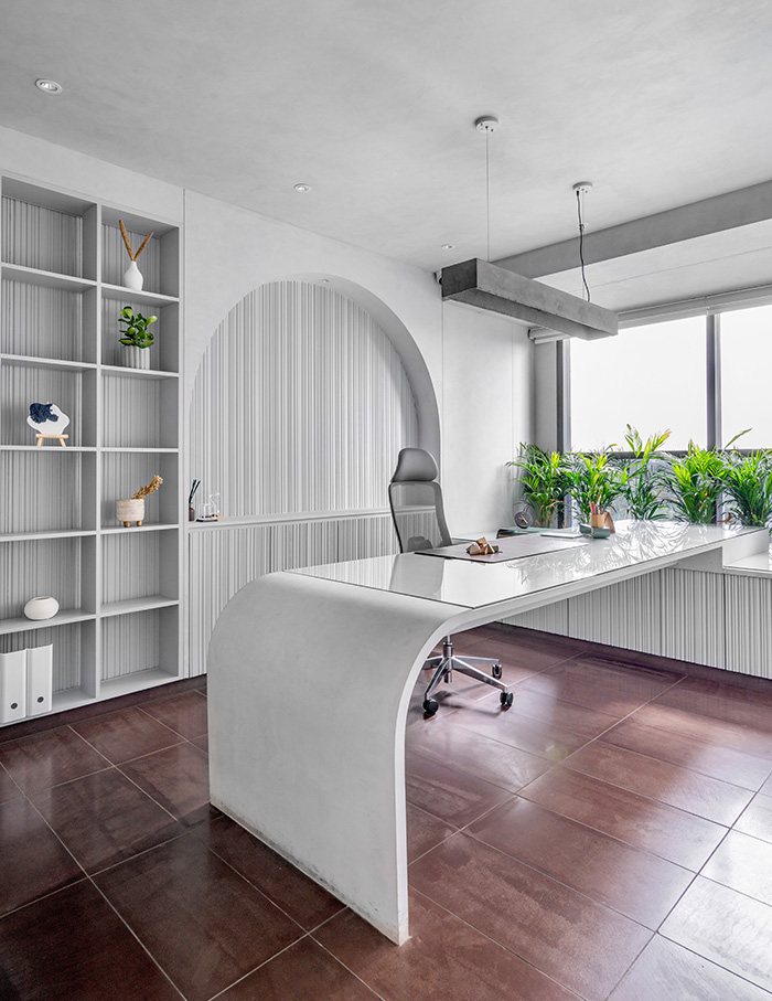
Photograph courtesy Inclined Studio
Natasha’s aesthetic ideology draws from the German architect Ludwig Mies van der Rohe’s mantra of less is more, crucial for optimising every square foot while eliciting an aura of uncomplicated sophistication.
